
如迪 PARK
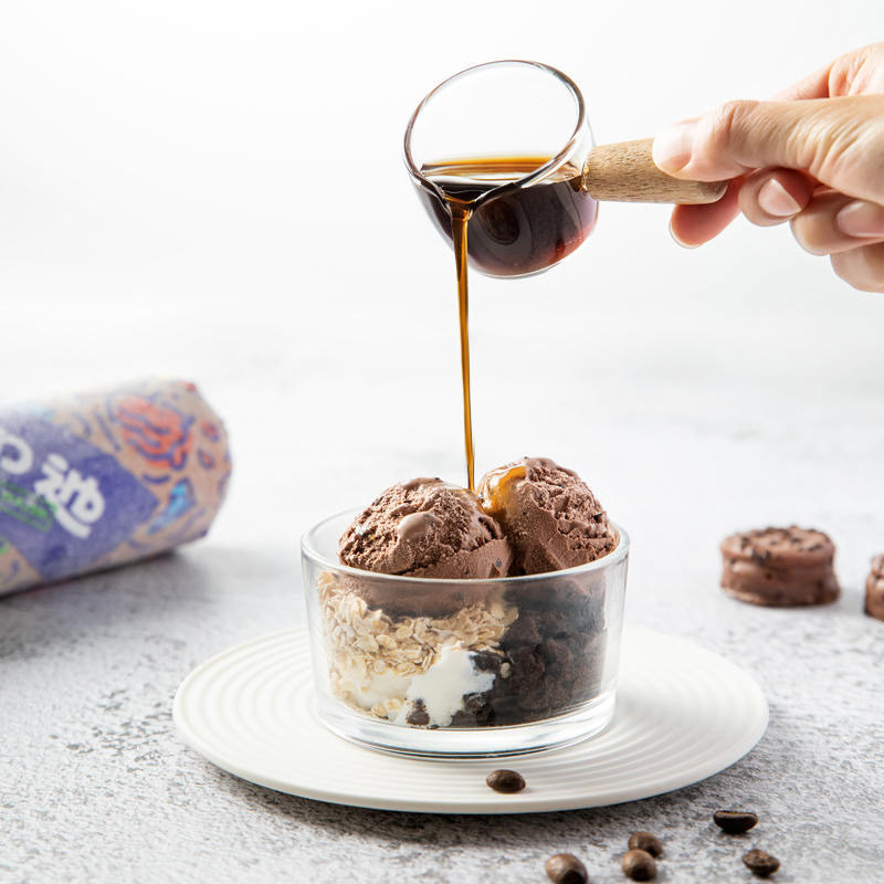
Rud is a new Chinese ice cream brand. Its products are made in Ukraine, and its quality is certified by the European Union. It takes family sharing as its brand positioning and diversity, interestingness and sharing as its brand value. Except being launched online, the brand hopes to create “a third space” implementing Rud’s concept in the future and share the endless fun brought by ice cream with the public!
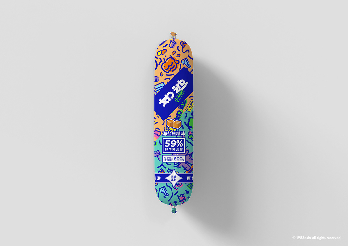
The customer groups of Rud are from the public, so the brand logo uses bold characters which can be easily identified and remembered, and the slightly flat font makes people generate an intimate feeling. The simplified processing of the “Di” character is not only the highlight of logo design but also an important memory point. The English sub-logo “Park” is superimposed on the Chinese character logo with a small stamp, and the logo design implements the relaxation and interestingness of the brand.
Greenbelts, blue sky and blossoming flowers are available…People rest, date and entertain here. Park may be the earliest third space for human beings. “Rud Park” is used as the third space to represent Rud’s concept-diversity, interestingness and sharing. Rud is relaxing and interesting, so the design style is expressed with relaxing strokes, bright colors, irregular and interesting overprinting techniques. Taking family sharing as its brand positioning, Rud has its designers launched the strategy of brand spokesperson family, which is helpful to improve brand closeness and better communicate with target consumers. The designers have selected five things about Park and refined them into the brand spokesperson family: Xiao Di combined with pet dogs and clouds, Little Smoothness combined with slide and tongue, Sparkling combined with Christmas tree and starry sky, Apple Cheeks combined with apples and muscles (fitness) and Flowers combined with flowers and elfins. Together, they have built the spokesman family of Rud Park. In addition, the designers have extracted some elements about Park and Ukrainian embroidery as auxiliary patterns and formed different story scenes through matching changes, which can generate different design images and bring interesting and colorful extensibility to the brand.
如迪是新興的中國冰淇淋品牌,其產品製作於烏克蘭,質量獲得歐盟雙認證。品牌定位家庭分享,以多元、趣味、分享為品牌價值。除了線上,品牌未來更希望打造貫徹如迪理念的「第三空間」,與大眾分享冰淇淋帶來的無窮樂趣!
如迪顧客群體面向大眾,所以品牌標誌使用了便於識別和記憶的粗體字,稍扁的字形令人有親近感。「迪」字的簡化處理是標誌設計的亮點,同時也是一個重要記憶點。英文副標「park」以一個小印戳的形式疊加在中文字標上,標誌設計貫徹了品牌輕鬆趣味的調性。
綠地藍天、百花爭艷…人們在這裡休憩、約會、玩耍——Park可能是人類最早的第三空間。以「如迪Park」來作為承載如迪理念——多元、趣味、分享的第三空間。 如迪品牌調性為輕鬆趣味,所以在設計風格上使用了輕鬆的筆觸、明快的色彩和不規整而富有趣味的疊印手法來表達。如迪品牌定位家庭分享,設計師推出品牌代言人家族的戰略,有助於提高品牌的親和度,更好地與目標消費群體溝通。 設計師選取了關於Park的5個事物來提煉為品牌代言人家族,它們分別是——結合寵物狗和雲團的小迪、結合滑梯和舌頭的小滑頭、結合聖誕樹和星空的閃閃、集合蘋果和肌肉(健身)的蘋果肌、以及結合花朵和小精靈的如花。它們一同構建了如迪Park品牌代言人家族,另外設計師提取了一些關於Park以及烏克蘭刺繡的元素作為輔助圖案,通過搭配變化形成不同的故事場景,可以衍生出不同的設計畫面,為品牌帶來趣味和豐富的延展性。
CATEGORY|PACKAGE DESIGN 包裝設計 AGENCY|1983ASIA CREATIVE DIRECTOR 創作總監|YAO & SU SU 楊松耀 & 蘇素 ART DIRECTOR 美術指導|HE JING 賀靜 DESIGN |XU SHU YI 許書溢 YEAR|2022 COUNTRY|CHINA, GUANG ZHOU 中国, 廣州


1983ASIA
WEB:www.1983asia.com
WECHAT:1983亚洲造
MAIL: the_1983@foxmail.com
TEL: +86-0755-86233262
ADD:中国深圳华侨城创意园北区B3栋东侧604
604, B3 building, OCT loft north area, Nan Shan district, 518000, Shen Zhen, CHINA.


