SALUS BIOMEDICAL CENTER
The Challenge
Update and create the entire brand style, from logo all the way to guidelines, brand identity manual, stationery elements, and other applications without loosing the concept of harmony and equilibrium of the company.
The Outcome
Updated and created the entire brand style, from logo all the way to stationery elements, without loosing the concept of the company.
Process
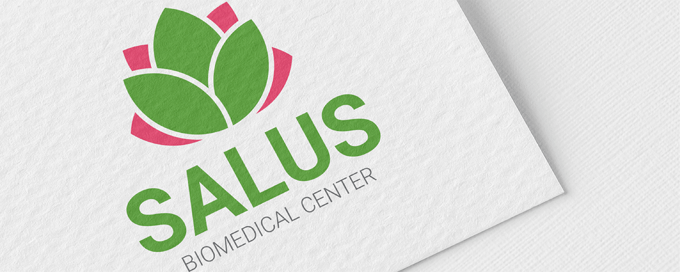
Previous logo had a hand and a lotus flower, and other irrelevant elements. But everything was confusing. The purpose of the sketching phase was to integrate a lotus flower and a couple of hands carrying it.

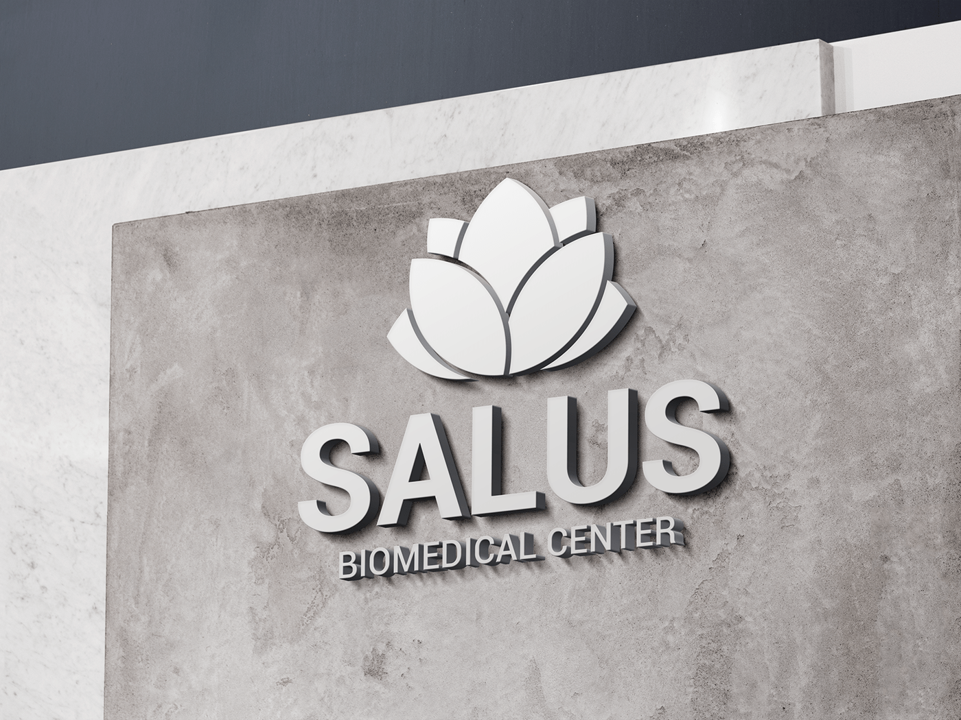
Going Digital
Since we're talking about alternative medicine, the company implements meditation, and natural practices, to maintain equilibrium. That's why the logo was created using the Golden Ration.


Color Palette
Salus has always use a green and violet/pinkish color. We decided to maintain this colors but using a PANTONE palette that could be used for digital and printing purposes.

Branding Manual
A creation of manual with some branding guidelines on how to use the logo, the correct use of color, and established formats was vital to instruct the client on how the brand must be used from now on.

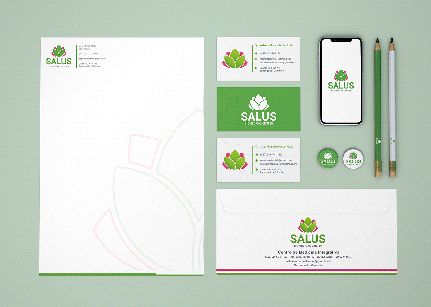
Stationery
Letterhead layout, business cards, envelopes among other applications were designed to keep aligned all aspects of the brand.


Other Applications
Labels for medicine, lab coats, recyclable bag, were also elements taken into account when refreshing the identity of the company.