

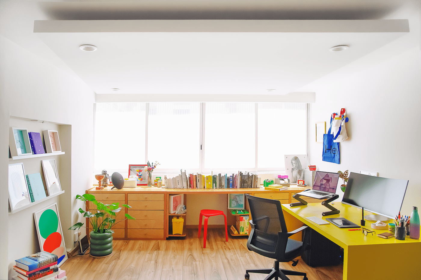
THE STUDIO:
I have always believed that it is important to create personal projects with absolute freedom to express one's ideas as a designer in the most honest way, on the other hand over the last year I embarked on the journey of designing a space that would represent me as a person and as a designer but that would also allow me to surround myself with all the things I love to inspire me every day, so I decided to design my studio surrounding myself with pieces from designers that I enjoy and admire, this selection of pieces that I selected for my personal enjoyment range from printed art, to objects, books, accessories, flower pots and a couple of objects that I designed myself like the yellow desk and the half point arch mirror.


THE POSTERS:
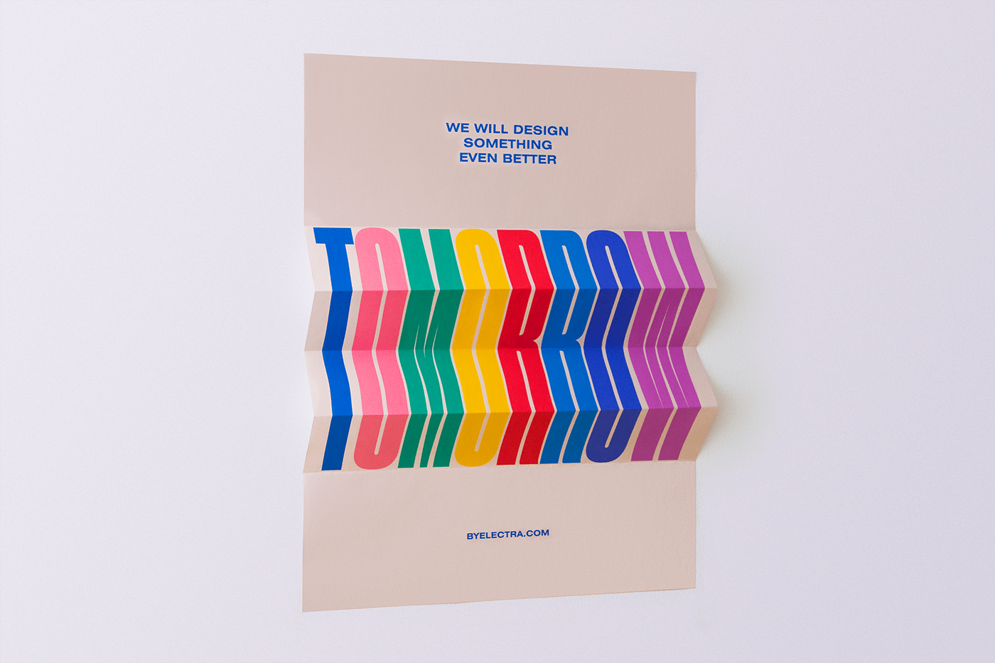
I designed this series of posters as a continuation of a piece I had done previously, finding a repetitive formula was quite simple: an extra condensed typography that applied to an editorial across the space allows in print format to generate movement through folds without losing legibility.
The use of Sans Serif typography usually has a connotation of seriousness and in conjunction with such an invasive editorial there is a visual heaviness, however the choice of color palette (inspired by the work of Stuart Davis) contrasts the elements generating harmony but mainly a playful dynamism. On the other hand the phrases used in these posters are part of a comical communication understandable within the design community, phrases like "Repeat after me: we have done this before", "Designed by extremely ordinary people" and more.
The use of Sans Serif typography usually has a connotation of seriousness and in conjunction with such an invasive editorial there is a visual heaviness, however the choice of color palette (inspired by the work of Stuart Davis) contrasts the elements generating harmony but mainly a playful dynamism. On the other hand the phrases used in these posters are part of a comical communication understandable within the design community, phrases like "Repeat after me: we have done this before", "Designed by extremely ordinary people" and more.


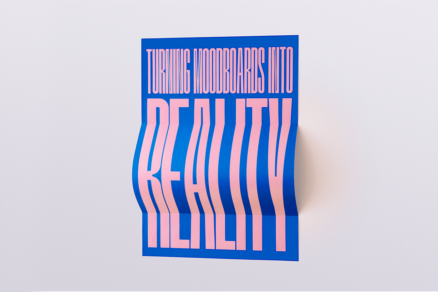


The pieces "No Internet, No problem" and "Turning Moodboards into reality" use TOWER typeface, designed by https://nodotypefoundry.com


