ecoe
Case
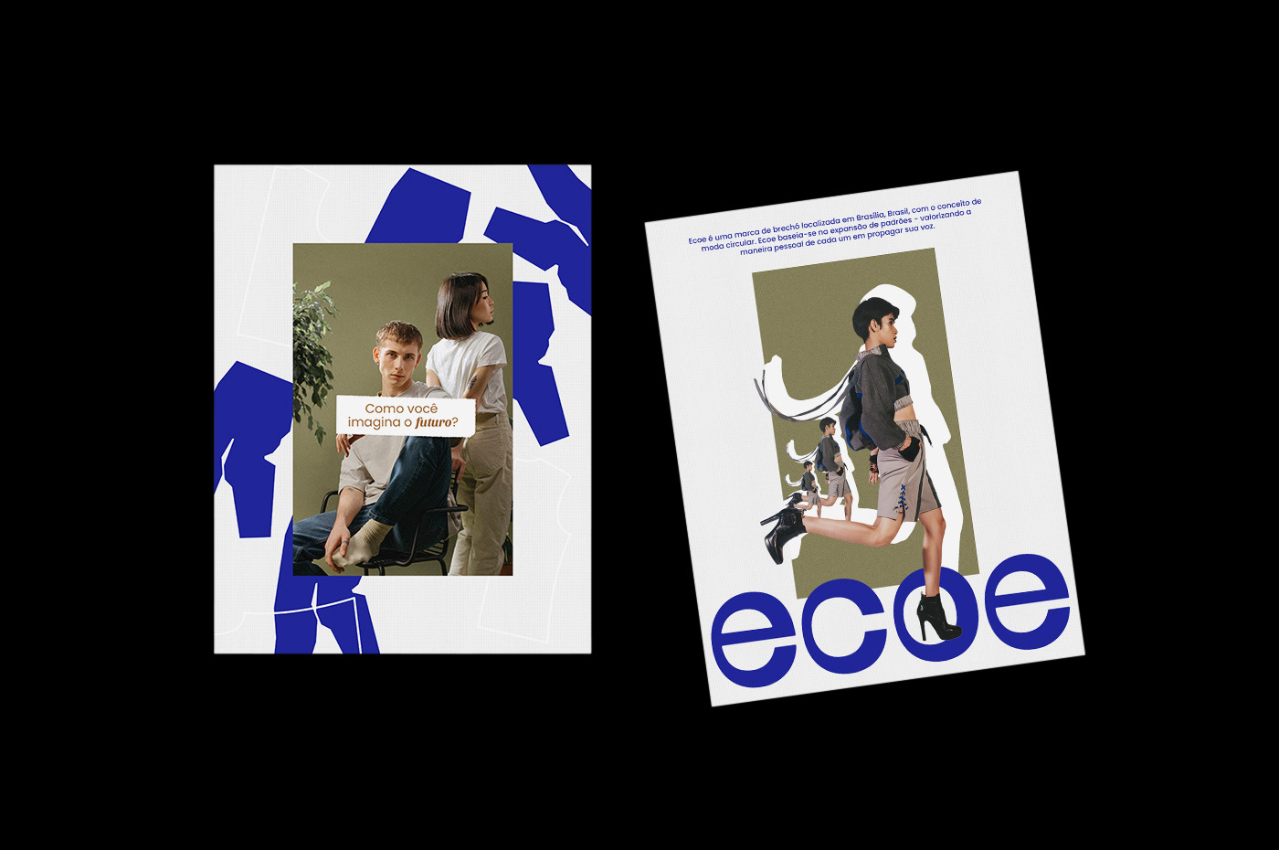
PT | Ecoe é uma marca de brechó localizada em Brasília, Brasil, com o conceito de moda circular. Ecoe baseia-se na expansão de padrões - valorizando a maneira pessoal de cada um em propagar sua voz. A empresa também afirma que existe a possibilidade de fornecer roupas com conforto e estilo cuidando da natureza, e assim, passar a mensagem de positividade com relação ao futuro da moda e o consumo. Esse futuro pode sim ser acessível, seja pelo vestuário ou pelo conceito de ecoar o cuidado com o meio ambiente.
EN | Ecoe is a thrift store brand located in Brasília, Brazil, with the concept of circular fashion. Ecoe is based on the expansion of standards - valuing each one's personal way of propagating their voice. The company also claims that there is the possibility of providing clothes with comfort and style, taking care of nature, and thus, pass the message of positivity regarding the future of fashion and consumption. This future can indeed be accessible, either through clothing or through the concept of echoing care for the environment.
Solution
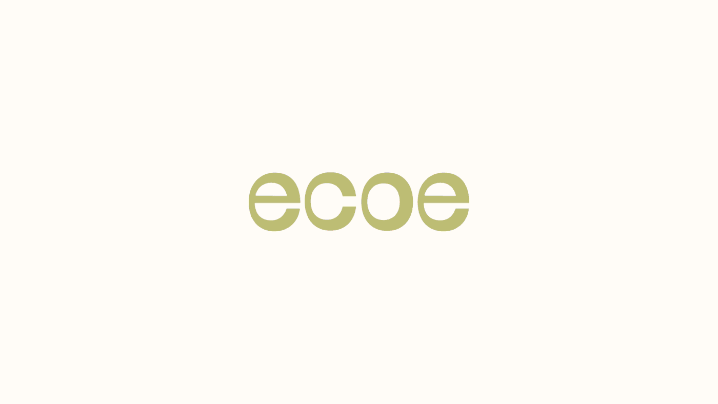
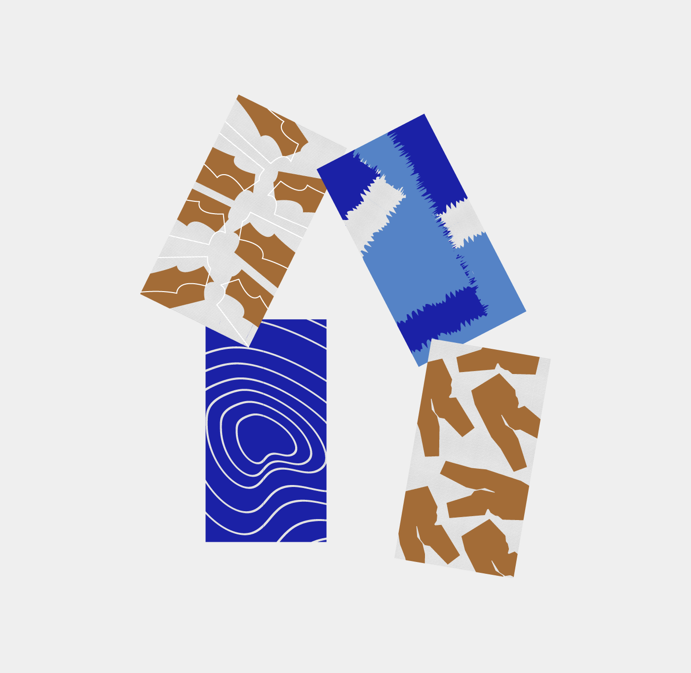
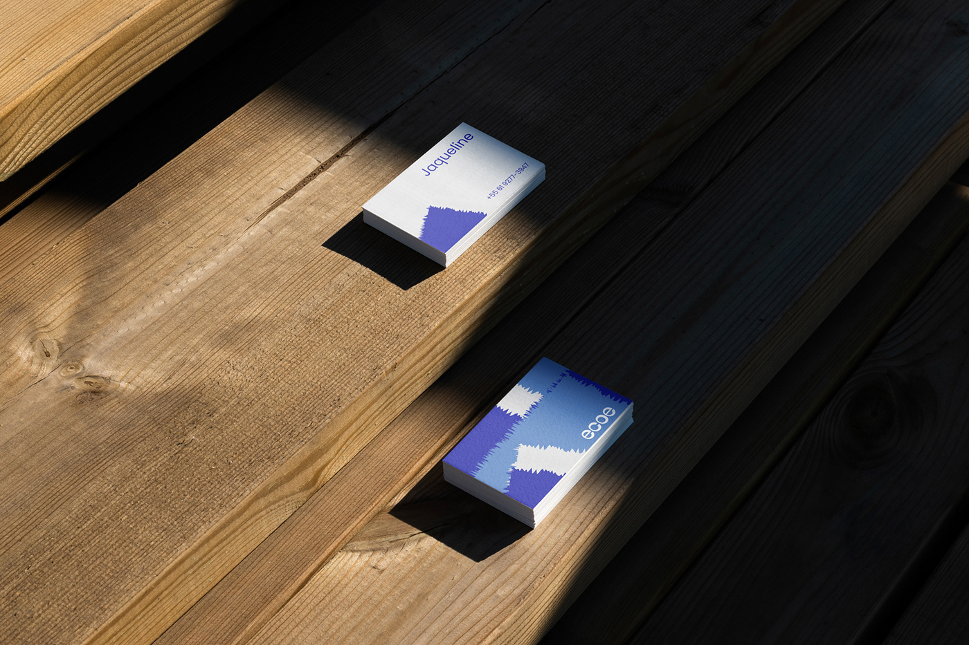
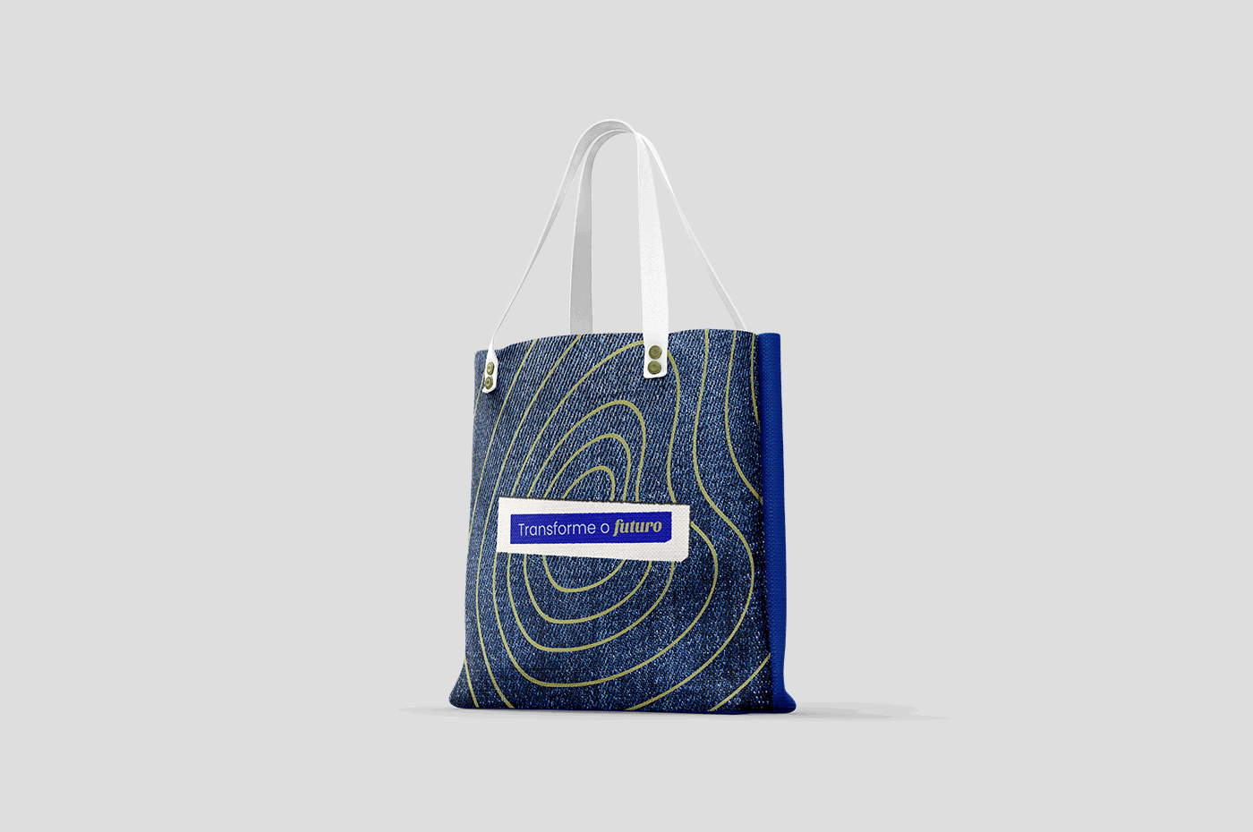
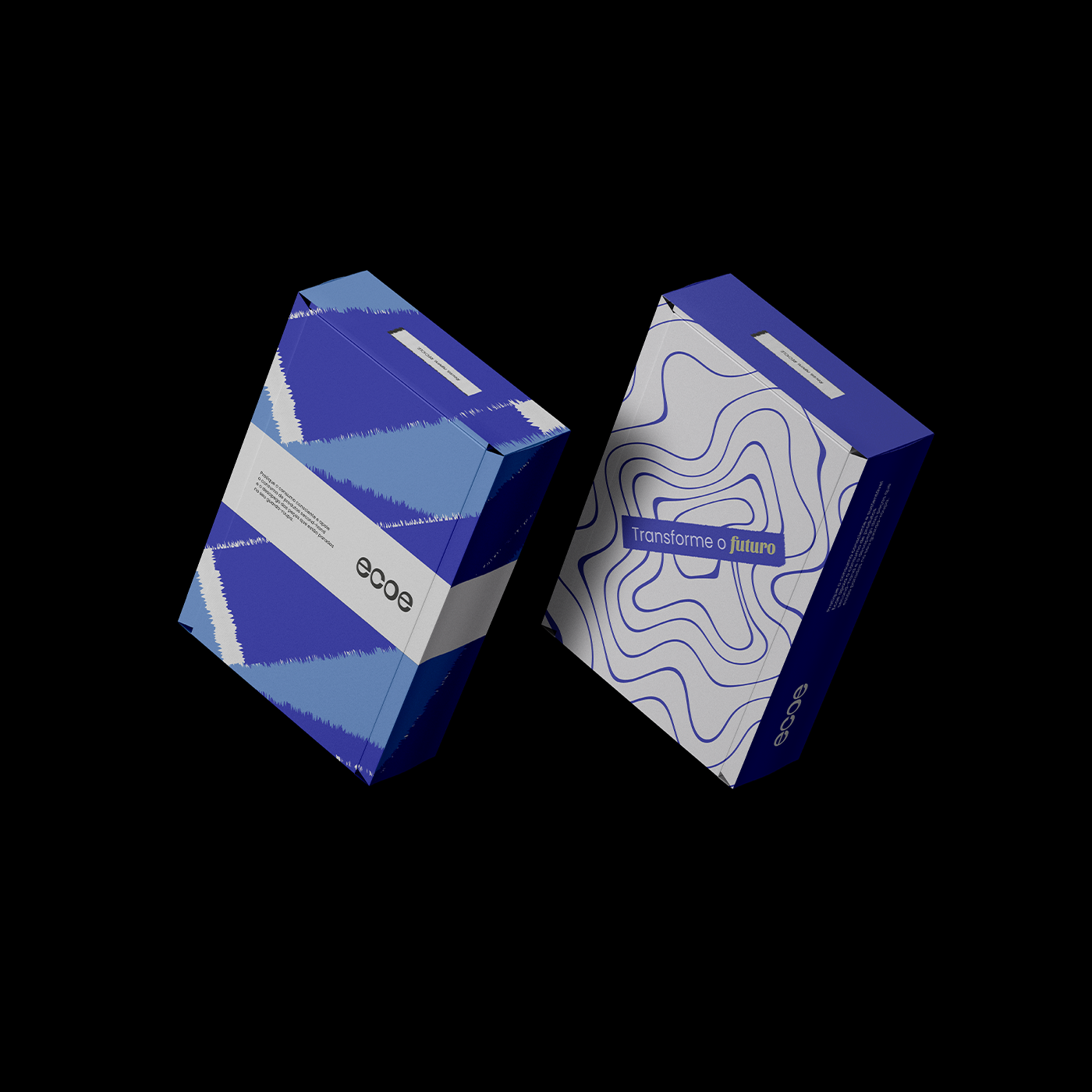
PT | O principal objetivo da identidade da marca é transmitir o posicionamento sustentável baseado na reutilização de peças. O design visual geral foi criado para apoiar o estilo de movimento e expansão da moda circular, fazendo refletir seus valores. A escolha das cores foi baseado em matérias primas, como: o azul/Mar e Jeans, marrom/Terra, verde/folhas. O tipo enfatiza o termo "ecoar", com hastes mais finas e grossas seguindo um grid pensado na "propagação" e "frequência", sendo assim, o logotipo simboliza uma sensação de movimento.
EN | The main objective of the brand identity is to convey the sustainable positioning based on the reuse of parts. The overall visual design was created to support the movement and expansion style of circular fashion, making it reflect its values. The choice of colors was based on raw materials, such as: blue/Sea and Jeans, brown/Earth, green/leaves. The type emphasizes the term "echo", with thinner and thicker stems following a grid designed for "propagation" and "frequency", thus, the logo symbolizes a sensation of movement.
Naming · Logo Design · Brand Identity