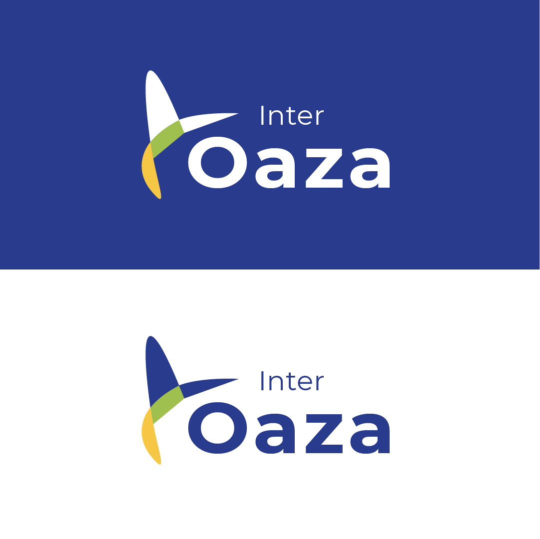
Interoaza is a distribution company bringing people’s favorite brands to our local market shelves. Being a corporate company, I saw fit that the brand ought to be slick, powerful and simple. The symbol representing a bird was created in a remarkable fashion, through various designs and sketches. Birds often are known as carriers for seeds and being great distributors over wide areas, the two things that strongly associate with the bird symbol. The correlation was a perfect representation of the company. Colors that I utilized -Blue is often seen as a sign of stability and reliability. -Yellow is a compelling color that conveys fresh energy and new beginnings, it is associated with success and confidence. -Green evokes a feeling of abundance, growth, and renewal.


