
About
Yota is a mobile operator in Russia.Yota positions itself as a mobile operator without intrusive services. The app needs a redesign because its rating in the App Store is one of the lowest. My task is to update the design of the application taking into attention the wishes of the users.

Design Process
1. Discover (user reviews, competitor analysis, survey, heuristics analysis of the current application)
2. Define (information architecture, User/Task Flow, hypotheses)
3. Ideate — Prototype — Test (Sketches, wireframes, final UI, usability test)

Popular problems of users:
1. unclear navigation
2. inconvenient communication with support
3. lack of convenient viewing of sim card statistics


Analysis of competitors showed weaknesses of the application:
1.There are no statistics on tariff expenses
2.Competitors have realized a simpler option of switching between numbers
3.Account replenishment and auto payments are combined into one function
4.You can't call support, there is only a chat

Survey results:
1.Three main functions of the application are to view the balance, balance replenishment and track the history of the account
2. Most users are more comfortable calling support than writing in a chat
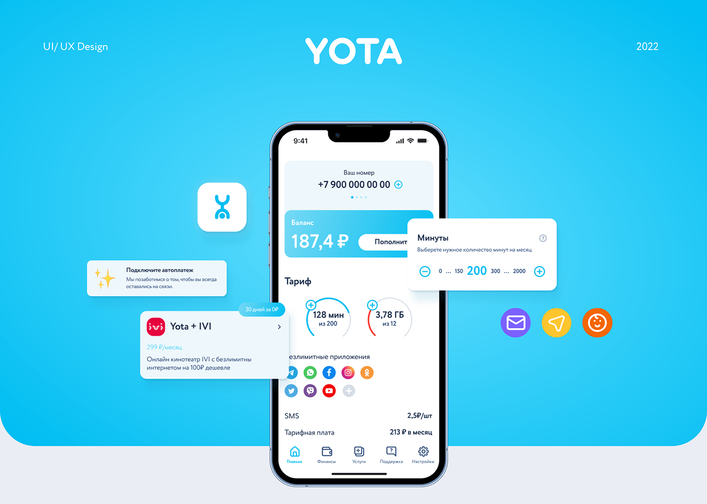
3. Users like the idea of personalizing the home screen in the app


Information Architecture:
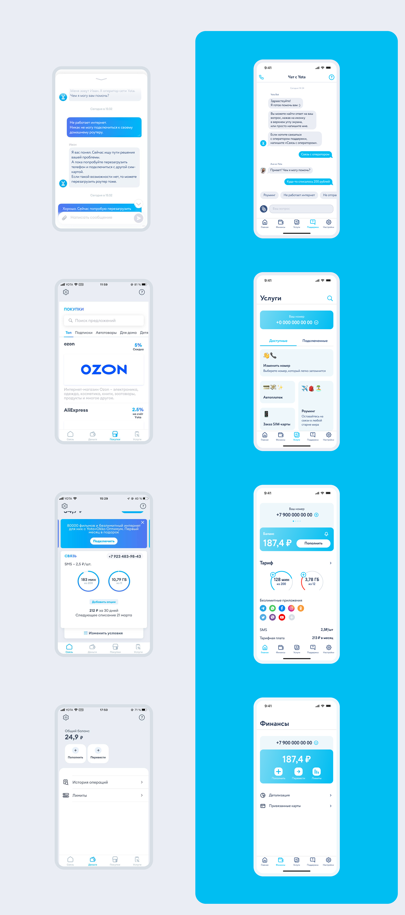
The current application has a menu at the top with Settings and Support sections and a tabbar at the bottom. I decided to move all the sections to tabbar to collect all the navigation features in one place. The Services and Shop sections have merged into one, as they are very similar in content.
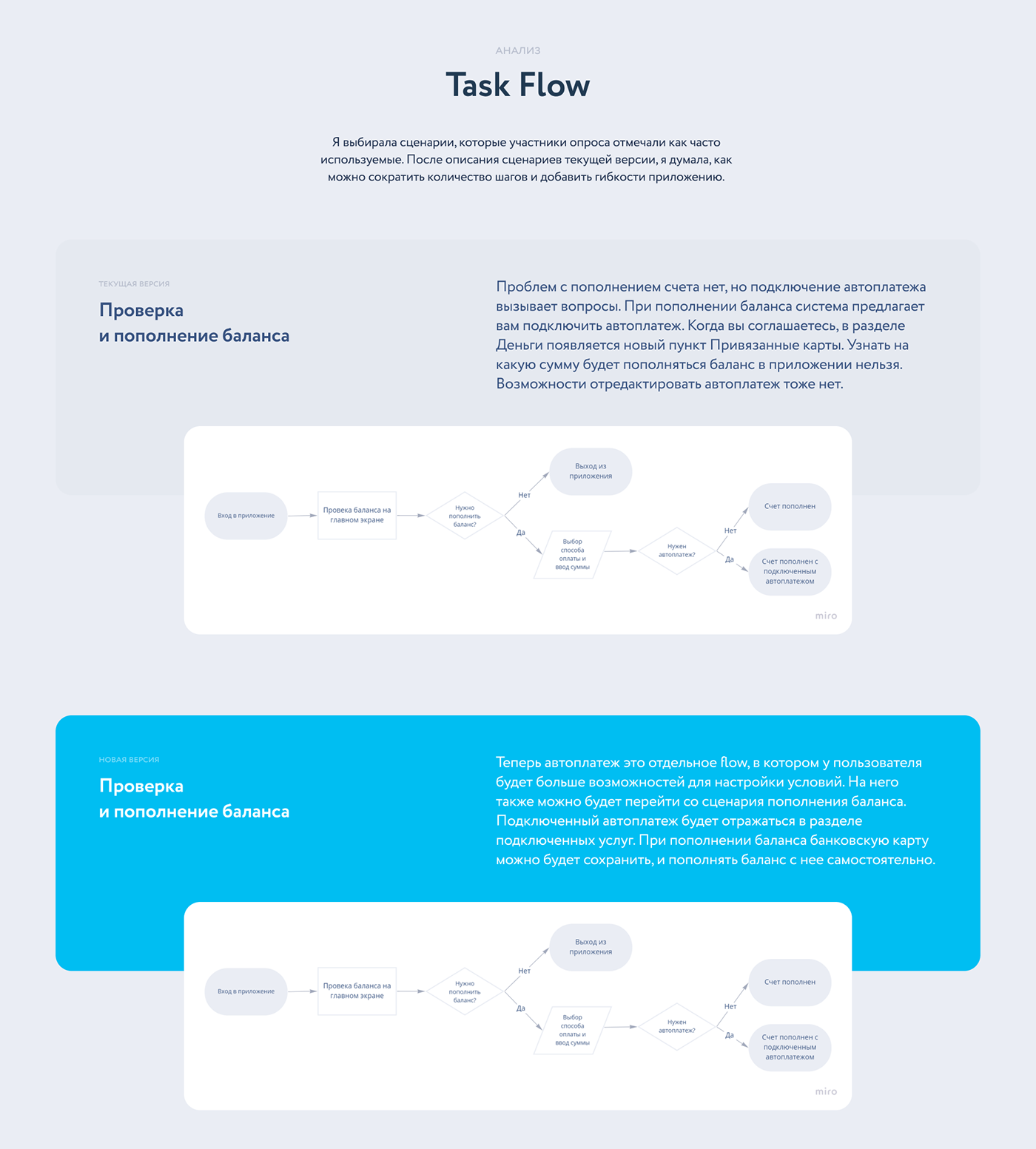
Task flow 1. Checking and replenishing the balance.
In the current version, auto payments and balance replenishment are in an inseparable scenario. Autopayments cannot be edited. Now autopayments are a separate flow, in which the user will have more opportunities to configure conditions. It will also be possible to switch to it from the balance replenishment scenario. The connected autopayment will be shown in the connected services section.

Task flow 2. Log in to an account with a different Yota number.
To change the number, you do not need to log out of your account and log in again with a new number. It is enough to enter the data once and switch the number on the Main screen. So, the amount of steps to the goal will be reduced.

Hypotheses:
1. By designing an application with a rethought IA and relying on heuristic analysis, we will eliminate the difficulties of users.
2. If we reduce the number of steps for some functions, we will accelerate the achievement of the goal and improve usability.
3. The ability for the user to change and add sections on the home screen can speed up the work with the application.

Sketches and Wireframes
Based on the prescribed Task Flow, I started to quickly sketch the interface screens. It helped me get involved in the work. These sketches formed the basis of a low fidelity prototype.
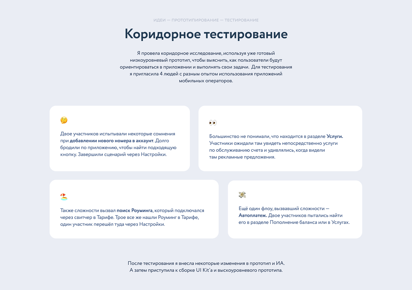
Hallway testing
For testing, I invited 4 people with different experiences using mobile operators' applications.The participants had difficulties adding a new number to their account, and also searching for information about roaming and autopayments. Most of the participants did not understand why the Services section contained promotional offers. They expected to see communication services there. Based on this data, I made some changes to the IA and prototype.


Usability testing
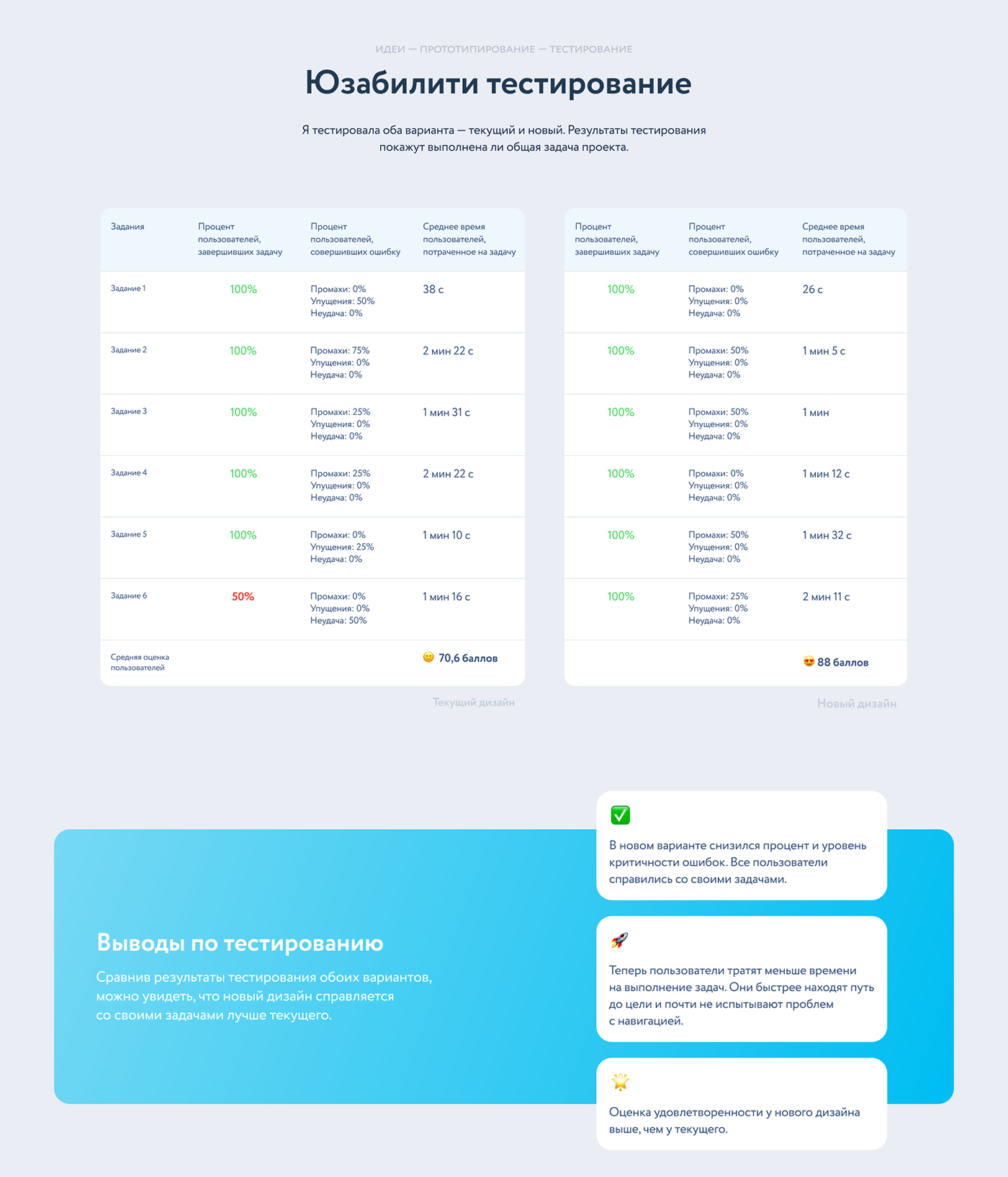
I tested both options — the current one and the new one. The test results will show whether the overall task of the project has been completed.
According to the results, the new design copes with its tasks better than the current one. All users coped with their tasks in less time. The SUS Score of the new design is higher than that of the current one.
According to the results, the new design copes with its tasks better than the current one. All users coped with their tasks in less time. The SUS Score of the new design is higher than that of the current one.

In order not to trigger a negative user reaction to the redesign, you need to update the application slowly and do not forget about onboarding.