

The New School: Communication Design
The following was printed and featured at The New School, Parsons at 66 W 12th St, New York, NY, and part of a four-week immersive for Summer Intensive Studies in 2014. Three projects open to the public documented communication, fashion, and product design, and can be seen on the WordPress blog - www.yaoyaopei.wordpress.com to understand the processes behind my portfolio and grade.

Urban Scroll
I thought about the emotional color palette and pieces of the Vanguard’s history to experiment from there. Eventually, I determined to keep the old fashioned look of my design but additionally wanted to add an element of art. I took photos of famous people who have been/performed at Village Vanguard and replaced their faces with pieces of art that reflected the time period (late 30s to early 70s). Layers would be an easy way to add these parts in without just pasting it on the background, so I designed black silhouettes and fake ripped paper to make it more 3-dimensional. For the font, I wanted to retain the classic feel, so I found a newspaper font on dafont.com. As for the emotional color palette, I chose red, orange, and green which is a split complimentary, and worked well because the sign of the Vanguard is red. My biggest challenge was placing the different parts in a way that wouldn’t be too random since I didn’t have a clear image of what my design out turn out like.


The color wheel and super flat value painting
We were to print the photos in black and white with high contrast in order to capture the changes of value in the photo. We then traced and outlined the photos by value and began painting. Mine took 3 days to complete...

Material alphabet
The challenge was to manipulate the material to distinctly form each letter, yet maintain consistency throughout the alphabet. My alphabet was built from toothpaste and Q-tips, which was easy to design with, but hard to manipulate. Toothpaste can be quite a mess. I carefully formed each letter on an illustration board, photographed it, and filled only the outline of the form with black (Photoshop) to create a unique typeface.


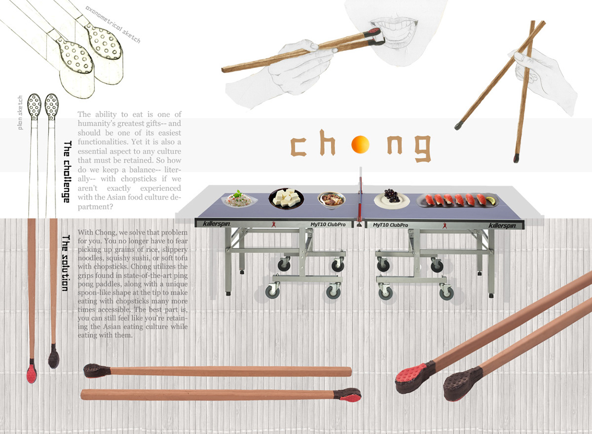
Chindogu Product
I could now take the last step in product design: making my final prototype which would just be an improved version of the second prototype. When designing the shape on Illustrator, I followed the same general form as the second prototype, but made it wider and shorter. This would make the chopstick easier to use and give me leeway for sandpapering later.


Fashion design in Chinatown: Project Prints


