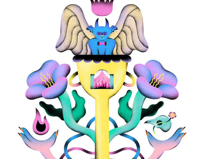
Notope Type Foundry Branding
2022 Instagram Account →
Notope is a digital type foundry, designing fine-quality or fun-quality static and variable fonts for Cyrillic, Latin and non-Latin scripts.
They reached out to me to design their brand. Throughout this 1-month project, I did: research and strategy to redefine the brand's direction, designed their logotype in a modern look, defined typographies and typographical layouts, generated graphic forms, created their packaging materials, advised in the art direction for current photoshoots,
and reevaluated their social media content strategy.
and reevaluated their social media content strategy.
The main inspiration is the book bought from Armenian street book market.

Searching...


After few attempts I finally understood the vibe I want to create. There's the time when tagline was born: "Notope is a digital type foundry, designing fine-quality or fun-quality static and variable fonts for Cyrillic, Latin and non-Latin scripts".
The logo should be accurate and a little bit funny. So I drew a music note by hand.
And that's it! I Also write Notope Typefaces across logo and found this color from London streets— it amazing fits!
And that's it! I Also write Notope Typefaces across logo and found this color from London streets— it amazing fits!


