___
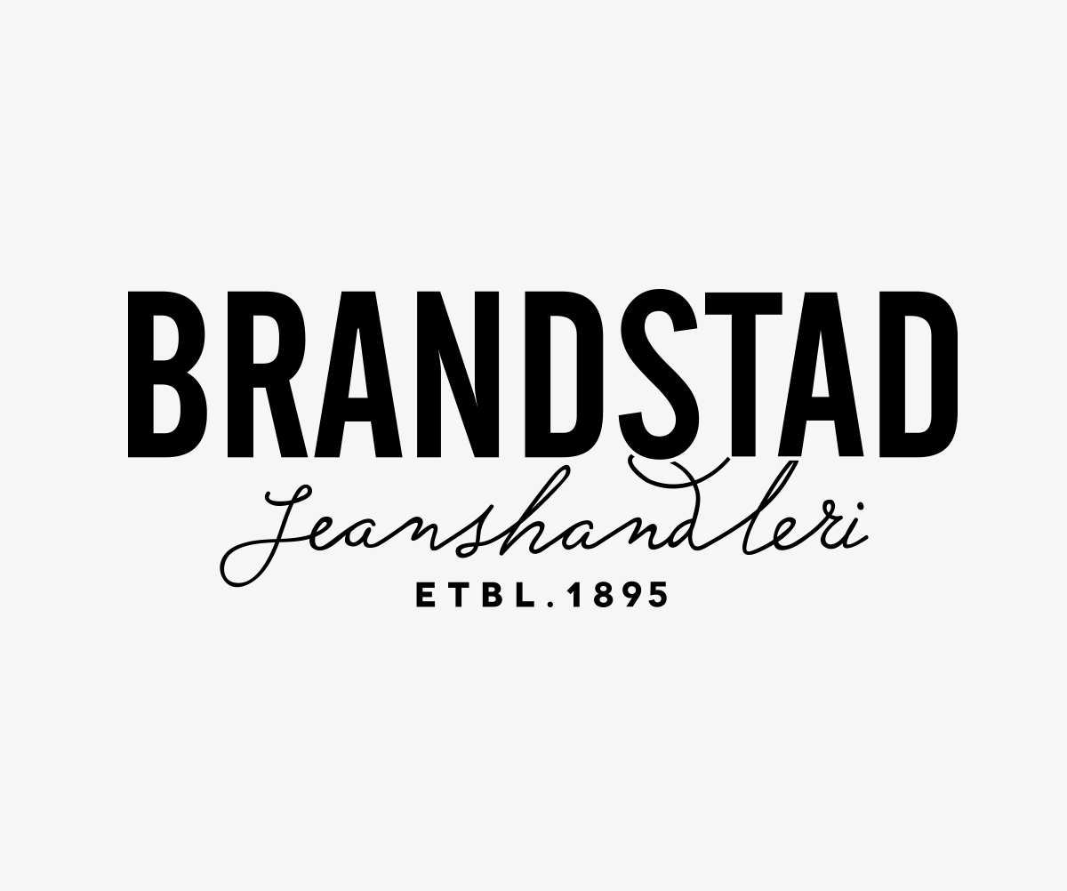
Brandstad Jeansforhandleri
___
Today, Brandstad appears to be unclear and groping, struggling to find their own identity and place in the market. They use various versions of their logo both online, in advertising and in their stores. It seems they are finding it hard to combine their heritage—which is what give the store its charm—with the demands and needs of their customers, and the brands that they stock.
Brandstads own expression need to be holistic and more concise to be a strong carrier of major fashion brands. They need to be clearer in the way they communicate and the message they send, and strive to be more visible to their audience. They want to step up in order to meet a wider audience and appear a bit more modern and distinctive without losing their valuable heritage.
Brandstads own expression need to be holistic and more concise to be a strong carrier of major fashion brands. They need to be clearer in the way they communicate and the message they send, and strive to be more visible to their audience. They want to step up in order to meet a wider audience and appear a bit more modern and distinctive without losing their valuable heritage.
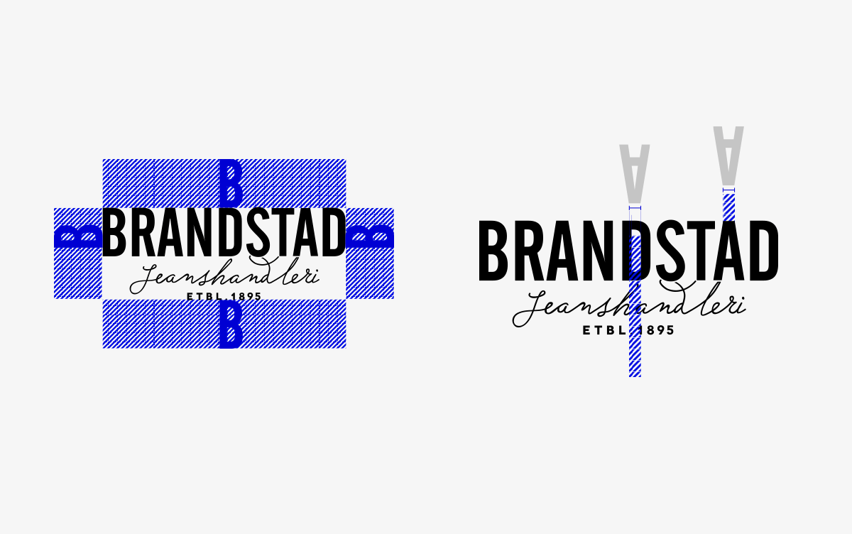
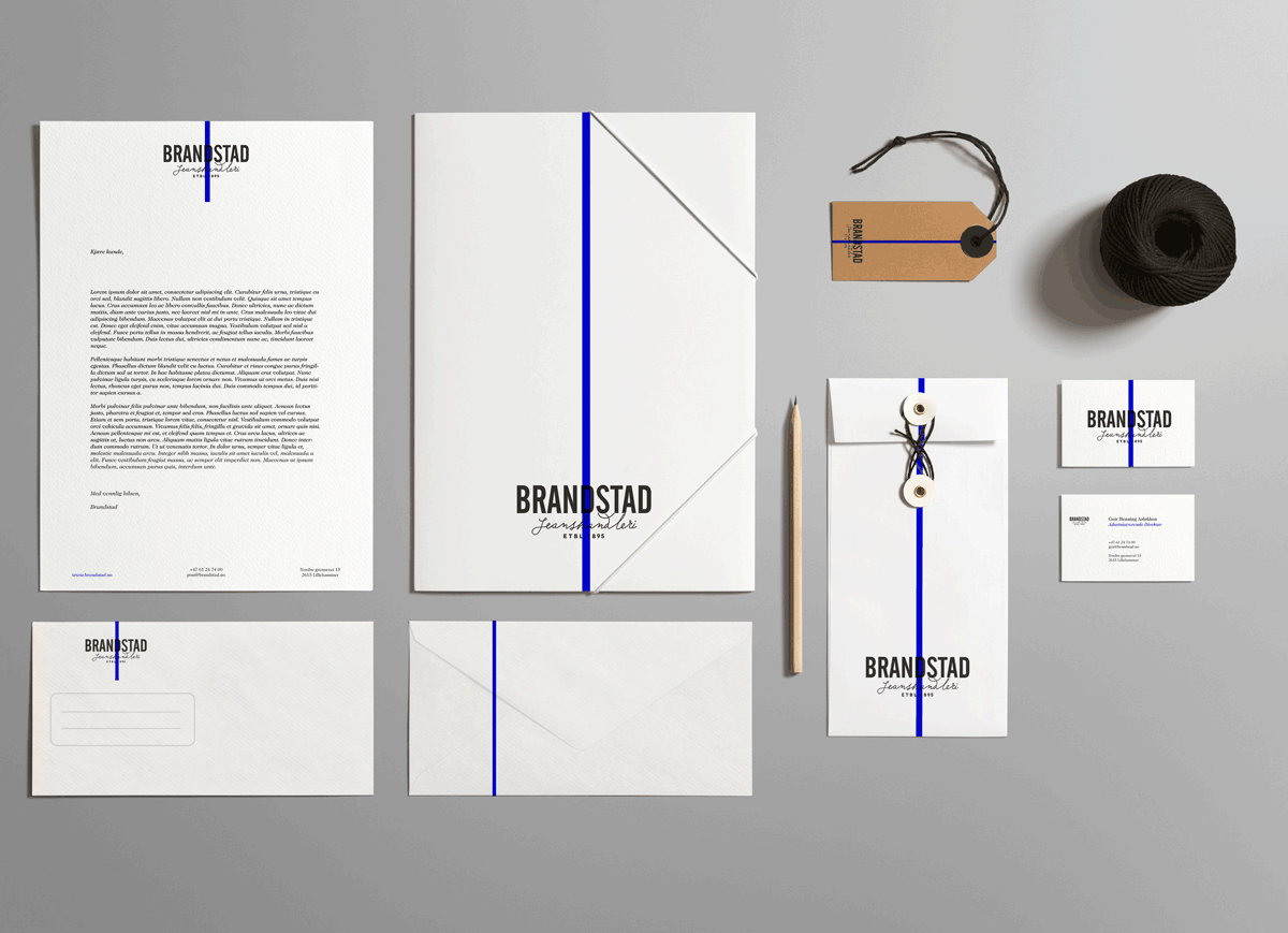
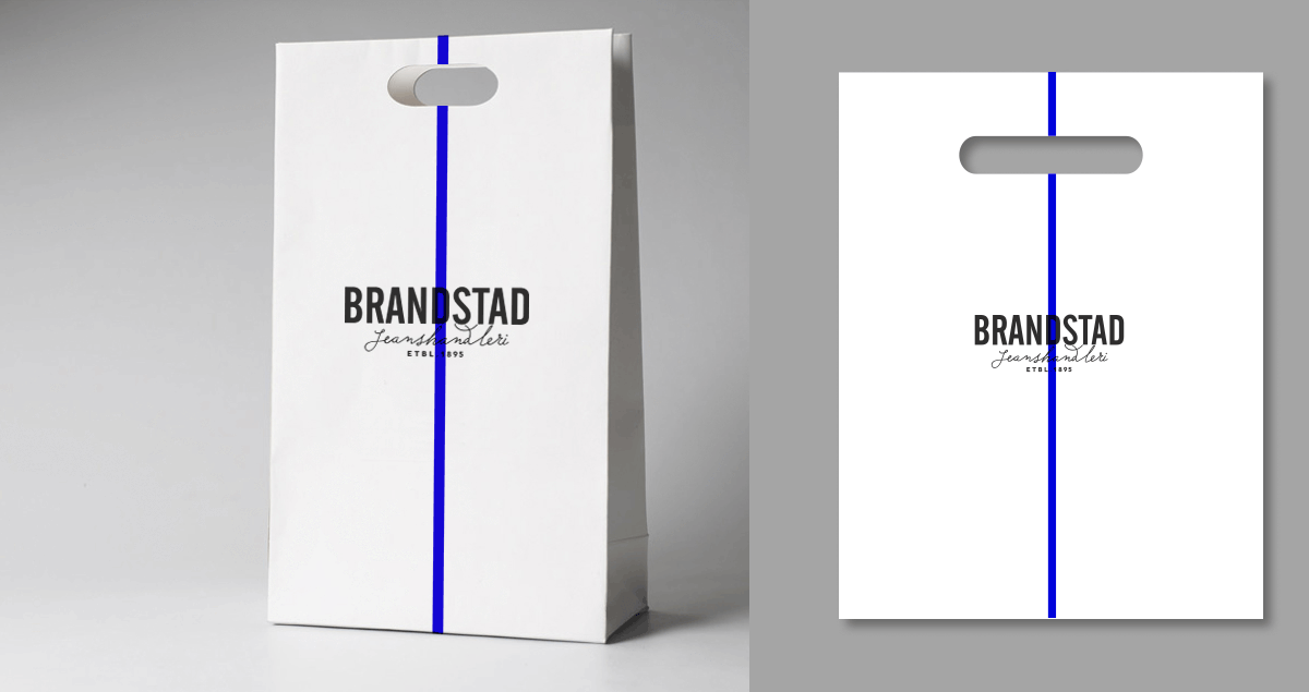
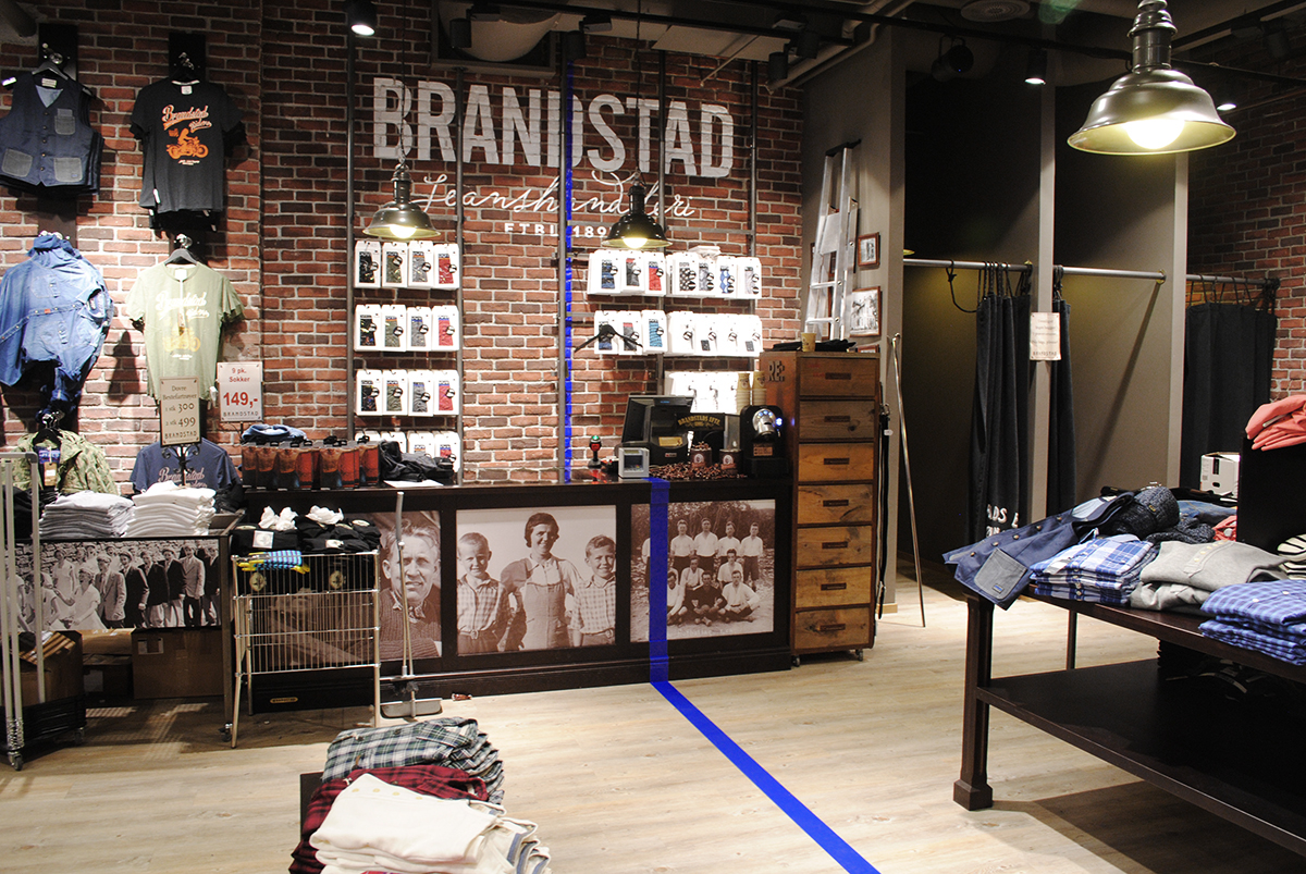
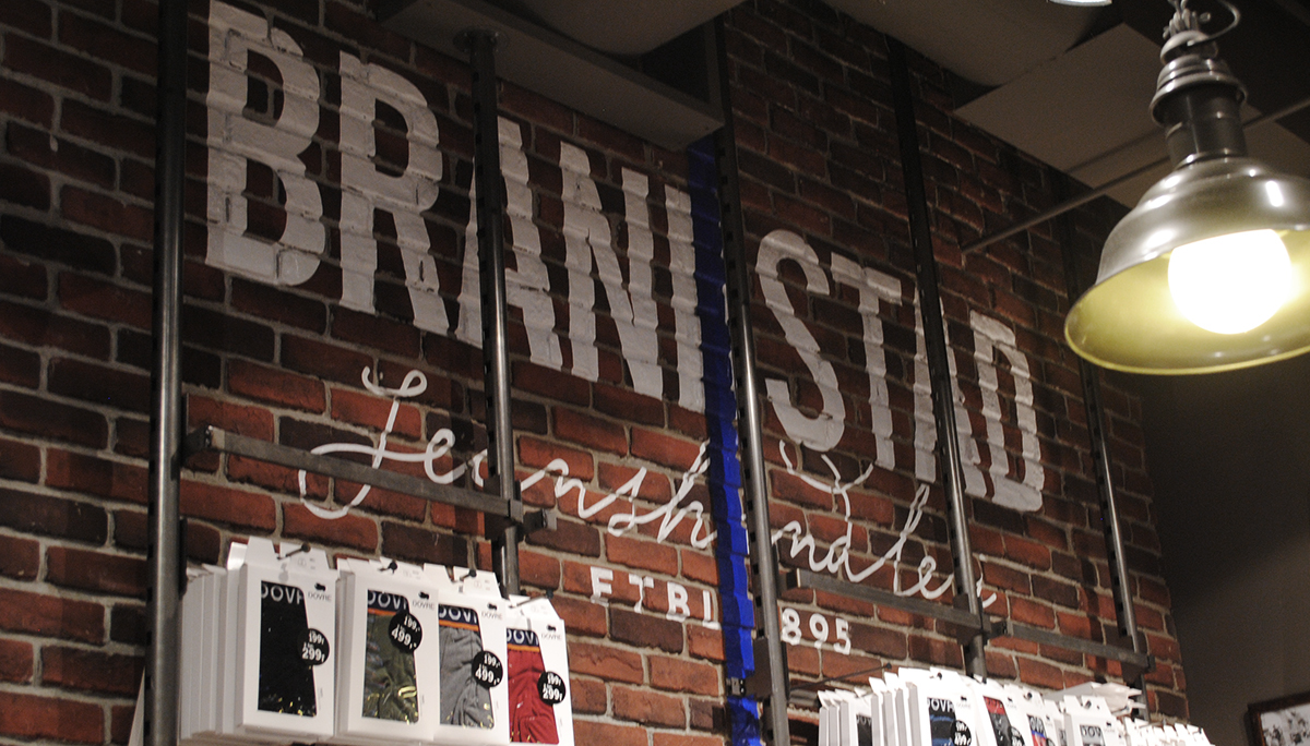
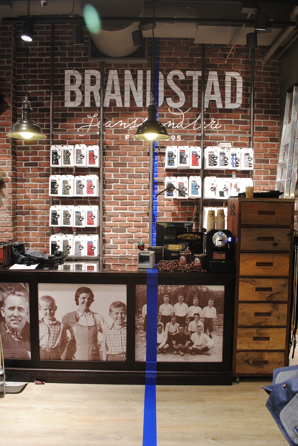
As the designer, I wanted to add something to the identity to give Brandstad an edge. I cleared up the battle between the old logos, designing a new mark that carries the best of all of them. It is masculine and modern, legible and visible from a distance, but also says something about their long and solid roots. A blue stripe makes the look more contemporary and gives character. It is an obvious link to the market segment, hints to the products they sell, and goes hand in hand with the home-town Lillehammer—an old cobalt-mining town.
All in all, the new logo, together with the provocative blue stripe, and the modern, masculine, yet almost inherent colour, gives Brandstad the edge and personality they need to overtake new market shares and gain a stronger position.
All in all, the new logo, together with the provocative blue stripe, and the modern, masculine, yet almost inherent colour, gives Brandstad the edge and personality they need to overtake new market shares and gain a stronger position.
___


__
Thanks for appreciating. Feel free to leave a comment.
__


