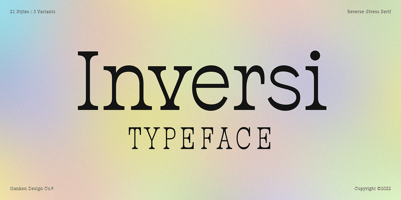


ABOUT INVERSI TYPEFACE
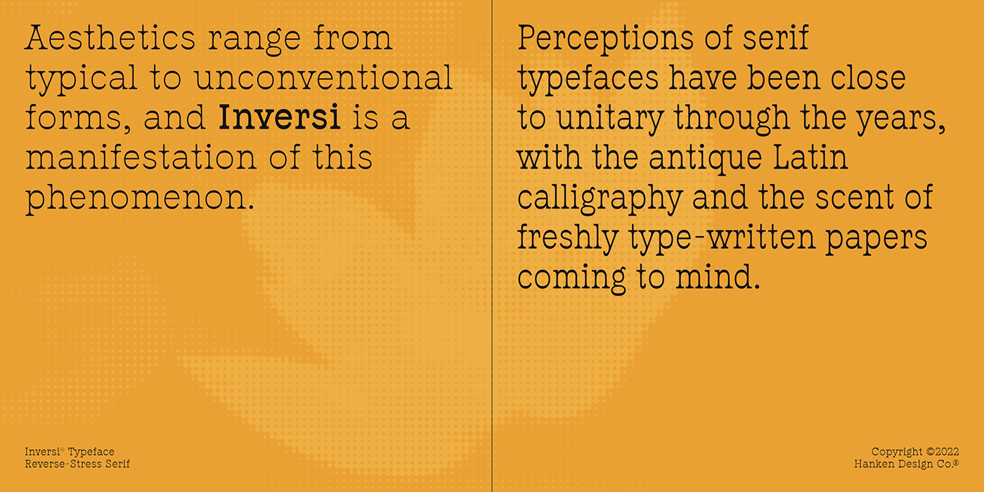
Aesthetics range from typical to unconventional forms, and Inversi is a manifestation of this phenomenon. Perceptions of serif typefaces have been close to unitary through the years, with the antique Latin calligraphy and the scent of freshly typewritten papers coming to mind.
Although it began as a parody, the strokes of reverse-contrast letterforms did not weather in appeal since its first appearance in 1821. Designers of today produce different renditions of this masterpiece. Nevertheless, the beauty of Inversi extends beyond merely bending the norms on serif typefaces as to whether horizontal or vertical lines should be the thickest. At first sight, its unique feature might be unnoticeable to those who do not know reverse-stress types, but a curious mind will get relentlessly boggled as to what makes a seemingly simple font worthy of attention. Peculiar as the wrongly printed serifs may appear, the thin vertical slices compared to that of socially labeled standard stroked alphabets and numbers can instantly become a fan favorite. Exclamation points and other symbols may leave a louder expression through Inversi. The virtual uniformity of the line thickness makes this font stealthily memorable for anyone, not only artists and visual design enthusiasts.
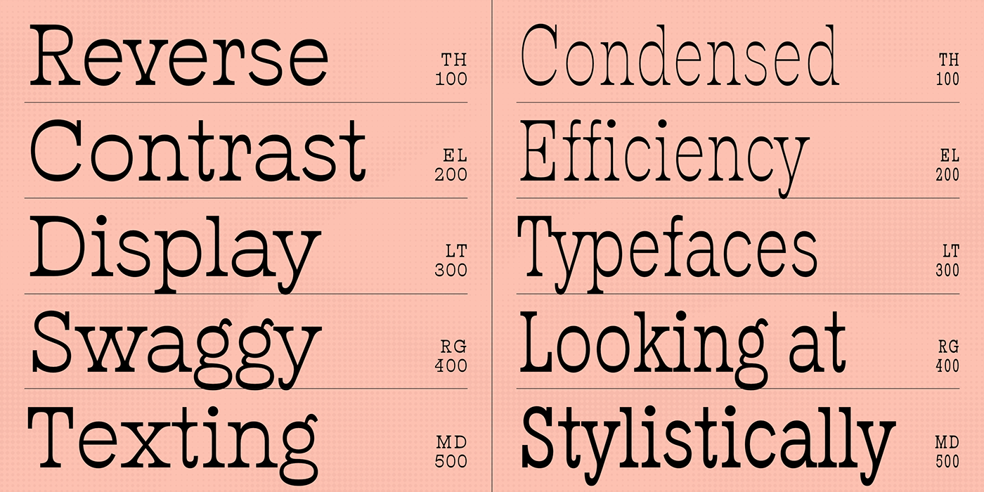
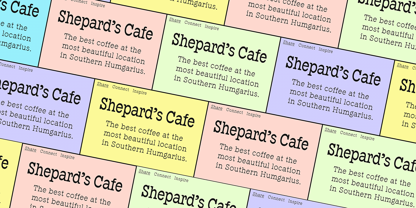
Inversi comes in equally satisfying forms for an imaginative creator to play with boldness. From the thinnest to the boldest, the oddity of the font face gets retained, so one can never make a mistake with any choice. Regardless of line width, the typeface guarantees its immediate attractiveness to any observer, which may assist in leaving a positive reinforcement of finding the beauty in the unusual. Reverse-contrast fonts take pride in eccentricity, making them the ultimate showstopper in any heading or title. But for someone fond of experimentation, there is nothing undesirable in the modernity of Inversi, even in the body of texts.
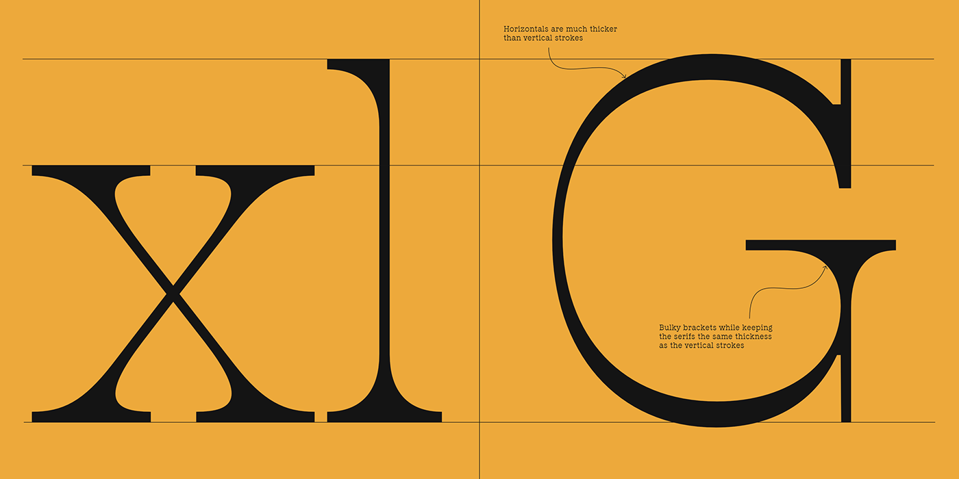


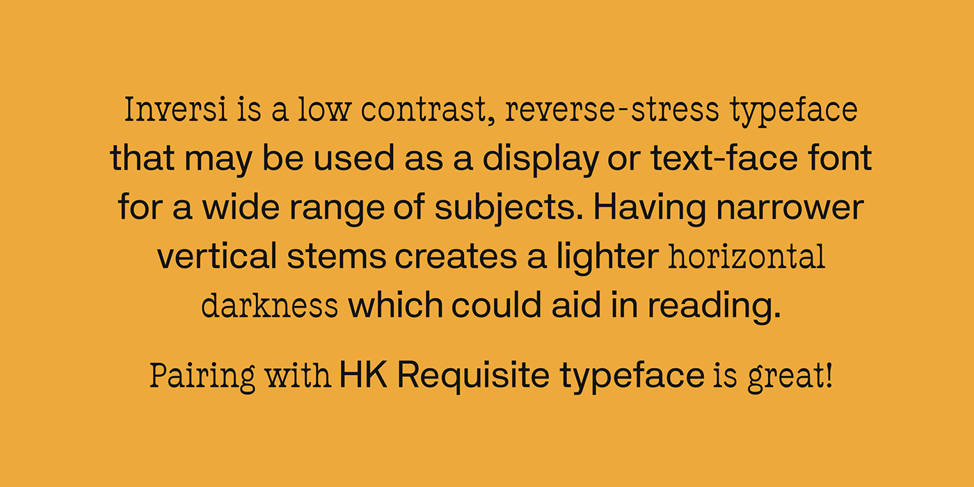

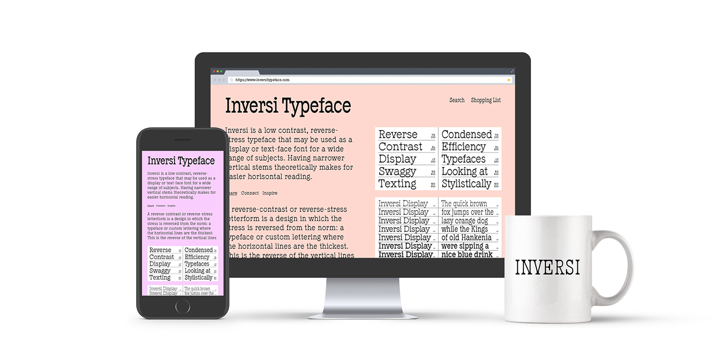


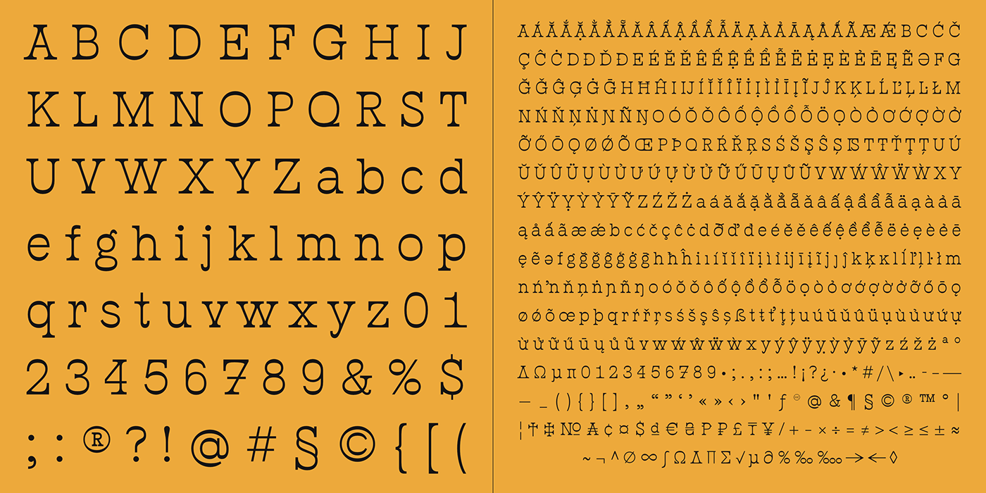
Inversi is a reverse-stress typeface that may be used as a display or text-face font for a wide range of subjects. Compared to other reverse-stress/reverse-contrast typefaces, Inversi's linear contrast is much lower which, at lower sizes, makes it a good options for text or captions. It has good language support, unique design, fractions, and three different widths.
Inversi pairs well with HK Requisite. Use the narrow or condensed style when mixing with HK Requisite to give more contrast to the composition.
Type: Desktop, Web, App
Vector: Yes
Styles: 21
Vector: Yes
Styles: 21


