Rebranding of the State Enterprise
"Medical Procurement of Ukraine"
This rebranding project was not approved by the Medical Procurement State Enterprise or any other state-owned enterprise. It is posted online solely as our agency's vision and an example of our approach to work.

About the organization:
"Medical Procurement of Ukraine" is the only national agency that provides centralized procurement of quality medicine and medical products from the state budget.
The task set:
To redesign the current style of "Medical Procurement of Ukraine," which was created a few years ago, while preserving the main recognizable elements of the logo.
After a preliminary analysis of the brand's mentions, we suggested not to give its basis up because:
- Campaign to raise brand awareness has been going on for years
- There is not much negativity around the brand
- There are no new competitors in the market that could offer any better conditions for the target audience.
The target audience of Ukrainian state-owned enterprises is within the B2C segment and the B2B segment. This proposal was focused more on the B2C segment as our target audience.

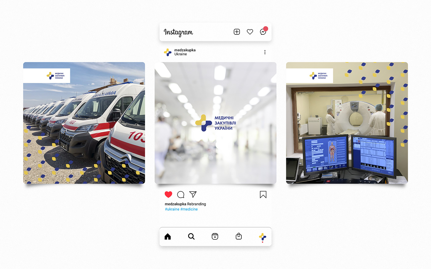
For the first concept, we left the logo unchanged. The branded blue was added to SOE's name to create a holistic framework.

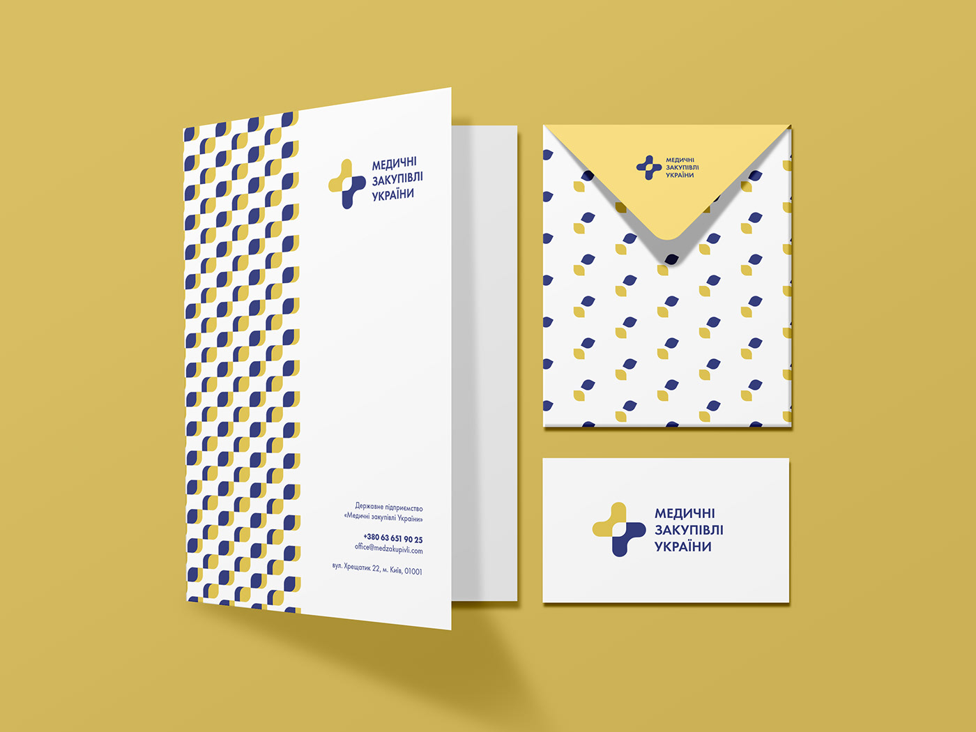
The idea of a branded element:
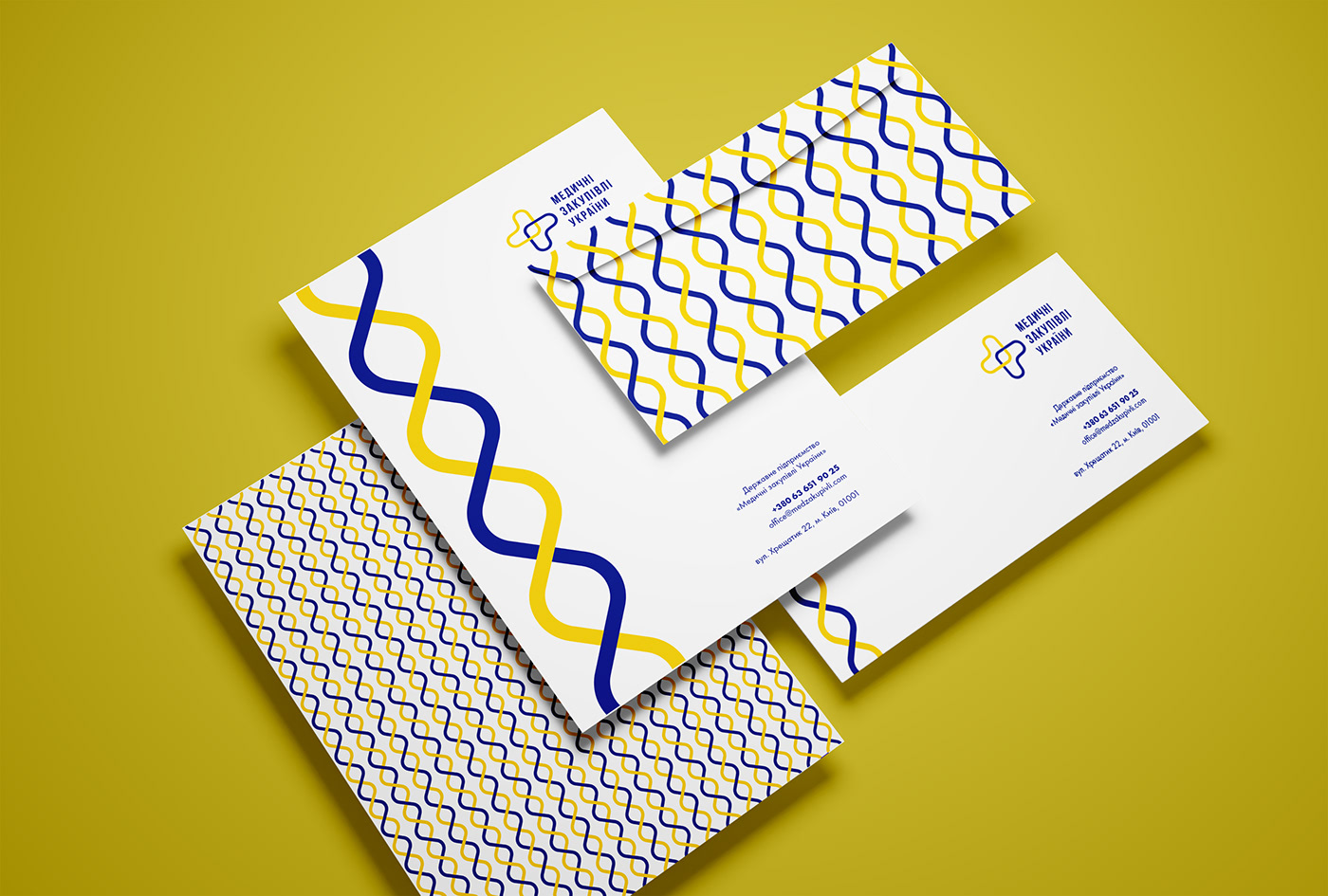
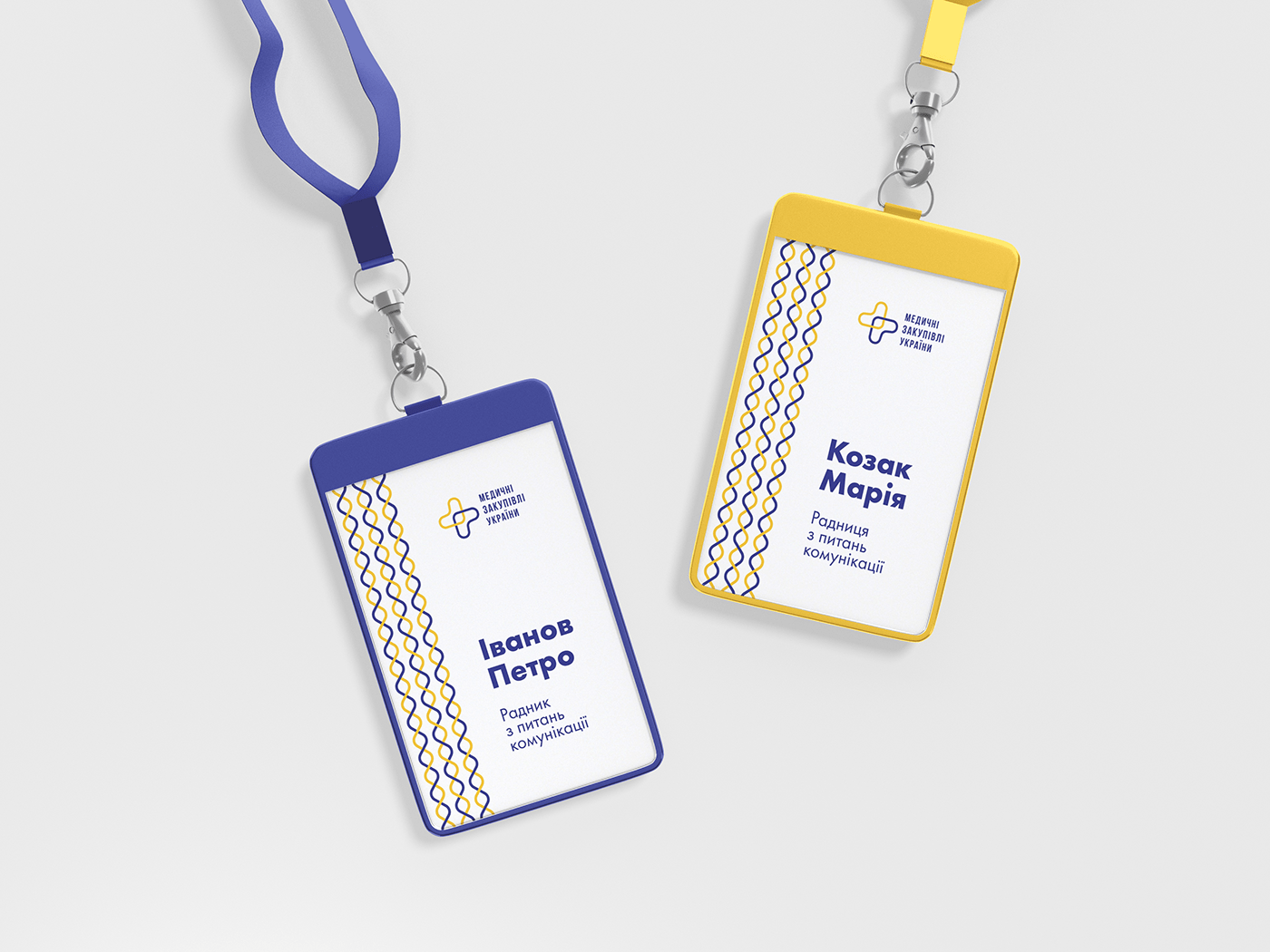
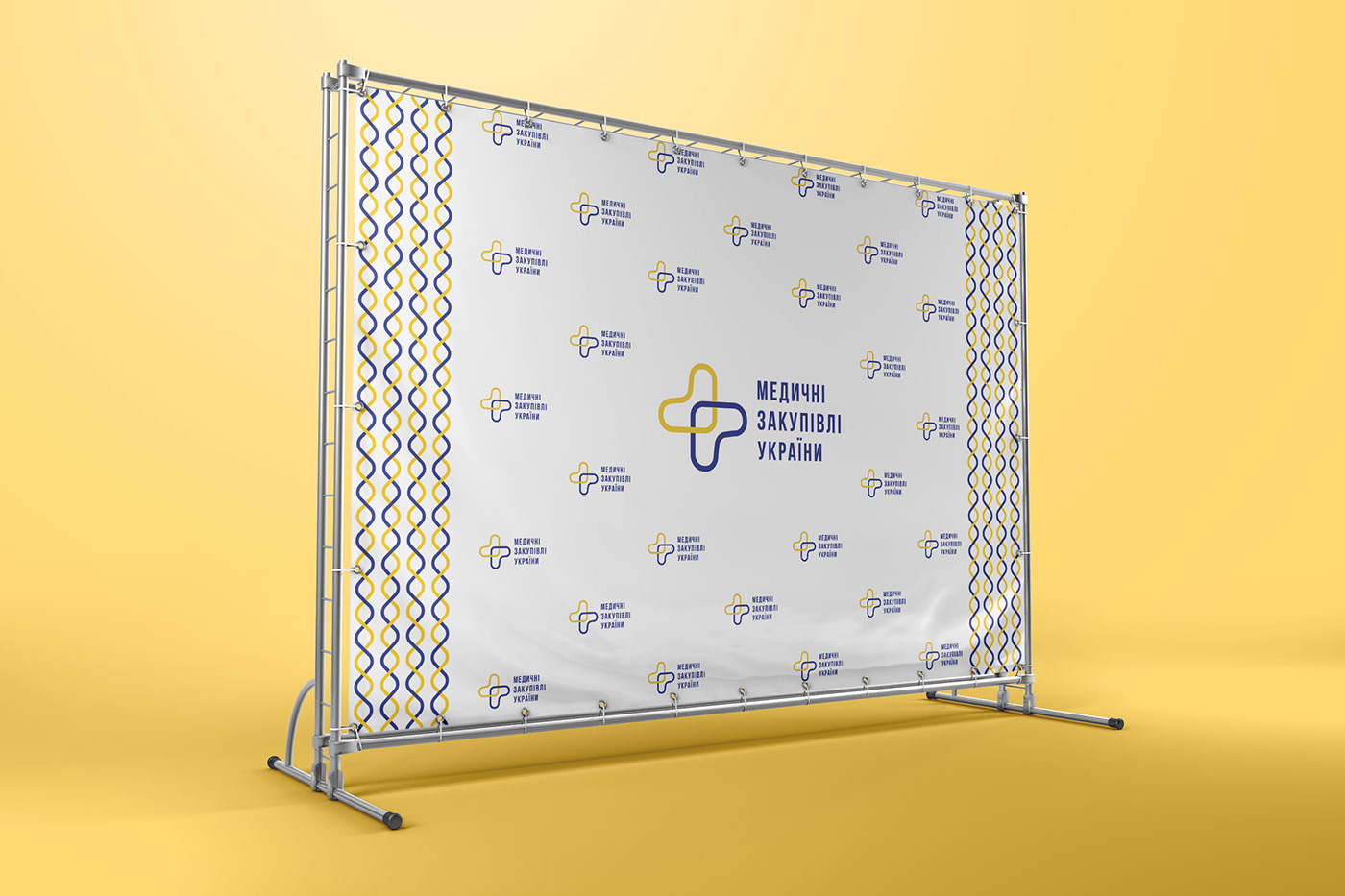
The inner part of the logo is transformed into a DNA image and forms an element of corporate identity, which can be used as a separate element or pattern.
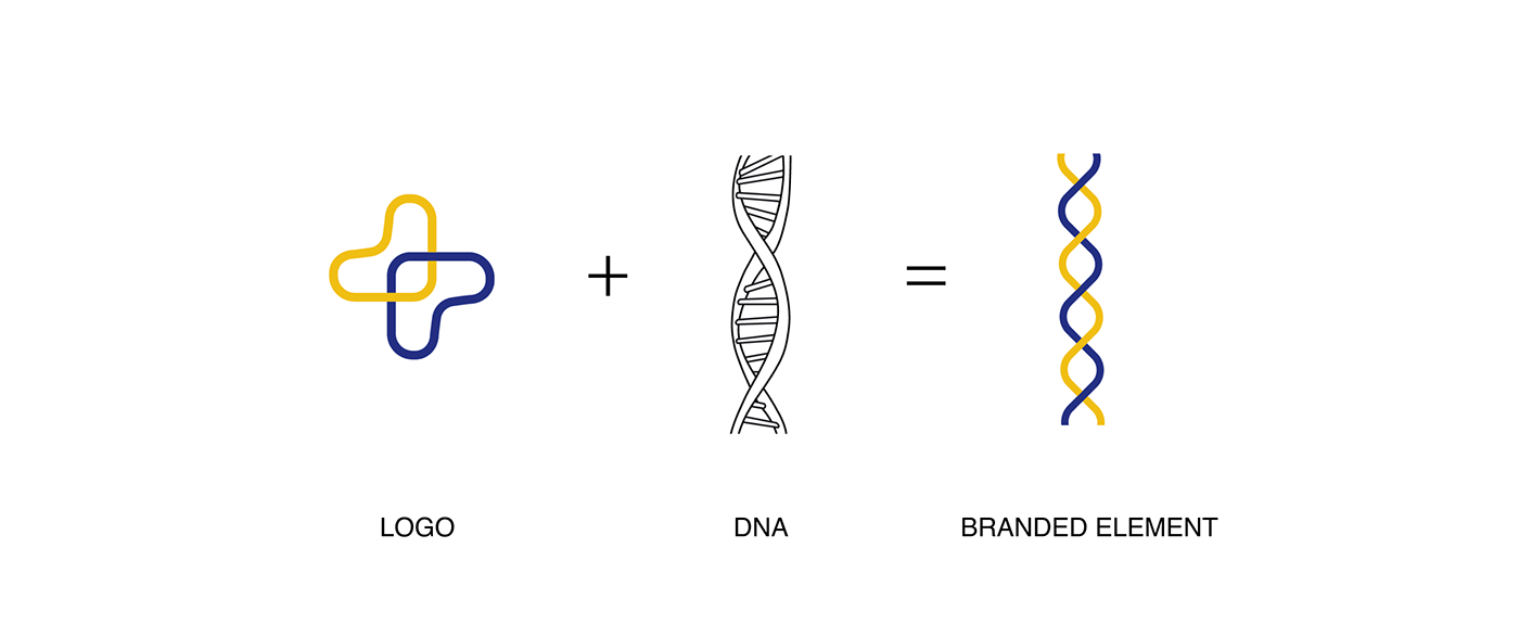
The idea could be perceived as a symbol of unification, a state's connection with its suppliers and citizens, and the particular image of the "Ukrainian maiden braid", which, combined with national colors, causes an emotional attachment.


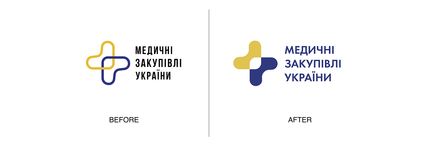
We changed the logo's style in the second concept, but the original form remained.
Another font was chosen, which made the logo more delicate and soft.
Another font was chosen, which made the logo more delicate and soft.
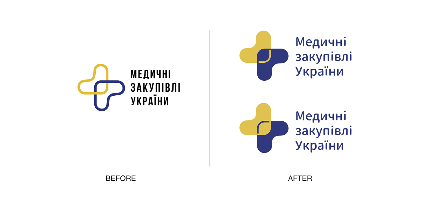
You can see a cheerful and sad smiley in the symbol if you look closely. Such a reference could be used in future communication strategies, as the feelings of people who fell unwell and got better with the help of medicine provided by "Medical Procurement of Ukraine."
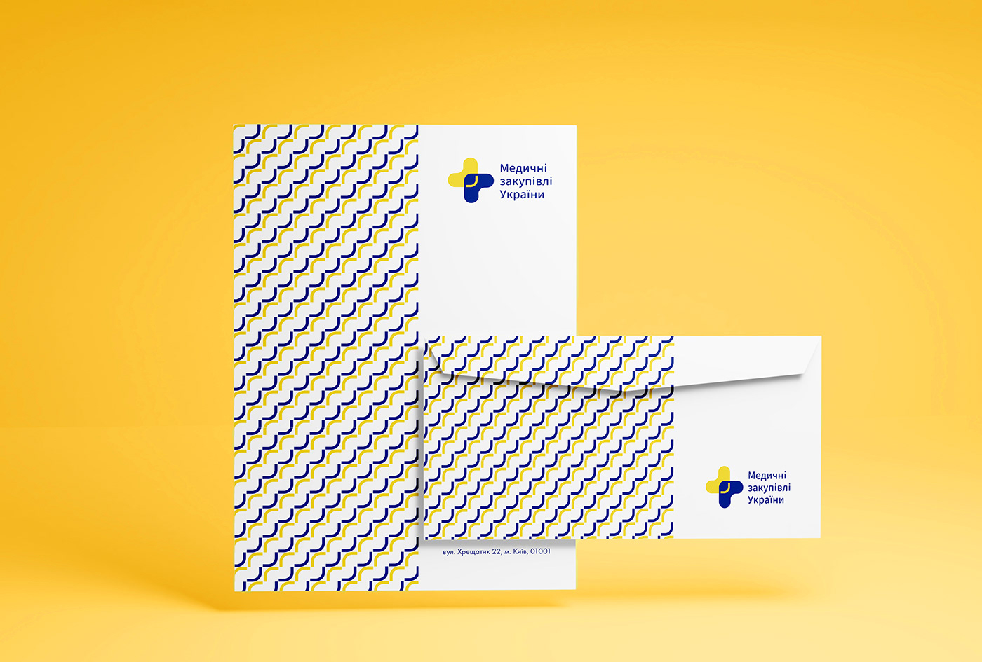
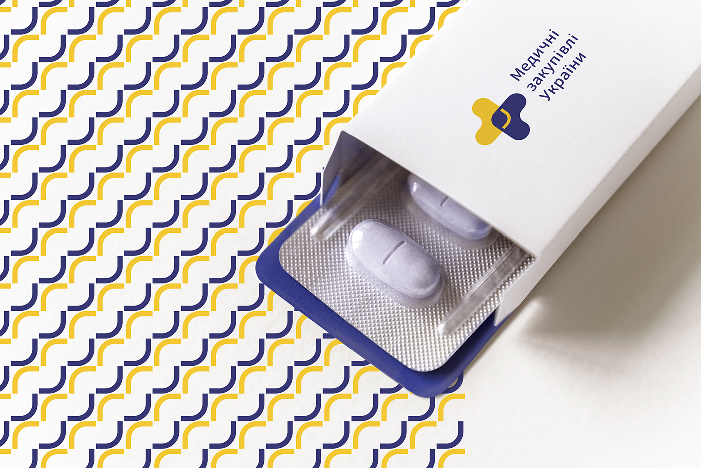
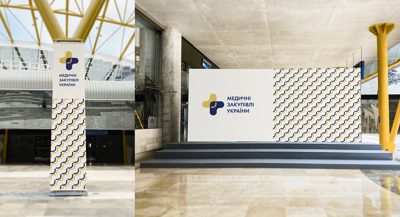
The idea of a branded element:
The brand pattern consists of two emotions:


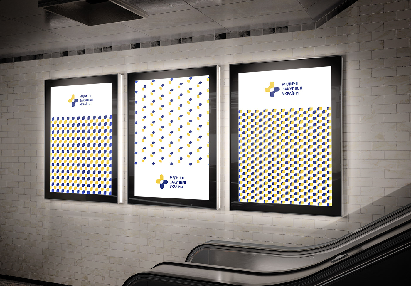
This concept also calls for changing the logo's style and choosing a different font that makes the logo more fresh and modern.
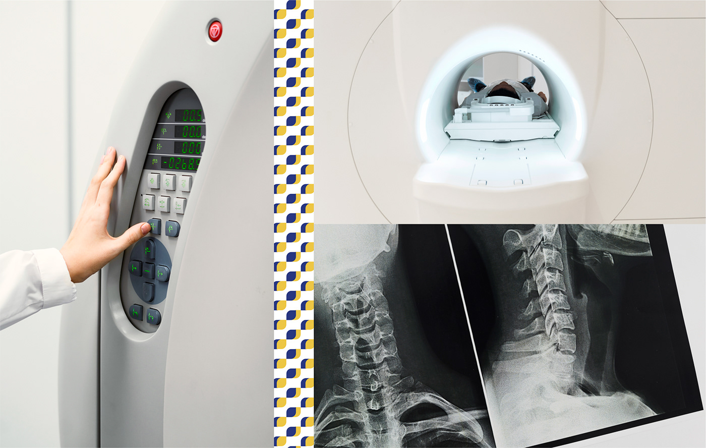
For this concept, we designed three branded patterns comprising the inside of the logo. Depending on the situation, they can be used differently - a more simple and airy version, a traditional and smooth version, and a more saturated pattern.


Thank you for your attention!
barbaro.communications@gmail.com
+38(093) 418 78 33