Alubuild is the first Portuguese company to produce panels of aluminium composite. In its headquarters it produces up to 1.5 million square metres of aluminium composite per year, with different thicknesses, textures, coatings, and colours, meeting the demands of the market.

Developing an identity for a company that bends an otherwise unbendable material—aluminium—has transported us to the world where it is applicable: we got inspiration from architecture and the organic shapes it can explore, and we travelled to Bilbao where Frank Gehry’s dialogue between volumes, perspective, curves, and eccentricity meets Richard Serra’s installation that makes us question our own elasticity because of the materials’ own elasticity.

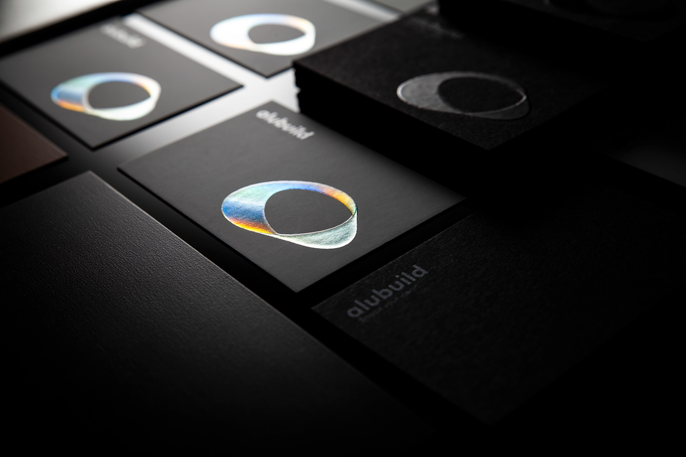
While creating Alubuild’s brand, we kept this dichotomy between elasticity and rigidity.
The tridimensional, conical, organic, free approach of the brand mark translates the pliability of the aluminium composite, to which we can give every shape we want. On the other hand, the logotype breathes the architectural and geometrical side of Alubuild. And even though the two elements aren’t glued together, they are linked. Which also translates the pliability of the material, in an abstract way.
Overall, the brand identity reflects the characteristics of the aluminium composite, especially with the iridescent foil that mimics the metal and that includes the whole spectrum of colours.