
Project Explanation:
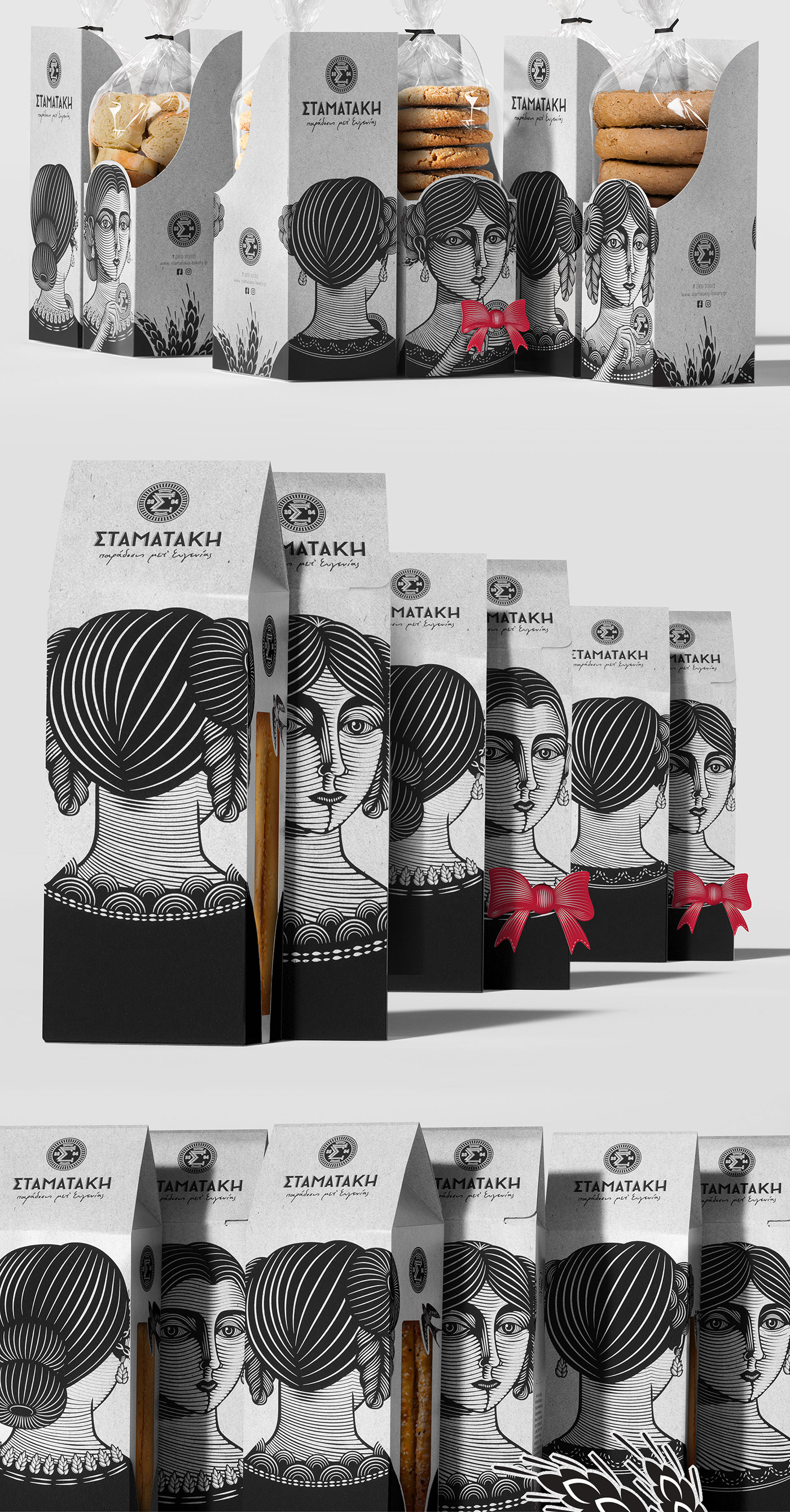
Eugenia is like a lithograph, never the same, never taken out of a mold. There are no molds for Eugenia because she is our mother. The one who -through the mystagogy of taste and the ritual of pleasure- gave birth to creation. The one that brings all the memories of our home. The creator.
Eugenia is like a lithograph, never the same, never taken out of a mold. There are no molds for Eugenia because she is our mother. The one who -through the mystagogy of taste and the ritual of pleasure- gave birth to creation. The one that brings all the memories of our home. The creator.
Inspiration:
We started with a blessing. We touched the ritualistic stamp that Eugenia used to pm top of her breads, just before putting them in the oven. It is truly a blessing to be a creator, to be able to offer. And she loved taking care of others. We imagined her red hair, intricately made every day. She was never careless, her liveliness and her red bow, trademarks. If she was a piece of nature, she would be the cobs rustling in the wind. The wind that made her dress flutter, revealing her back and her majestic personality…
We started with a blessing. We touched the ritualistic stamp that Eugenia used to pm top of her breads, just before putting them in the oven. It is truly a blessing to be a creator, to be able to offer. And she loved taking care of others. We imagined her red hair, intricately made every day. She was never careless, her liveliness and her red bow, trademarks. If she was a piece of nature, she would be the cobs rustling in the wind. The wind that made her dress flutter, revealing her back and her majestic personality…
The Creative Research / Challenge:
The aim was to create the logo and packaging design for the Stamatakis bakery. The challenge was to capture in an original way, the tradition of a company with successful recipes that were passed down from generation to generation.
The aim was to create the logo and packaging design for the Stamatakis bakery. The challenge was to capture in an original way, the tradition of a company with successful recipes that were passed down from generation to generation.
Operations:
All the bows used, are from recycled material. The bows are from paper scraps, taken from the original packaging when cut for production. Instead of throwing away the leftover papers, we are reusing them as a final touch. The packaging only uses black ink and the bows red pantone color, resulting in fewer use of ink.
All the bows used, are from recycled material. The bows are from paper scraps, taken from the original packaging when cut for production. Instead of throwing away the leftover papers, we are reusing them as a final touch. The packaging only uses black ink and the bows red pantone color, resulting in fewer use of ink.