


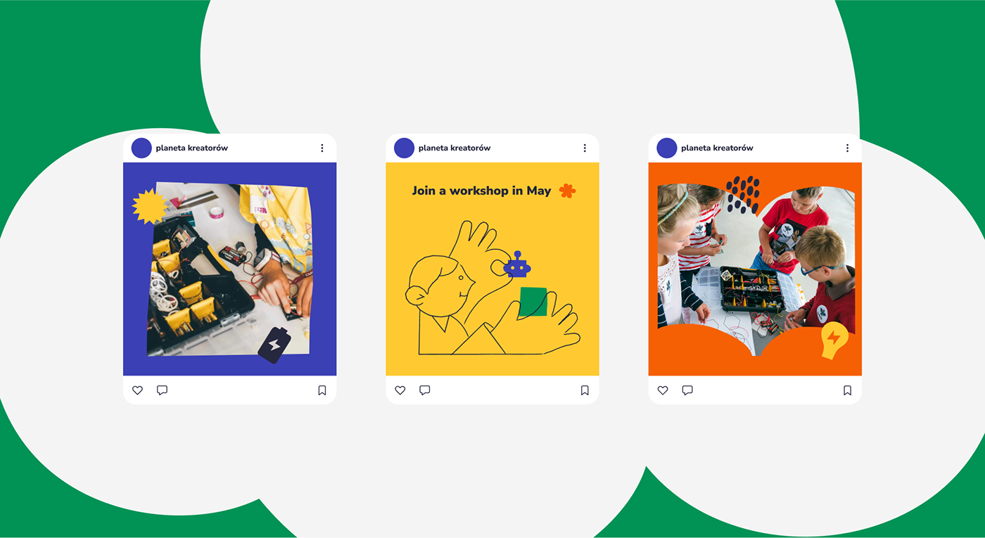
Planeta Kreatorów (The Makers Planet) is an organization and fund that teaches children the aspects of sustainability through playful workshops. The whole visual language is inspired by paper-cutting techniques. Irregular shapes that come out of it express the brand’s DIY character, and “fresh out of a tube”-like colors manifest its playful, creative energy.
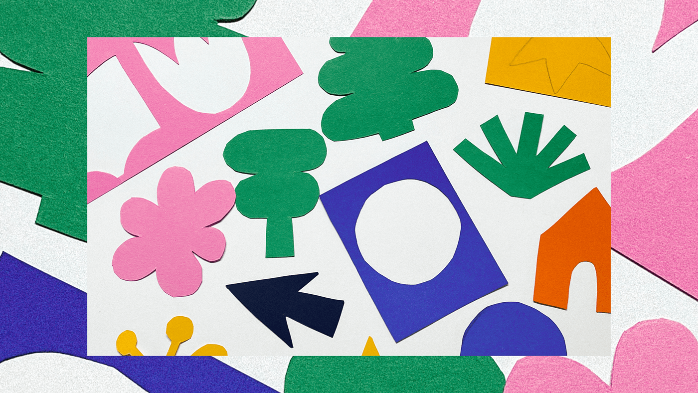

The brand’s main symbol is represented by the remainder of a sheet of paper with a circle – the shape of Earth – cut out of it. When animated, the form livens up and fills up with colorful shapes.
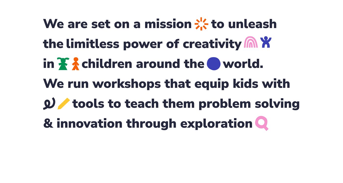
Iconfont is a simple and expressive way to highlight the message of the brand. Starting with basic cut-out forms through to symbols themed on sustainability, nature, education, DIY and technology, we get a whole alphabet of shapes.


The line-based set of characters interact with the cut-out shapes and form hand gestures communicating the important values of the brand, helping to express its friendliness.


Credits: Brand Identity Design & Illustration by Anna Żołnierowicz
Brand Discovery by Jakub Kuik • Logo Animation by Maciej Dyjak
We’re available for new projects! Drop us a line at branding@netguru.com
If you want to see more designs by us,


