
Rayovac Batteries Repackage Project
Stephan Navarro DESN 366
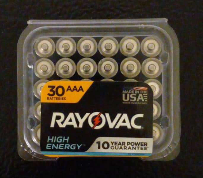
Summary/Audit
This original packaging was covered entirely with plastic with a thin foldable sticker with the logo and information of the product on it. The entire logo part feels bold, but cluttered. I had a difficult time opening this package for the first time by hand, but afterwards, it became easier to open. It however had some struggles to close properly. On top of this, the batteries had a tough time remaining in place, giving more incentive to throw away the package for a more reliable option. For this repackage to happen, it needs a little more of an identity to it as well as a strong use of better materials than just pure plastic. We want to package this product with better materials, as well as keep the boldness of the logo while simplifying if to make it less cluttered to be able to send a proper message to the audience.


Original Sketches
These are the original sketches for the repackage of the batteries. I wanted to have the signature lightning bolt logo on the side as a see through as well as have a cylinder on the inside act as support for the batteries to keep them in place. I would also have a pull off top to reveal the inside that can be closed back up with ease. Even though some of the sketches for battery placement isn't 100 percent accurate, I planned to have 10 batteries all around with three batteries stacked on each to accompany the 30 batteries the original package came with. At the bottom would also be a barcode or a price tag.


Modified Sketches/Inspiration
These are modified sketches of the same package as well as what the design of the outside would look like. At this point, I had realized after a few observations and die lines that what I had previously was not going to work. The first sketch on the left was a design that I had went to before performing the die lines to save material. I took the inside cylinder from the original sketches and made that the base to hold my batteries. The sketch in the middle was after the two original die lines did not work for the project, so I combined both the first modified sketch as well as the original idea and made it into one thing with the inner cylinder holding the batteries and the outer base cylinder acting as support for the product. Instead of a pull-off top, I decided to add a flap to hold closed as well as have the top attached to the base. In the design sketch on the right, I removed the lightning bolt from the package, as there may have been some inconsistencies with the fold for the final product. I went with the more simplified look, and this along with other cylinder projects/products is what I used as the main inspiration for the final piece.


Die Lines and Graphics
The first set of two die lines above was from the slim cylinder base sketch in the modified sketches. The measurements, however, were not accurate as they were only based off of the width multiplied by 10 and length of the battery multiplied by 3. This did not work, which resulted in the next set of die lines below the measurements. I took one of my final mockups I had put together, took it apart and laid it flat, and remeasured all the elements of the mockup to be able to revamp my die line. Both were solid productions when put together, but I ultimately went with the right as I added more flaps to the top and bottom for more support. I wanted to take the original idea I had with the idea I had before I remeasured to combine the two and create a solid package that worked well. The last set was when I started to apply the graphics onto the die line similar to my graphics sketch. I used black at first as a basis to test for any issues in terms of applying colors as well as added the logos and some text from the package. I then started to add the colors similar to the colors of the battery as well as more typed text from the original package and a barcode. This was the last result I went with.


Mockups
The first four mockups were from either from trying to get my ideas into 3D form or as failed prototypes from the first two die lines. The fifth mockup is the final mockup I created and used to measure the elements for my future die lines, ultimately leading to my final package print. The sixth and seventh image is from the same mockup. This mockup was created as a test from the finalized die line before adding the graphics.


Final Product
This is the final product of the repackage. For this final setup, I decided to go with a thicker paper to be able to hold the batteries properly so the weight of all 30 batteries didn't weigh down on the package to the point where the bottom would fall apart. I also made small adjustments to the text and placement to add a little more to the identity the original package tried to showcase. In terms of the outcome, I'm happy with how this turned out, and I thought it held the product well. However, I need to be more careful with my folds, as the base cylinder has unwanted creases that makes the package look sloppier than it should. Considering how thick the material was, extra care and steps were needed to get the ideal result. With that being said, I'm thrilled with the final result of this repackaging of Rayovac's batteries.


