


Playing Cards: For this project the students will be designing a set of typographic playing cards as a promotion for one of the fonts from losttype.com. It will be an exercise in exploring what makes a font unique: What is the font's overall 'vibe'? What was the inspiration? How is it best used? etc. For the project we will be designing a set of playing cards with the typeface as the main element and inspiration.
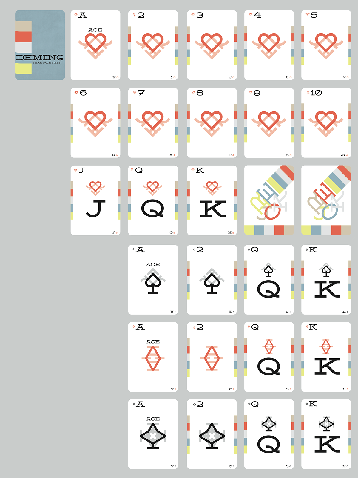
I picked the typeface Deming EP by Mike Fortress. Deming is elegant, simple, vintage-y and soft but also bold since it is always in uppercase.
For the final design, I used the letterforms of R and A to create the imagery for the suits. Two R's become a heart and then with a stem it creates the spade. Then two A's become a diamond and then with a stem it creates the club. I decided to emulate the traditional playing cards by having the suits repeated to represent the number on the card. I choose this color palette because it is simple but bold which is reminiscent of Deming. For the box, I wanted the back information to stack like the five strips on the sides of the suit cards. I also wanted to highlight the suit imagery since they are made up of the typeface.


