klären
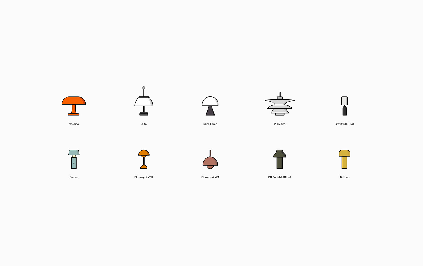
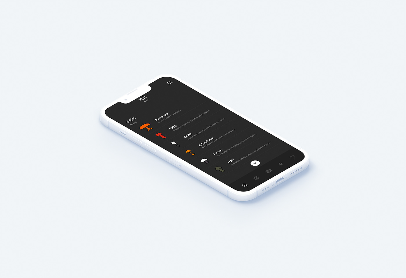
This is a UXUI app design created by creating illustrations based on famous brand lighting. The name klaren is German for the sentence “Lights illuminate us.” I translated it and named it. Unlike other lighting shopping apps, in order to highlight klaren's unique personality,
it is easy to find detailed information about lighting that consumers do not know. There are shooting scan and image scan functions
that can tell you. It is a technology unique to klaren that informs the detailed information of lighting by using the scan function. The logo
is high-end With the motif of the lighting brand Luceplan/Artemide/HAY/FLOS, only the first letter of the logo was designed with a serif font.
유명 브랜드 조명을 일러스트 기반으로 제작하여 만든 UXUI 앱 디자인입니다. KLAREN 이름은 조명은 우리에게 빛을 밝히다라 문장을 독일어로 번역하여 하게 되었습니다. 다른 조명 쇼핑앱 들과 다르게 KLAREN 만의 개성을 돋보이기 위해 소비자가 모르는 조명의 상세정보를 쉽게 알려줄 수 있는 촬영 스캔과 이미지 스캔 기능이 존재합니다. 스캔 기능을 활용하여 조명의 상세정보를 알려주는 KLAREN 만의 기술입니다. 로고는 하이엔드 조명 브랜드인 Luceplan / Artemide / HAY / FLOS 모티브로 얻어 앞 글자 k만 세리프체로 로고 디자인을 하게 되었습니다.