Descrizione del progetto
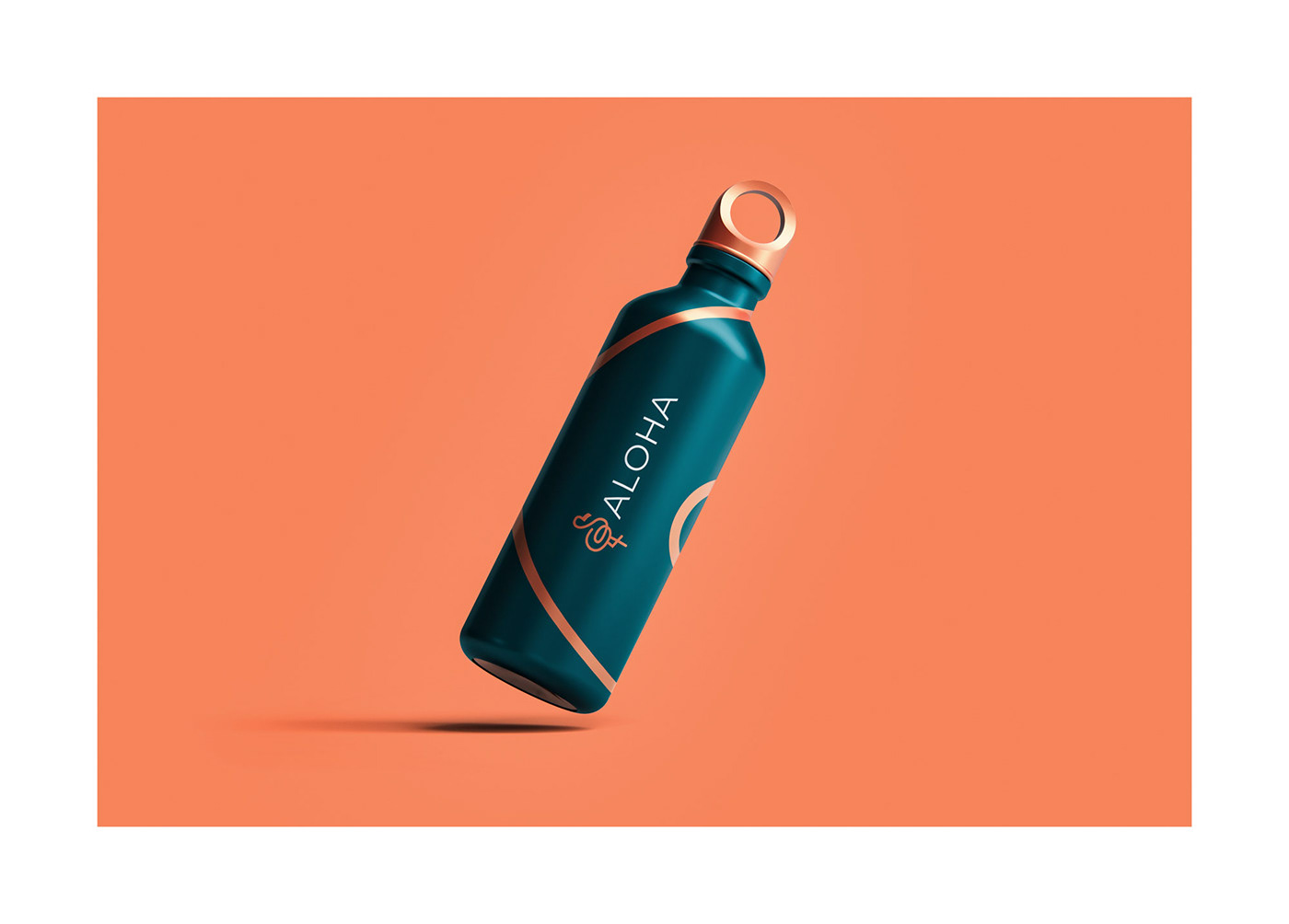
ALOHA è una nuova realtà che punta ad aiutare le persone a trovare benessere attraverso pilates, fisioterapia e osteopatia. Nasce da due ragazze, Sarah e Giulia, e la richiesta è stata quella di realizzare un logo e una brand identity che punti a trasmettere equilibrio, armonia e movimento. Per quanto riguarda lo stile la richiesta è stata quella di trasmettere i valori attraverso un design minimal e pulito, con colori naturali e tenui. Quello che mi ha subito colpito di Sarah e Giulia, è stata l’idea precisa del logo: un fenicottero formato dalle lettere S e G (le iniziali dei loro nomi). A primo impatto ho pensato che fosse una cosa strana e che forse avrei provato a realizzare qualcosa di diverso una volta entrato nel processo creativo. Successivamente, dopo un po’ di ricerca, ho capito che poteva essere una forma distintiva nel mondo del pilates, un elemento che potesse differenziare Aloha dagli altri competitors.
Processo
Una volta appurato che l’idea del fenicottero poteva essere vincente, ho subito iniziato a fare qualche sketch per capire come la struttura della S e della G potessero formare un fenicottero. Infine, dopo pochi sketch, ho subito trovato l’idea giusta, ovvero quella che poi ho sviluppato e che vi mostrerò in questa presentazione. Perché ho sottolineato il fatto che il logo è stato realizzato con pochi sketch? Semplice, perché se il nostro cliente ci da dei limiti sul design (in questo caso il fenicottero, la G e la S), noi riusciamo a concentrarci meglio e a creare un prodotto adatto alle esigenze del cliente stesso. Detto ciò, dopo aver trovato il logo, sono passato alla scelta dei colori e della tipografia, fino ad arrivare a creare le linee decorative che amplificano la riconoscibilità del brand e la differenzazione rispetto ai competitors.
Obiettivo e target
L’obiettivo è stato quello di realizzare un logo e una brand identity che rappresentava al meglio lo studio e le mie clienti. Doveva essere dinamico, giovanile, elegante e riconoscibile, volto ad un target formato principalmente da donne dai 30 ai 50 anni che si vogliono mettere o rimettere in forma, trovando sia un benessere fisico che mentale.
Project Description.
ALOHA is a new business that aims to help people find wellness through pilates, physiotherapy and osteopathy. It was born from two girls, Sarah and Giulia, and the request was to create a logo and brand identity that aims to convey balance, harmony and movement. As for the style, the request was to convey the values through a minimal and clean design, with natural and soft colors. What immediately struck me about Sarah and Giulia was the precise idea of the logo: a flamingo made up of the letters S and G (the initials of their names). At first glance, I thought it was a strange thing and that maybe I would try to make something different once I got into the creative process. Later, after some research, I realized that it could be a distinctive shape in the pilates world, an element that could differentiate Aloha from other competitors
ALOHA is a new business that aims to help people find wellness through pilates, physiotherapy and osteopathy. It was born from two girls, Sarah and Giulia, and the request was to create a logo and brand identity that aims to convey balance, harmony and movement. As for the style, the request was to convey the values through a minimal and clean design, with natural and soft colors. What immediately struck me about Sarah and Giulia was the precise idea of the logo: a flamingo made up of the letters S and G (the initials of their names). At first glance, I thought it was a strange thing and that maybe I would try to make something different once I got into the creative process. Later, after some research, I realized that it could be a distinctive shape in the pilates world, an element that could differentiate Aloha from other competitors
Process
Once I ascertained that the flamingo idea could be a winner, I immediately started making a few sketches to see how the structure of the S and G could form a flamingo. I immediately found the right idea, which is the one I then developed and will show you in this presentation. Why did I emphasize the fact that the logo was made with just a few sketches? Simple, because if our client gives us limits on the design (in this case the flamingo, the G, and the S), we are able to focus better and create a product that fits the client's needs. That said, after coming up with the logo, I moved on to choosing the colors and typography, all the way to creating the decorative lines that amplify brand recognition and differentiation from competitors.
Once I ascertained that the flamingo idea could be a winner, I immediately started making a few sketches to see how the structure of the S and G could form a flamingo. I immediately found the right idea, which is the one I then developed and will show you in this presentation. Why did I emphasize the fact that the logo was made with just a few sketches? Simple, because if our client gives us limits on the design (in this case the flamingo, the G, and the S), we are able to focus better and create a product that fits the client's needs. That said, after coming up with the logo, I moved on to choosing the colors and typography, all the way to creating the decorative lines that amplify brand recognition and differentiation from competitors.
Goal and target audience
The goal was to create a logo and brand identity that best represented the studio and my clients. It had to be dynamic, youthful, elegant and recognizable, aimed at a target audience consisting mainly of women in their 30s to 50s who want to get or get in shape, finding both physical and mental well-being.
The goal was to create a logo and brand identity that best represented the studio and my clients. It had to be dynamic, youthful, elegant and recognizable, aimed at a target audience consisting mainly of women in their 30s to 50s who want to get or get in shape, finding both physical and mental well-being.


Brand Identity
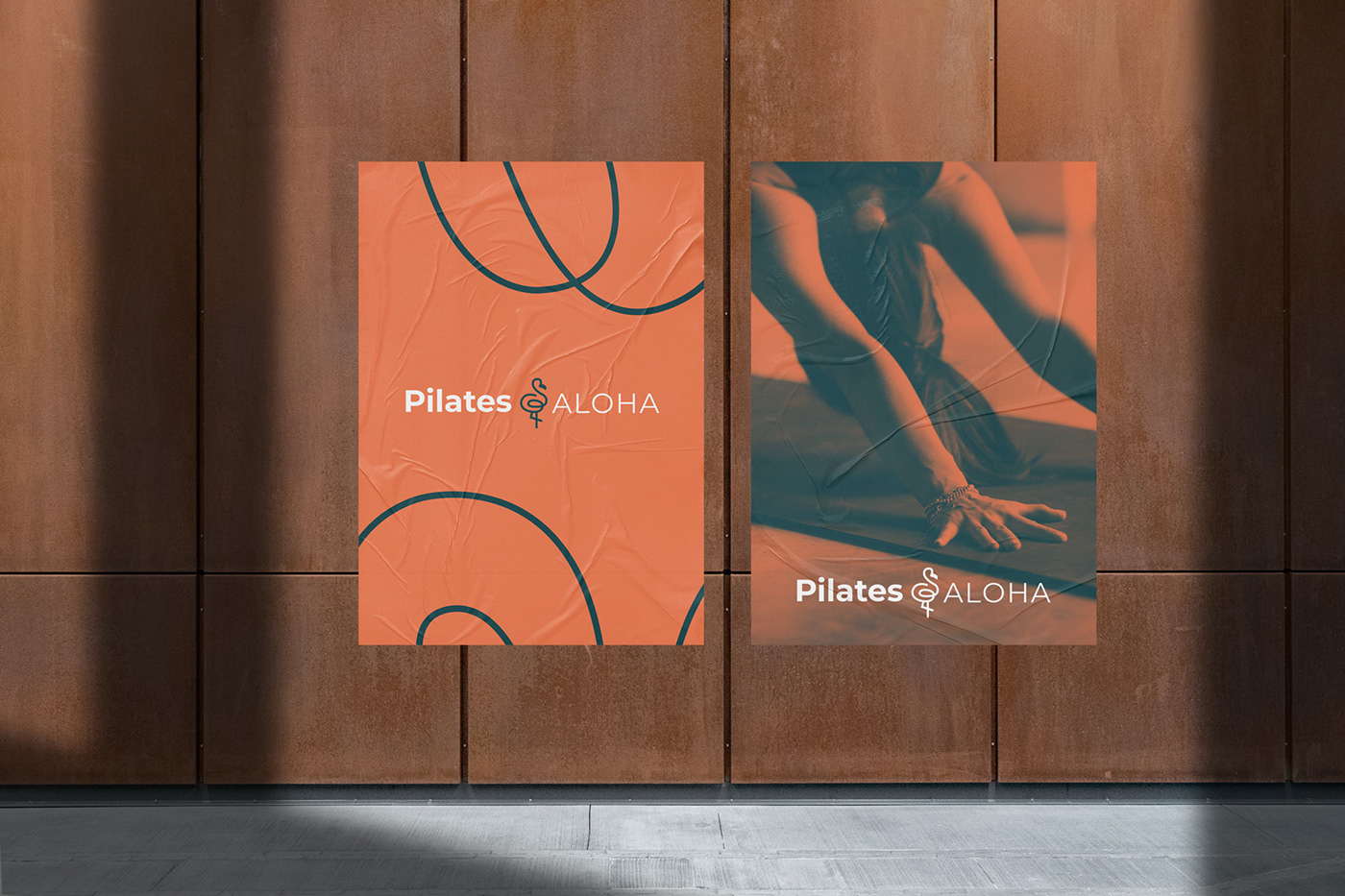
Per quanto riguarda la brand identity ho pensato fin da subito di creare forme eleganti, che trasmettessero movimento. Per questo ho studiato varie combinazioni differenti, fino a che ho capito che la soluzione ce l’avevo sotto agli occhi. Infatti, tutte le linee presenti sui vari touchpoint sono prese dal logo. Come illustrato nell’immagine qui sotto, ho notato che se avessi ingrandito il logo, al di fuori dei bordi della pagina, avrei creato un elemento riconoscibile e identificativo per Aloha.
Brand Identity
Regarding the brand identity, I thought from the beginning to create elegant shapes that conveyed movement. For this I studied various different combinations, until I realized that the solution was right in front of my eyes. In fact, all the lines on the various touchpoints are taken from the logo. As illustrated in the image below, I noticed that if I enlarged the logo, outside the page borders, I would create a recognizable and identifying element for Aloha.
Regarding the brand identity, I thought from the beginning to create elegant shapes that conveyed movement. For this I studied various different combinations, until I realized that the solution was right in front of my eyes. In fact, all the lines on the various touchpoints are taken from the logo. As illustrated in the image below, I noticed that if I enlarged the logo, outside the page borders, I would create a recognizable and identifying element for Aloha.