Probitas Herald Logo
Background
The Probitas Herald is a start-up online newspaper still in development as of this posting (February 2014). Their name comes from the Latin word for honesty. As such the aim of The Probitas Herald is to position itself as an honest, in-touch news source that shares news, ideas and information. Probitas delivers the news primarily through social media outlets to create a conversation between reporters and readers in which all voices contribute to the story.
Logo Development
Unless an abstract symbol was used it appeared difficult to properly convey the idea of news with a pictoral symbol. This lead the project in the direction of a type based solution.
From there script fonts were explored for two reasons. The first reason was that a script font would convey a personal and honest feeling. The second reason was that it would differeniate The Probitas Herald from the competition as research showed that script fonts aren't typically used in popular news media.
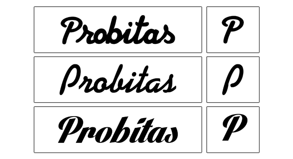
The three initial typefaces presented (top to bottom): Strato, KG Legacy of Virtue and Lighthouse.
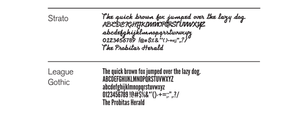
The typeface Strato was chosen along with League Gothic to accompany it in the masthead and
headlines for use on a potential Probitas Herald website.
headlines for use on a potential Probitas Herald website.

In addition to letter spacing, adjustments were made to the letters r, i, t, a and s for the final logo.
Final Logo

Variations
The main logo pictured above is the basis for three variations for use on social media and a potential website. Pictured below (from top to bottom) are the masthead, icon and favicon variations.
The main logo pictured above is the basis for three variations for use on social media and a potential website. Pictured below (from top to bottom) are the masthead, icon and favicon variations.


Social Media
To put emphasis on Probitas tagline of "News. Ideas. Information." a pattern graphic was developed as a background for use on Probitas Facebook and Twitter sites.


This has been a Causarē project. For business inquiries please contact causaredesign@gmail.com.

