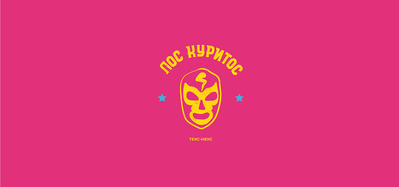
Design project for street food «Los Curitos»
Identity development is based on street style.
We wanted to add brutalism to the overall concept, make it hooligan.
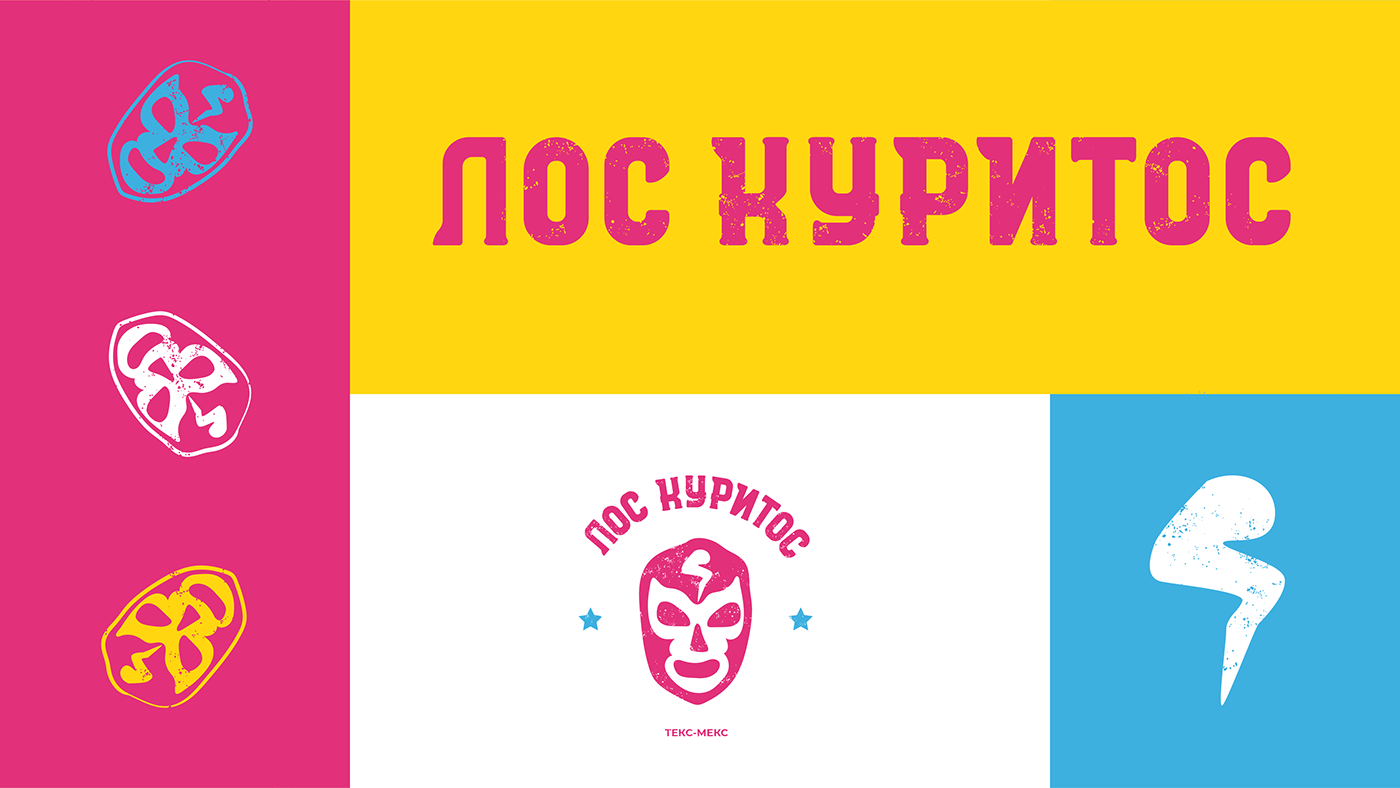
Colors are taken from references of Mexican streets, nature, establishments and food.
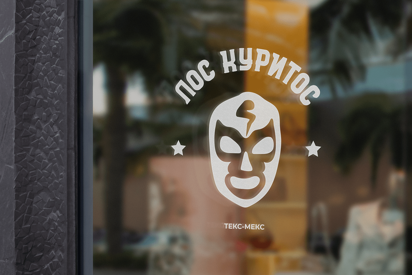
The logo shows a luchador mask, a chicken wing flaunts on the forehead.
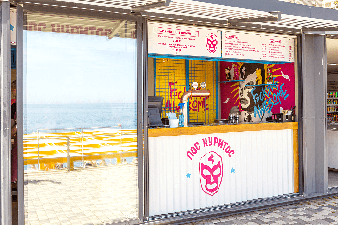
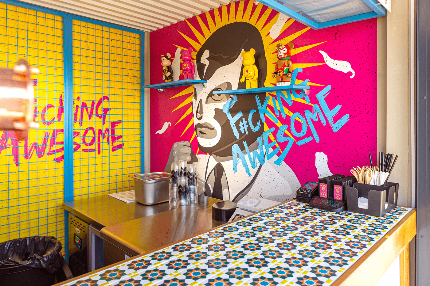
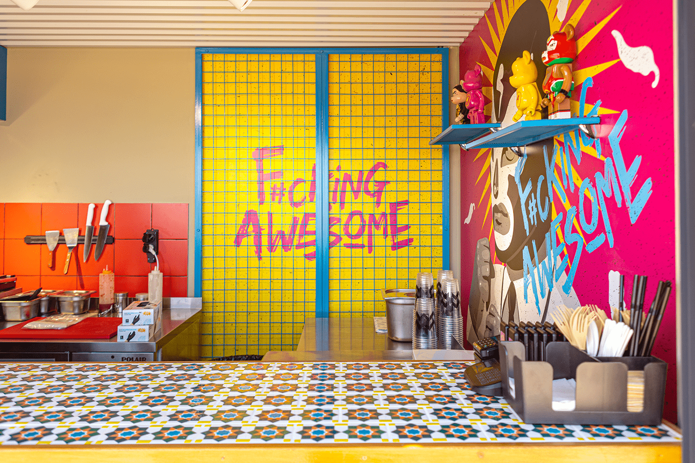
This luchador is also depicted on the wall, but more realistically.
The name «Los Curitos» has two meanings: the prefix "los" means plural,
and curitos (куритос from курица) is a chicken, but changed to the Mexican way.
Also, visitors might think that Los Curitos is the name of the luchador depicted in the logo.


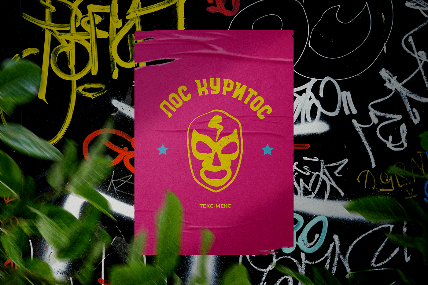


The bright design distinguishes the box with the institution from the competitors.
In sunny weather, the colors become brighter. Boxing is saturated with the atmosphere
of the institution, it "screams" with its piquancy.
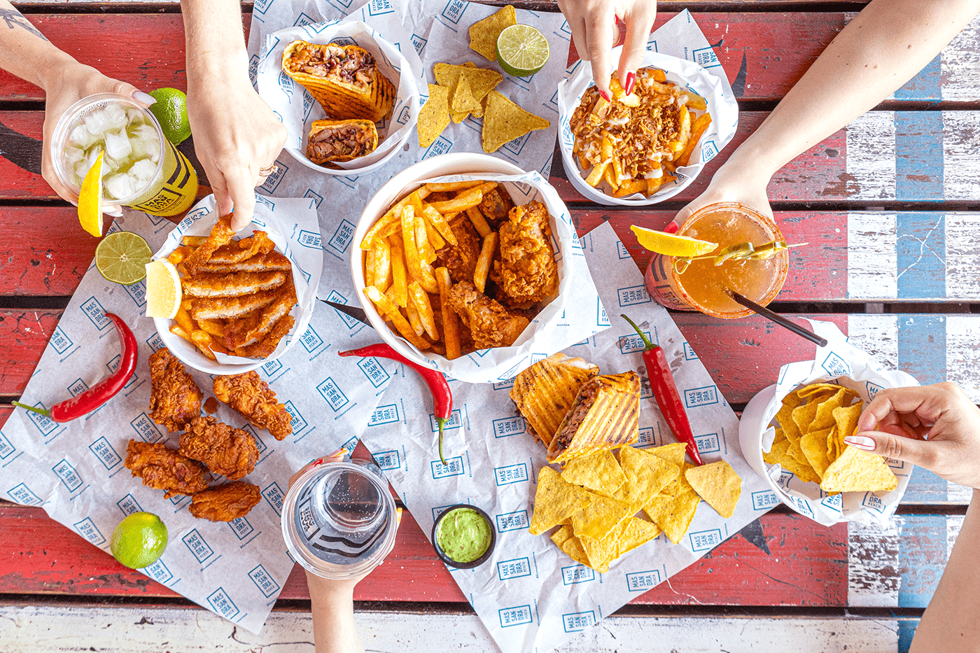
The target audience — is people vacationing on the Massandra beach,
mostly young people and parents with children. Young people are attracted by brutality,
and parents with children are attracted by some childishness.








Thank you for your attention <3
Location Crimea. Yalta
Completed 2022
P.S. If you liked it, we will be grateful for the likes. You can order branding in messages.
