
Is brand heritage a burden or boon in a fast changing world? For Tong Heng, a Singapore pioneer in Cantonese pastries with over 80 years of history, &Larry deep-dived into the heart of the brand and its people to discover the essence of what makes Tong Heng “東興” (Happiness in the East). From the initial phase of brand discovery through development and design, we worked with the owners to clarify and craft a new identity that reconnects the brand with a younger generation while staying true to their heritage.
Brand Identity
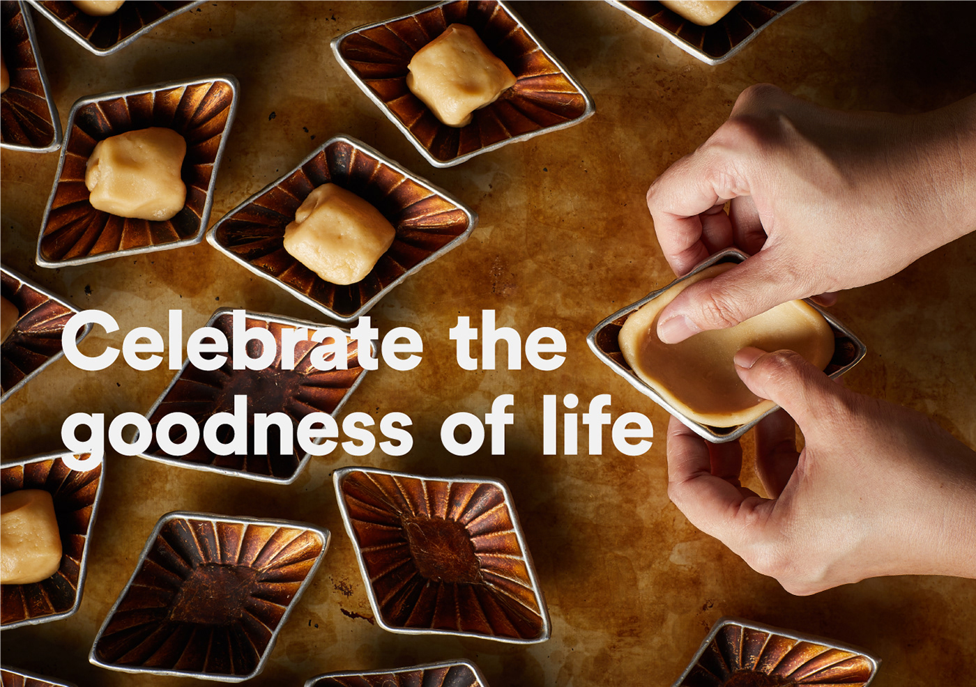
To create a great brand identity, you need to get the fundamentals right. &Larry took the time to investigate the history of the brand, interviewing the owners, staff and customers and asking the right questions to understand what makes Tong Heng special. From this process, we gained insights to Tong Heng’s enduring appeal within the Chinese community as the go-to for celebrating baby showers, betrothals, weddings, birthdays and anniversaries. This sense of bringing joy to people became the guiding principle for our design approach. The new logo, for example, incorporates the essence of ‘Joy In A Bite’ within the Chinese radicals of the character for Joy.


Packaging
The packaging design eschews the typical aesthetics of a ‘modern traditional’ brand for a decidedly young-at-heart look. The three colour variants are illustrated with rich Chinese symbology, and are designed with modular inserts to keep delicate pastries securely in place during transport.


Flagship & Satellite Store
For main store in Chinatown, &Larry worked closely with Nomura Design on the customer journey experience and also to ensure that the staff have ample room to work in. Special care was given to the materiality to enhance the sense of place and time, as as to modernising the product displays for the Instagram generation. These principles were also executed for the smaller satellite store in Jurong Point.


Digital Branding
&Larry also advised the owners on rationalising their social media presence, and created a distinct online personality through the use of original illustrations, a unified art direction for food photography, and creating a regular series of video content that offered followers a glimpse of the personalities and processes behind their favourite pastries.


Press Coverage
With the launch of its new brand image, Tong Heng has not only attracted attention beyond the usual audience, but also garnered positive buzz from the media and food bloggers.


The outcome? Singaporeans and tourists alike have welcomed the new Tong Heng with open arms, driving up footfall, customer engagement and sales. The rebranding has also brought intangible gains, attracting younger job applicants who have brought a new sense of energy to their customer service, and organically growing their online followers by 5x while preserving the value proposition of their core product.
Brand Identity & Packaging
A Singapore pioneer in traditional Cantonese pastries since 1935, Tong Heng faced the familiar challenge of brand relevancy in an increasingly fast-paced world. When &Larry was approached by the 4th generation owner to help revitalise the brand, we discovered challenges in the form of an ageing customer base, over-abundance of choice from recent market entrants (both locally and foreign-owned) all competing for mindshare of a younger audience.
Together with the owners and employees of Tong Heng, we undertook an extensive multi-phase rebranding exercise, culminating in a clarified and authentic branding and digital strategy, a modern identity, redesigned packaging and a revamped store design.

Brand Elements
The new brandmark and identity system pay respect to the original design while being thoroughly optimised for modern day requirements. The brand essence for Tong Heng, summed up as "Joy in a Bite", is incorporated into the Chinese character for 'joy' (興) as the radicals for 'a bite' (一口).


Corporate Stationery
When designing Tong Heng's corporate stationery, we were conscious in exercising restraint with the colour palette, focusing on functional aspects of information and typographic hierarchy. The owners were pleased to see that we retained their original handwritten calligraphy on the brand collaterals.


Illustration Bank & Packaging
The packaging for Tong Heng is a focal point for brand engagement and differentiation. In discussing what 'heritage' meant to Tong Heng, when so many brands claimed some form of 'heritage', the answer fell back on the name and the tradition: bringing joy to people in every pastry Tong Heng makes.
Designing with this in mind, what emerged was a vibrant portrayal of the essential elements of the brand: the diamond shape of Tong Heng's signature egg tarts, 'lucky clouds' and other Chinese symbology for auspicious days, various shapes of pastries and ingredients, etc. We also re-introduced the old logo as a seal of quality.
The colours are both aesthetic and functional – yellow for everyday orders; red for anniversaries, baby showers, betrothals and Chinese New Year; turquoise for Mid-Autumn Festival. The bright colours add cheer to the store and help staff to quickly discern and pack respective purchases. Inside, we designed a modular insert that is adaptable to holding differently shaped pastries in a secure manner.
Items include carrier bags, individual sleeves, gusset bags and kaya bottle labels.


Team Uniform
Tong Heng sought to attract not just younger customers but also younger team. &Larry supported this effort with a fresh take on the team's attire. Referencing the popular 'Hello my name is' stickers, employees were encouraged to express themselves through their
personalised name tags and unique ways of wearing the new bandana.
personalised name tags and unique ways of wearing the new bandana.


Food Photography
As part of the overall brand language, &Larry art directed the food styling and product photography, emphasising clean, airy visuals with vibrant pops of colour, playing with the natural shapes and geometry of Tong Heng's various pastries. The result is a tasteful presentation tailored for modern sensibilities.


Tong Heng Digital Branding
Our efforts to rebrand Tong Heng continued from the physical into the digital realm. We worked closely with the owners to rationalise their online presence, consolidating various social media accounts and unifying them under a single handle.
A digital strategy was developed to bring out the brand essence of “Joy in a Bite”, with original content designed to communicate Tong Heng’s personality and engage with a younger audience.
A digital strategy was developed to bring out the brand essence of “Joy in a Bite”, with original content designed to communicate Tong Heng’s personality and engage with a younger audience.
Tong Heng’s content is categorised under 4 main pillars: Inspire, Inform, Promote and Engage, with posts that offer glimpses into Tong Heng’s history, heritage, people, products and processes. To address the challenge of short attention spans, posts were designed to be concise, light-hearted in tone, and supported by colourful illustrations in Tong Heng’s new visual vocabulary.
By analysing feedback and user engagement, the content mix is constantly optimised with input from the owners, thereby building up a consistent and audience-relevant presence on both Facebook and Instagram.
By analysing feedback and user engagement, the content mix is constantly optimised with input from the owners, thereby building up a consistent and audience-relevant presence on both Facebook and Instagram.


Real People with Real Stories to Share
As part of the drive toward greater customer engagement, we introduced Tea Time Snippets as an ongoing series of 1-min video dialogues with members of the Tong Heng team.
Like a ‘yum cha’ session to shoot the breeze over some tea, each episode captures micro-moments of a typical day in Tong Heng, showing various staff in action, evoking positivity from inside out, and letting the people take centerstage. Besides third and fourth generation family members, the series also featured long-serving and younger employees to share about their experiences at work and what makes them happy.
Like a ‘yum cha’ session to shoot the breeze over some tea, each episode captures micro-moments of a typical day in Tong Heng, showing various staff in action, evoking positivity from inside out, and letting the people take centerstage. Besides third and fourth generation family members, the series also featured long-serving and younger employees to share about their experiences at work and what makes them happy.
Watch the Teatime Snippets series here.
Tong Heng Flagship & Satellite Store
As part of the rebranding of Tong Heng Delicacies, &Larry worked with Nomura Design to rethink the store space in terms of functionality, branding and customer experience. The previous arrangement was typical of heritage shops in Singapore’s Chinatown, with traditional displays and cramped serving space that could only fit two small tables and seating for 6–8 customers at most.
The redesigned store is a physical incarnation of the brand ethos – with more space to allow for happier workers and a more enjoyable dine-in experience for customers.
The redesigned store is a physical incarnation of the brand ethos – with more space to allow for happier workers and a more enjoyable dine-in experience for customers.
One of the most important changes was convincing the owners to adopt a modern mindset with regards to product display. The 60's-inspired terrazzo countertops were lowered to allow greater staff interaction with customers and to allow the latter greater freedom to see what was on offer. The photogenic displays sit on top of storage compartments that keep multiple trays of freshly baked pastries ready to be served.


The L-shaped display even extends to the storefront, helping to entice passers-by and draw visitors into the store. During closed-door events such as heritage tours and baking demonstrations, customers can still make purchases from the new ordering window at the storefront.
The mirror running along the length of the store’s interior is a throwback to those found in Chinese clan halls. It is engraved with the icons and illustrations inspired by Tong Heng’s pastries and ingredients and serve as another point of entry to the brand story when curious customers ask about it. Other design touches include the use of diamond shapes on the floor tiles and the overhead lighting fixture – subtle references to Tong Heng’s signature diamond-shaped egg tarts. The new bench seating not only increases capacity, it also folds down for occasions that require more floorspace, such as during Chinese New Year and other events.


The new branding is also translated to the store's exterior, from the main signage and awning, to the custom lighted signage that beacons to visitors exploring the environs of Singapore's Chinatown.


