


Bringing support to the world’s best support teams
KENCHI SAAS BRANDING & VISUAL DESIGN 2021
Kenchi is a browser extension that supercharges support organizations and makes work more empowering for agents. When we first met with Kenchi, the team was getting ready to kick hiring into high gear and preparing to move their product out of beta. Their goal was to imagine a delightful brand system that would resonate with stellar candidates and support teams everywhere.
To start, we tackled positioning and re-articulated Kenchi’s core value props. Many beta users shared that Kenchi brought a little bit of magic to their support operations. It kept everything their teams needed all in one place and enabled them to scale effectively without sacrificing quality.
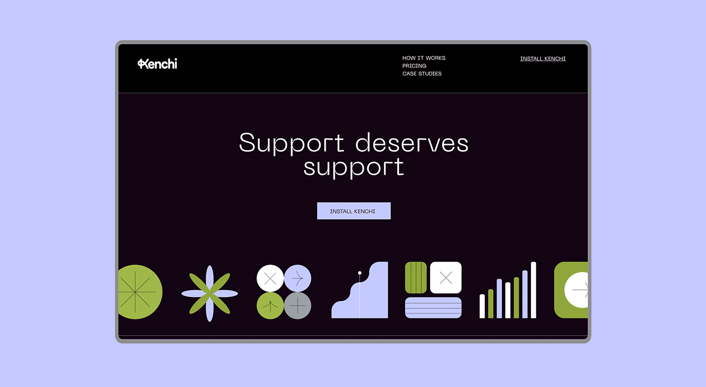
The brand identity we developed centers around the idea that Kenchi provides the building blocks to build an exceptional modern support organization. The Kenchi logo is a friendly wordmark with a unique “K” that evokes a feeling of new pathways, strong feedback loops and augmenting the way we work.
To start, we tackled positioning and re-articulated Kenchi’s core value props. Many beta users shared that Kenchi brought a little bit of magic to their support operations. It kept everything their teams needed all in one place and enabled them to scale effectively without sacrificing quality.
The brand identity we developed centers around the idea that Kenchi provides the building blocks to build an exceptional modern support organization. The Kenchi logo is a friendly wordmark with a unique “K” that evokes a feeling of new pathways, strong feedback loops and augmenting the way we work.


Crafting Kenchi’s visual language
Leaning into the theme of building blocks, we built a flexible visual system that represents different workflows, individuals, and pieces coming together. The team united around a unique and ownable color palette and type system. The identity is grounded by a subtle grid texture, which adds structure and depth to the brand touchpoints.
Kenchi is all about bringing power to the user and empowering individual agents in their jobs. We knew we wanted portrait photography to play a prominent role as a way to elevate the real narratives of support teams.
Kenchi is all about bringing power to the user and empowering individual agents in their jobs. We knew we wanted portrait photography to play a prominent role as a way to elevate the real narratives of support teams.


Bringing it to life
As a system, the building blocks were just begging for some whimsical movement. We brought in our favorite animator, Stina Wahlen, to bring these shapes to life as we cascaded the brand & verbal identity to a new Kenchi website.


CREDITS
KELSEY AROIAN, JD REEVES, STINA WAHLEN


