
Backtrack is a mobile application design project worked on in light of user experience principles and Design Thinking framework. It's a semester project supervised by Dr. Amna Basharat; therefore, the credit goes to her. ❤
Challenge
Design a product for your target users that enhances their existing experience which in turn induces gratitude.
Objective
Design a Scheduling app that enhances our target users' comfort of scheduling.
Target User Group
Our target user group consisted of segments that at least have used or are using one scheduling application. And they are:

Process Used
Design Thinking Framework
We applied design thinking framework to create our product design. Below table shows the major iterations and its corresponding activities performed during our journey.

Empathize
We empathized with our target users through interviews. We planned the interview script and identified our overarching question supported by follow-up questions in order to find out the pain points and unusual interactions of users with the current scheduling applications.
With this, we conducted needs finding study with our target users. We recorded their current practices, needs, and suggestions regarding the application features.
Define
After recording our users' needs through conducting interviews, we went through making our affinity wall using an online tool - Draft.io. Then, we applied Thematic Clustering and Recursive abstraction to synthesize user needs.


We were able to synthesize the following generalizations that represents our users' needs.

Empathy Mapping
Below are some of the empathy mappings we made from user needs findings.


Personas
After going through interviews, user needs synthesis, and empathy mappings, we were able to represent our target users by the two personas: Alice and Howard.
The two cards below describes the personas' goals, frustrations, and characteristics.


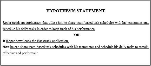
Define
After characterizing our personas, we defined multiple problem statements related to the personas, made hypothesis statements, and created our value propositions to alleviate our users' pain points.


Ideate
We generated many different ideas for the design of our solution. We Listed down the major How-Might-Wes for corresponding user needs. For each HMW, we sketched out crazy 8s, made storyboards, did dot-voting for finalizing our final design idea.


Prototyping Tool
We have used Figma for mid-fi and hi-fi prototyping, whereas lo-fi prototyping was done as paper prototyping.

Lo-Fidelity Screens / Paper Prototype
Following are the paper sketches that we made for lo-fi prototyping.


Tasks for Lo-Fi Testing
We created a set of tasks for user testing session to evaluate our lo-fi prototype. Following were the tasks created:
1. Use the application to make your first ever weekly schedule.
2. Use the application to find and add friends to your friend’s list, see if you can find any of your friend using the Backtrack application.
3. Use the application to schedule a task on a specific day and time, and invite your friends or team members to participate in it.
4. Use the application to let your friends see or view your schedule.
Lo-Fi User Test Findings
Critical incidents
After conducting our user testing of our product’s low-fi prototype, we observed the following problems that our users faced:
- The add button in the home page was confusing and odd for the users as it renders every tab in the same viewport. Does the button add a new schedule or friend? So, they looked other options.
- The users wandered in menus to add a friend as the home page add button was confusing.
- The publicizing of the schedule button was difficult as the users expected it to be around the schedule page where the schedule is edited.
Usability issues
- The home page layout is not efficient as it confuses the user.
- Users expect publicizing functionality in the My schedule page.
Recommended solutions
- Home page layout needs to be redesigned.
- Publicizing functionality needs to be in the My schedule page where schedule is edited.
- Separate layout for friends list page should be made.
Mid-Fidelity Screens
We transformed our lo-fi prototype into mid-fi focusing on creating an interactive prototype without focusing on color scheme, typography, styles etc.


Mid-Fi Heuristic Evaluation Findings
After creating our mid-fi prototype, we informally (not with the target users) performed its usability testing based on the heuristic principles.
Following table displays our findings.

Color Palette For Hi-Fidelity Prototyping
We randomly generated the background color. So, based on that we hand picked rest of the colors by trial and error using cooloers.co.

Hi-Fidelity Screens
After performing heuristic evaluation of our mid-fi prototype, we improved it in light of the recommendations from the evaluation. Then, we applied color scheme, typography, design principles such gestalts, Normans etc. to transform our it into hi-fi prototype.
Below are the hi-fidelity screens created:


Learning Outcomes
In this project, we went through many different stages and iterations learning:
- Planning and Conducting Interviews
- Wireframing, Prototyping using Figma
- Design sprint
- Conducting Heuristic Evaluation
- Implementation of Design Thinking framework
- Design principles: Normans, Gestalt etc.
What's ahead?
There are things to learn more, such as:
- Through a final design iteration, we believe, the design can be improved further.
- Color theories weren't utilized. So, that would be beneficial in defining colors for the visual layout for the purpose of accessibility and standards conformity.
- Designing our own Design System would be an interesting next step.
So, there is much more that can be said and learned. Once again, really grateful to have gone through such an experience of learning UX. Looking forward to great experiences!
Date of Completion: 24th June, 2022.

