Thesis work for Masters of Arts in Design (Graphic Design) : MINDLESS TO THOUGHTFUL CONSUMPTION
Thesis Statement: The need to change the consumer mindset and their buying patterns, where people purchase goods they do not necessarily need.
PROBLEM: Food wastage in single member households in UK.
BRAND NAME: PickSmart
PURPOSE: Sell compact re-sealable packaging of basic food items
BIG IDEA: Healthy and fresh food that's not wasted
PROMISE: More sustainable way of living by doing smart food consumption.
TARGET AUDIENCE: Single member households. Mainly college and university going students but product will also suit the needs of people who live alone such as ones who are divorced, separated or working professionals.
For the logo I have used the palette of fresh greens to symbolize health and freshness which is the major characteristic of my brand. It also portrays a sense of RIGHT choice made by the consumer as a safe product to use. The thought bubble symbol itself symbolizes the very act of making smart choices by doing thoughtful consumption.

All my packagings are compact and re-seleable to maintain freshness. The light pastel shade of green shows the light green colour of the green bags plastic so it is almost transparent. Showing some level of transperancy was important to make the consumer believe that the food product is fresh and it also gives some level of satisfaction to the consumer when he can actually see through what he/she is purchasing. The curved strip on the other hand symbolizes vitality and health offered by PickSmart.


Food sampling
Food samples used to create awareness about PickSmart. These will be sold outside colleges/universities and in market areas where PickSmart will be sold which is in Sainsbury’s, Tesco, Aldi, Asda and Premiere.


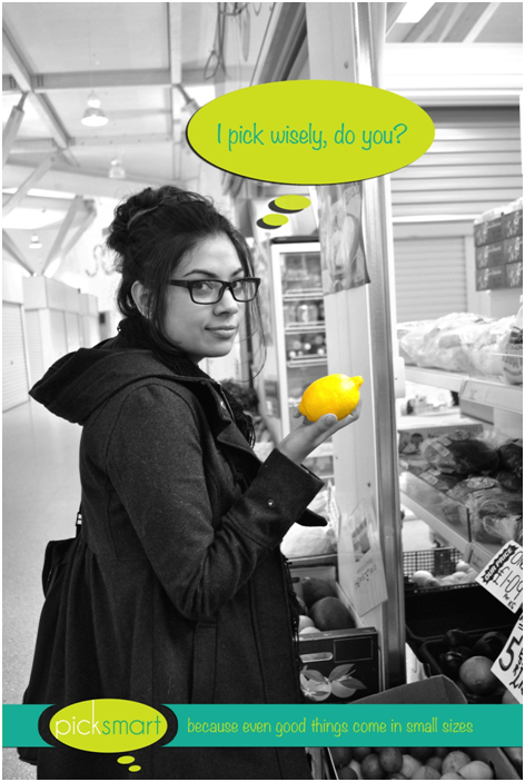
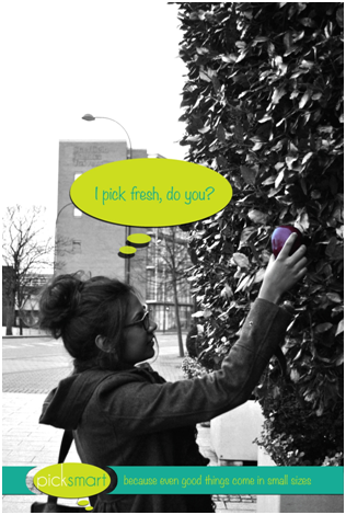
Social media campaign
The following teaser ad campaign will be placed on PickSmart’s facebook page, instagram and twitter. I chose to do a social media campaign because according to research, people of the age group of my target audience use these mediums more often and I felt this was the best medium to approach them.
Conceptually, I have photographed and used images of students who are making smarter choices. The decision of choosing to photograph in black and white was to signify how fresh and healthy PickSmart can be induced into their dull lives where they have been possibly making mindless decisions in the past. The tinge of fresh greens and the colour of the object is being used to symbolize the ‘smarter’ choice.