

Smile Safari
REBRANDING A MUSEUM OF HAPPINESS
Smile Safari is at the forefront of social media and smartphone tourism. They offer a captivating experience through their photo-op expeditions. Yet it can't all be 'sunshine and rainbows': As a growing company, they ran into several specific issues.
They had no clear visual system, leading to their growing base of employees to start freestyling with whatever was available.
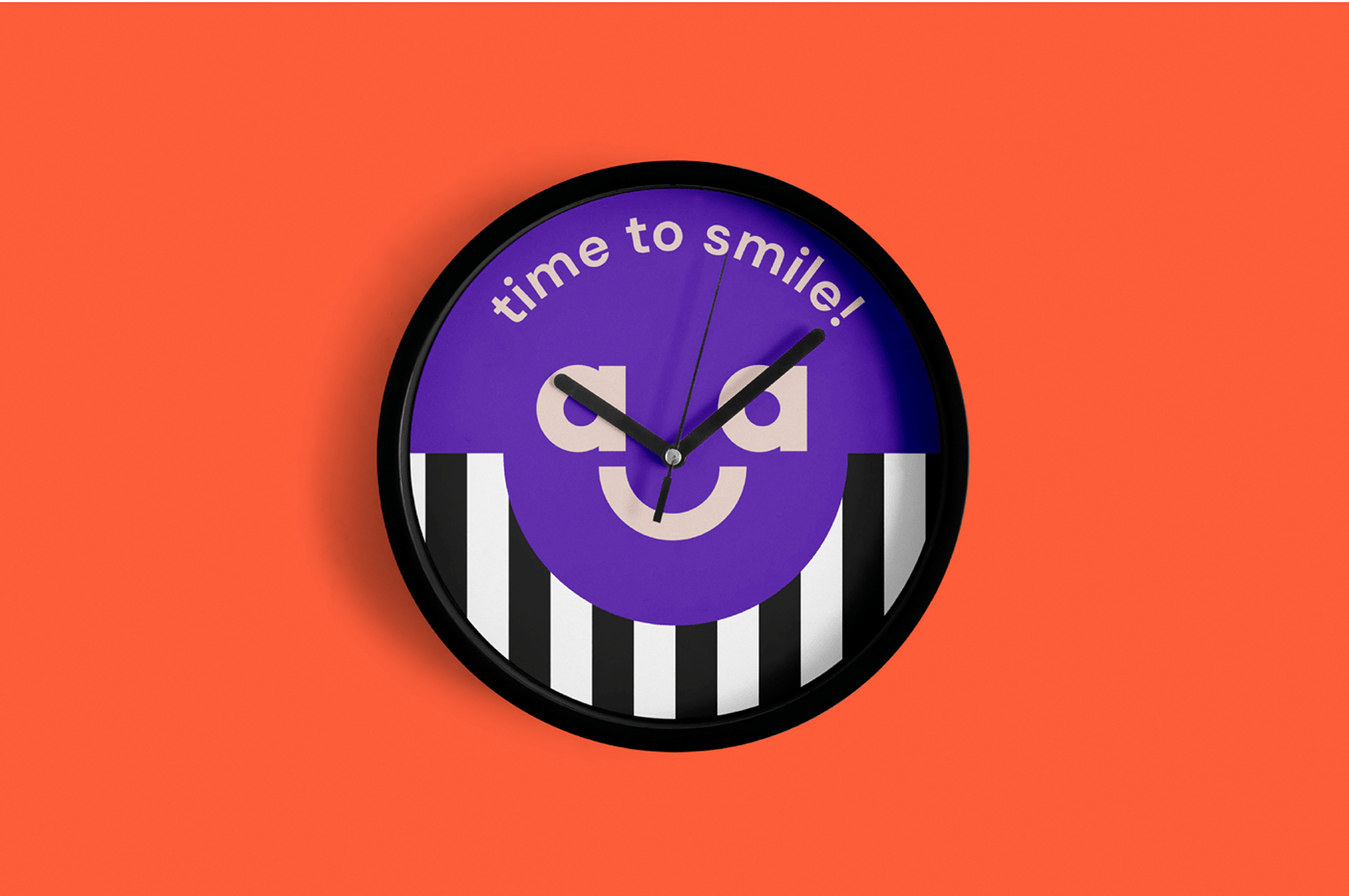
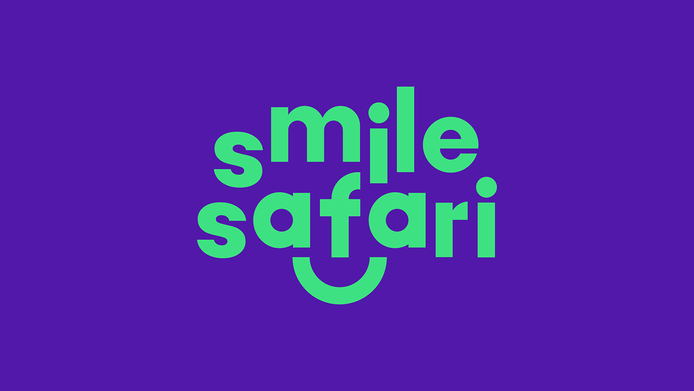
The logo
The client was clear and adamant: the old logo stays. Sure, no problem. But being the cheeky designers we are, we did an 'optional redesign,’ and guess what: they loved it!
The Safarians were fond of the mouth, smile, and eyes. However, the old logo didn't always work on different scales and formats. We kept those elements but cleverly incorporated them into the wordmark's typography.
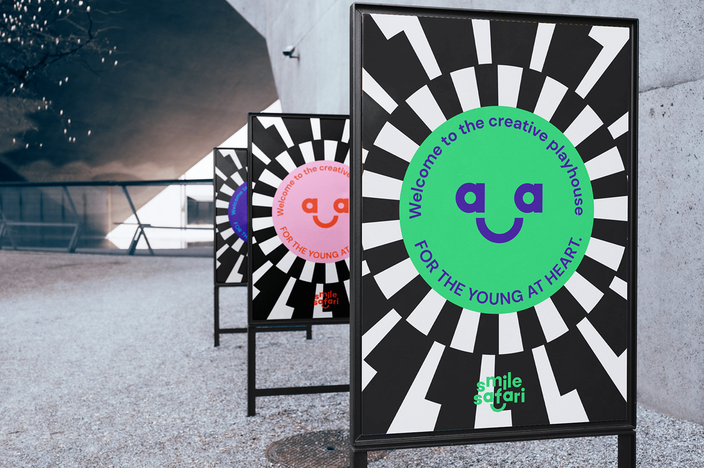
Colors and patterns
Smile Safari is a - or perhaps thé most - colorful place. So we needed color! A thoughtfully selected palette conveys the vibrancy of Smile Safari. We selected three fonts that work in unison to emphasize the spectacle that is Smile Safari. Oh, and patterns please.
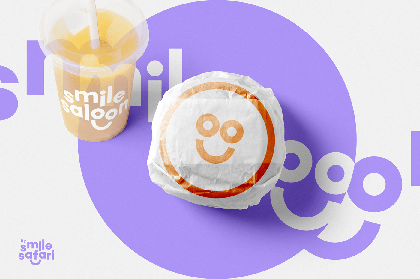
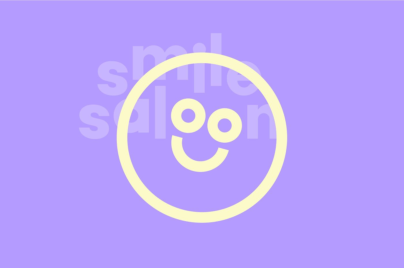
Smile Saloon
We even created a subbrand for their own snackbar 'smile saloon'.
This case proves it: no matter how much cool stuff your brand owns, it’s time to build a smart system that conveys your worth to your audience. It’s time to smile!
Website