Kiddo Rebranding & Concepts
At the end of 2021 me and Raluca were contacted to work on a rebranding that included customer interviews, brand strategy and visual approach for an app that hires and offer courses for nannies in Moldova called Kiddo.
After finishing the strategy part, it was my time to chip in and come up with visual solutions. We've started with a mood board and photography-led imagery that we worked on until we got to a few sketches. The winning variants went through digital and presented as concepts applied to various mockups.
Here you can see how the process of a rebranding goes. Enjoy!


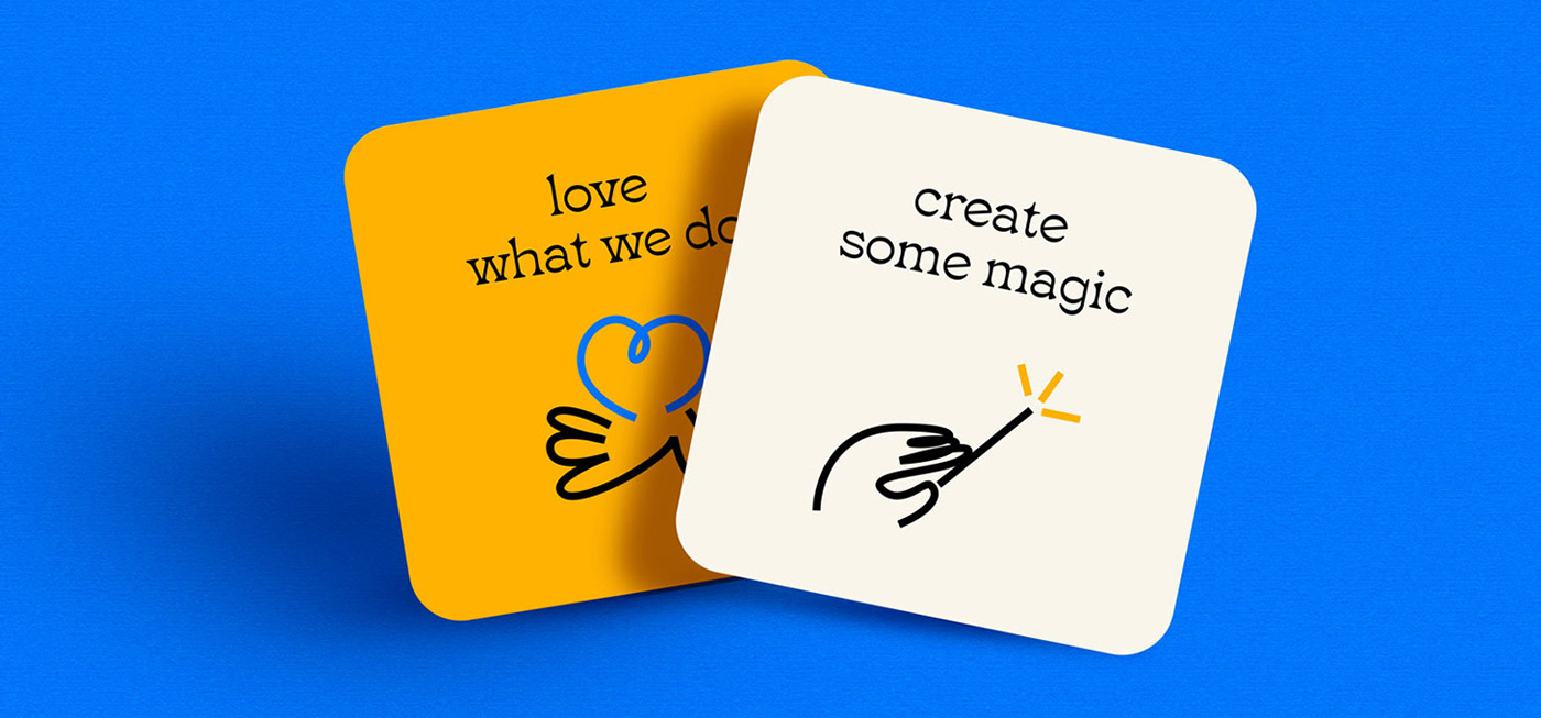
This is one variant, a very bold and playful approach. The letters are integrated in a square and written on 3 rows. I've added some elements such as hand that approaches to help a smiley blue-nosed figure. I also tried a more clean approach as you'll see on the next set of images.


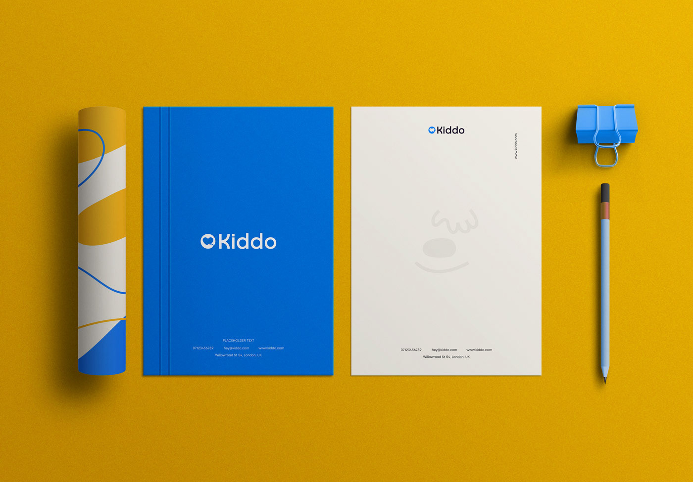
In another variant, but keeping the same colours, the logo is almost similar to the old one, but adjusted to a more fresh look, with a new font and better symbol. The hand and the heart within were refined to create a better flow along the circle lines inside.


