


AFC Ajax is one of the biggest and most traditional clubs in the Netherlands and came about as a tribute to the Greek warrior of the same name. He is considered one of the strongest and most skilled among Greek warriors after Achilles, and thanks to his invincibility, he won several victories over the Trojans.
Years after its foundation, in addition to the name, the club decided to insert the image of the warrior into its shield, to further strengthen its meaning.

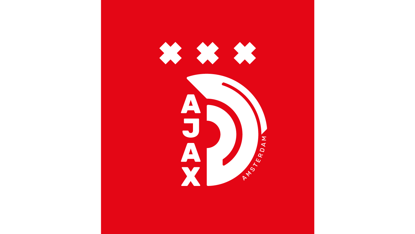
Ajax is located in Amsterdam, the Dutch capital and that is why the club carries the city's flag on its captain's armband. The flag has 3X in honor of Saint Andrew, patron saint of the city, who according to history was crucified in the shape of an X, as he did not think he was worthy of being crucified in the shape of a T, just like Jesus.
Utilizing the precept of minimalism, the shield is a representation of the Ajax warrior's helmet and the stars have been replaced by the Xs of the Amsterdam flag.


This is a fictional stand-alone project to redesign the AFC Ajax shield
Art Direction: Giovanne Donini
Video Editing: Rodrigo Martins
Graphic Motion: Bruno Pedro


