While in a bit of a creative block I decided that updating my personal branding would be a great way of finding a breakthrough. An idea popped into my head I hadn’t thought about in years. When I first started out on my endeavor to build my graphic design skills some 10 years ago I had always envisioned I would open my own design studio and base it out of key cities in certain regions of the US. I wanted to call each studio the city’s nickname followed by “concepts”. (Queen City Concepts, Charm City Concepts, Emerald City Concepts, etc.). I remember I had decided to condense my idea down to just simply “The Concepts”.
The epiphany I had that led me to rebrand myself also saw me finally realizing what The Concepts was. It was my brand.

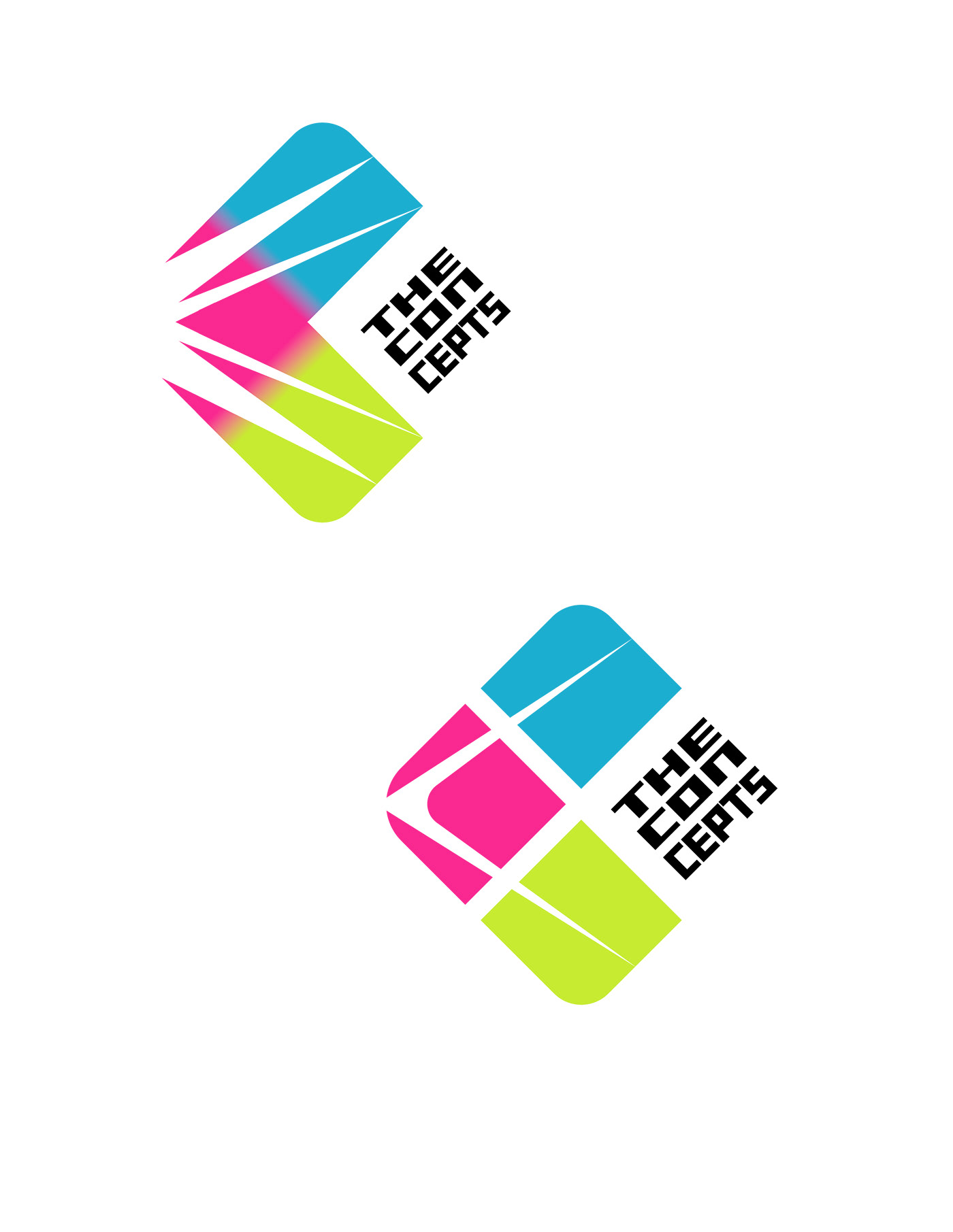
The rough drafting stage was where I built the foundation. A stylized letter C utilizing negative space coupled with gradients.

The final draft, like my initial vision so long ago, condensed my idea into 3 key hierarchical components. A cyan-magenta-yellow stylized C to represent the foundational print color palette and the key letter in my brand. Then a tactfully placed cutout in the middle to guide the eye towards the title wordmark.


