Task: Rebranding DutchWare
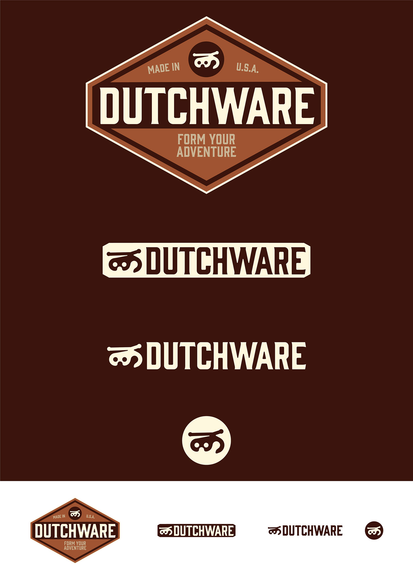
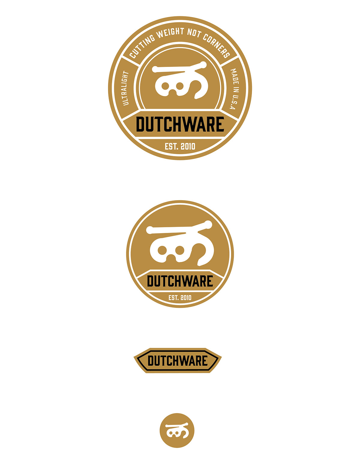
Outline: To make the logo simpler, more mature readable. The existing logo was only one fix style where as the new logo has multiple variants to change with the sizing, complexity and other restraints. This allows the new logo to retain its fundamental design from small web icon to full print banners.
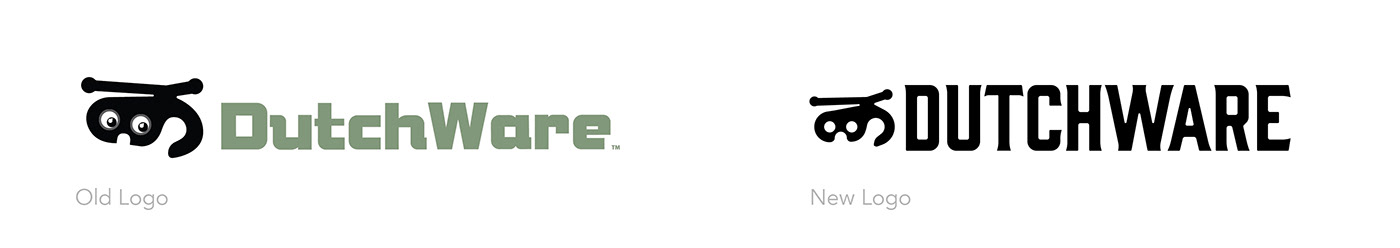
The logo typeface is based off of "Gin". Tracking was reduced and edges were smoothed or deleted. This allows for minimal amount of serif readability while still staying modern, clean and more rugged.


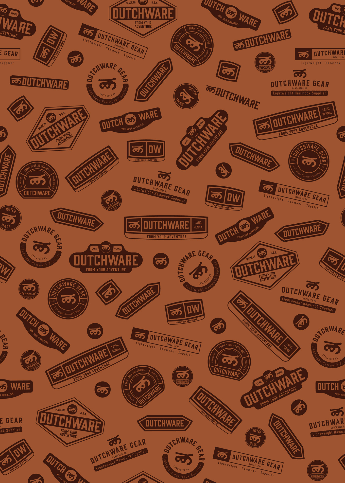
These lockups are finished logos that were pitched as potential, but not chosen.
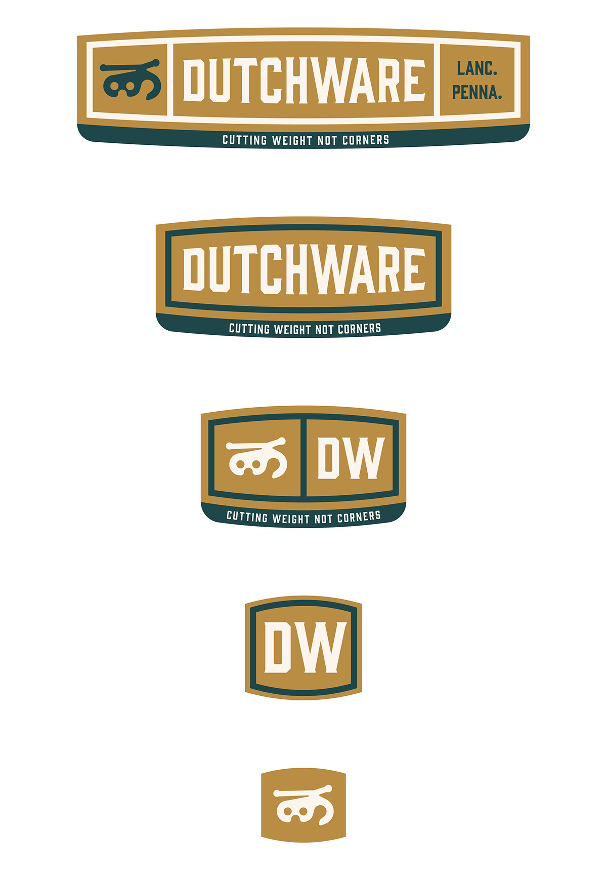
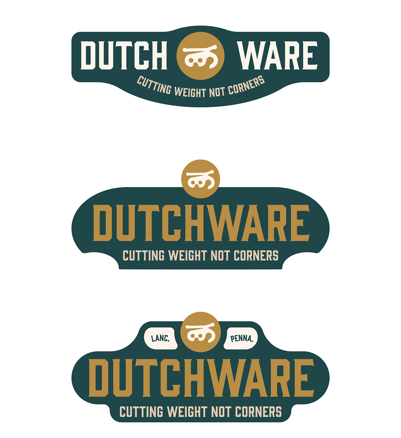
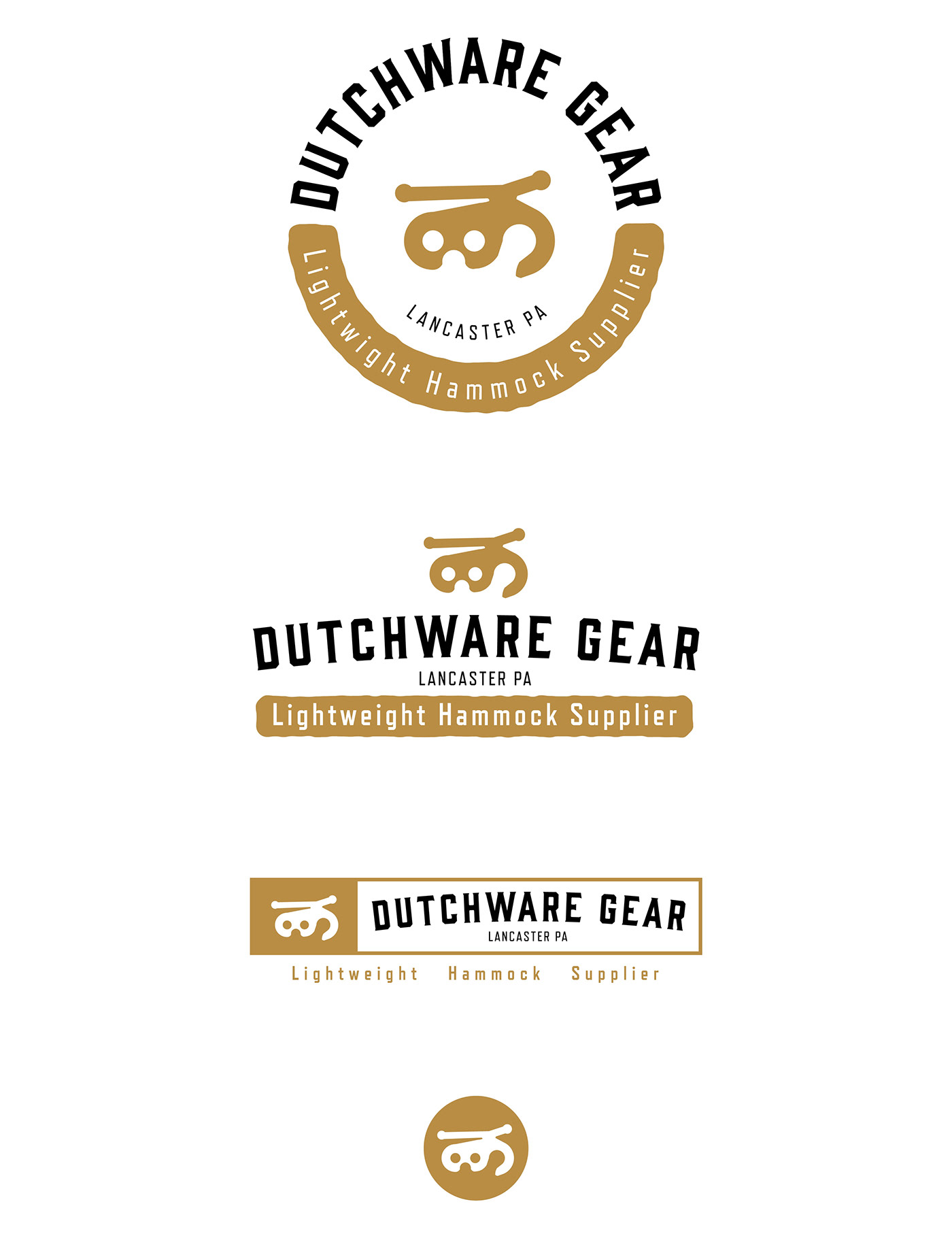
These brown, diamond shaped logos were selected as the final. The logo is easily contained, which allows it to easily be placed most places like a sticker, separating it from the background. The squared off sides of the diamond remove wasted space, and the "flea" icon is still kept in center.
A catch phrase is added to the full logo.
A catch phrase is added to the full logo.
As it sizes down the box that surrounded it inside the diamond is kept. If the situation is more open then the box may be removed. The "flea" can simply be used by itself as it is a strong identify symbol to DutchWare's clients and easily recognizable to those in the industry.
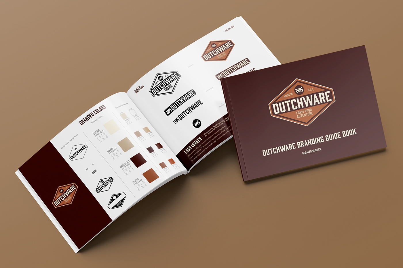
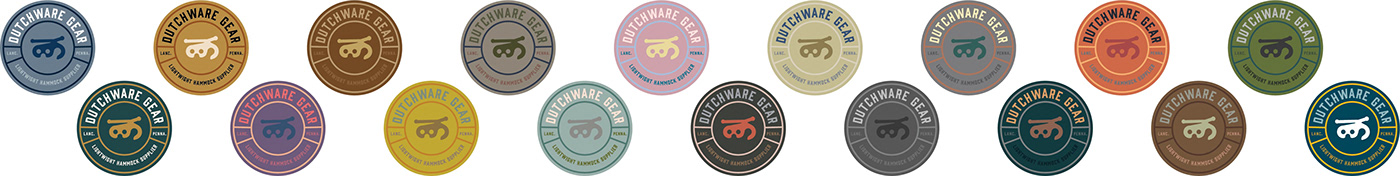
Brown was chosen as it is the founder's favorite color and also a great fit for an outdoor company.
The logo can be used in black and white and works well without loosing any meaning and detail.