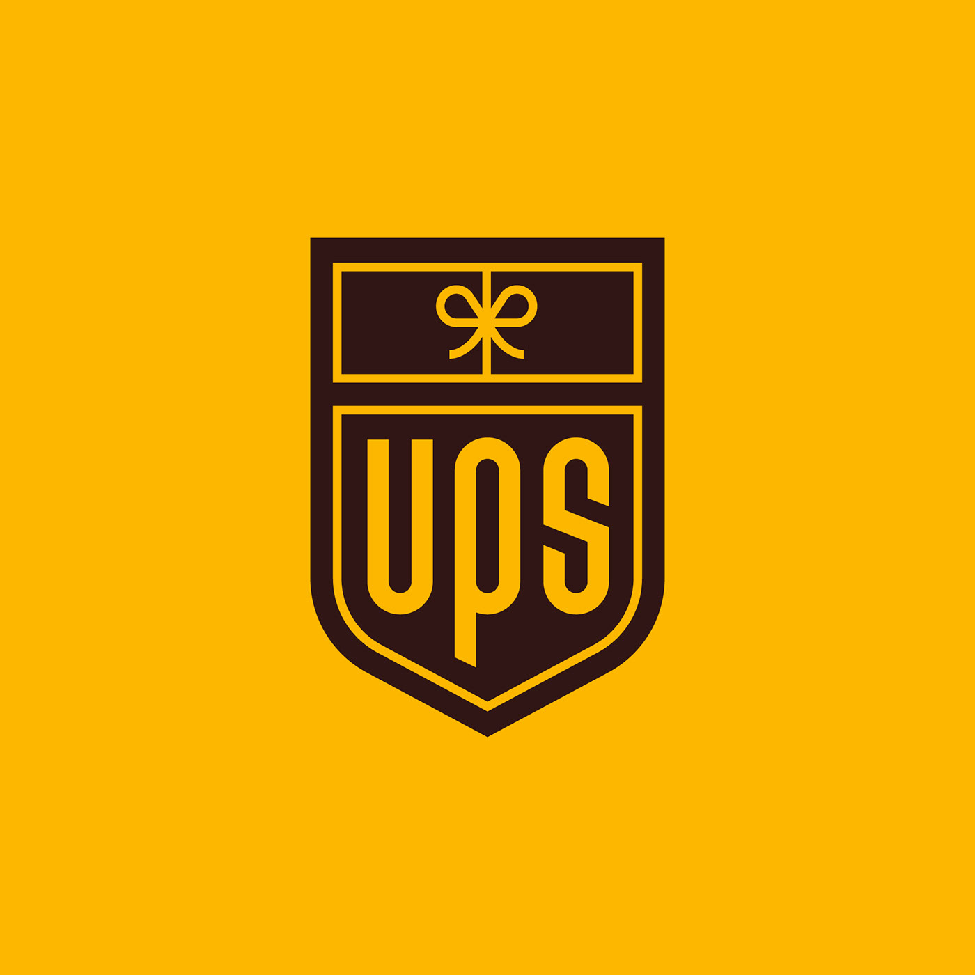
UPS logo evolution proposal
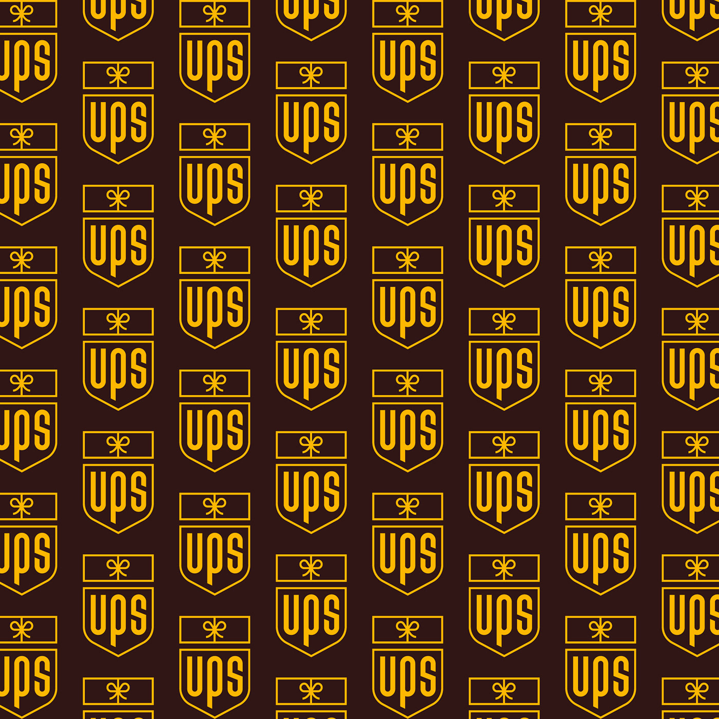
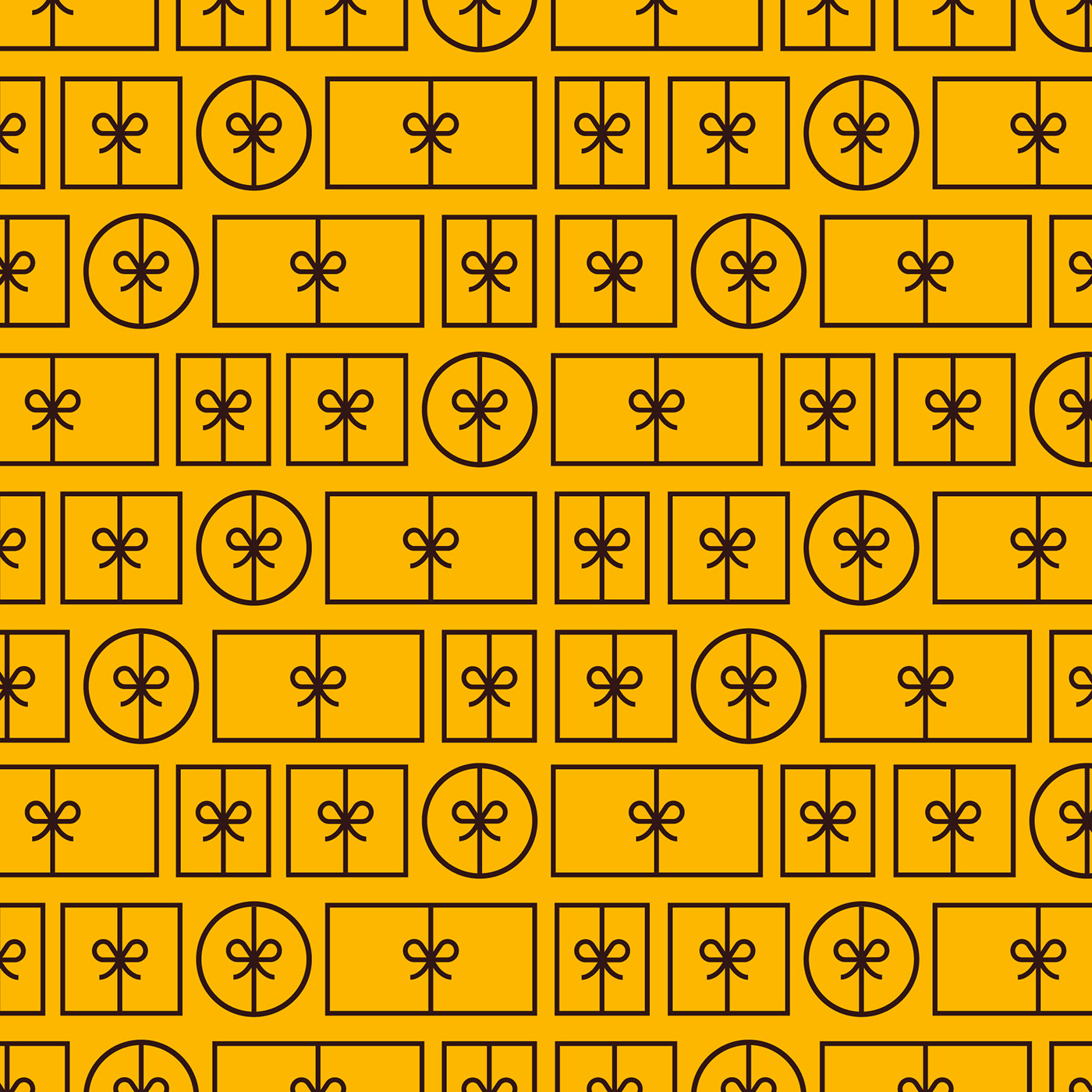
The 1961 UPS logo design by Paul Rand is one of my all time favorite marks. What I love so much about it is the ribbon at the top. It’s unique, playful and it says “craftsmanship” at a glance. In 2003, FutureBrand simplified the mark down to a shield. In my opinion, it lost everything memorable about the mark. Today, I decided to take a fresh look at the UPS logo in an attempt to add back in the care and craft that was stripped in 2003. I embraced Paul Rand’s logo but cleaned up the typography and simplified the package. I created a brand system that’s modular and adaptable. What do you think?


