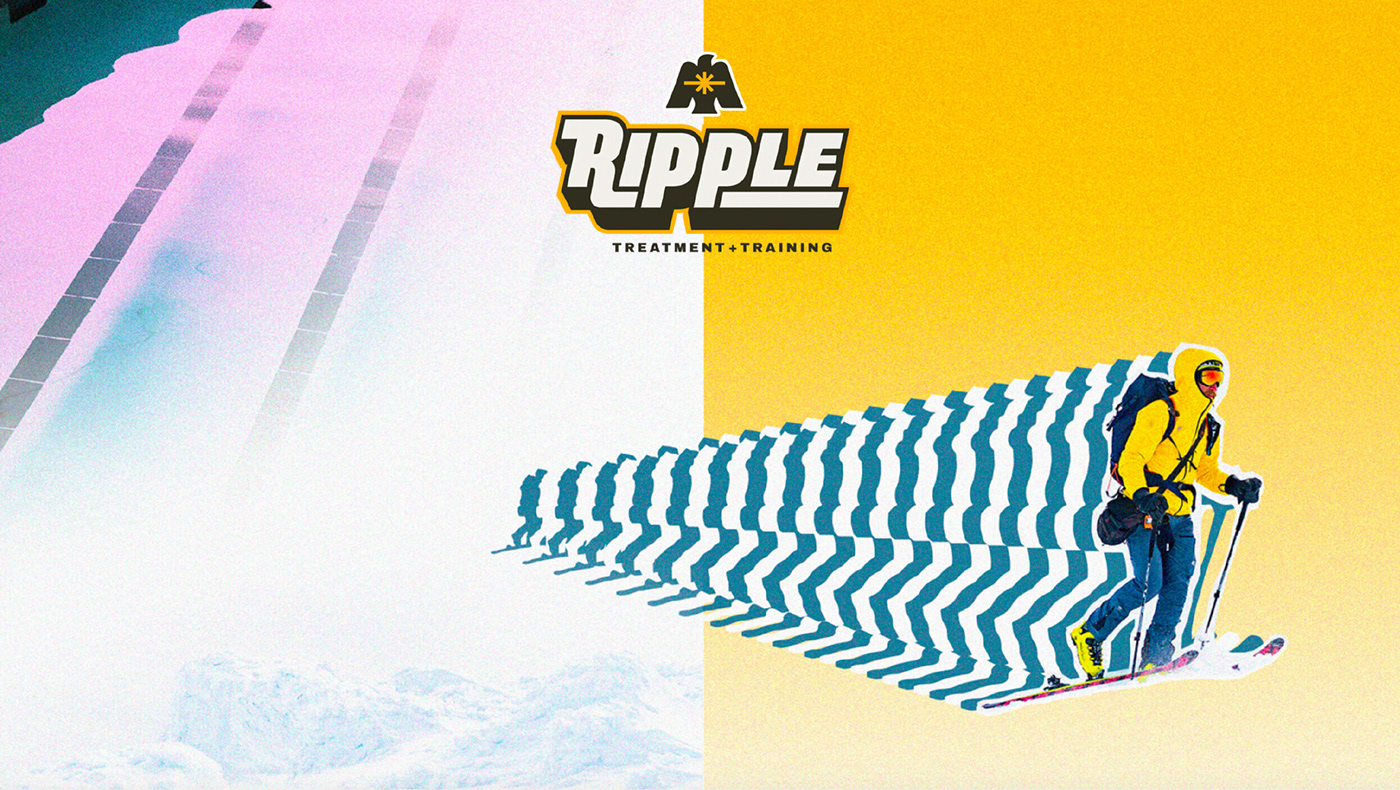
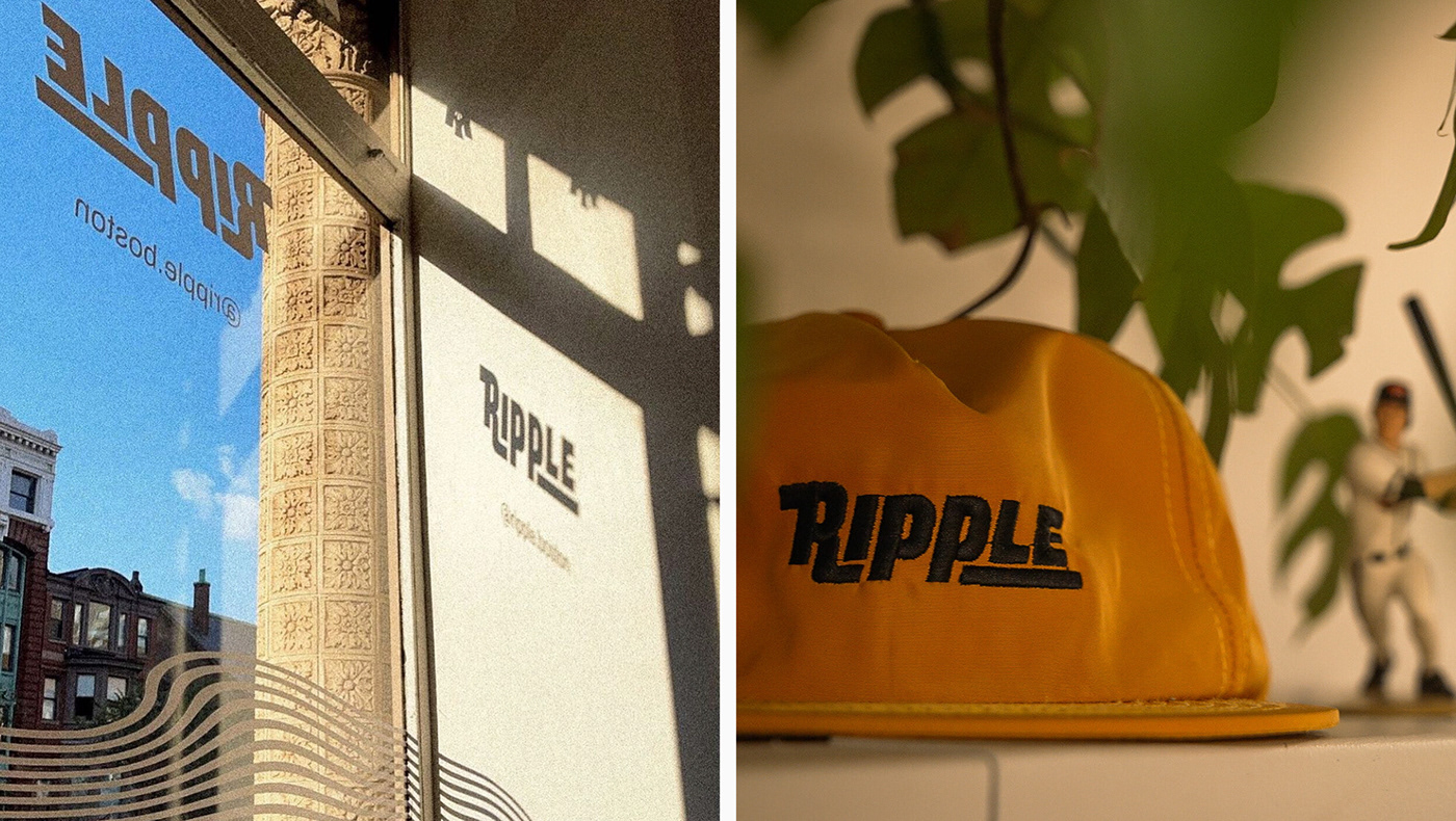
RIPPLE TREATMENT & TRAINING
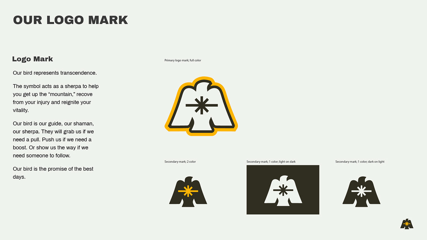
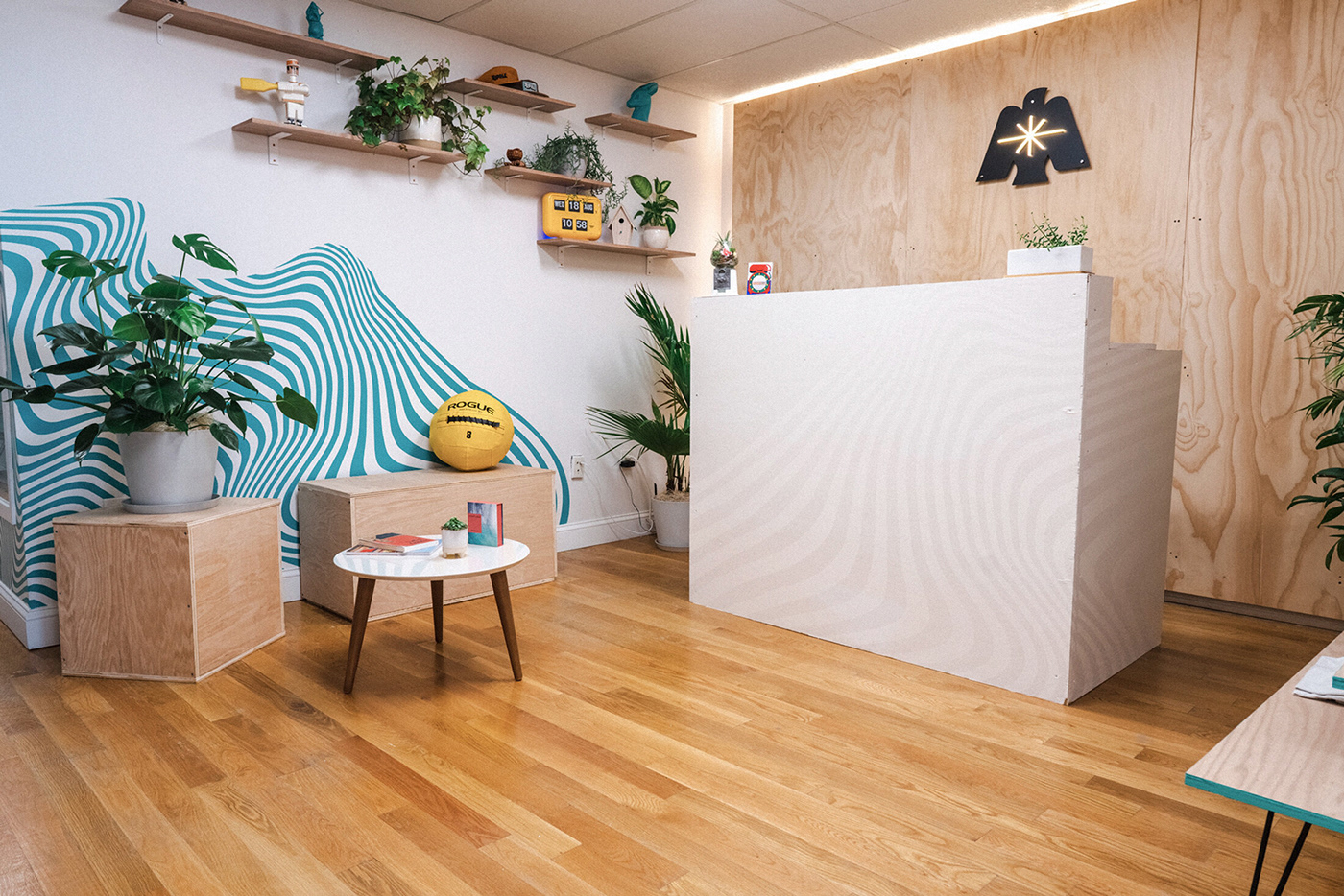
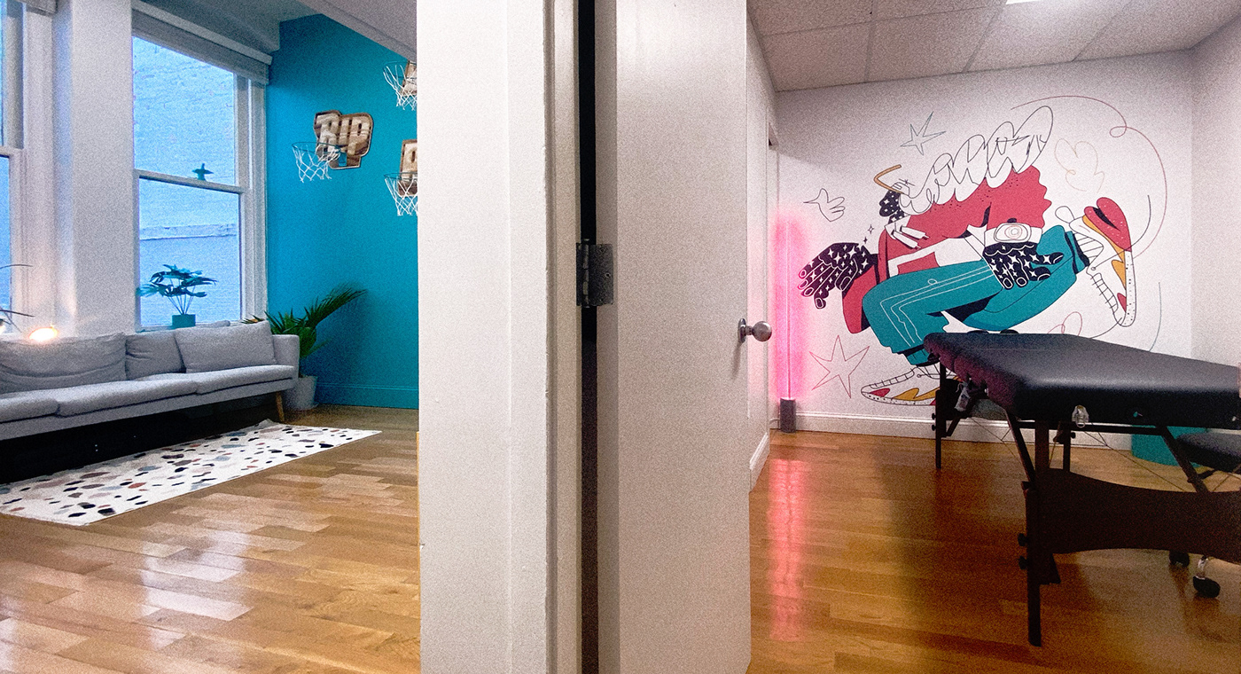
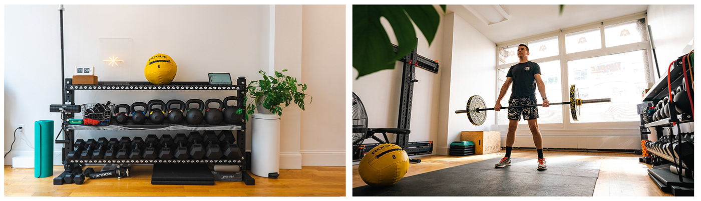
Flowing water never grows stale. Ripple is a treatment and training facility in Boston that encourages and empowers all clients to keep moving their bodies more as opposed to less. The bird logo symbolizes transcendence — acting as a sherpa to help you get up the mountain, recovering from your injury and reigniting your vitality.
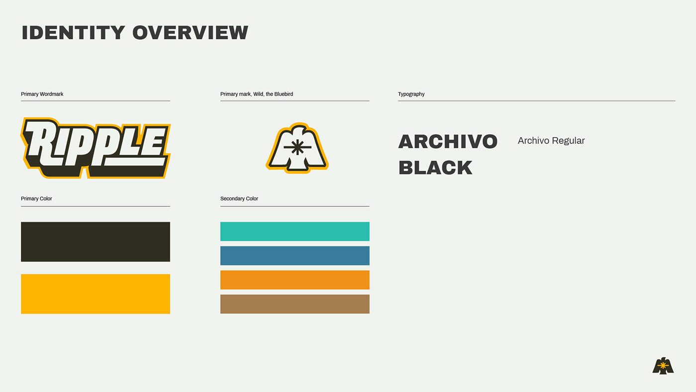
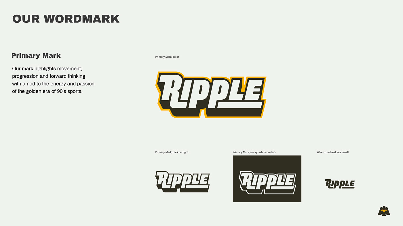
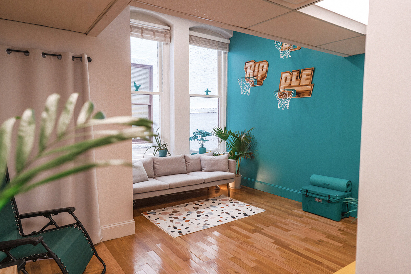
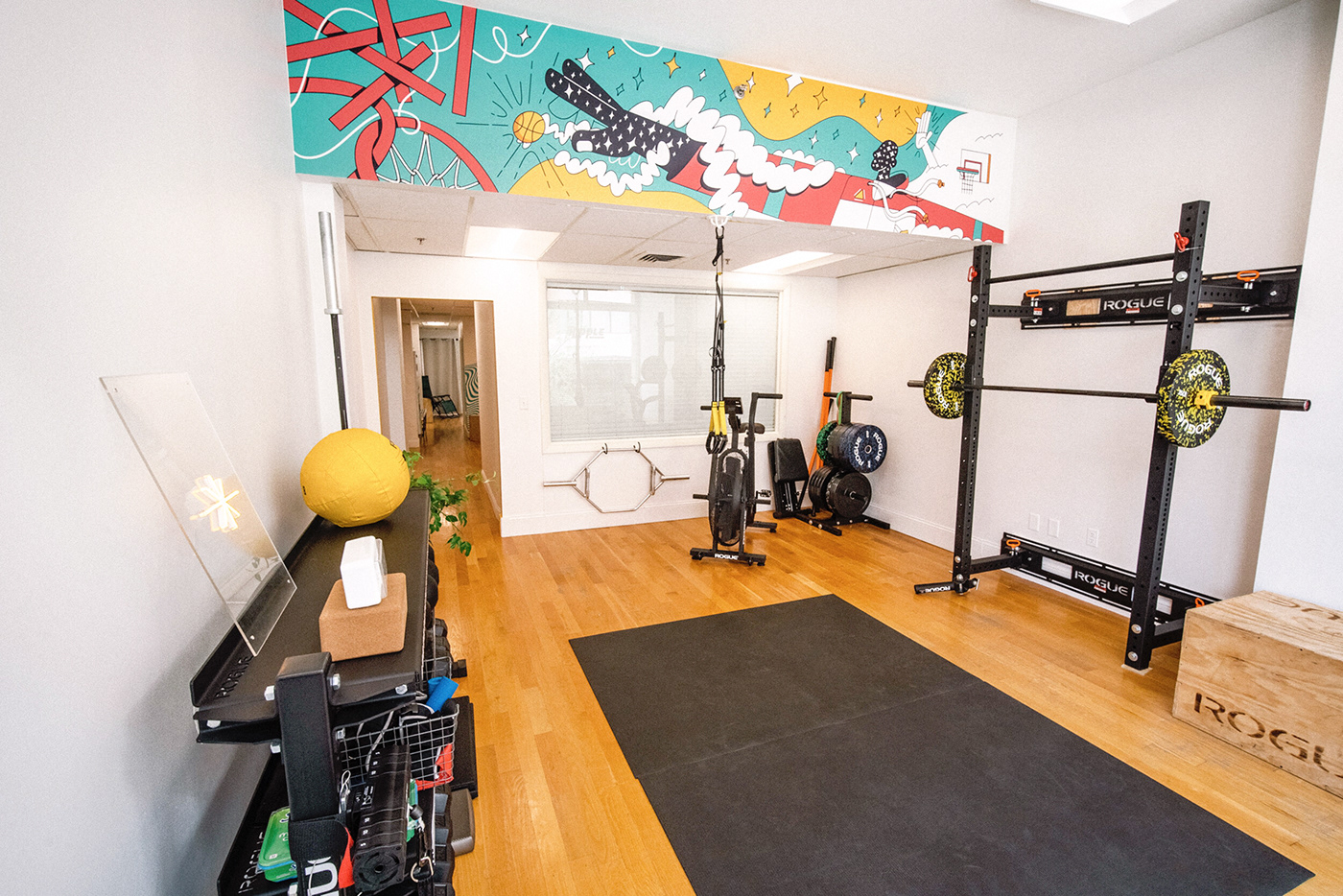
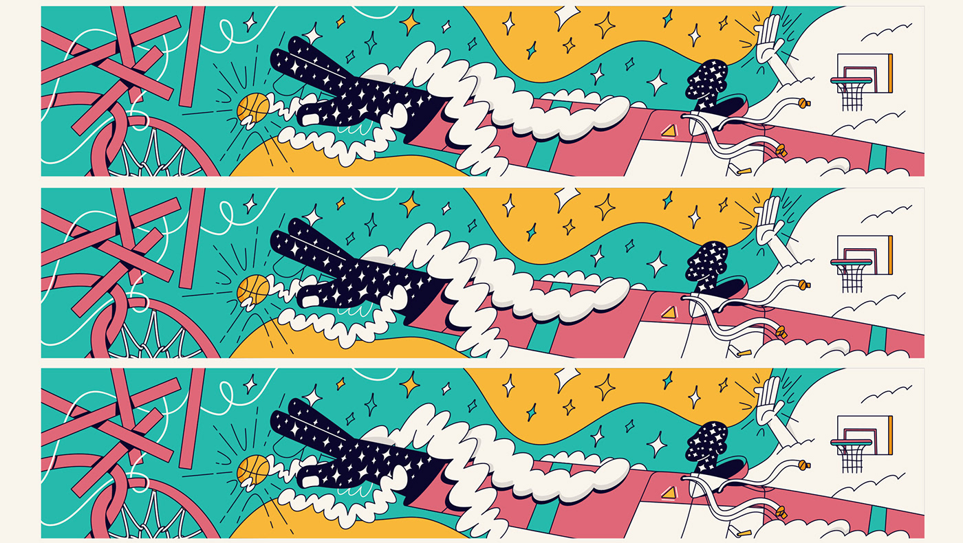
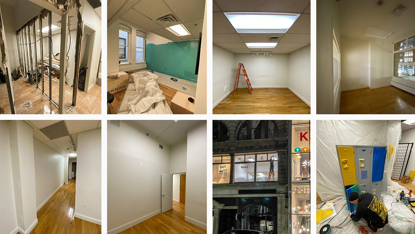
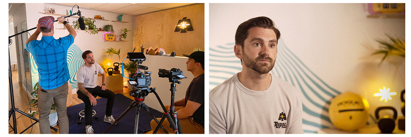
Scope: Strategy, Naming, Brand Identity, Interior Design & Build, Mural Design, Merchandise, Creative Direction

The Result
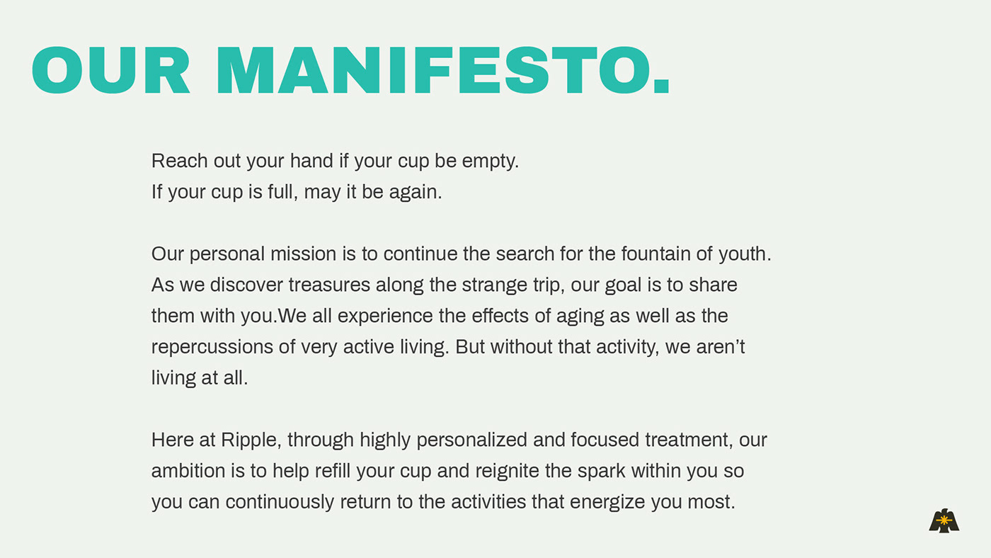
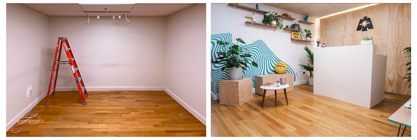
We created a brand that is the antithesis of what is expected in the physical therapy industry. The initial ask was to help develop a name and identity. Over the course of a year — the scope expanded to interior design and build of the physical location along with merch, website and illustration.


Process
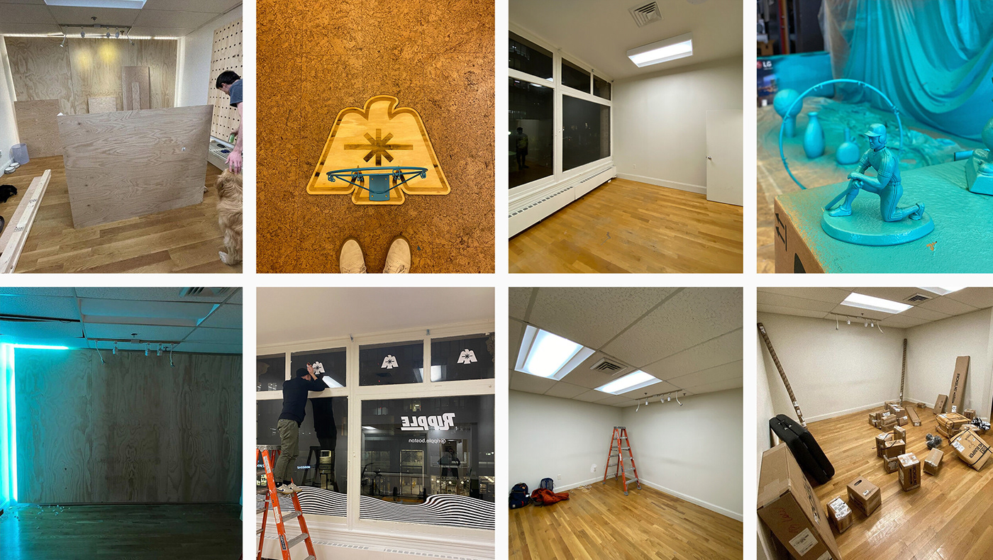

THE BRAND