

Konny Brand Identity Renewal
Project Overview
Project Overview
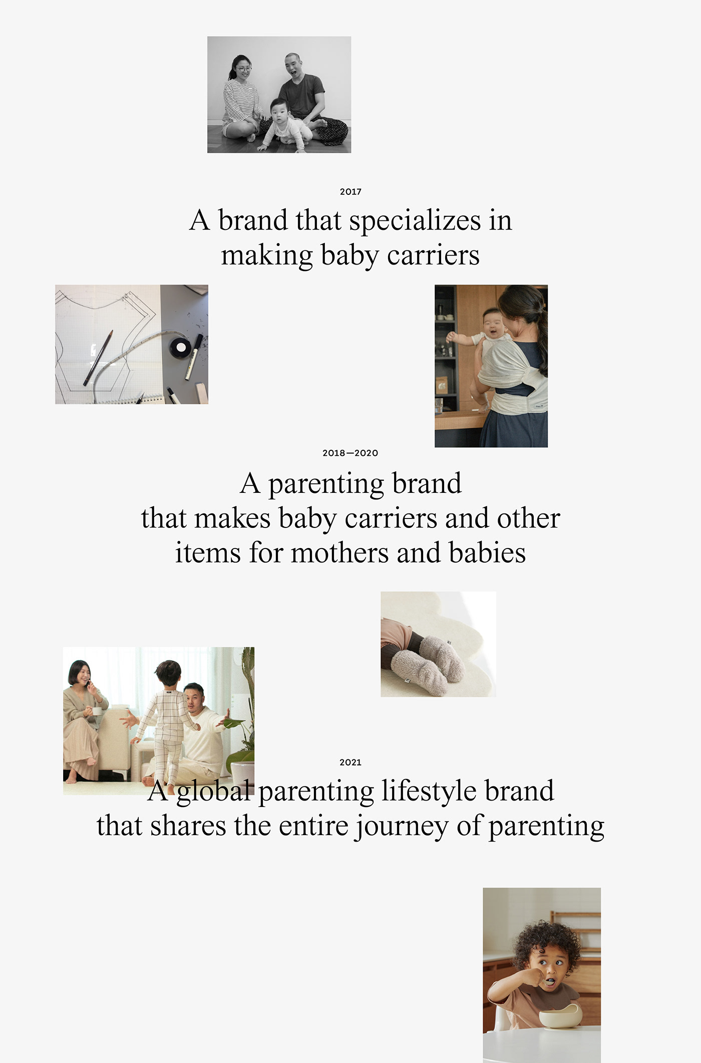
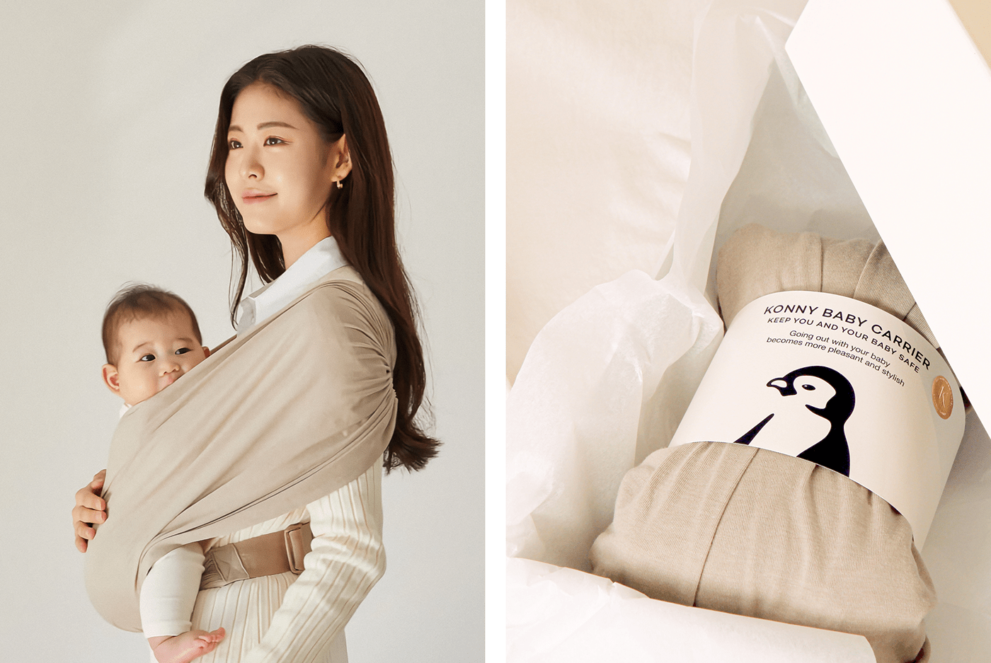
Konny is a parenting lifestyle brand that makes various parenting products starting with baby carriers for parents and children. At the beginning of its business in 2017, the types of baby carriers were very limited in Korea. As a result, a novice mother who suffered from disc trouble in her neck developed the Konny Baby Carrier after considering the comfort of both parents and children through trial and error, and this soon became known as a baby carrier made by mothers and led to a great response in the parenting product market. The brand Konny, which started like this, has gradually expanded its business to include Konny Mom’s Wear and Konny Baby under the goal of Easier and Cooler Life for Parents. Therefore, this project was designed to establish the identity of Konny as a parenting lifestyle brand that goes beyond the baby carrier to encompass the entire parenting journey, and to enhance a consistent brand image.
Brand Identity
Konny’s brand motif is the way emperor penguins give birth and raise children. This is because the parent penguins overcome the cold through huddling, the way they take care of their baby penguins with their unique sound, and their willingness to take risks to keep the baby penguins safe were all in contact with the unfamiliar moment of parenting that everyone experiences for the first time. We have advanced our brand identity based on Konny’s clear brand motif.

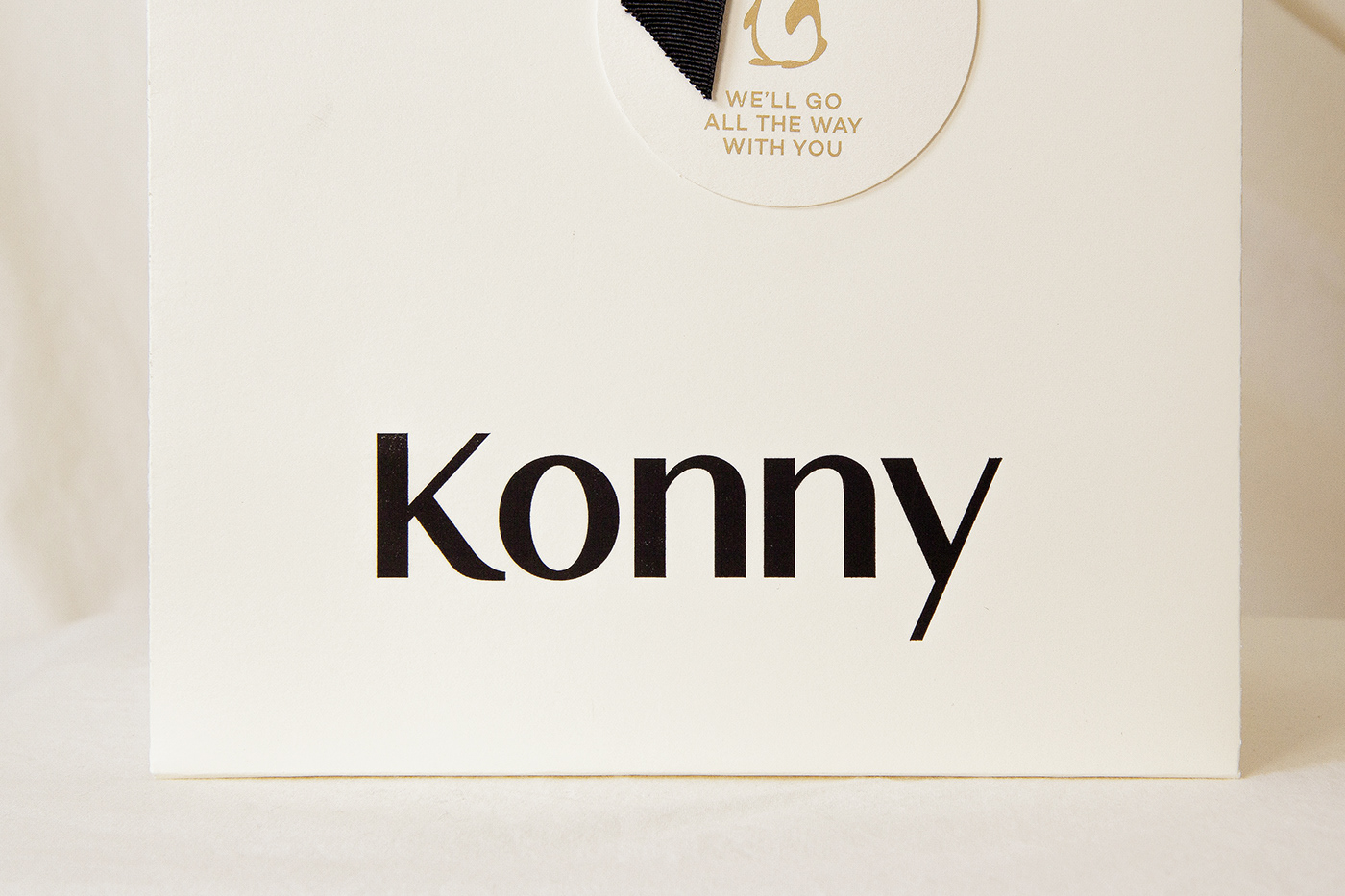
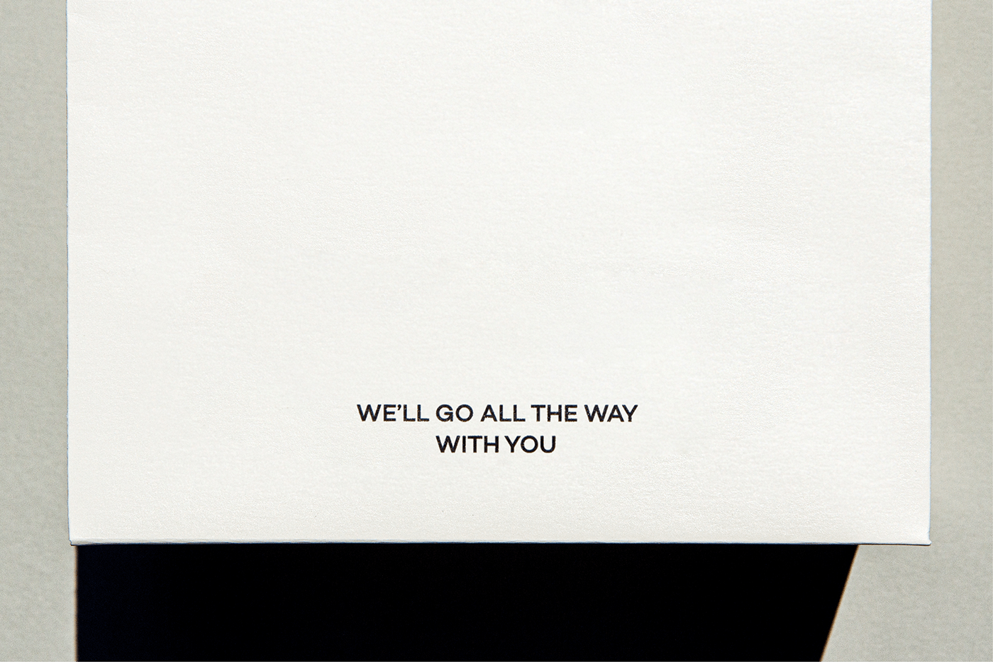
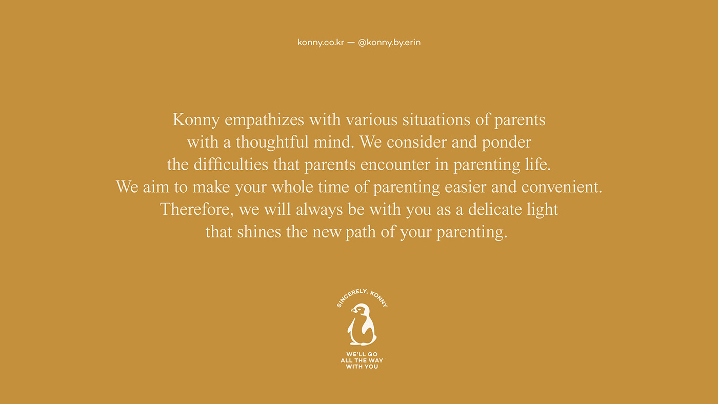
Brand Slogan
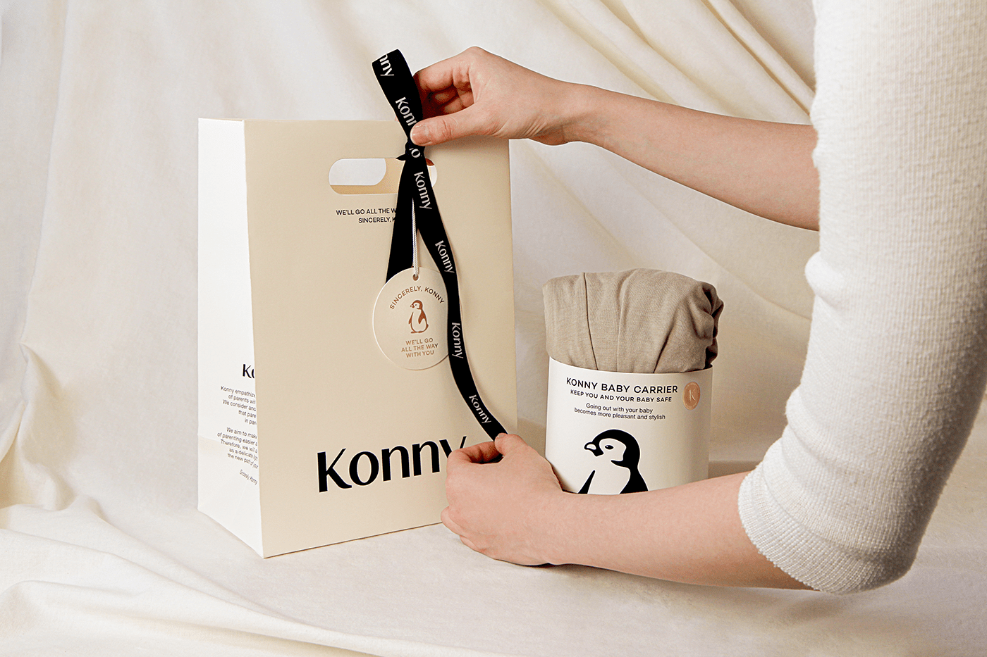
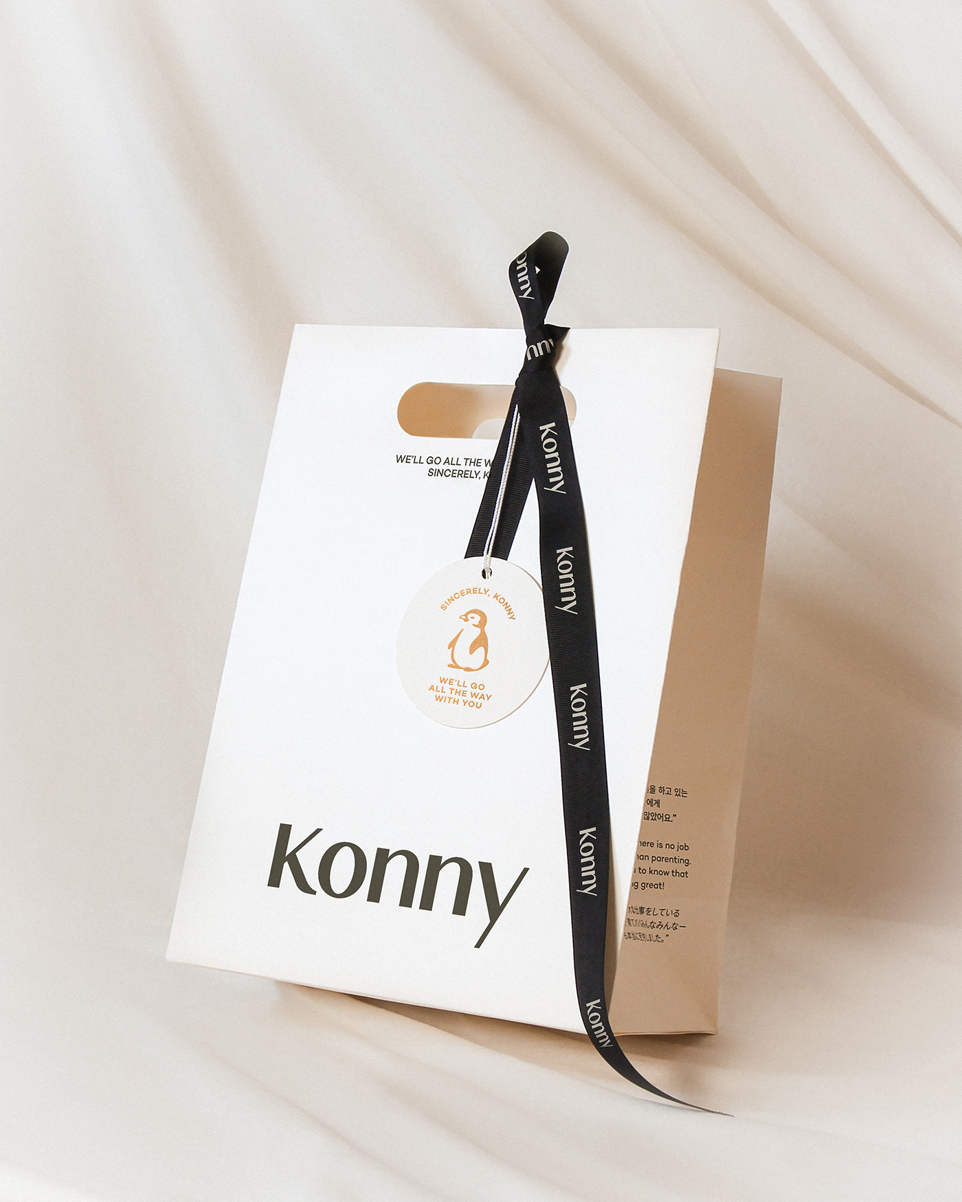
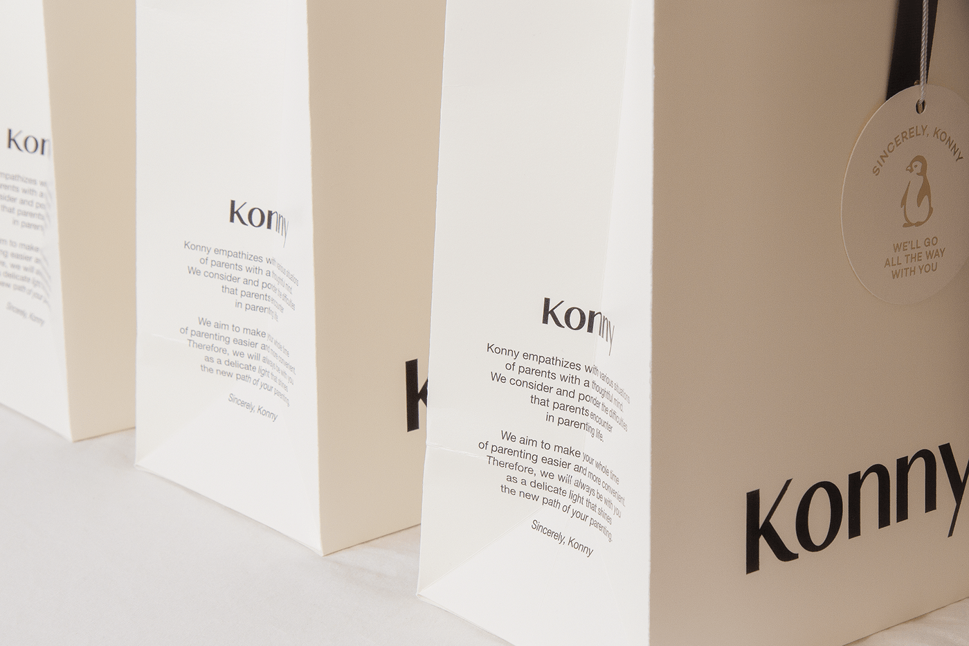
The slogan was developed to convey Konny’s sincere heart to be a warm ray of light to customers during the entire journey of parenting. Konny’s support for parents and babies to be together in every moment of parenting is highlighted when customers see the product packages, brochures, and of course, the products.
Samples of OLD and NEW Identity
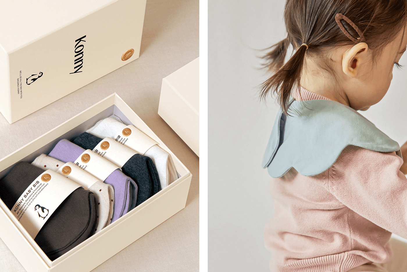
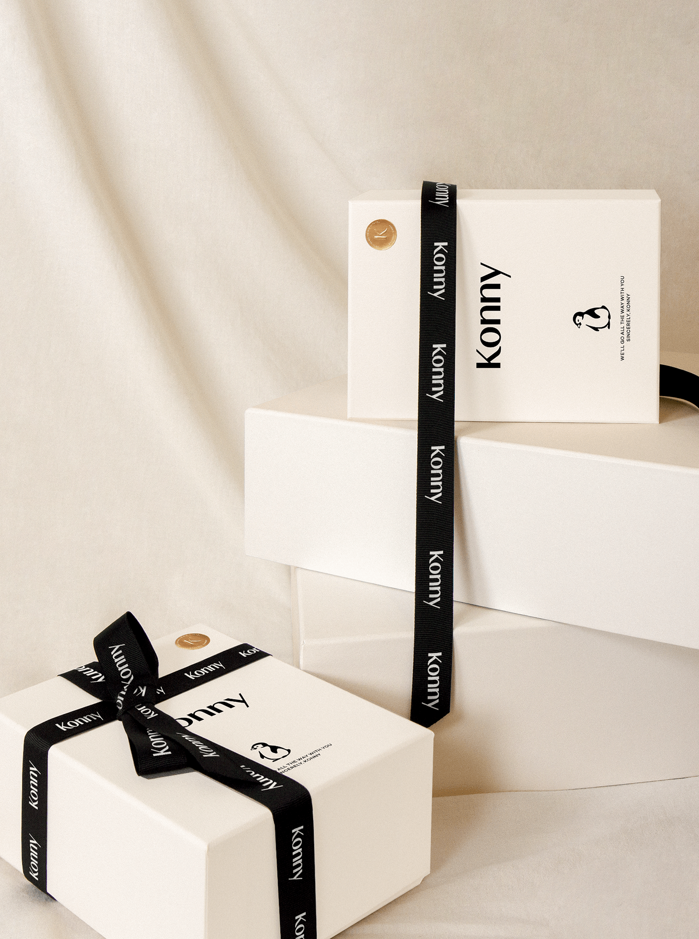
The most central consideration in the renewal of Konny’s brand identity was the establishment of an advanced design system that can be easily applied to BMs that extend beyond baby carriers while inheriting the current design elements that the Konny team has affection for, and creating a sophisticated look and feel that appeal to new customers. As a result, Konny’s new brand identity has been developed based on a design system that can be flexibly extended to a wide range of media without changing the main frame of the existing design elements.
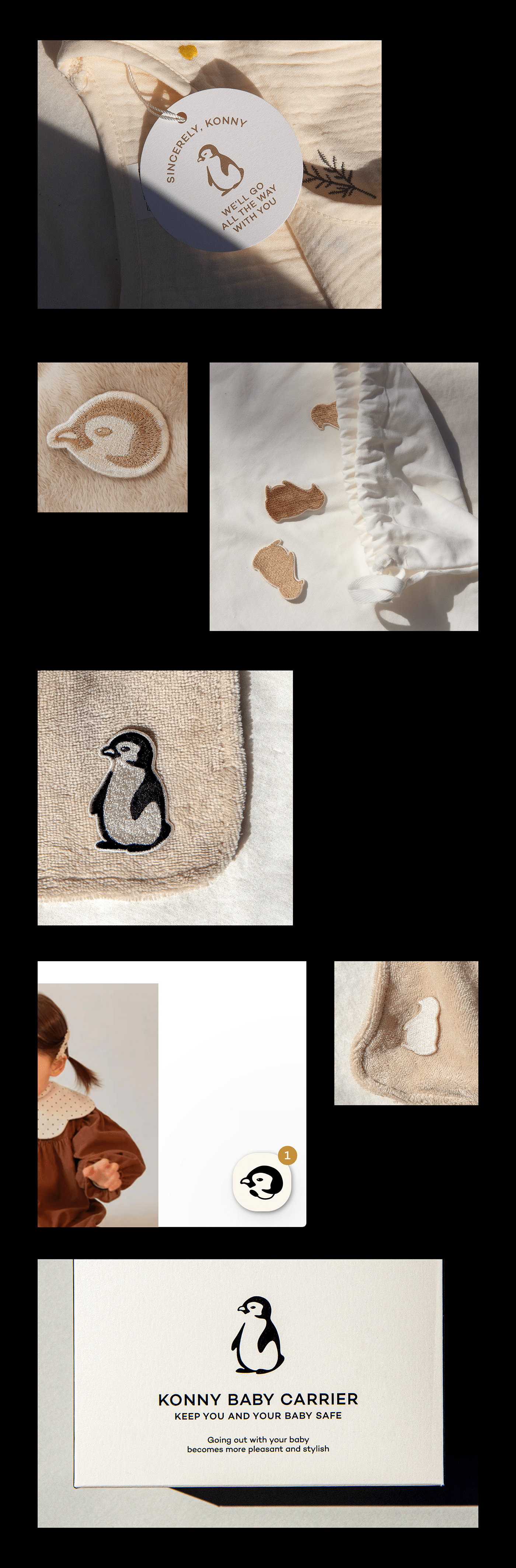
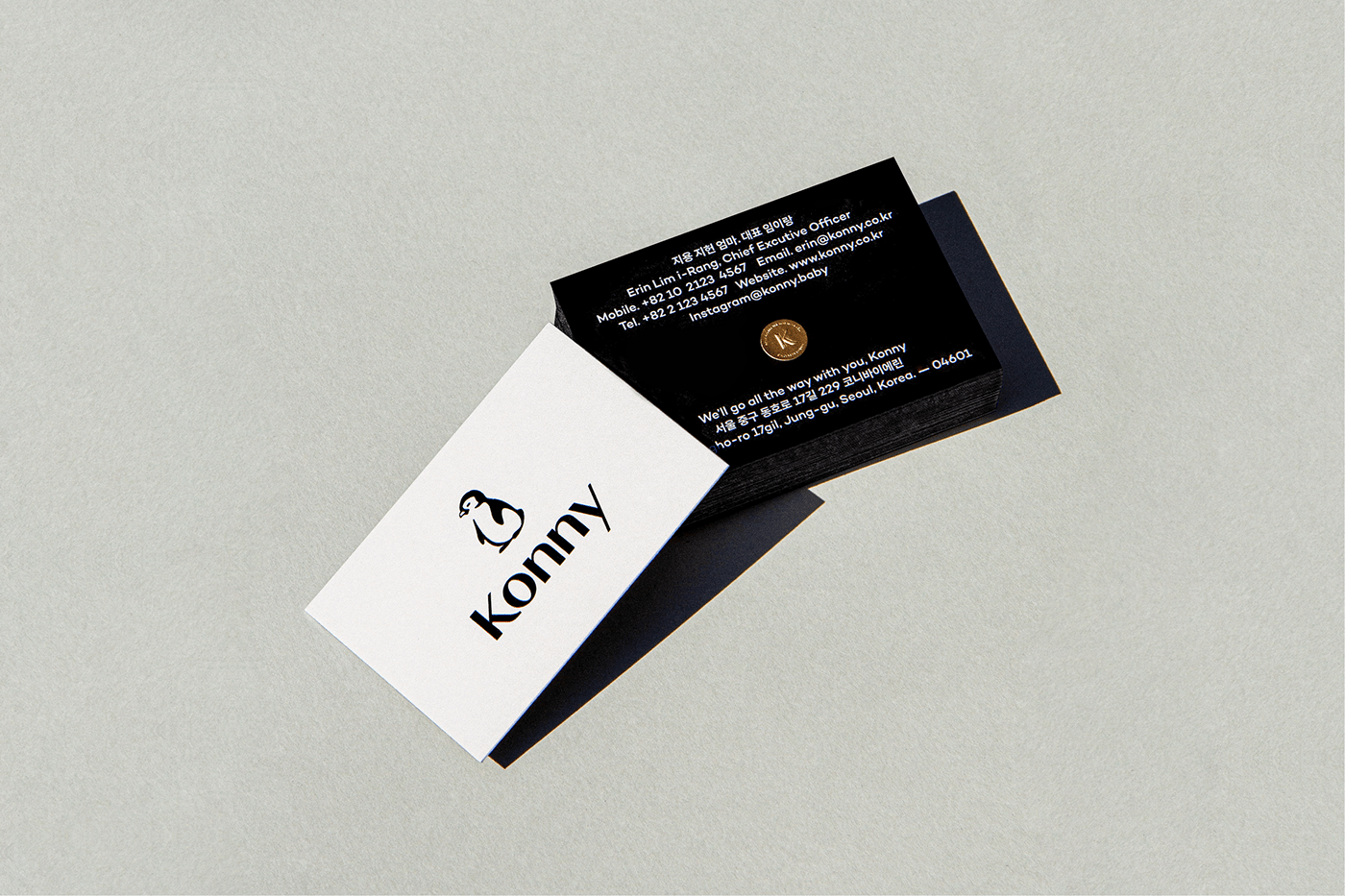
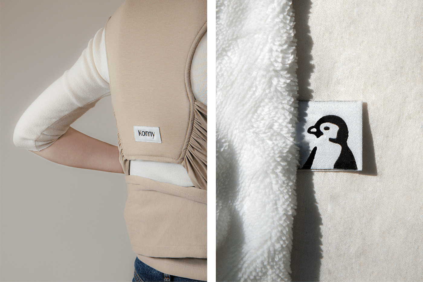
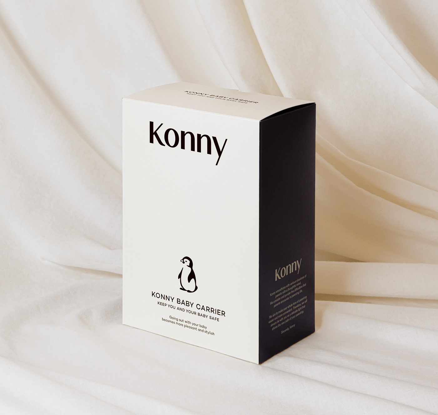
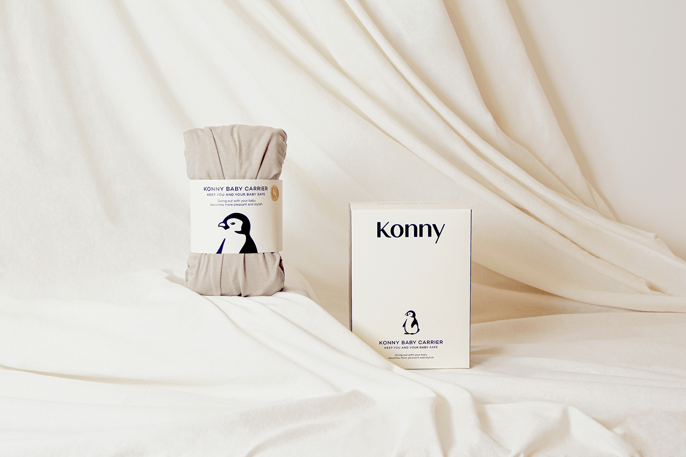
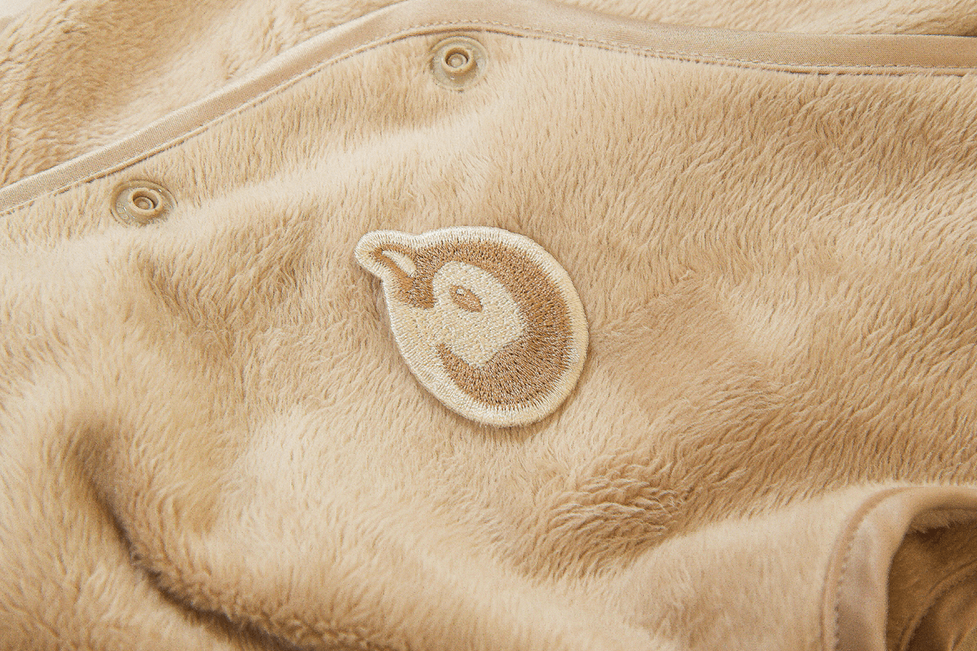
Symbol
Konny’s penguin symbol is a key visual asset that connects to the brand story. However, the existing symbol consisting of a cropped upper body and faces and lines had many limitations when applied to some media. As a result, the new Konny symbol, which has been upgraded to a full body shape, improved usability by improving the shape finish, and added dynamic movement make the symbol more usable.

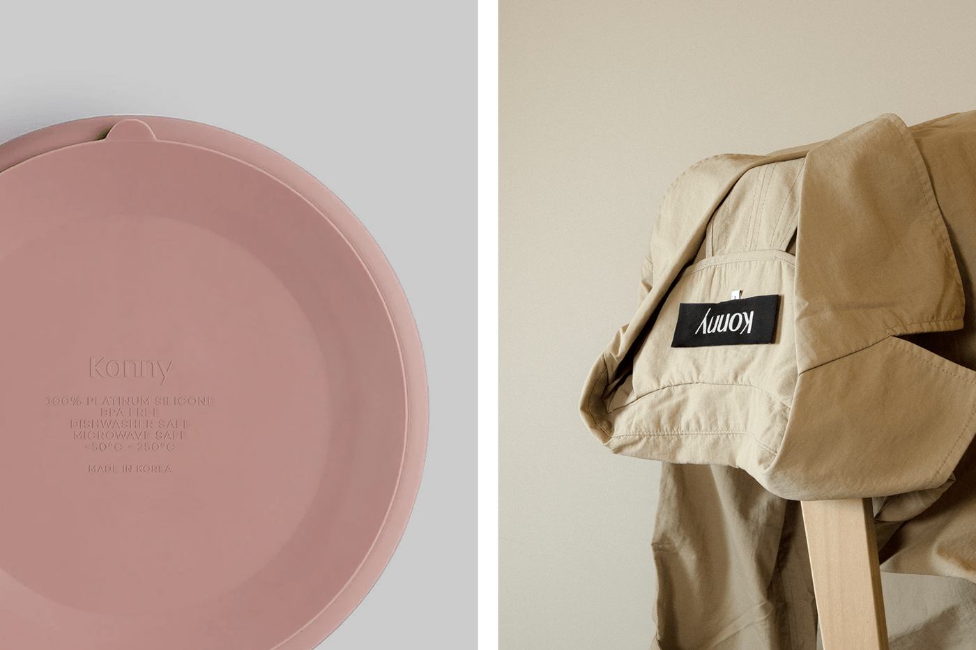
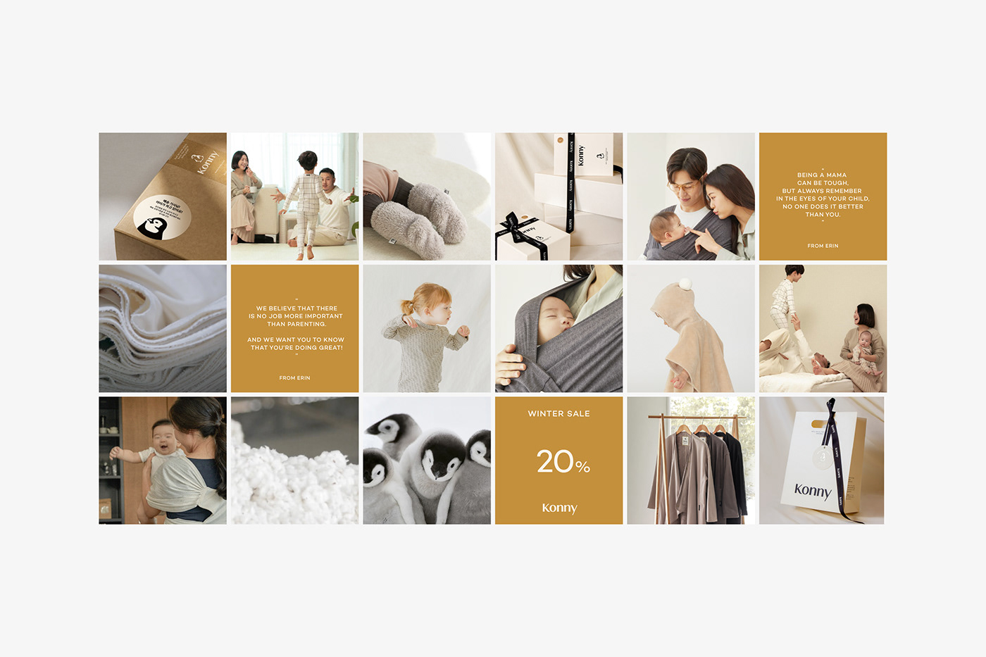
Design System
Konny’s design system expresses a consistent brand identity across a wide range of media environments that consumers encounter, from package and paper design in the offline environment to the product detail page in the online environment.


Konny Brand Identity Renewal
Plus X Creative Partner
Creative Director: Tyodi Hyojin Lee
BX Strategy Director: Sunyong Kim
BX Strategist: Jeeyoung Song, Hyemin Oh
BX Design Director: Sunghwan Im
BX Designer: Byeongkuk Jung, Yoonhak Lee, Sukmin Son
Konny By Erin
CEO: Erang Lim
Brand Marketing Lead: Myungjin Song
Design Lead: Jinsil Jeong
©2022 Plus X Creative Partner.


