SymbolStudio©
www.symbolstudio.pl
__
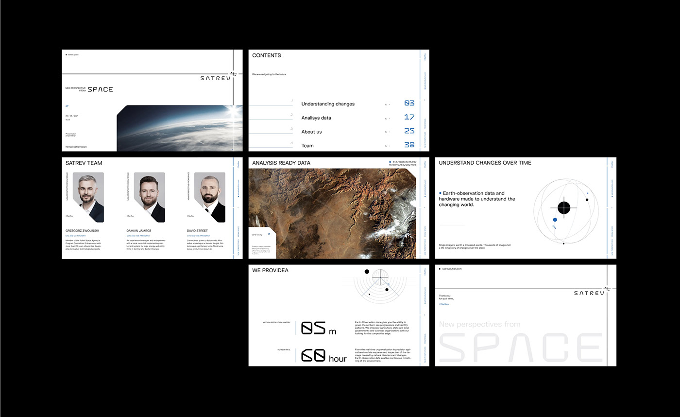
SATREV : New perspective ● from space.
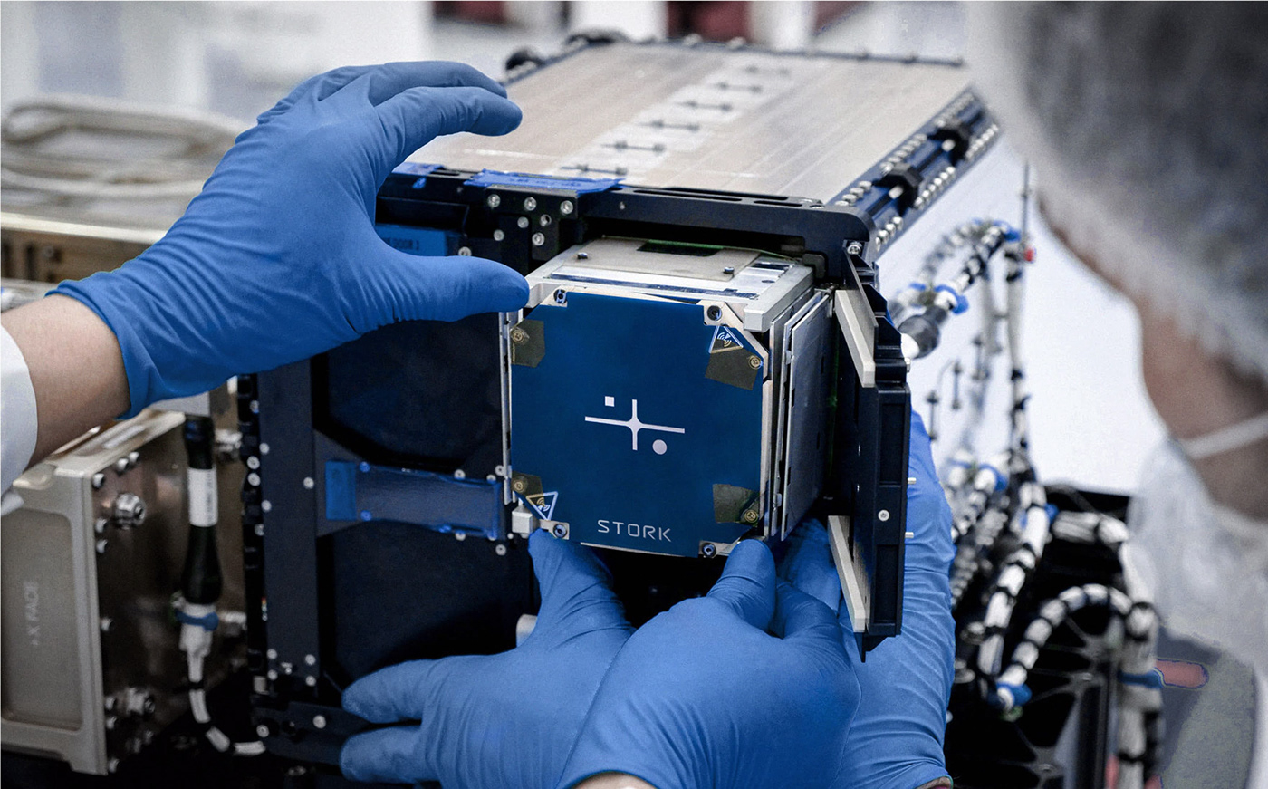
SATREV S.A. is the first Polish new technologies company specializing in the design and serial production of artificial satellites for international space agencies and other entities operating within the private and public sectors. SatRev also conducts research on other solutions related to space technology.
Scope of work :
‣ Market and target group analysis
‣ Logo design
‣ Brand visual strategy
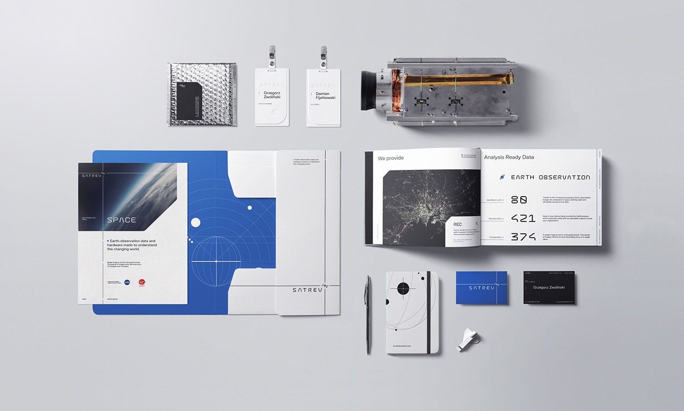
‣ Book of visual identification
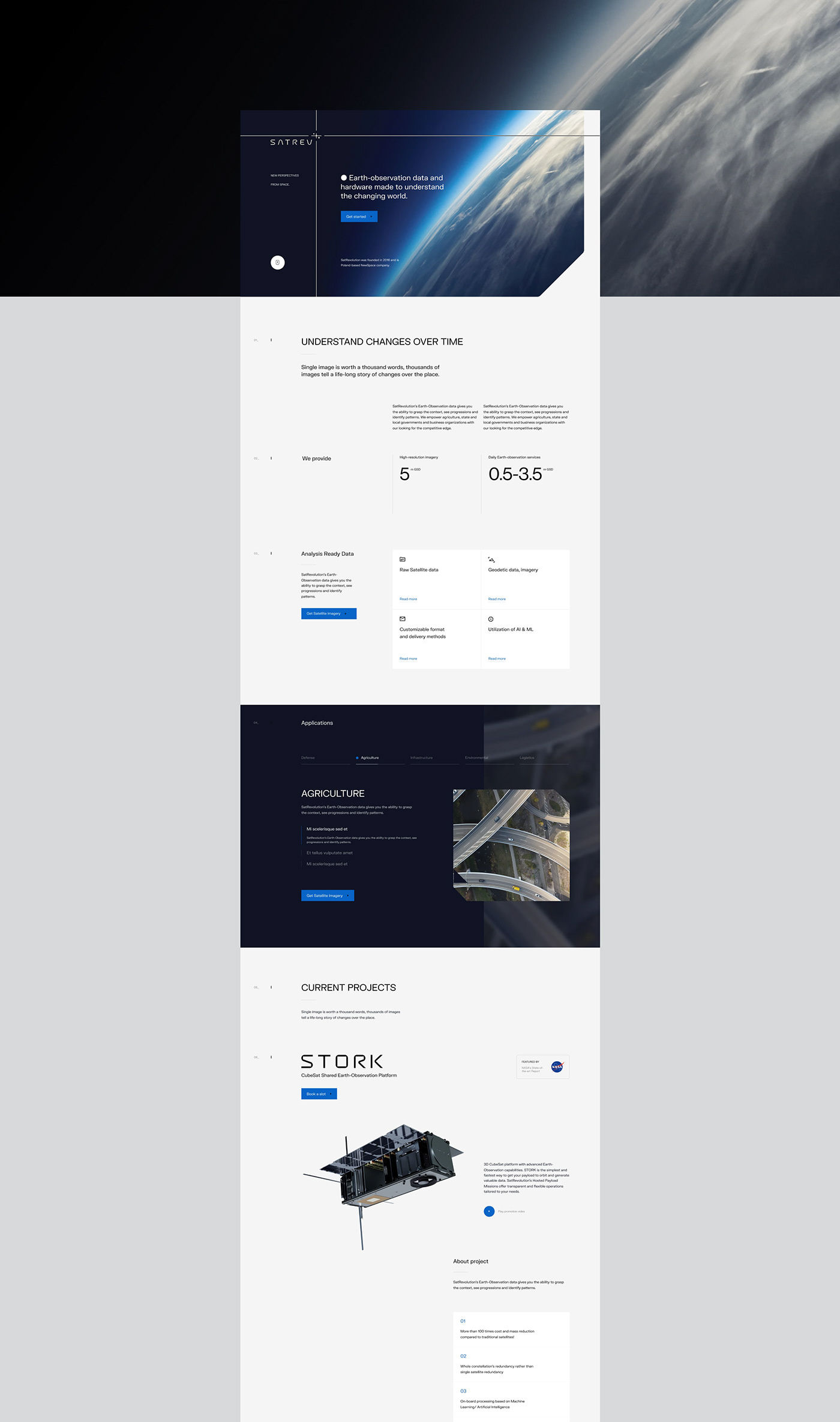
‣ Website design and development
‣ Animations
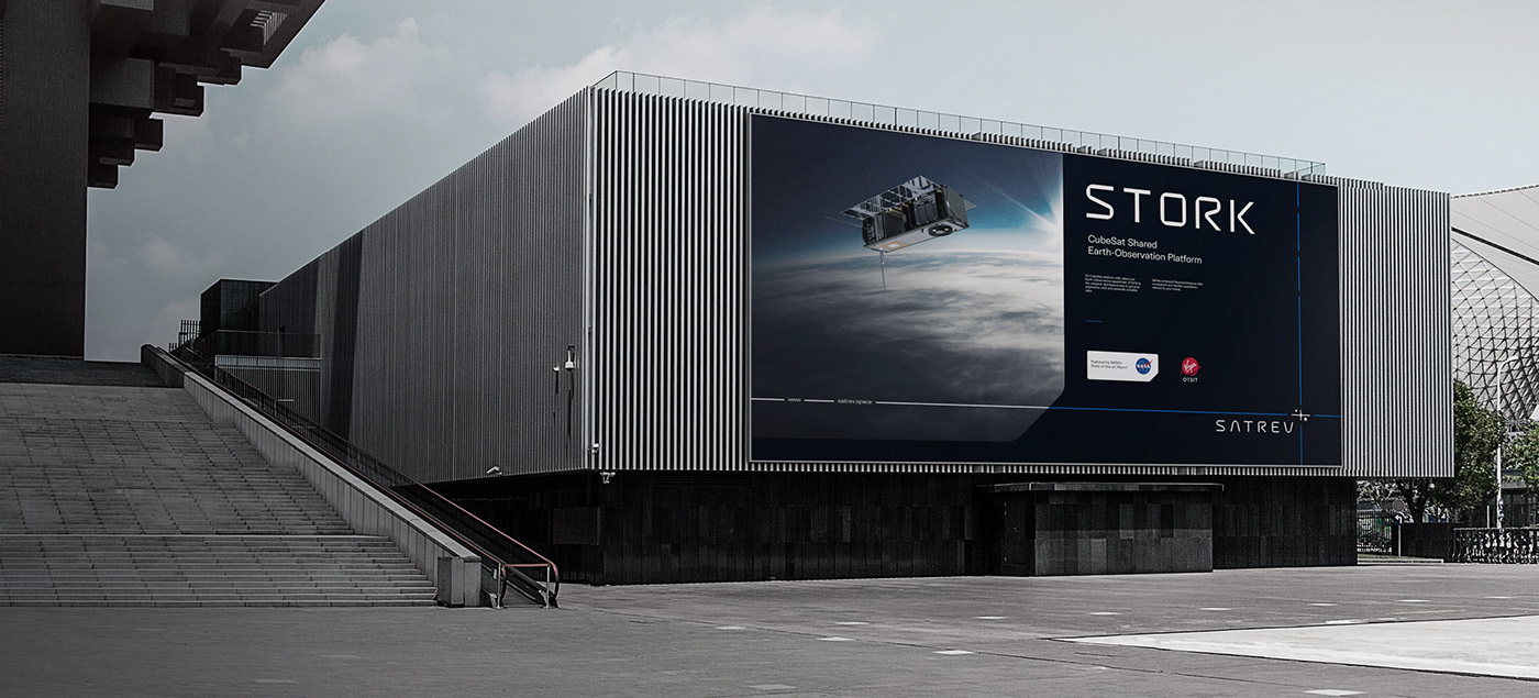
‣ Marketing materials
‣ Social media - graphic system
‣ Custom font
‣ Logo design
‣ Brand visual strategy
‣ Book of visual identification
‣ Website design and development
‣ Animations
‣ Marketing materials
‣ Social media - graphic system
‣ Custom font
Credits :
Mateusz Pałka - Creative director
Przemysław Zięba - Analysis, visual identification design, font design / implementation
Karol Socha - Webdesign & development
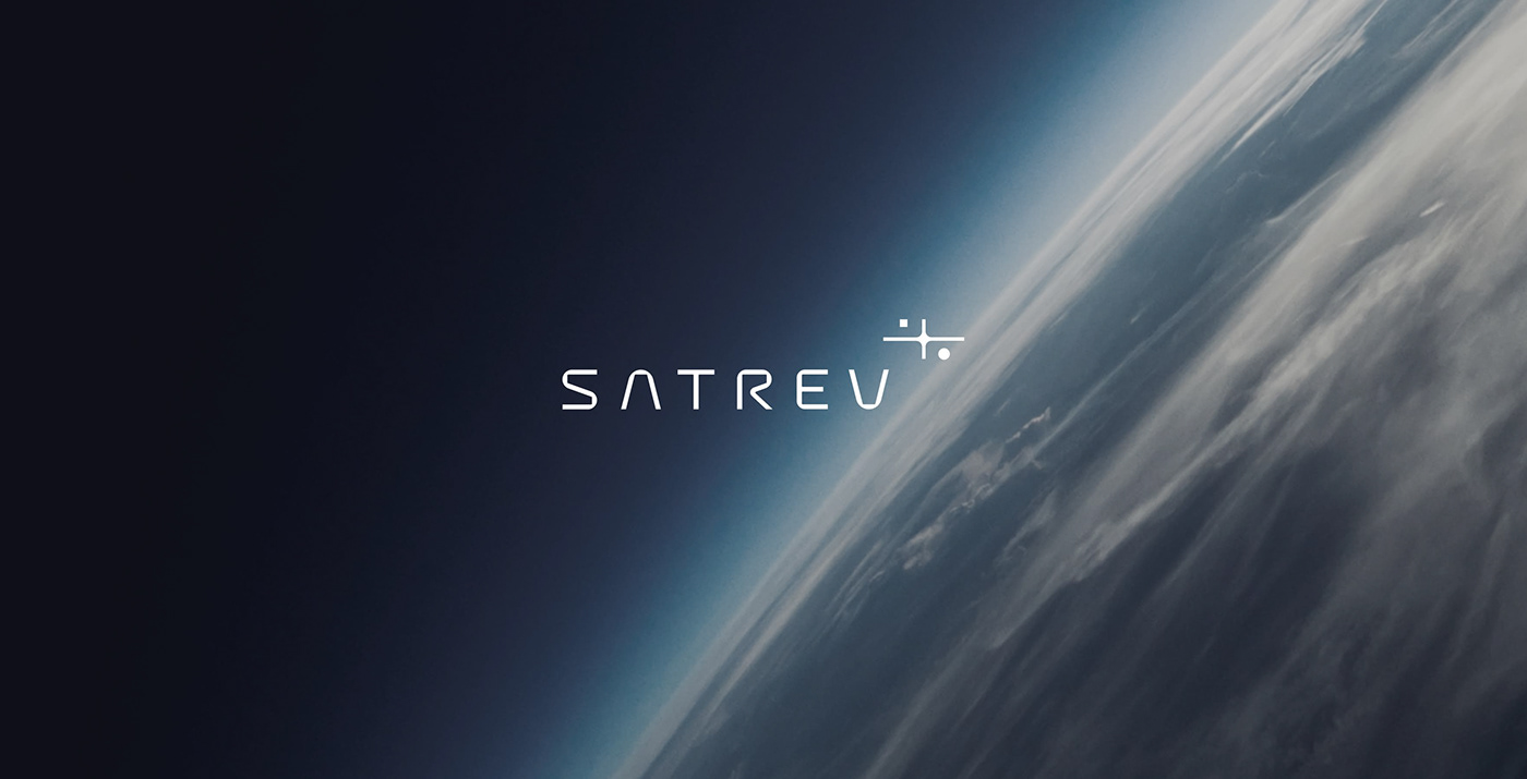
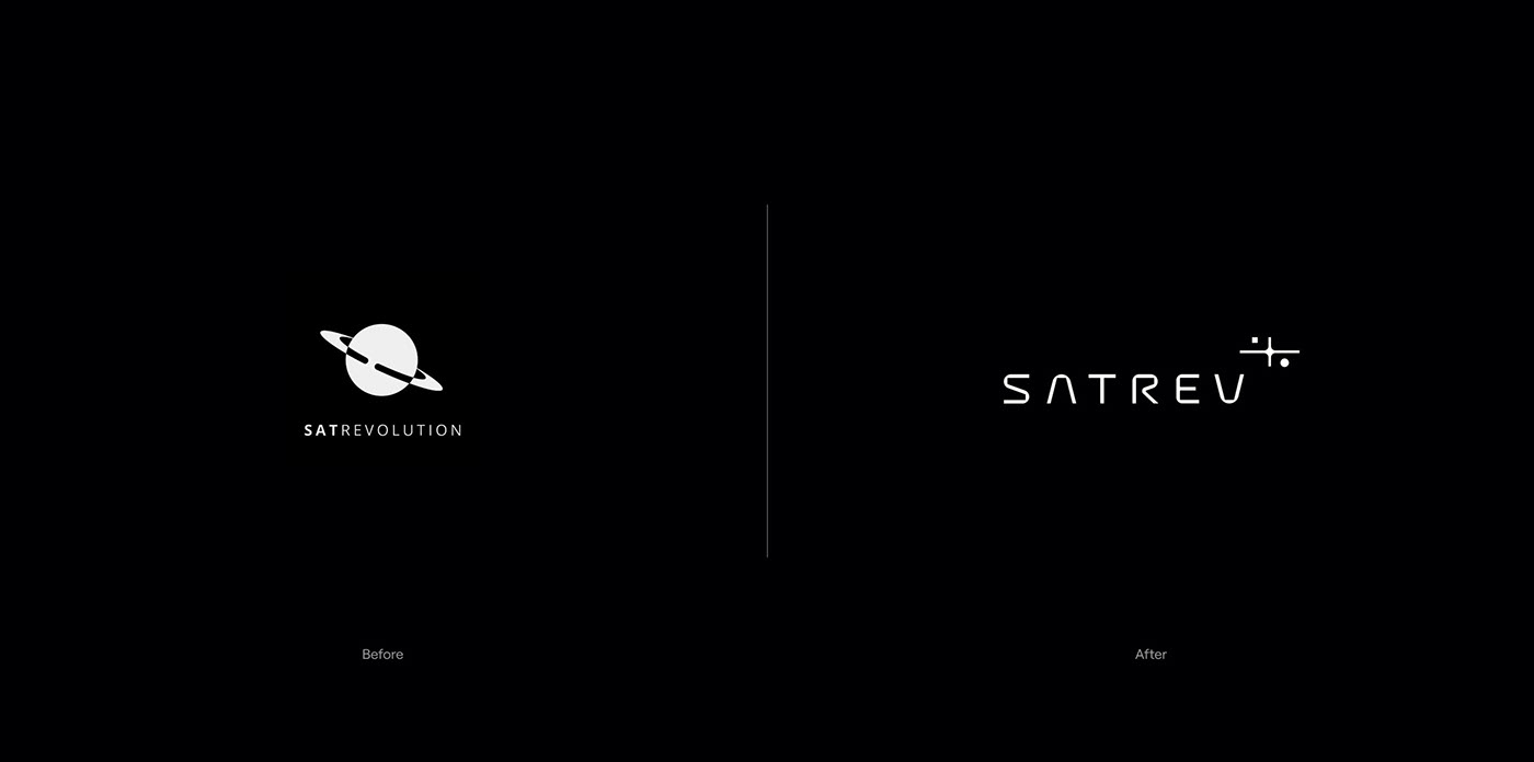
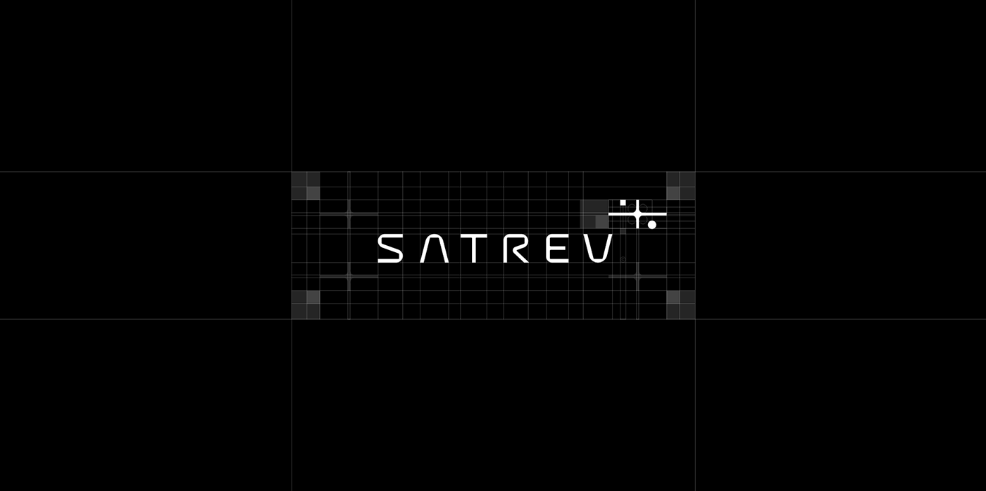
Logo form ✦
Upon a thorough analysis of the market we have decided to shun planet shapes that competitors commonly use in visual identifications. We have decided to feature original lettering in the logotype, so that it highlights the technological aspect of the brand. The symbol is based on a star motif that conveys a wider, more exhaustive meaning (wisdom, a guide, aim).
The placement of the symbol in relation to the logotype is not coincidental either. Its position increases the dynamic of the whole sign while the direction suggests growth (space flight).
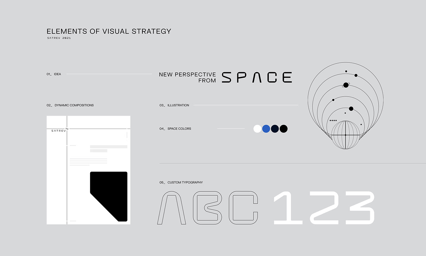


Space-based system ⍈
We have created a composition building system with a dynamically spaced brand logo at its core. A larger version of the symbol was enhanced by lines that symbolize the satellite's movement in space. They also refer to the performed measurements and precise readings.
The brand's new slogan, "NEW PERSPECTIVES FROM SPACE" is supposed to go beyond the simple verbal reflection of the visual identification system. Its ambiguity is aimed at communicating to the target group (investment industry companies) that the SatRev brand provides new growth perspectives.


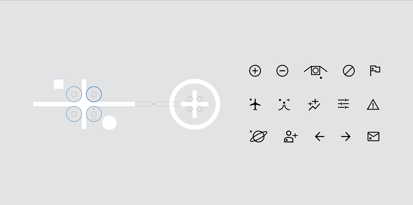
Original typeface ©
We created a mono font for the purposes of identification. The typeface is used in the brand's logotype and mission names.
The monospaced font makes it easier to use it on the products. The technical nature and base shapes draw from the form of solar panels found on satellites' wings.