


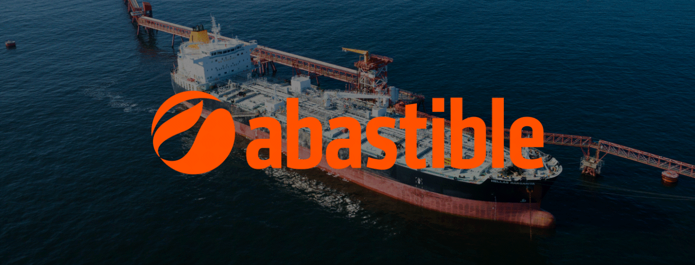
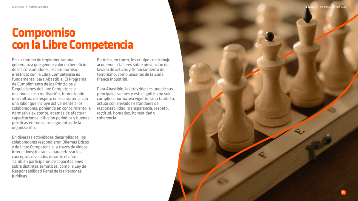
Abastible.
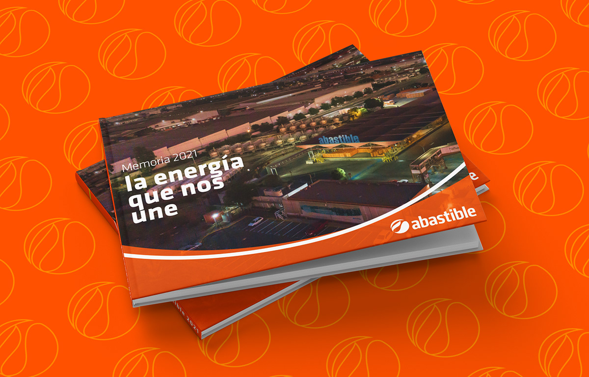
La energía que nos une.
¿Cuál era la necesidad?
Una memoria es algo desafiante para cualquier empresa, no solo por los balances
financieros que deben presentar, sino porque en ese documento queda en manifiesto todo lo que hace una compañía en un año. Y si es una compañía corporativa de primera necesidad, las problemáticas país, la escala del negocio y hasta la política hacen que las cosas más simples sean difíciles de ver. Por eso para Abastible el desafío no solo era grande por la complejidad de su realidad, sino que además hace años no lograban plasmarlo desde su esencia de manera consistente.
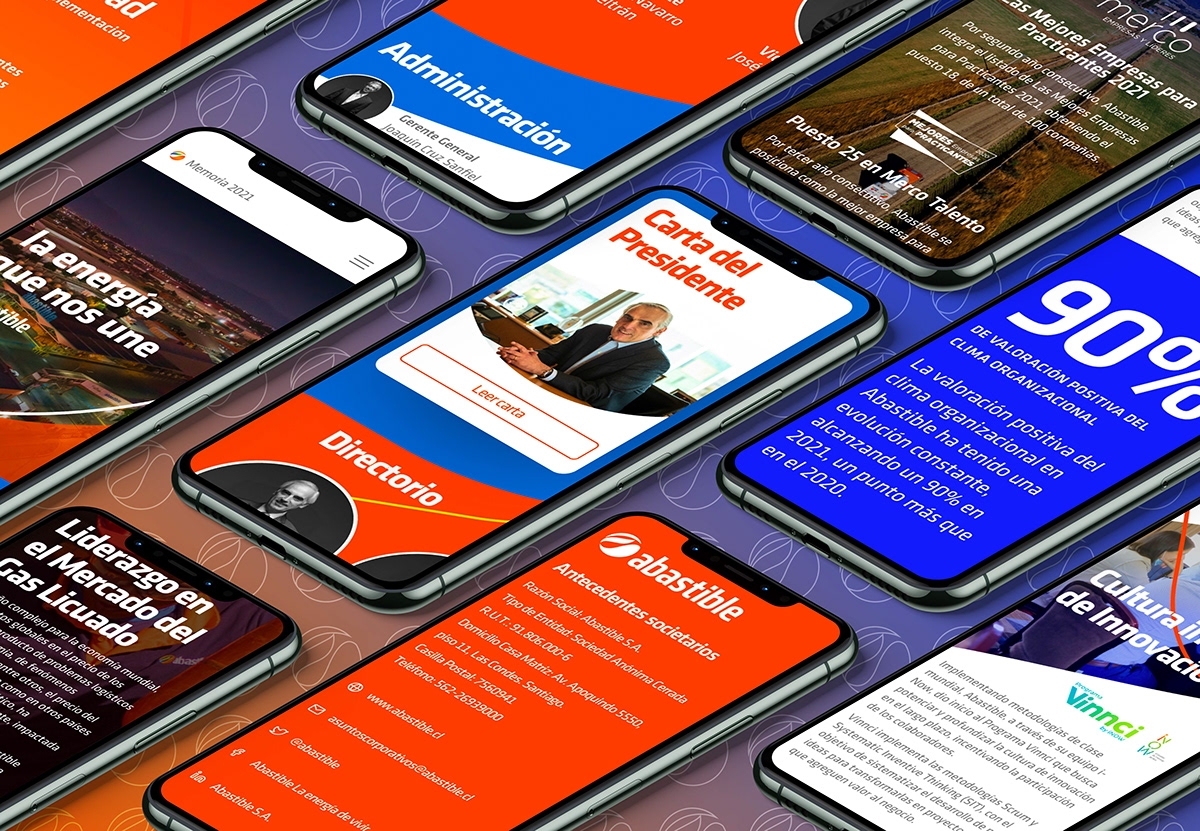
¿Qué hicimos?
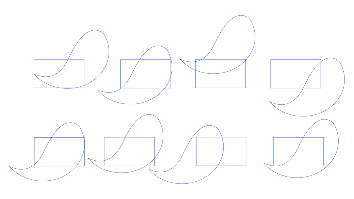
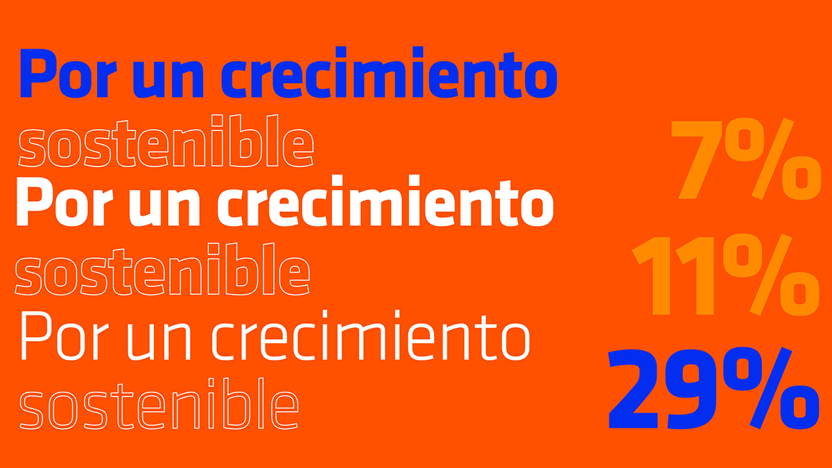
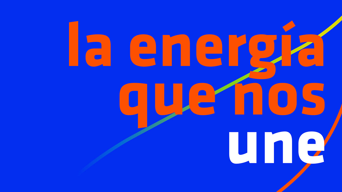
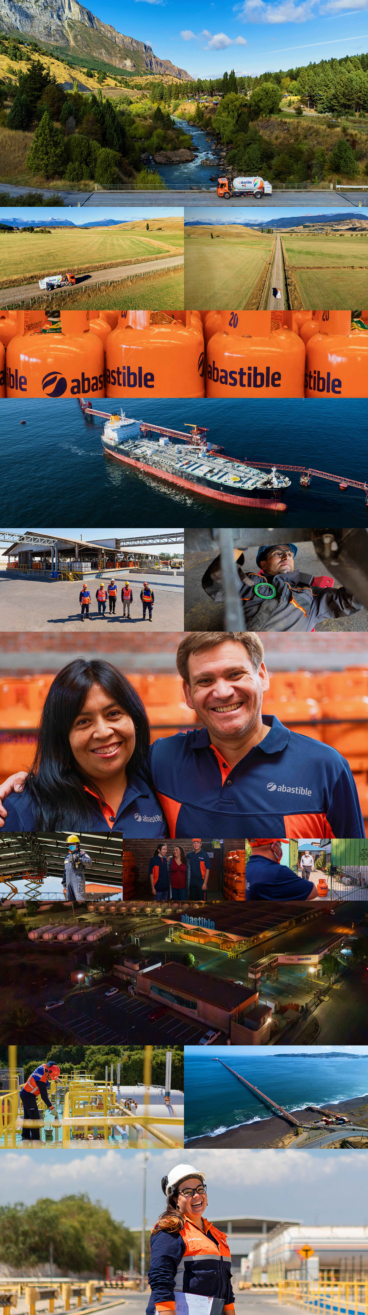
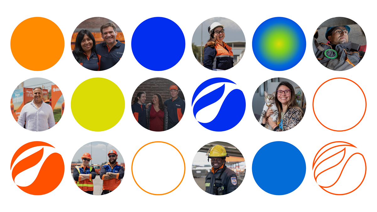
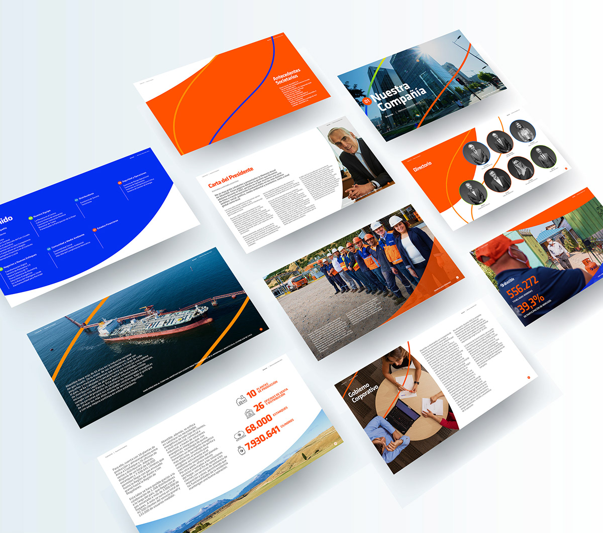
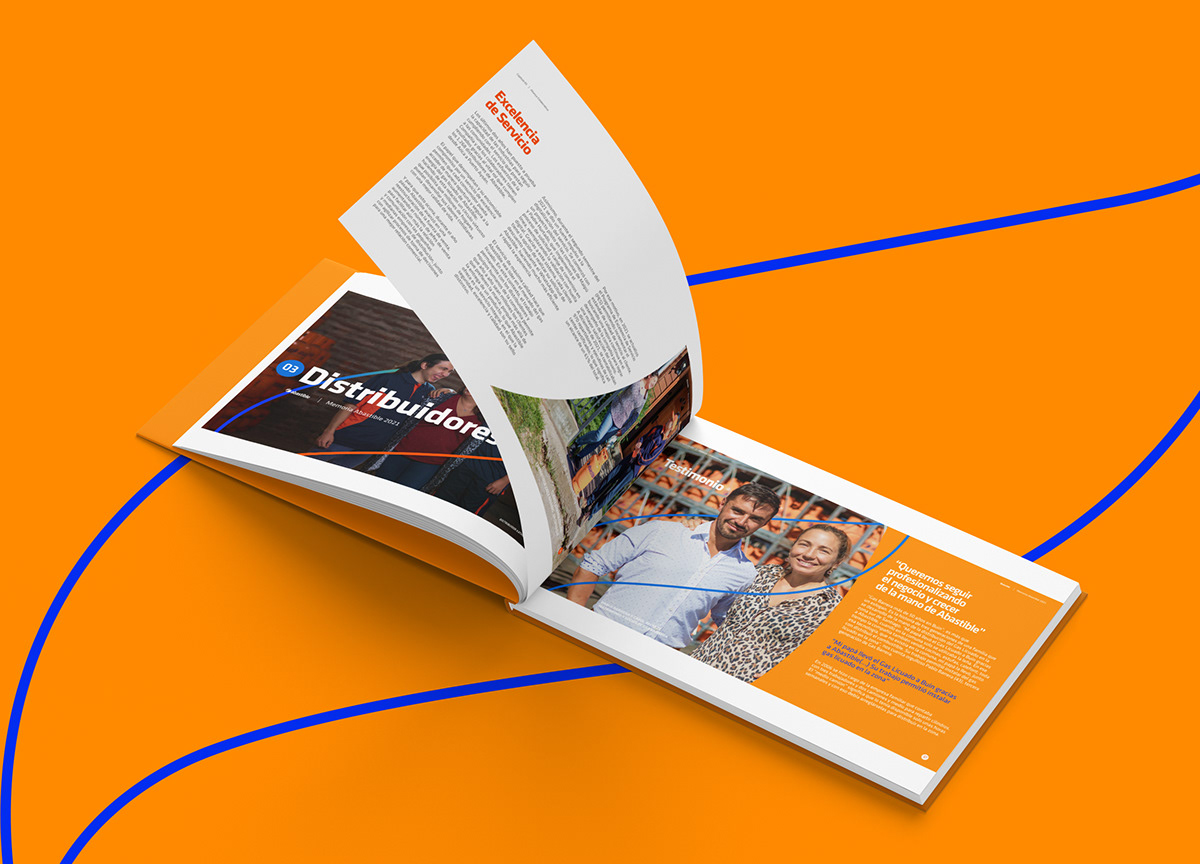
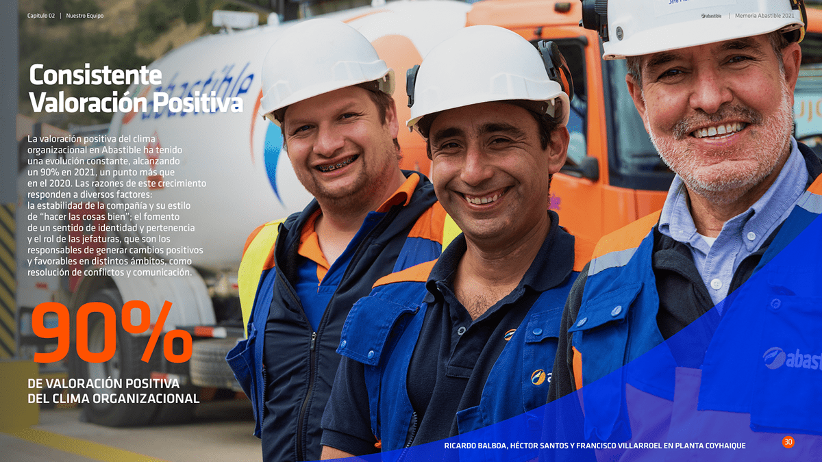
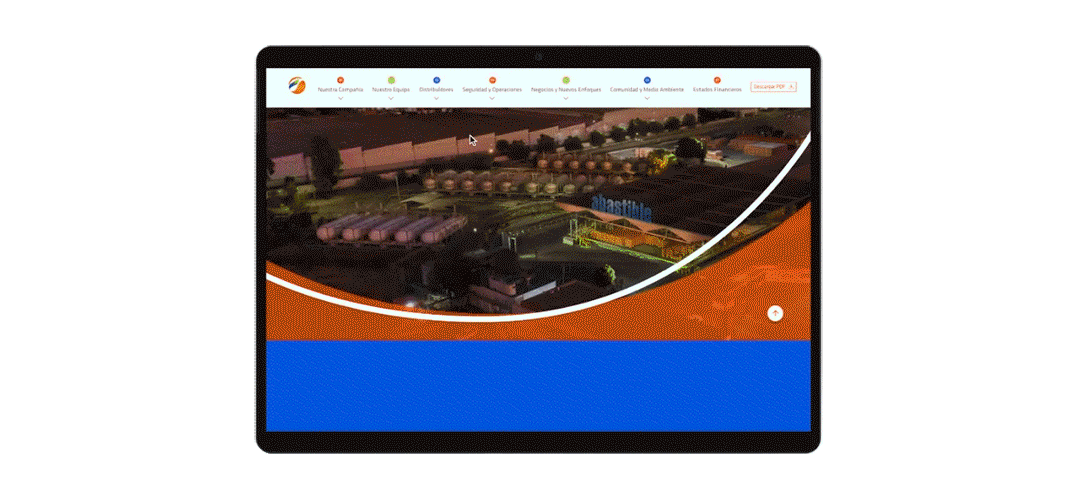
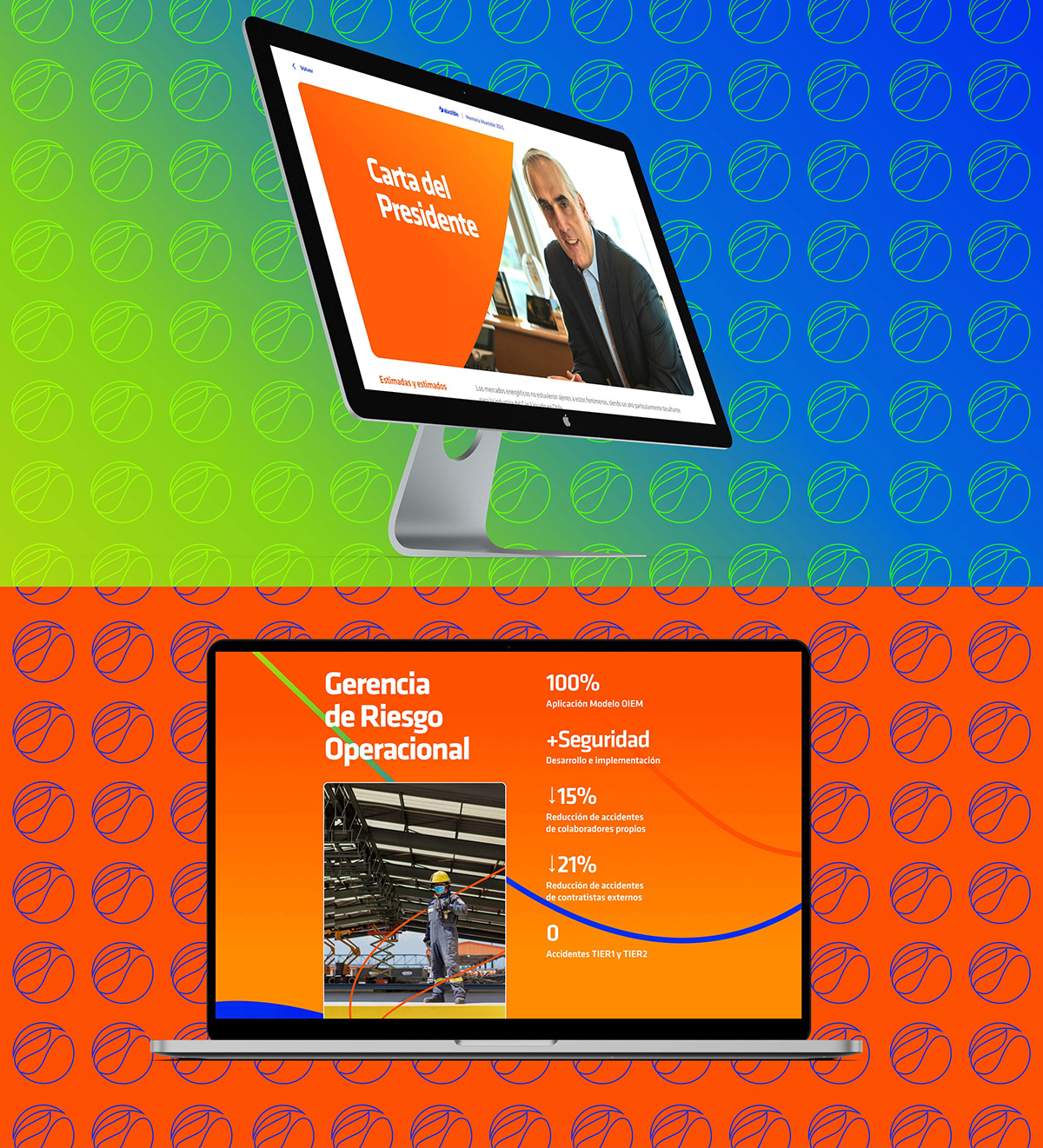
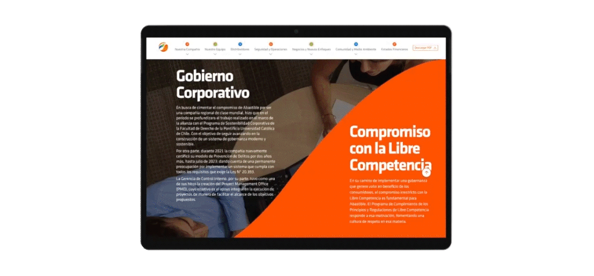
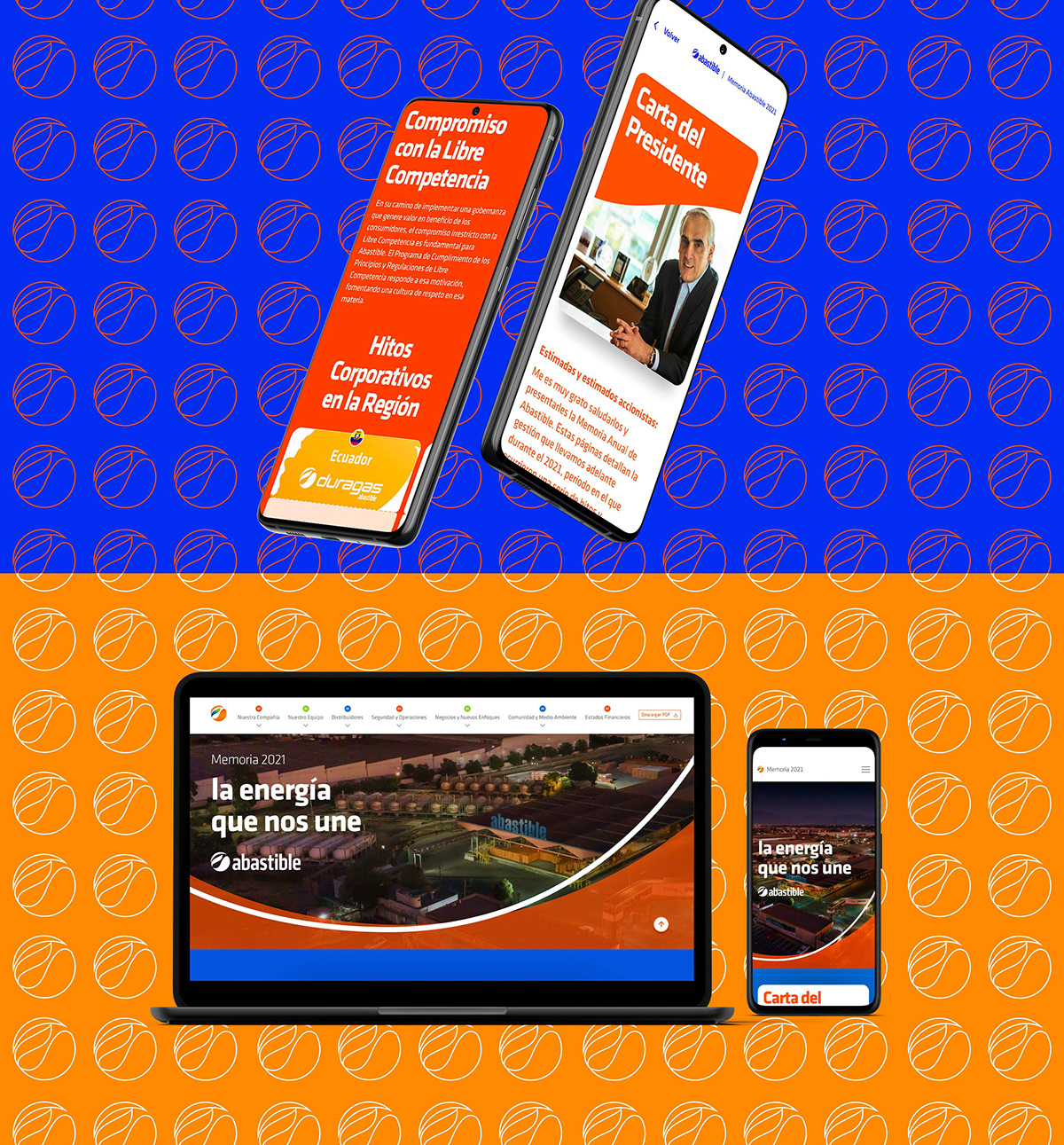
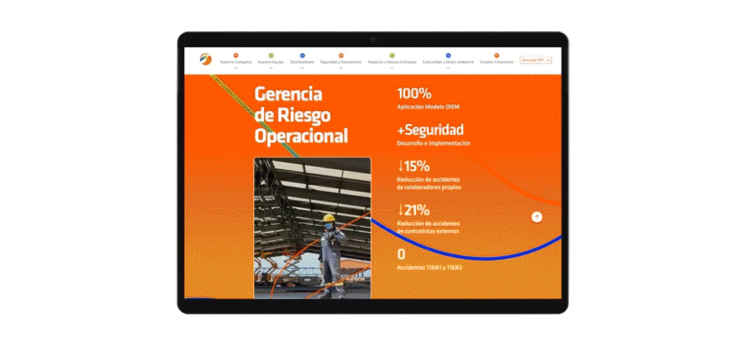
Al ser un documento corporativo clave, queríamos que se sintiera Abastible, pero de una manera que no se había mostrado antes. Para eso creamos un concepto derivado de su claim institucional: “La energía que nos une”, que nos permitiría humanizar un poco más la compañía y darle valor a las personas. A partir de esto, se hicieron fotografías, un diseño que le diera sentido desde lo visual y el completo desarrollo de la editorial y una versión web que le daba una dimensión digital a la memoria completamente diferente.
¿Cuáles fueron los resultados?
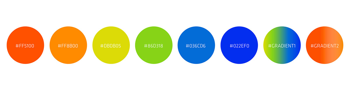
Un branding renovado, fresco, con un concepto que le da un nuevo propósito a la marca volcada hacia las personas y la energía humana. Un sistema visual diseñado para unir a cada uno de los que participan dentro y fuera de Abastible. Y una memoria física y digital que marca un cambio radical en lo que se venía haciendo en años anteriores sin desconectarse de su esencia.
#branding #visualsystem #claim #editorial #web #uxui
----
Abastible. Annual Report 2021.
What was the need?
A report is something challenging for any company, not only because of the balance sheets that they must present, but because in that document it is in manifest everything a company does in a year. And if it is a company corporative of first necessity, the problematic country, the scale of the business and even politics make the simplest things hard to see. That's why for Abastible the challenge was not only great due to the complexity of its reality, but also In addition, years ago they could not capture it from its essence in a consistent manner.
A report is something challenging for any company, not only because of the balance sheets that they must present, but because in that document it is in manifest everything a company does in a year. And if it is a company corporative of first necessity, the problematic country, the scale of the business and even politics make the simplest things hard to see. That's why for Abastible the challenge was not only great due to the complexity of its reality, but also In addition, years ago they could not capture it from its essence in a consistent manner.
We did?
Being a key corporate document, we wanted it to feel Abastible, but a way that had not been shown before. For that we created a concept derived from its institutional claim: "The energy that unites us", which would allow us
humanize the company a little more and give value to people. Starting from this, photographs were taken, a design that gave it meaning from the visual and the complete development of the editorial and a web version that gave a digital dimension to the completely different memory.
What was the results?
A renewed, fresh branding, with a concept that gives a new purpose to the brand dedicated to people and human energy. A visual system designed to unite each of those who participate inside and outside of Abastible. And one
physical and digital memory that marks a radical change in what was being done in previous years without disconnecting from its essence.
physical and digital memory that marks a radical change in what was being done in previous years without disconnecting from its essence.
#branding #visualsystem #claim #editorial #web #uxui


Client: Abastible
Creativity: FUEGO Company
Content: Abastible & FUEGO Company
Support Design & Motion: Nordanth Muñoz & Lucía Sánchez Vilar
UI/UX: Lucía Sánchez Vilar
Web Developer: Miguel Ayala
2022


