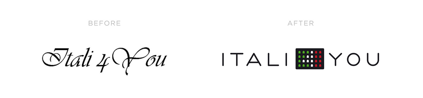
Logo redesign for Itali4you, which sells and rents real estate in Italy, as well as organizes excursions and various events for Russian citizens.
The old logo did not reflect the activities of the company, looked rather archaic and was hard to read. The new logo looks modern, it transforms well for any type of communication, the brand symbol can be used separately from the text block.
The main symbol is the building, the windows of which are painted in the Italian flag. The white windows in the center form number 4.