


TASK 4 - EVENT PROGRAM
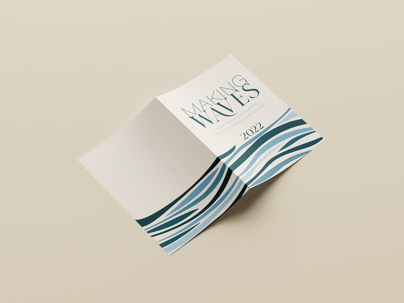
I was interested in an ocean themed conference that encapsulated a different point of view from several different people. I thought it would be an interesting theme where I could play with shapes and type. I chose the name Making Waves for the conference as I already had the perfect typeface in mind to create the wave-like effect I was after. Acumin Pro Wide Thin, was combined with my perfect typeface Brand, to create hierarchy and contrast in this design. I used positive tracking and a smaller font for the word Making, and a larger scaled Waves so that they would sit at exactly the same length, creating a slight hierarchy in the title. Again, I coupled these typefaces within the poster, but only using Brand as a pointer to the interesting names these speakers had been given (i.e. The Wildlife Warrior). I really liked the way Acumin Pro Wide Thin looked in all capitals, so used this for the speakers names to indicate the hierarchical difference between the lowercase italic occupations and the body copy.
References
https://en.wikipedia.org/wiki/Jorge_Cervera_Hauser https://earth.org/eo-photographers/jorge-cervera-hauser/ https://www.linkedin.com/in/jchauser/?originalSubdomain=ca https://www.deepseaguardians.org/home/the-crew https://www.dailymail.co.uk/news/article-7352203/The-Shark-Whisperer-Diver-calms-giant-predator-touch-hand.html
