
Overview
For this project, I explored many type variations of typography letters to determine which letter form had the stronger visual relationship when pairing them together. In the final design for the final pairing letter composition, I chose the letters that were visually appealing for the typeface.
Composition Exploration:
During the exploration phase of the project. My two typeface choices were Adobe Jenson Pro Semibold- Italic and Proxima Nova Condensed- Light. While both were good options I ended up choosing Adobe Jenson Pro Semibold- Italic.
Semi-Final Compositions
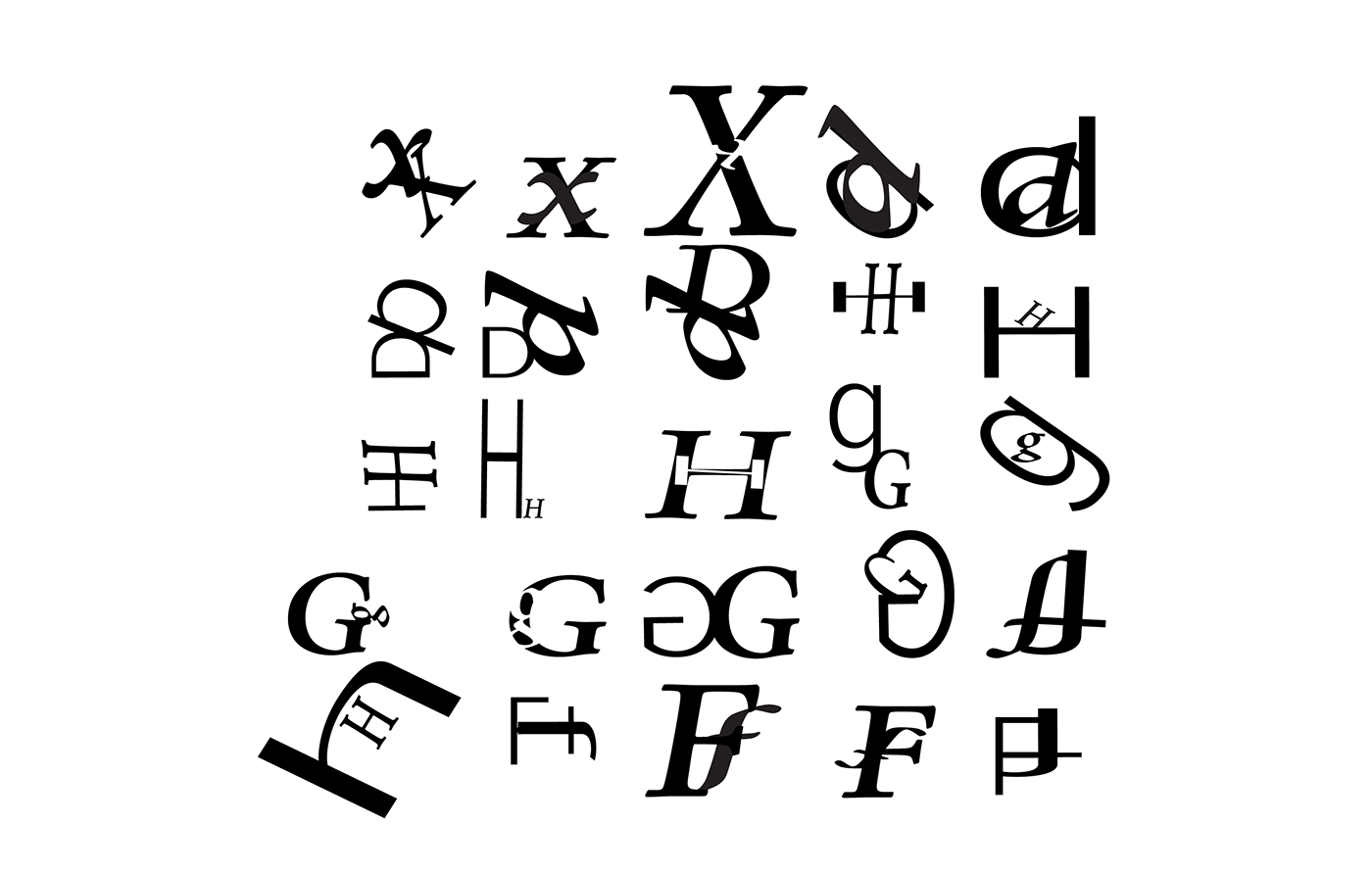
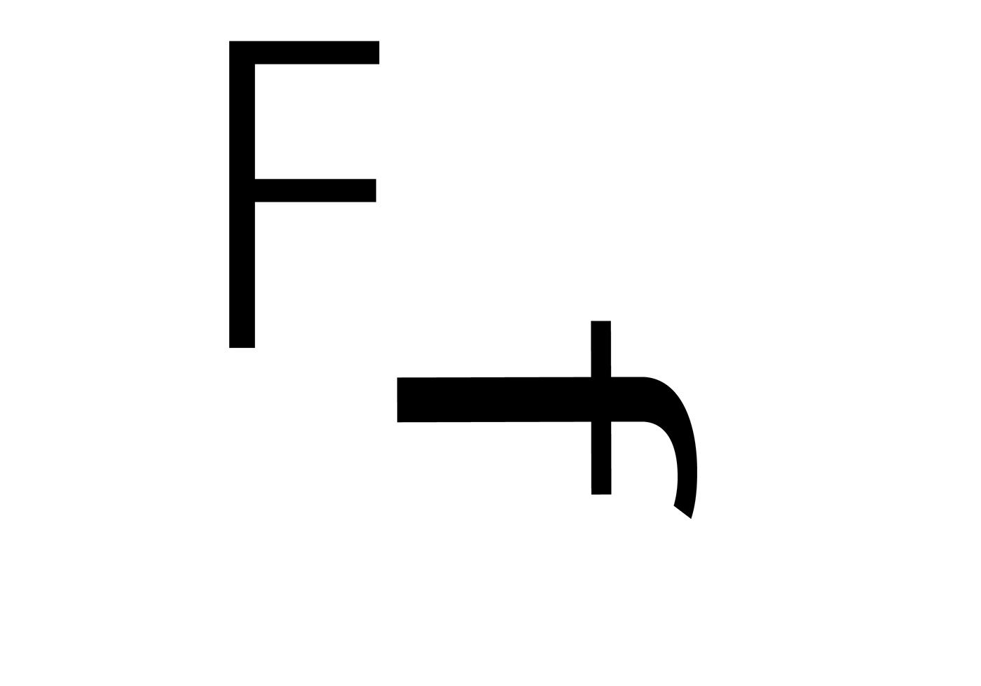
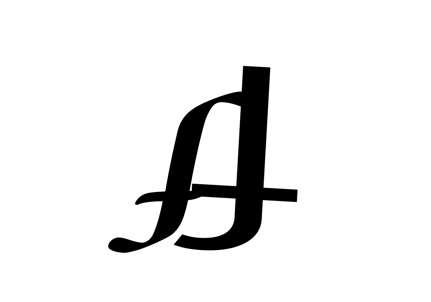
The letters were, X, G, F, d, and H because they show the most contrast when it comes to letters and their forms.


Final 5 Compositions
Consists of lowercase and uppercase letters such as old-style serif"g" and an uppercase "G". These letterforms are G, X, D, H, and F using the typeface AdobeJensen Pro in the style semibold that is italicized. I chose these because They are visually appealing and have the lowercase"g" hidden giving a figure/ground relationship that catches the eye.


