


The Bifolks
— Ice Cream Oddness
— Ice Cream Oddness
Graphic design
Experimental
Copywriting
Typography
Poster
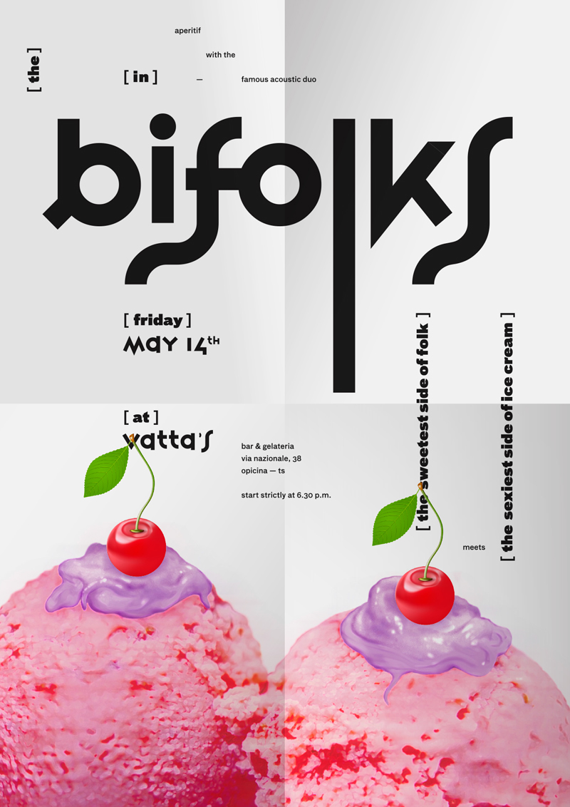
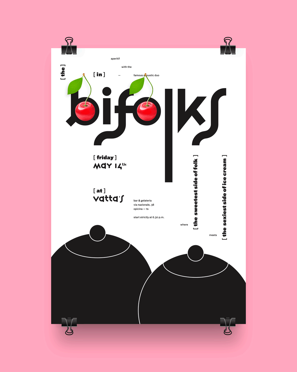
The Bifolks are a folk-country-pop acoustic duo, playing mostly 50’- 60’- 70’ tunes re-arranged for two voices and two guitars. Covering the great classics as well as some valued tunes, it’s just about the music you’d like to listen while drinking a good beer with your beloved friends in a pub. Well, on may 2010 they held a concert not in a pub, but in an ice-cream shop and there came up the idea to create a stunning and kinda shocking promotional poster to promote the gig. Inspired by the strong ironic nature of the band I designed a clean white poster, institutional and polite by its layout but at last deliberately bizarre by the imaginary: two huge pink ice-cream balls stand imposingly on the bottom of the white paper, and two red cherries are placed on the top of each one. Sweetness, but also oddness in this image: the two ice cream balls with the cherries looks just like two big boobs, creating an humorous connection between the freaky style of the Bifolks and the ice-cream shop atmosphere where the concert had place. Two ice-cream boobs, pretty representative of the duo’s discreet madness.
The 'mad' structure
of the poster:


Credits:
Art direction → Aleš Brce
Graphic design → Aleš Brce


