


THE STORY
Two friends and stylists, Deanna Graham and Ashley Martinez had an idea to open a different kind of hair salon in historic downtown Frederick, MD. Their vision: to create a light-filled boutique studio where like-minded stylist entrepreneurs work in a collaborative space, creating hair and makeup styles for the modern woman. Like a traditional artist’s studio, the duo envisioned an environment where creative talent could flourish. Taking a cue from the initial letters of each of their names, Dash Hair Studio was born.
With picturesque downtown Frederick as their backdrop, Deanna and Ashley also wanted the Dash brand to convey the walkable neighborhood’s unique sense of place: a combination of historic charm and modern polish. At the same time, they sought to create an intimate respite from the outside world. A place where clients could relax with an herbal tea or glass of wine while feeling energized by the creativity surrounding them. As a new business to this competitive industry, they needed to establish a brand that set them apart while also telling their unique story. They turned to Lisa Sirbaugh Creative’s branding services to help them find the way.
THE SOLUTION
Our brand discovery phase was the first step to uncover what Deanna and Ashley wanted to convey with their new identity. This process includes a deep dive to identify and understand target audience, desired messaging, feelings and associations, among other considerations. The brand identity suite we created was based on four brand attributes that emerged from our research: refined, modern, feminine and inviting. From there we developed a luxurious color palette of gray and black, enlivened by metallic gold.
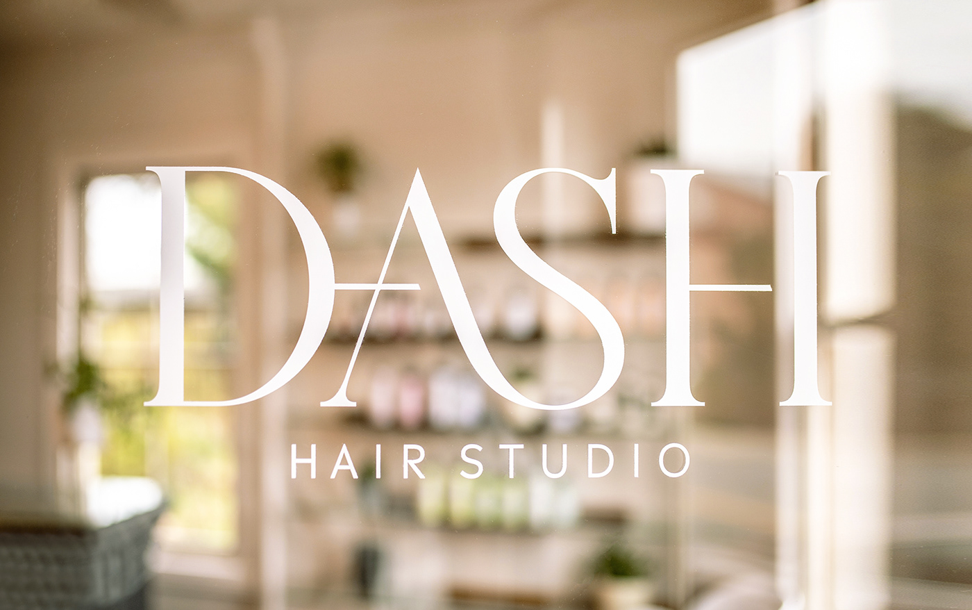
The visual identity workmark features a modern riff on a classic serif typeface. Graphic “dashes” are offset as the letterforms connect and flow like a tendril of hair—and like the friendship and creativity that flow between stylists. Rendered in metallic gold, the logo design reflects a refined, feminine vibe. We also considered how the identity is conveyed in the physical environment, as well as on packaging, brand collateral, and signage design. The secondary mark that was created for social media icons and other small usages is an abbreviated play on the logotype: the letter D rendered in a series of graphic dashes. The identity system extends further with a brand pattern featuring four intersecting D’s that's reminiscent of a classic fleur-de-lis with a fresh, energetic modernism—a nod to the collaborative culture within the Dash studio.
The end result is a brand identity system that makes a statement without overwhelming the creative activity in the space. After all, the most effective way to communicate your brand isn’t necessarily about shouting. Sometimes, all you need is a little restraint and subtlety—dare we say a dash?


