
A comprehensive, multi-phase group project (Elle Floyd, Blake Wiedenmeyer, Jaden Stiff) that required an understanding of audience and the competitive landscape, brand and identity attributes were visualized in multiple design assets and implemented in a range of touchpoints. Here is the Dropmark link for the process and inspiration for this project.


Our main audience would be vegan/Vegetarian/ lactose intolerant people that can't have regular milk and want other milk besides unsweetened or sweetened almond milk. Healthy food can be fun as well. We wanted to put in the Experimenter as well to show not just healthy people can have it too, anybody can try it!

Utterless is a quirky, casual, natural product that everybody will love; With the audiences being vegan or health issues to people who just want to experiment, it is for all!


For our wordmark, It was hard to figure out what we wanted to do with the dash line, did we want to go with a normal dash, or an almond, etc. Finding the font is always the hard part but we went with the more in your face type.

With the contact card, we wanted to keep our pattern consistent making the U more prominent and in your face.

Our digital stationary is pretty cool! We kept it simple and just put our mark on the end with the fun different flavors we have available. Also showing it in black and white shows that it can work in different ways.

With the thank you cards, we want the the theme to be the same as our business cards to keep it consistent with our brand.

With our print advertisement we wanted to be big and bold! so having our awesome statement on one side with our pattern then slowly fading on the right to give the information needed.

Here is the large billboard; It had to be photographic heavy, so we wanted to go the funny direction. We wanted to have a funny dad joke with a funny picture because humor is the way to the heart.
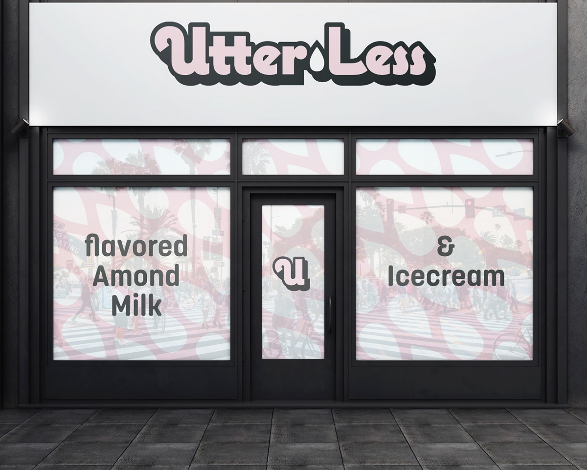
With our storefront we wanted to have a cover with the pattern that we made to make the mood of the store. With the "banner" keeping it simple is what our brand is about, so we wanted to represent that.

mobile app and its screens shown here, keeping with the simplistic theme, showing flavors, size, how many, reviews, everything you would see in an app.

Extra mock ups: wanted to show our to-go bags; small and large would look the same with the Utterless tag with information on the back.

Extra mock-ups: Stickers that would go on the to-go bags for pick-up and take-out or kids who want free stickers!


Extra Mock-ups: Wanted to show extra social media or poster advertisements for the almond milk ice cream! I know this isn't the main product, but when people go to the store they can get ice cream there or to-go as well, so showing we are expanding is huge!


