Interactive Dashboard (Tableau) Exploring Price of Airbnb Rentals across 32 Cities
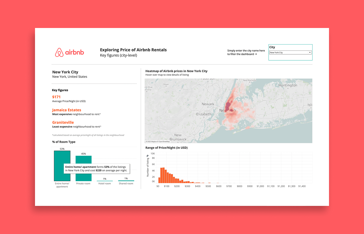
In this little project, I wanted to explore and compare the price information of Airbnb listings using a simple and interactive dashboard. The 32 cities featured were selected based on availability of data and to ensure mixed coverage of different countries. There are 2 parts to the dashboard: the first shows a bird's-eye view of the 32 cities and how they fare (in terms of average price/night and room type), while the second allows readers to filter for more granular details at a city-level.
Data is retrieved from Inside Airbnb (http://insideairbnb.com/), compiled by Inside Airbnb from the period of December 2021 to April 2022. The interactive Tableau dashboard can also be found here.