


I got a rough draft of an idea (pretty much pure text) from one of the co-owners of this northern Virginia t-shirt startup, and was permitted to deviate to my heart's content. I was given the latitude to be a bit edgy, and out of four comps, this is the one they picked. I was glad they did.


Dr. Scotti needed a website refresh, and thought it was a good time to adopt a logo for her at-home pet euthanasia business - prior to this decision, she had been using photographic imagery of sunsets and fading paths, and wanted to keep those themes. Unfortunately, we've needed to employ her services, and it made a world of difference...

The client here is a very smart and sober Washington, DC-based financial whiz (you can read and see him in places like Forbes and Fox Financial Report), and was after something that felt sophisticated, but that conveyed sureness in an era of fiscal uncertainty. I opted for a compass theme, pointing north-ish. (I tried true north, but it looked overconfident.)
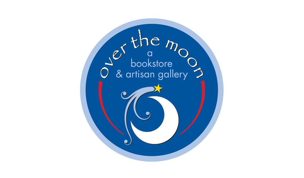
This small bookstore put up a shingle in a cozy yet affluent suburb of Charlottesville - they were after a logo which felt warm and whimsical, and were pleased with this offering. Their building is featured as the cover of this set of logos.

This Maryland telemarketing firm is no longer a going concern, but the direction I got from the owner (a Baltimore Orioles fan, ironically) was that the bird should be minimalistic, just a few lines. He liked this one, and it's still one of my favorites.

I don't know anything about gluten, but this lady's baking pretty much rocks the house. This small Charlottesville startup's name started as a different three word phrase (don't remember it now), so when I heard she was changing up but wanted to preserve the logo as much as possible, I was pleased that she kept her business name to three words. Whew.

The client (a Charlottesville e-entrepreneur) was hot on purple and green. All I can think of when a client lists those as their favorite colors is "the Joker." I moved her to a bluer green, and in fact spent most of my revision time (because she liked this design) experimenting with color options.


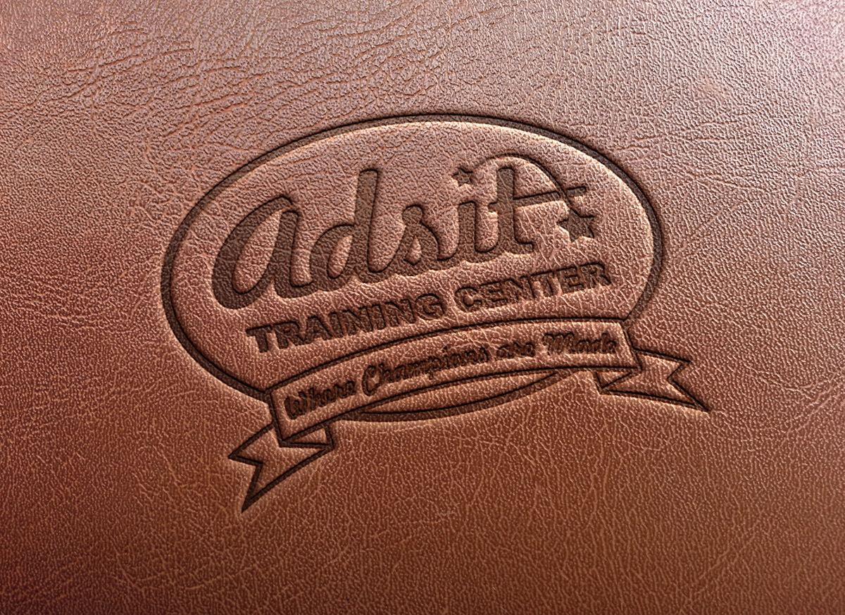
Somewhere between Charlottesville and Richmond, a woman named Billie Jo Adsit is helping young horseback riders rack up enough blue ribbons to choke... well, a horse, thankyouverymuch. Most people think "Adsit" must be short for something, or an acronym. I was very aware that I had to mix caps and lower case to not reinforce that idea. Anyway, she loves the logo and thinks it'll make a swell western belt buckle!

This was another client in northern Virginia who was after a minimalistic approach to an organic form - in this case, a body in motion. I did this I think around 2005 or so, and I think they're still using it.

Coming soon to a smartphone near you - I can't reveal too much about this app-in-development, but I was lucky enough to be able to help with the branding at the early stages. I won't give you any more hints than the logo already divulges...

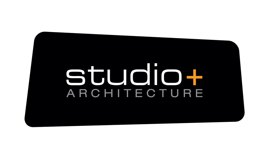
The president of this company isn't afraid of risks - after breaking away from the security of a larger firm, he built this company from the ground up, daring to use a plus sign in the business name. Based in Ft. Myers, Florida, they now have four offices in the U.S. that bear this logo.
This northern Virginia business advisor was looking for a logo that felt a bit abstract, but that conveyed individuals in a close-knit group. He liked this one...

This logo was designed for the easy-going-est of all clients - me. Whistle Corps LLC is the company my wife and I set up to organize our freelance efforts. The child depicted is inspired by my daughter, who is far more beautiful than her cartoony counterpart.
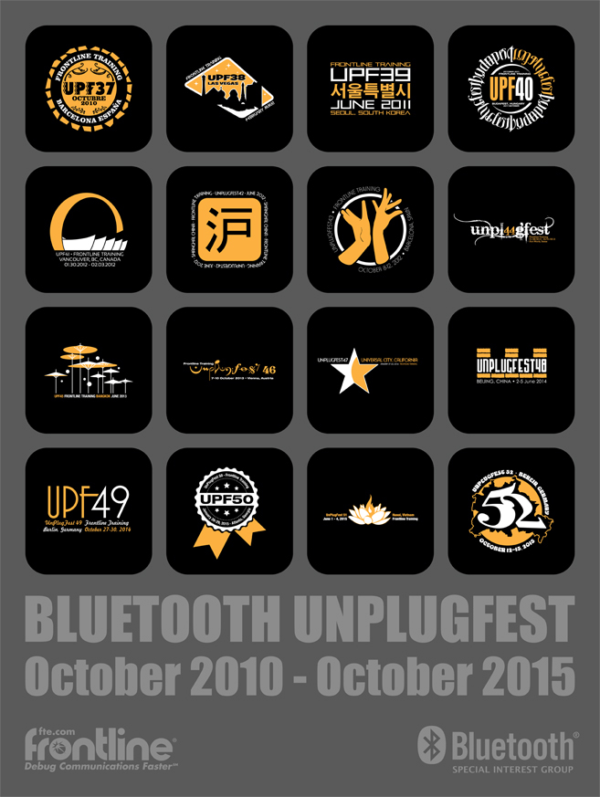
This is a poster marking five years of Frontline Test Equipment's participation in the Bluetooth Special Interest Group's testing events held three times every year (which gives me the opportunity to make at least three new logos a year). These logos appeared on our trade show materials and on the very popular and highly anticipated t-shirts we gave out at all of these events.

The Charlottesville business owner that helped us navigate our hound's fear issues asked me to redesign her logo. She actually liked her logo from a conceptual point of view, so I was asked to keep the idea of a building with dog bone columns, and having a Husky was non-negotiable. She liked the reboot, which now adorns a sign on her building that she never felt inspired to buy before. Score!

Super quick turnaround here with a minimal budget - this North Carolina e-startup was looking for something colorful, with a hint of ink. They're still in placeholder mode, but they were pleased with the product and the turnaround.


