PT
Sobre a Parizatto
Com o objetivo demonstrar segurança, confiabilidade e criatividade, a marca precisava de um símbolo inovador e forte.
Ao analisar os concorrentes, nota-se o uso extensivo do formato de casas, telhados e materiais de construção na criação do símbolo. Para fugir de tudo isso, o símbolo foi criado a partir da singularidade do nome Parizatto.
Além de ser um nome não muito frequente no Brasil, o mesmo possui duas letras T o que torna ainda mais único e belo.
A forma da letra T é muito recorrente em projetos de engenharia e arquitetura. Pode ser visto em vigas, colunas e perfis, este formato possibilita grande resistência nas estruturas.
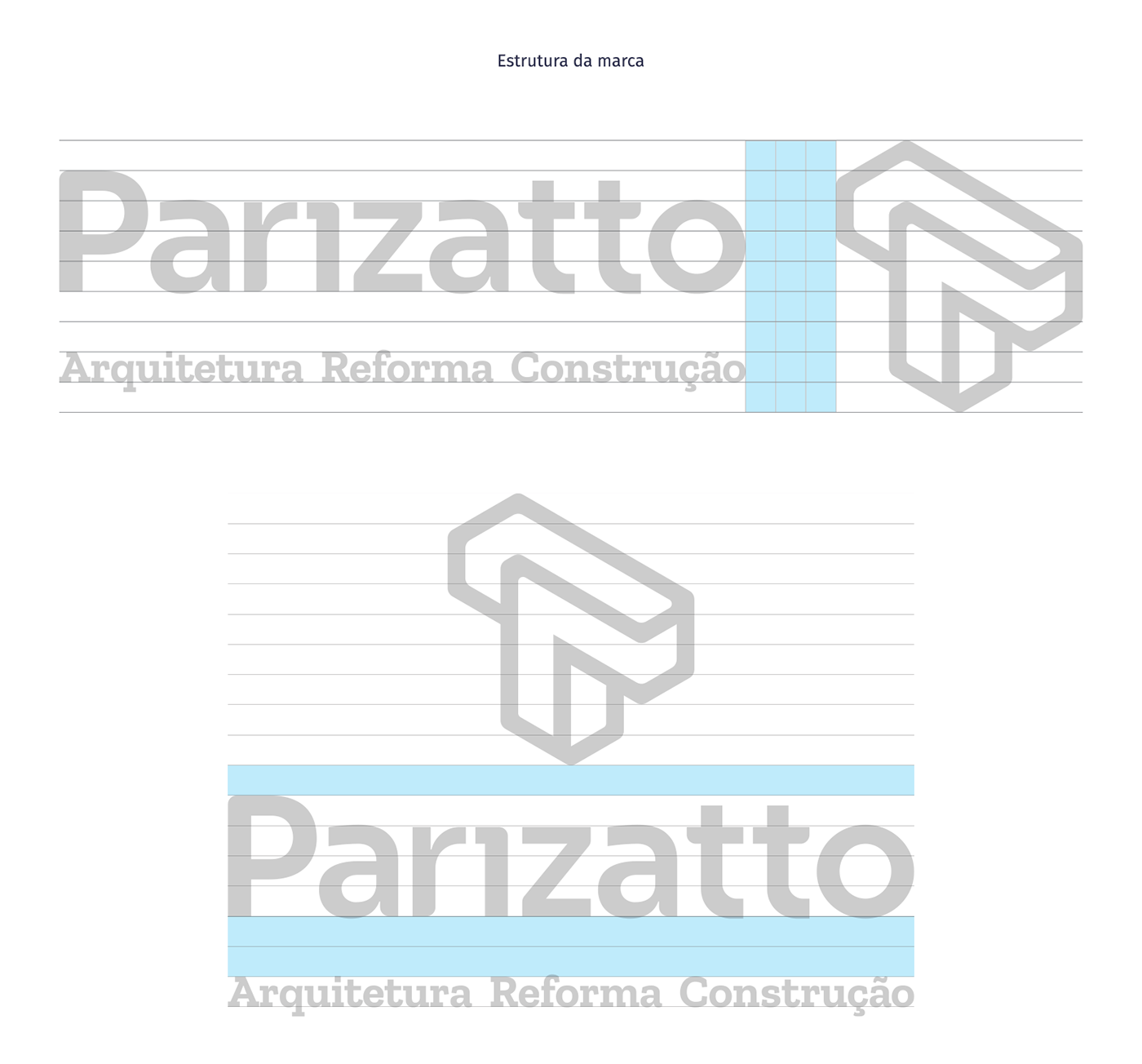
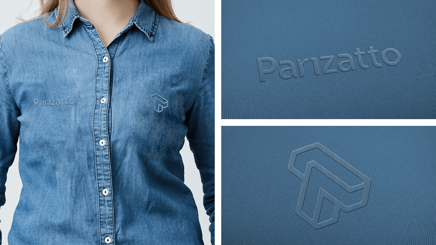
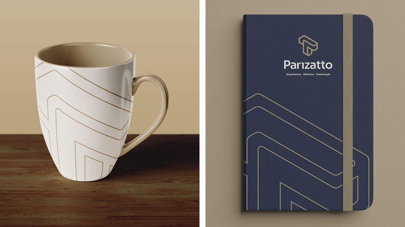
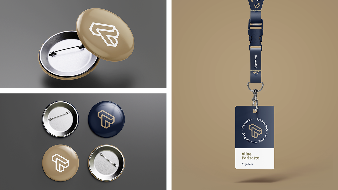
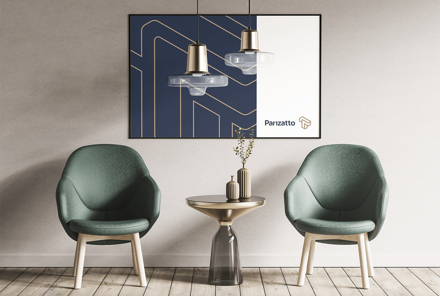
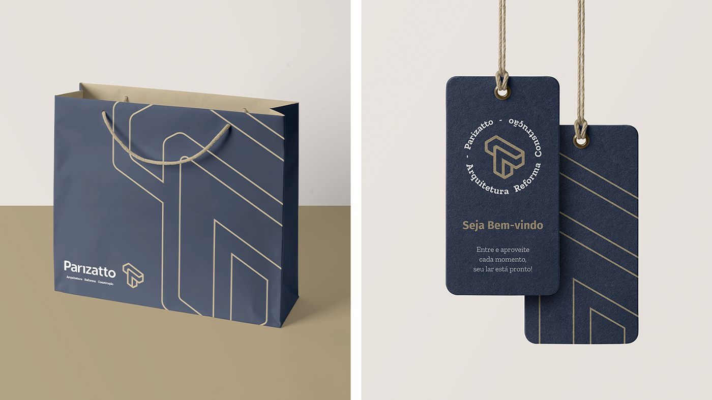
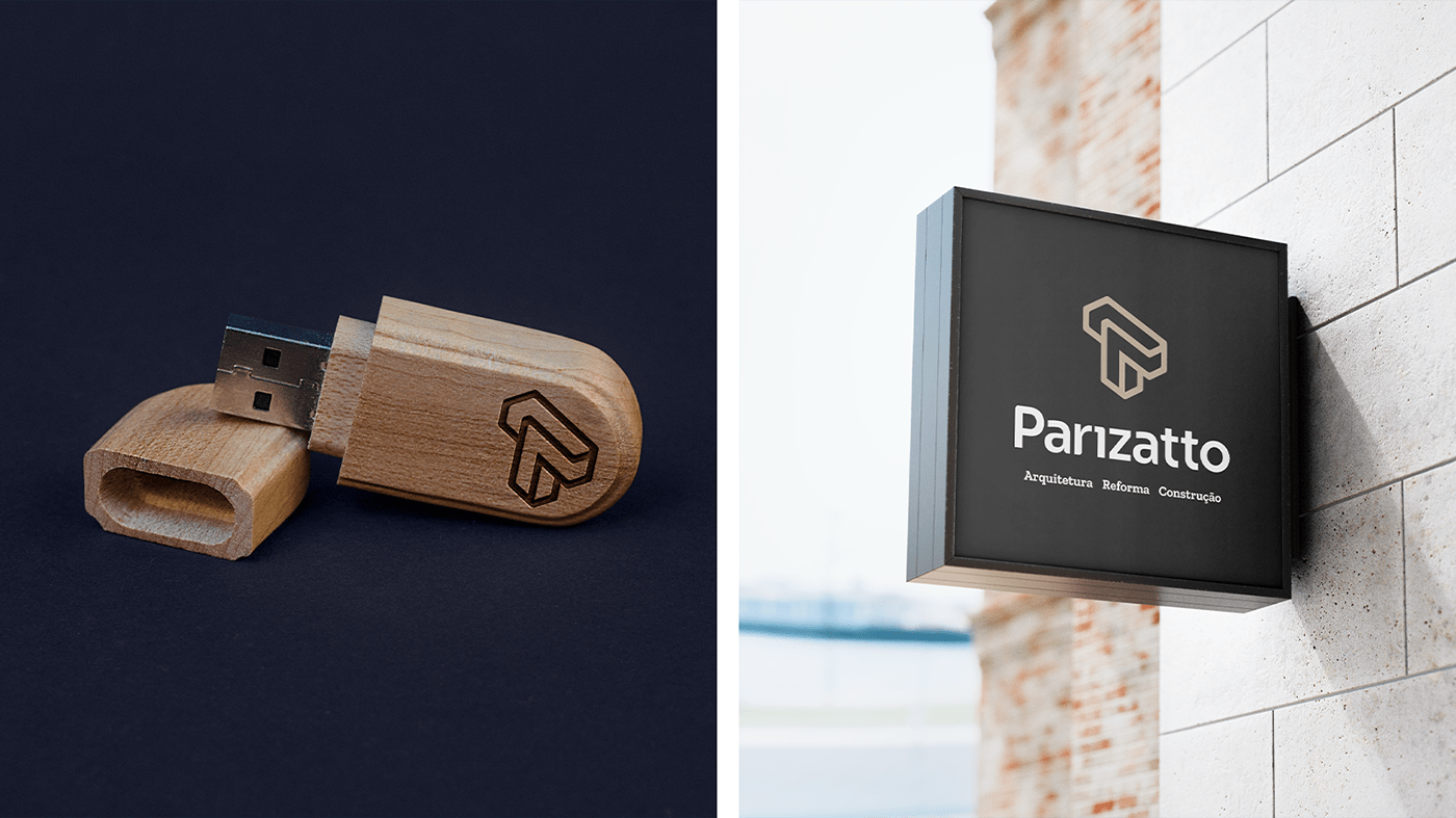
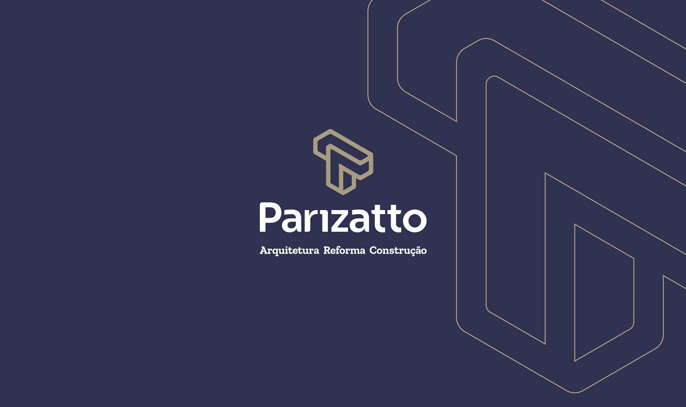
Ao juntar as duas letras T do nome e estilizar as formas foi encontrado o símbolo que irá compor a marca. Um símbolo autêntico, diferenciando a Parizatto das marcas concorrentes. Representando força, solidez e segurança obtida através das linhas retas. O arredondamento dos cantos torna o símbolo amigável, humano e mostra a delicadeza feminina presente em todas as etapas do serviço prestado.
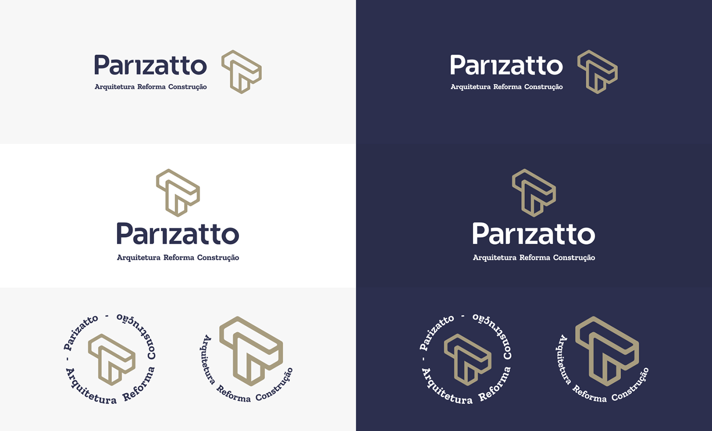
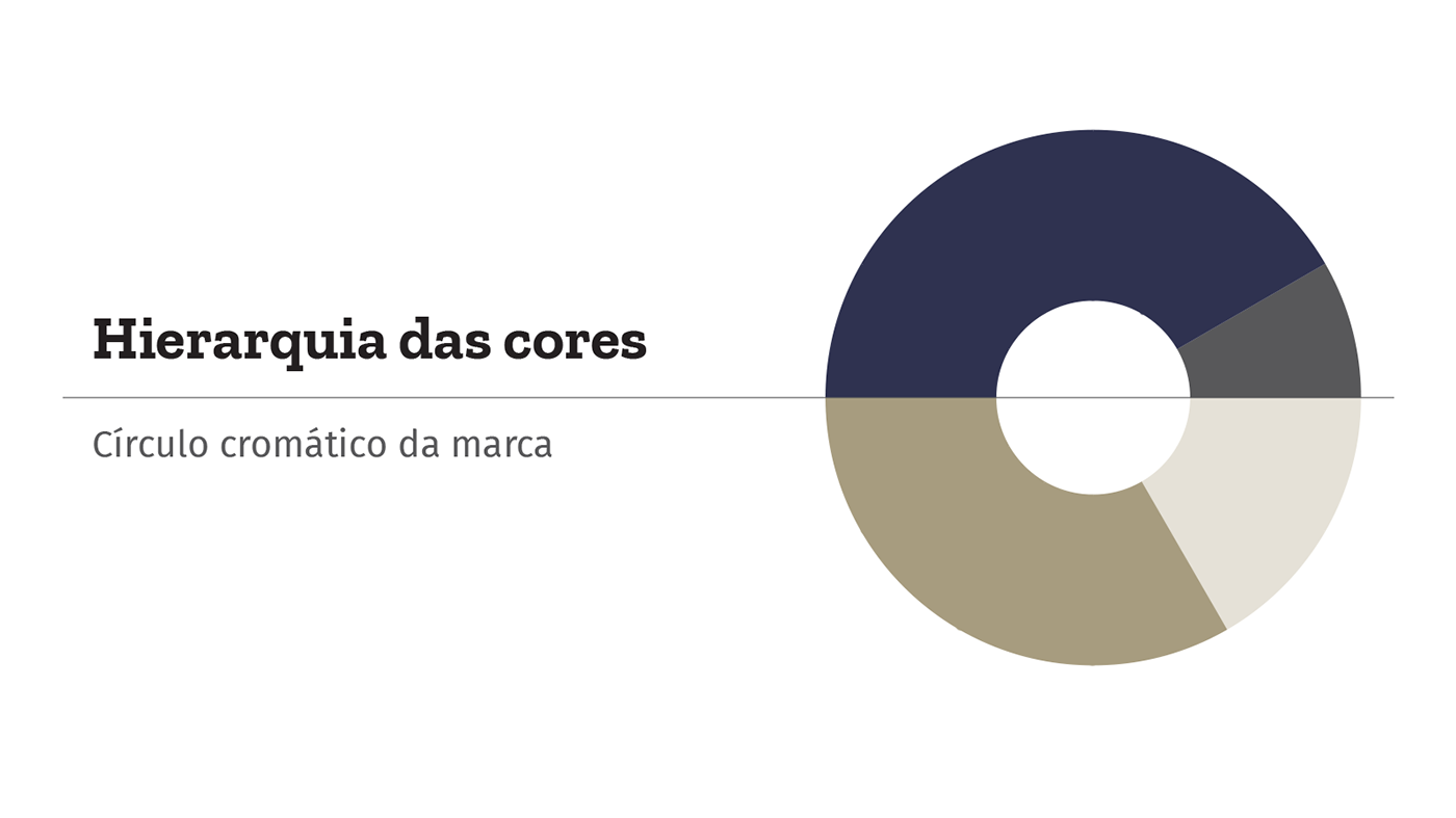
Ao analisar o mercado, nota-se o uso massivo de cores chamativas ou tons extremamente sóbrios. A Parizatto se posiciona no meio dessas duas tendências.
A cor Azul Marinho é comumente ligada ao sucesso, esperteza, estabilidade, credibilidade e intelecto. A cor Ocre, segundo a Psicologia das Cores representa felicidade, prestígio, sabedoria, pontualidade, conquistas, liderança, concentração e realização.
EN
About Parizatto
In order to express safety, reliability and creativity, the brand needed an innovative and strong symbol.
By analyzing the competitors, notices the extensive use of the shapes of houses, roofs and building materials to create the symbol. Avoiding all this, the symbol was created from the uniqueness of the name Parizatto.
In addition to being a not very frequent name in Brazil, it has two letters T which makes it even more unique and beautiful.
The shape of the letter T is very recurrent in engineering and architecture projects. It can be seen in beams, columns and profiles, this format allows great resistance in structures.
By joining the two letters T of the name and stylizing the shapes, the symbol that will compose the brand was found. An authentic symbol, differentiating Parizatto from competing brands. Representing strength, solidity and security obtained through straight lines. The rounding of the corners makes the symbol friendly, human and shows the feminine delicacy present in all stages of the service provided.
When analyzing the market, notices the massive use of flashy colors or extremely sober tones. Parizatto is positioned in the middle of these two trends.
The color Navy Blue is commonly linked to success, smartness, stability, credibility and intellect. The color Ocher, according to Color Psychology, represents happiness, prestige, wisdom, punctuality, achievements, leadership, concentration and accomplishment.