The Mammals
Redesign of the 1960's TimeLife Nature Library book, The Mammals.
Redesign of the 1960's TimeLife Nature Library book, The Mammals.
Rationale
Mammals are special creatures, in which embody a great deal of sophistication and beauty. To reflect that esthetic, the color palette chosen was mostly composed of soft, earthy tones, The pages should evoke a calming feeling that pays homage to the natural world, while not being overbearing to the viewer.
What makes mammals stand out amongst other forms of animals, is their complexity. This expression is seen through the type choices used throughout the book. A serif font for the body of the text, reveals the fragility of life. By juxtaposing it with a sans serif typeface, this helps create the perfect tone, paying respect to the playful, lightheartedness that nature provides all around us.
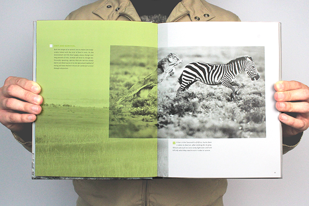
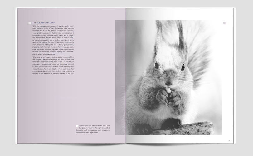
The image treatments are set in black and white to create a universal color palate throughout the book. This allows the color palette to pop off the images through use of overlays and layers. This sort of play with transparency, illustrates the complexity that all mammals have. This book is a testament of the sophistication, as well as power, that the natural world and all of its habitant hold.
Mammals are special creatures, in which embody a great deal of sophistication and beauty. To reflect that esthetic, the color palette chosen was mostly composed of soft, earthy tones, The pages should evoke a calming feeling that pays homage to the natural world, while not being overbearing to the viewer.
What makes mammals stand out amongst other forms of animals, is their complexity. This expression is seen through the type choices used throughout the book. A serif font for the body of the text, reveals the fragility of life. By juxtaposing it with a sans serif typeface, this helps create the perfect tone, paying respect to the playful, lightheartedness that nature provides all around us.
The image treatments are set in black and white to create a universal color palate throughout the book. This allows the color palette to pop off the images through use of overlays and layers. This sort of play with transparency, illustrates the complexity that all mammals have. This book is a testament of the sophistication, as well as power, that the natural world and all of its habitant hold.
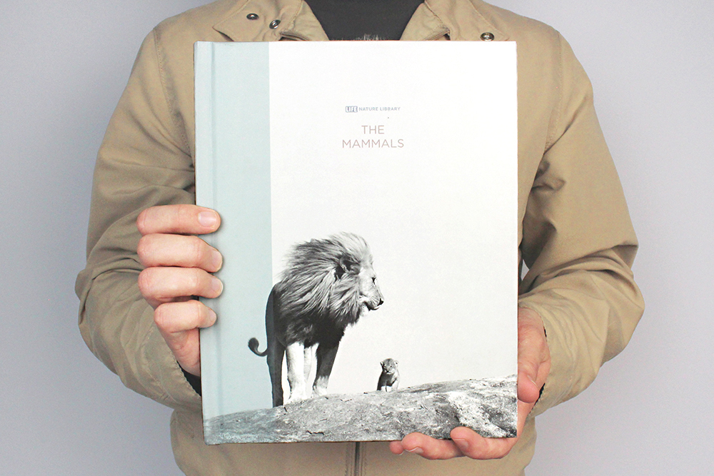
Front Cover
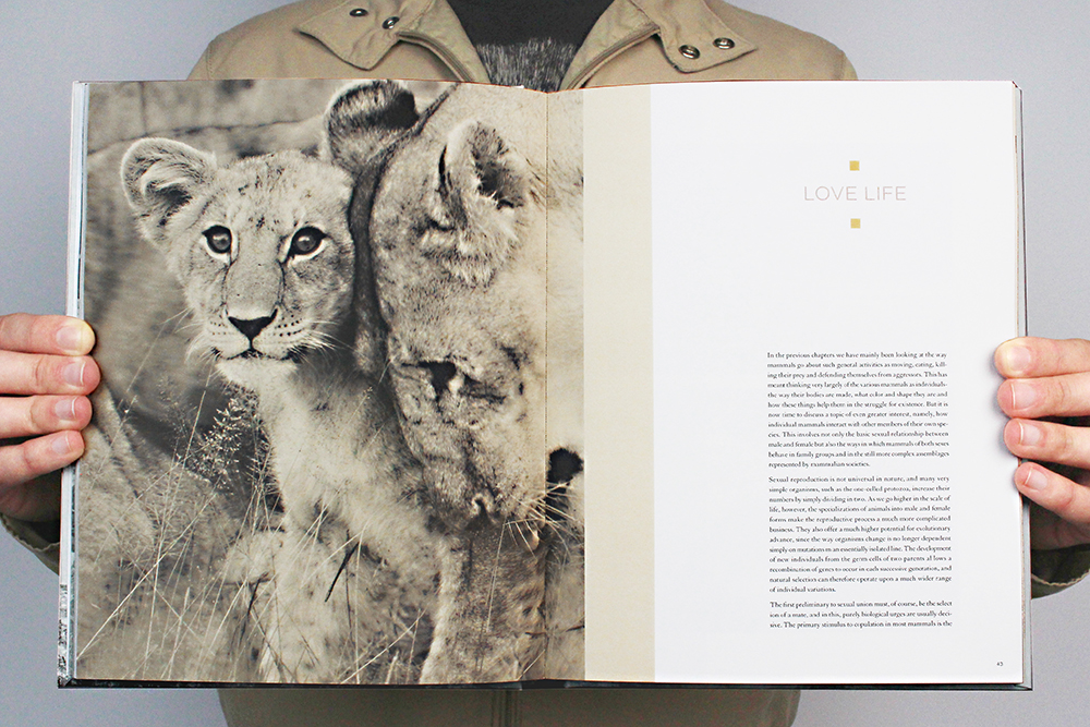
Chapter One Opener
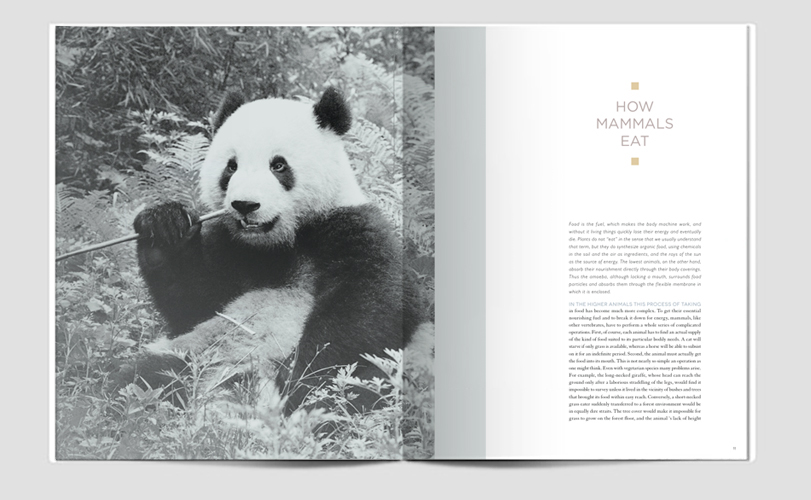
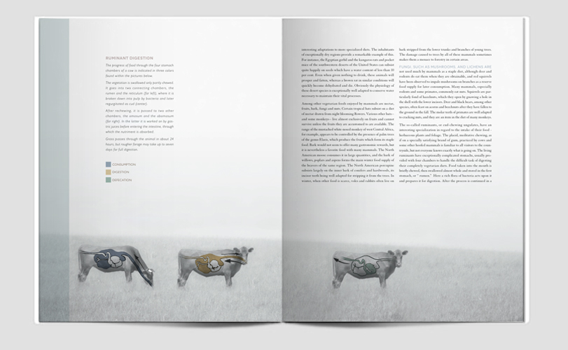
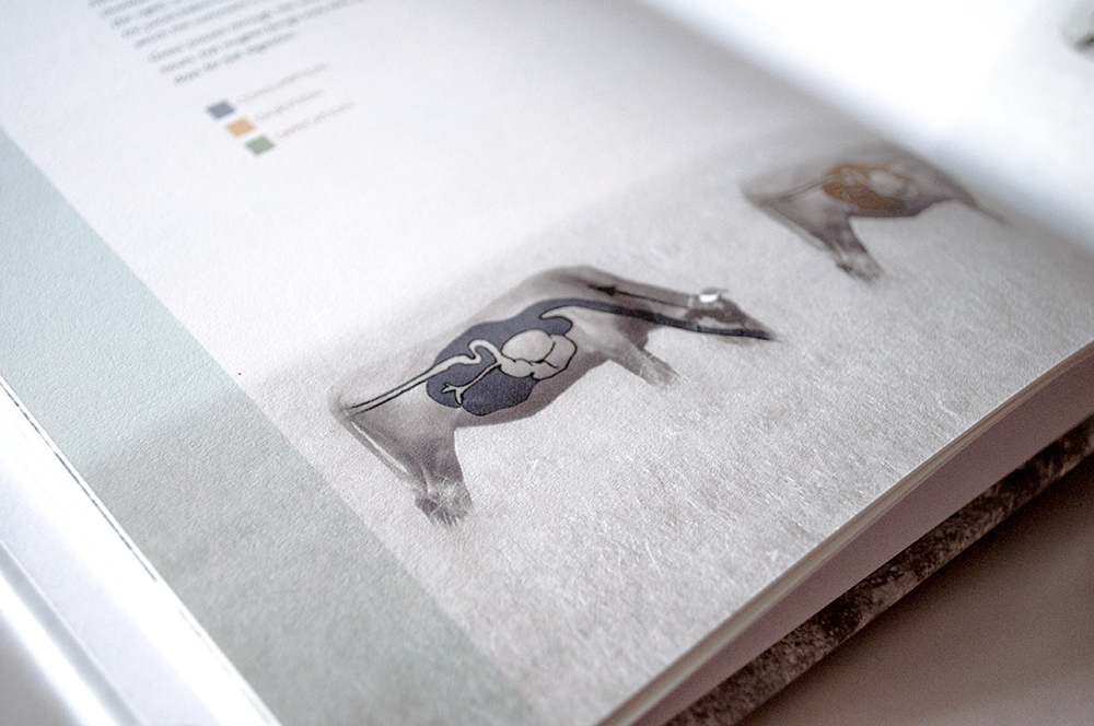

Image Chapter Opener

Chapter Two Opener