

Bare Bones Coffee ◦ Brand Identity
Project Scope
This project was a full brand identity for Bare Bones Coffee, a new shop opening in a vibrant downtown neighborhood. The final deliverables for the project included a color scheme, brand typography, logo, icons, thumbnail marks, brand imagery, and social media visual guidelines.
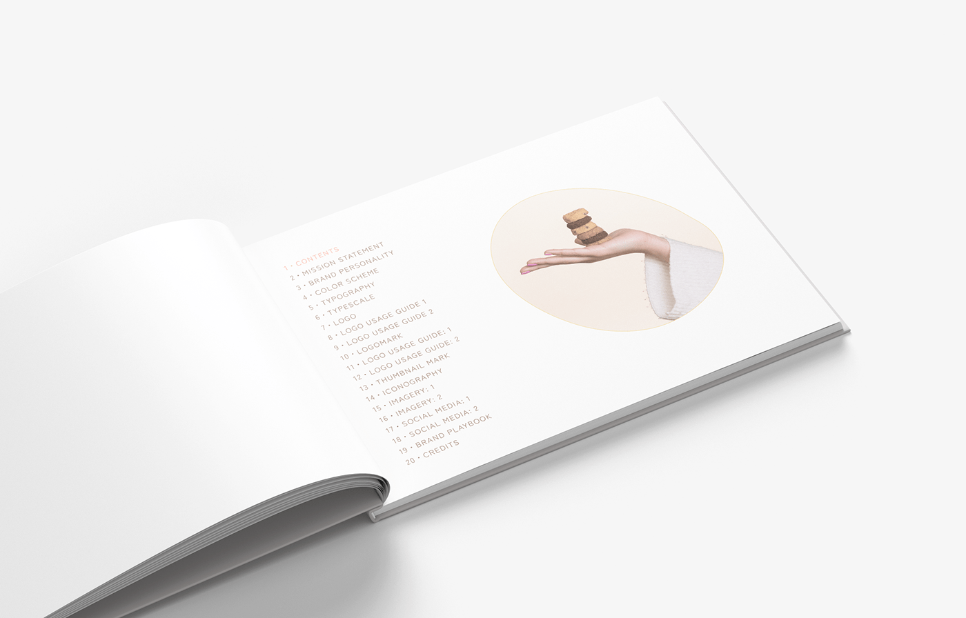
Everything was organized in a (print-friendly) brand style guide designed in Figma, with an accompanying brand Playbook, to ensure that brand assets are easy to access and share with a variety of project stakeholders.
Project Overview
Bare Bones Coffee is a new coffee shop opening that needed a consistent brand identity to ensure that the shop’s look and feel remained consistent and conveyed the brand’s values and mission. The project included creating a color scheme, typescale, logo, icons, and a full brand style guide to guide design choices in the future. These assets and guidelines will ensure that Bare Bones Coffee has a solid visual foundation from the start, and will allow them to focus their resources on building trust and loyalty with new customers and community.
Project Role
As the lead designer on this project, I worked closely with the owner of Bare Bones Coffee to conceptualize a visual representation of the brand’s personality, mission, and values. I took great care to build in features that will make future collaboration with others smoother and faster. Other designers and developers can easily access and contribute to the brand style guide in Figma, or quickly refer to and download brand assets on the brand Playbook.
Problem Statement
The owner of Bare Bones Coffee wanted to establish a visual identity that would make a great first impression on the neighborhood and surrounding businesses as a part of laying the groundwork for a successful future as a local independent business. They wanted to make sure that the look and feel of their brand pre-paved the way for creating a particular mood and attracting customers interested in their products and approach to service.
I worked with the owner to articulate the personality, values, and mission of the company. I used that information, research, and ideal customer avatars to guide my design decisions. There was a three-month timeline for the project to provide Bare Bones Coffee enough time to implement the designs into store signage, printed materials, and online presence before the grand opening.
Project Goals
At the end of this project, the owners of Bare Bones Coffee will have a comprehensive brand identity, brand style guide, and visual brand assets for immediate usage. It will include:
・A brand style guide formatted for both print and online use, accessible as a Figma file and downloadable PDF.
・A logo and logomark, including a thumbnail mark for online usage.
・A mission statement for the brand, with clearly defined brand personality.
・Color scheme, typography, typescale, logo, logomark, guidelines for logo and thumbnail mark usage, iconography, imagery, and social media brand style guidelines.
・A brand Playbook, that contains up-to-date visual brand assets in a variety of file formats, for easy access to download and use immediately.

Design Process
Research & Planning
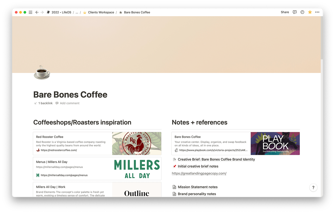
To collaborate remotely, the owner of Bare Bones Coffee and I used a shared Notion Workspace document where we could easily look at, discuss, and share information that allowed me to develop several ‘ideal client’ avatars. It also provided a tidy landing space for the owner to share examples of other businesses’ brands she was inspired by and provide any other needed information.
This allowed for a smooth process of sharing resources and communicating efficiently. Even being able to embed the Figma design file directly into the Notion workspace helped eliminate the need to constantly resend multiple links.
Brand Mood Board
After some initial research and client onboarding, I started organizing visual inspiration on a brand mood board in Figma, to easily share with the client remotely. The mood board served as a valuable resource for verifying that my design choices kept the style and aesthetic of the project with the client’s goals and expectations.
I believe that sharing a mood board early in the process can lead to fewer needed revisions to the finished designs since it can get everyone on the same page from the beginning of the design process. Verifying that I understand the visual identity we’re looking to build for the brand was an important step before moving forward in the design process.
Mission Statement & Brand Personality
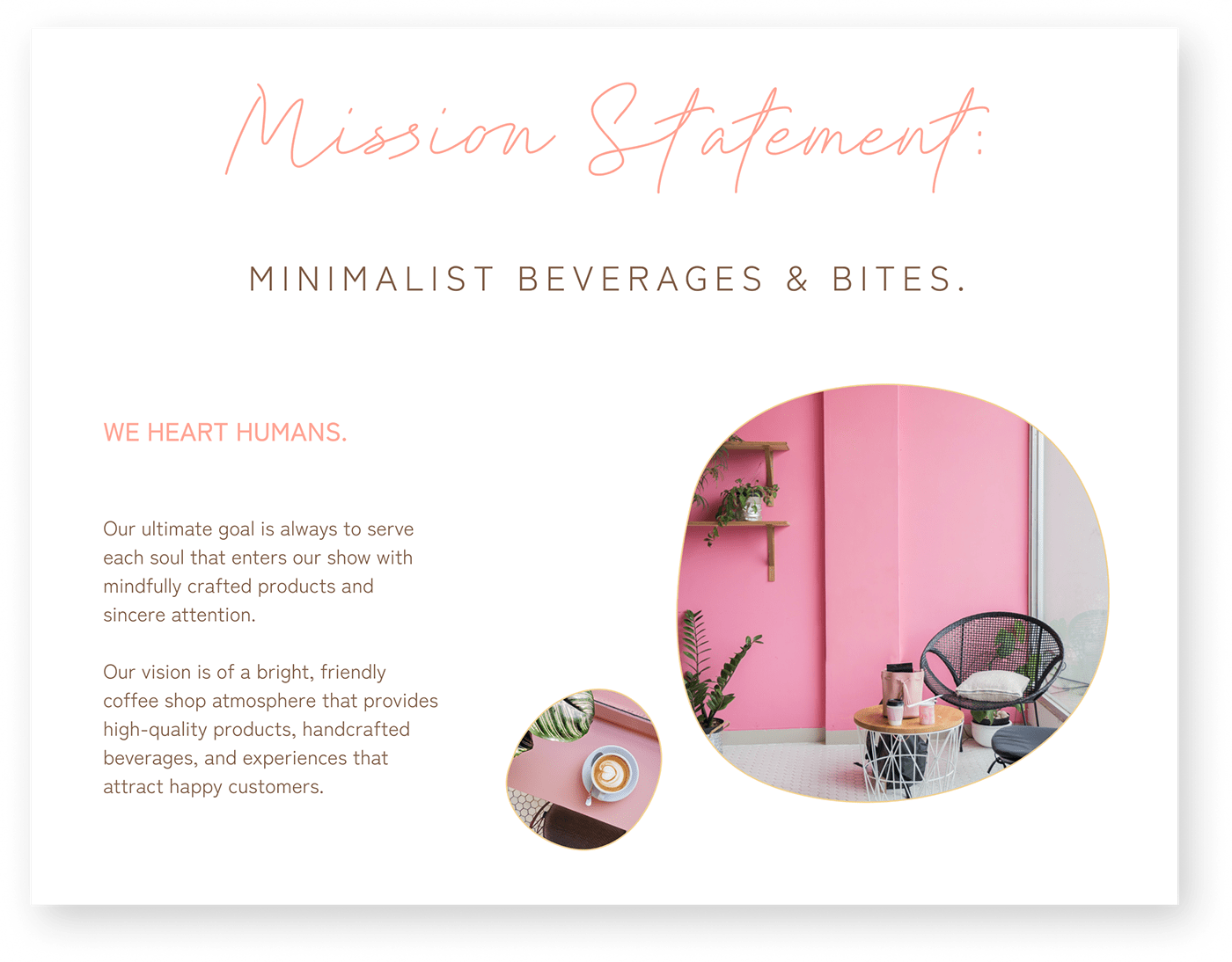
Using information I gathered from the client and feedback I received after completing and sharing the brand mood board, I began to work on designing the core components of the brand style guide. A well-crafted mission statement focuses on the business because it serves as a core framework for employees, vendors, and the target audience, I worked with the owner of Bare Bones Coffee to craft a simple, significant mission statement:
“Minimalist Beverages & Bites”
For consumers, it sets the company apart from the competition without limiting the business purpose, declaring what makes Bare Bones Coffee important. It will guide the decisions and actions of employees and attract customers by explaining succinctly what the company values and intends to accomplish. As a designer, it also provides an invaluable launching point to build from when establishing the brand and crafting assets.
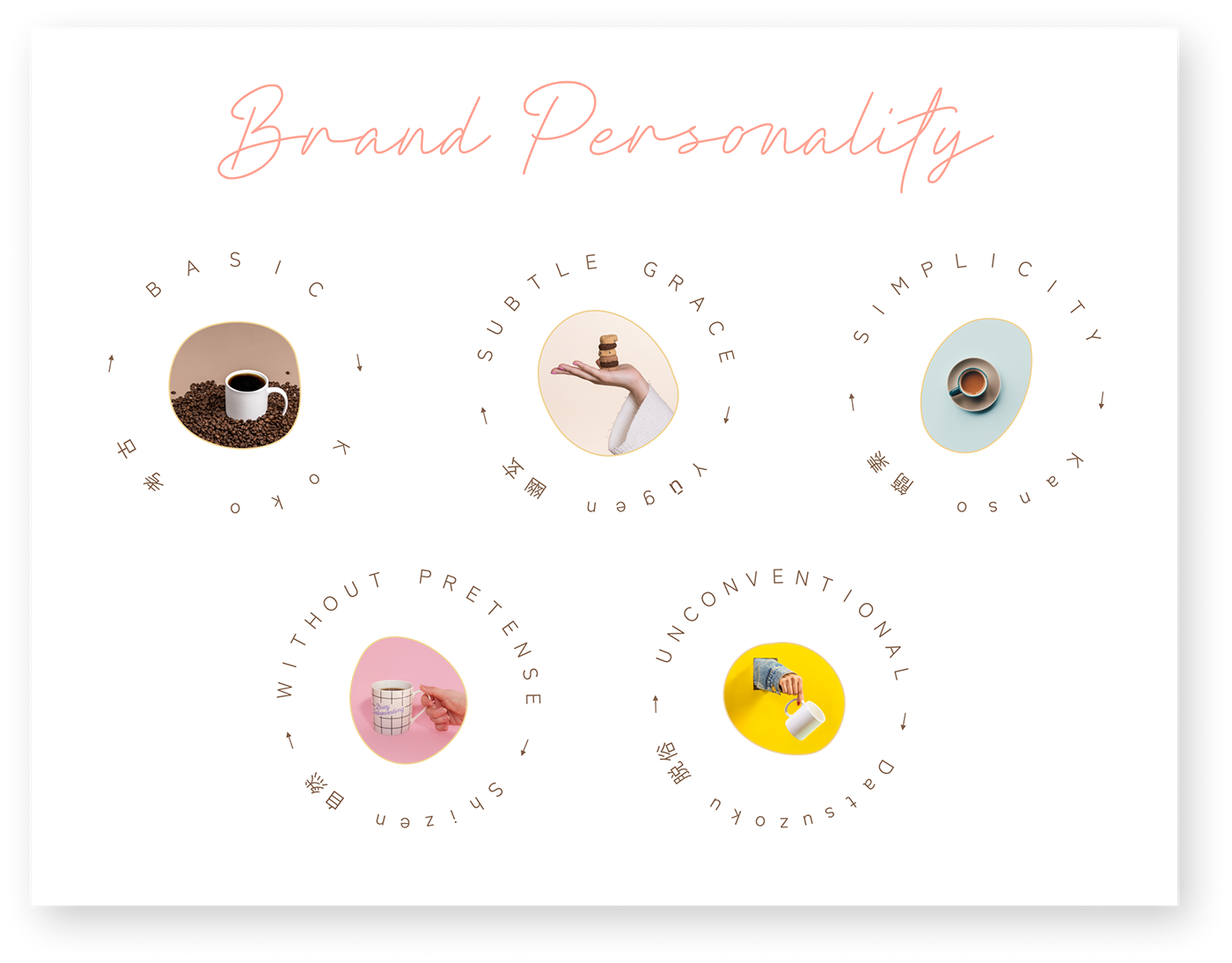
The personality of the Bare Bones Coffee brand is significantly influenced and informed by traditional Japanese aesthetics and ideals, with a modern flourish or two. Specifically, the owner of Bare Bones Coffee wished to incorporate several zen aesthetic principles of ‘wabi-sabi,’ (a ‘mindful approach to everyday life):
・Kanso ( 簡素 ) : simplicity
・Koko ( 考古 ) : basic
・Shizen ( 自然 ) : without pretense
・Yūgen ( 幽玄 ) : subtly profound grace
・Datsuzoku ( 脱俗 ) : unbounded by convention
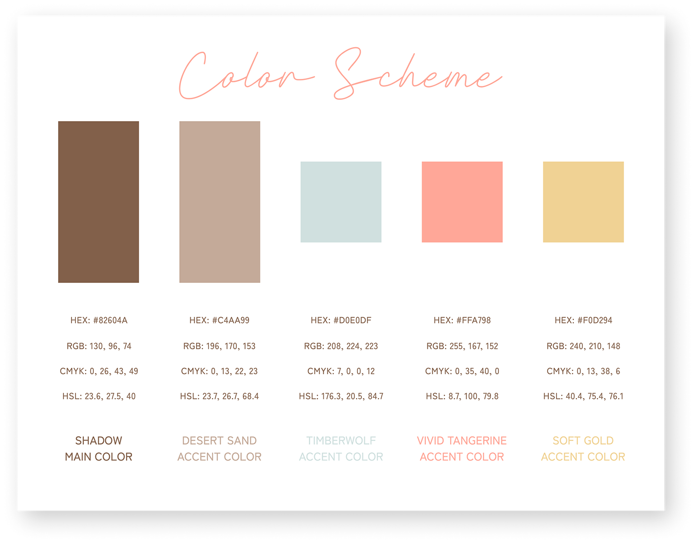
Color Scheme
For Bare Bones Coffee’s color scheme, I selected the main brand color with an additional four accent colors. When I began initial research into imagery for the brand mood board, a theme of color groups began to emerge- cocoa/beiges, light cyan/blues, light pinks, corals, and soft gold/yellows. These groupings served as the inspiration for my final choices of accent colors, which will support the core main brand color.
The main brand color I selected is a medium warm brown color evoking delicious coffee and milk chocolate, referencing the two core products of the company. The accent colors reference modern palette trends (such as coral, mustard yellow, and teal) but in softer, unobtrusive muted tints.
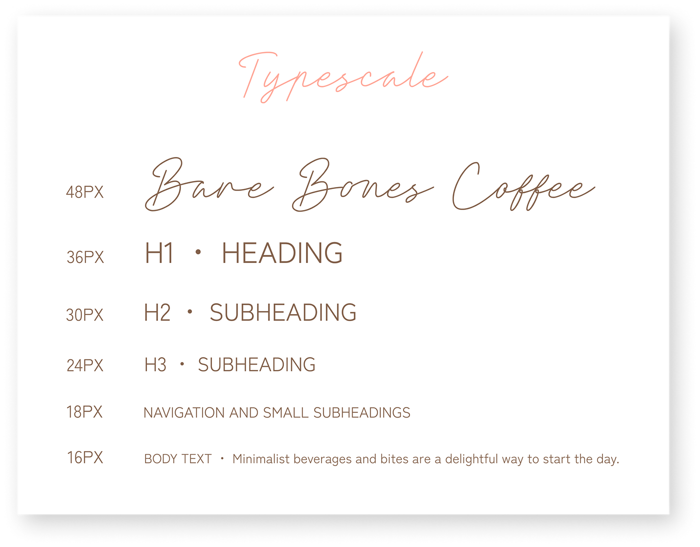
Typography
Brand & Accent Display Typeface ・ Clathyn Keith Signature
During one of the initial discussions about the project, the owner of Bare Bones Coffee expressed a strong desire to incorporate handwriting into the brand identity. Incorporating the brand mission’s values of mindful presence and personal attention, I chose a handwritten display font that evokes the personalized feel of a barista handwriting a customers’ name on the side of a to-go coffee cup.
It is to be used primarily as the typeface for the brand name logo but can be used lightly as a display font for product packaging or social media content design, to express a handcrafted feel.
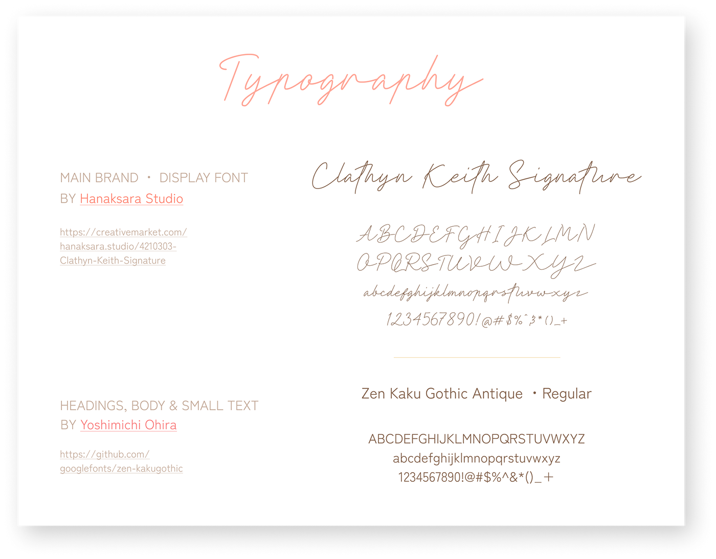
Main Brand Typeface ・ Zen Kaku Gothic Antique
For the main brand typeface, I selected Zen Kaku Gothic Antique, a contemporary Japanese gothic (sans-serif) typeface family. Classical yet simple, it is a highly legible typeface that is flexible and beautiful that can be used for everything from titles, subheadings, navigation, body text to captions.
The clean sans-serif style of Zen Kaku has a modern and approachable feel, yet incorporates light stylistic touches of traditional Japanese characters. When discussing the project, the owner expressed a desire to have a font that could smoothly include hiragana characters in future packaging and promotional designs.
Logo Design
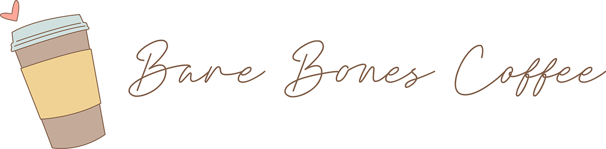
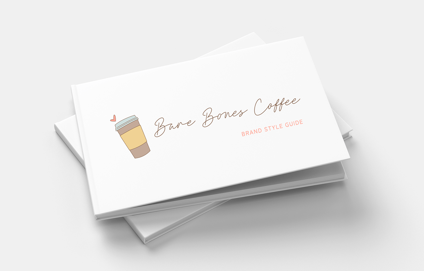
I designed the logo for Bare Bones Coffee in two variations: the primary logo containing both the logomark and logotype (the preferred version to appear on the majority of branded materials), and the stand-alone logomark (to be used when production restrictions or the particular media format does not allow the use of the full preferred logo.) This will give the company the modern flexibility it needs while maintaining a consistent brand identity.
With the brand colors and typefaces chosen, I drew multiple sketches of ideas and then settled on a design of a to-go beverage container slightly tilted with a small heart hovering above where a person would take that first wonderful sip!
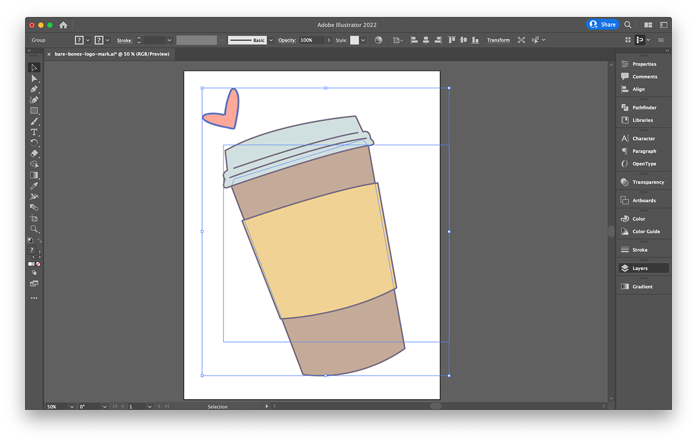
Both the client and I felt the logo should express the heart-centered human connection articulated in the mission statement the brand aspires to embody. Using Adobe Illustrator for the iPad Pro with my Apple Pencil allowed me to draw the heart flourish by hand, aligning with the hand-drawn aesthetic of the display typeface I’d chosen for the brand. I used Adobe Illustrator to create vector versions of both the primary logo and logomark that can be scaled easily to any size without quality loss.
Thumbnail Marks
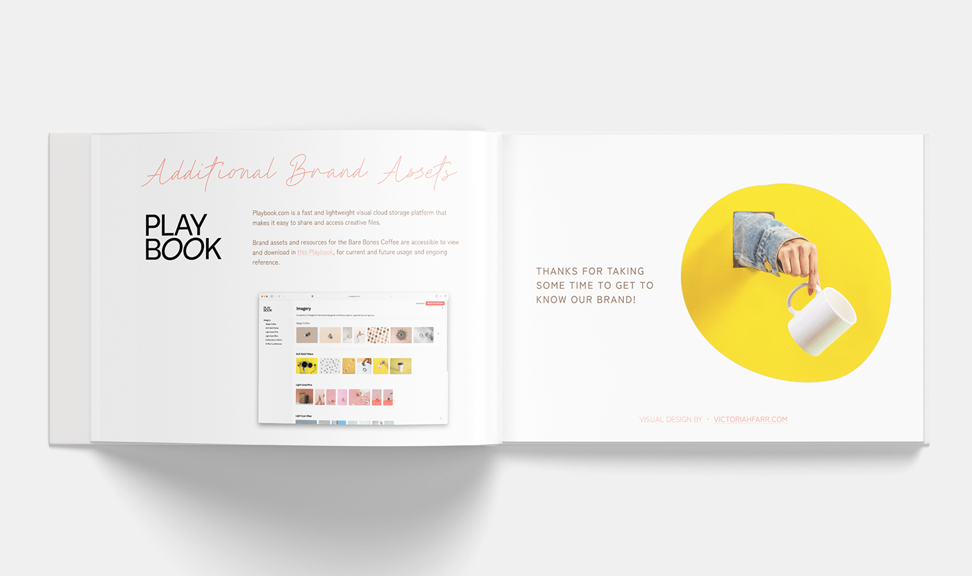
In addition to the brand logo assets, I created a thumbnail mark with several variations for different uses on digital platforms-a compressed glyph mark to be displayed on a white background or 50% tint of brand accent colors. I chose to construct several examples and upload them to the brand Playbook so they could be accessed and used immediately by the client and vendors.

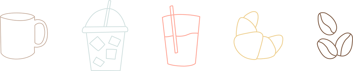
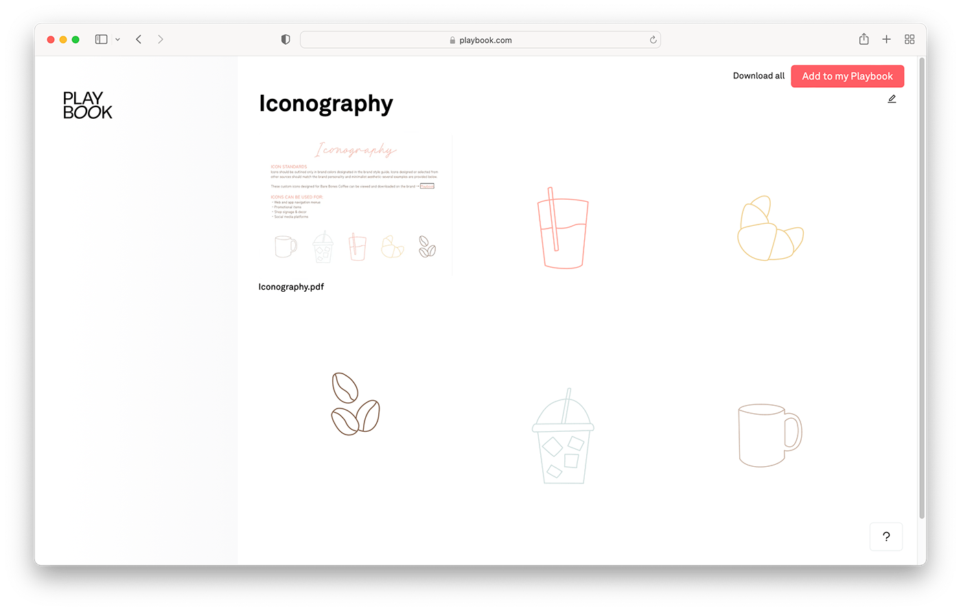
Icons
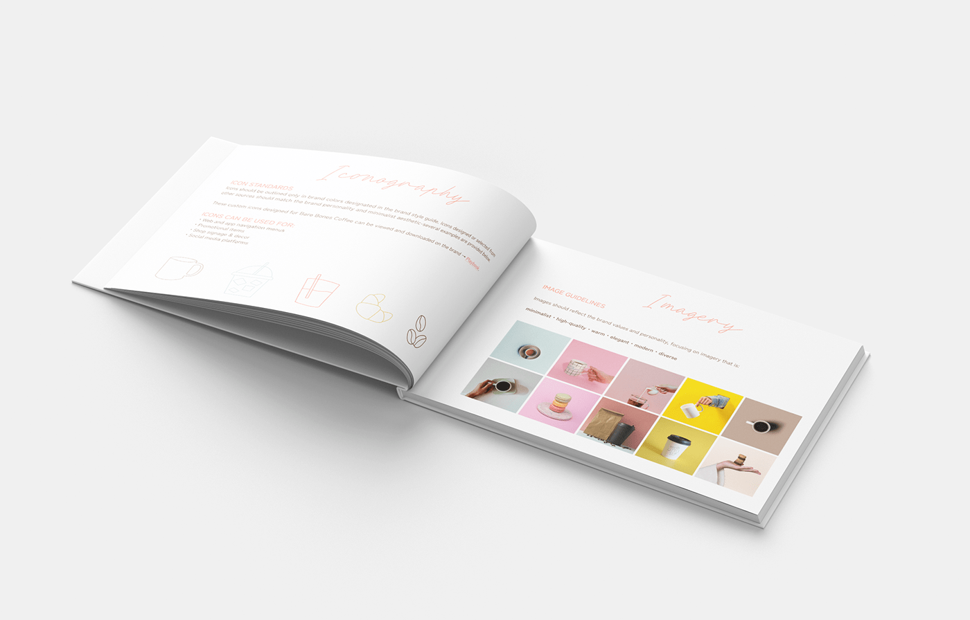
I created a set of starter icons in Adobe Illustrator, for use on the menu, website, shop signage/decor, and product packaging designs. I chose several standard coffee shop items and outlined them in brand colors in a clean, simple minimalist hand-drawn style.
Designed to blend in seamlessly with other minimal-styled open source icon sets that are available online, they can be downloaded in a variety of file types on the brand Playbook, or directly exported from the Figma design file as needed.
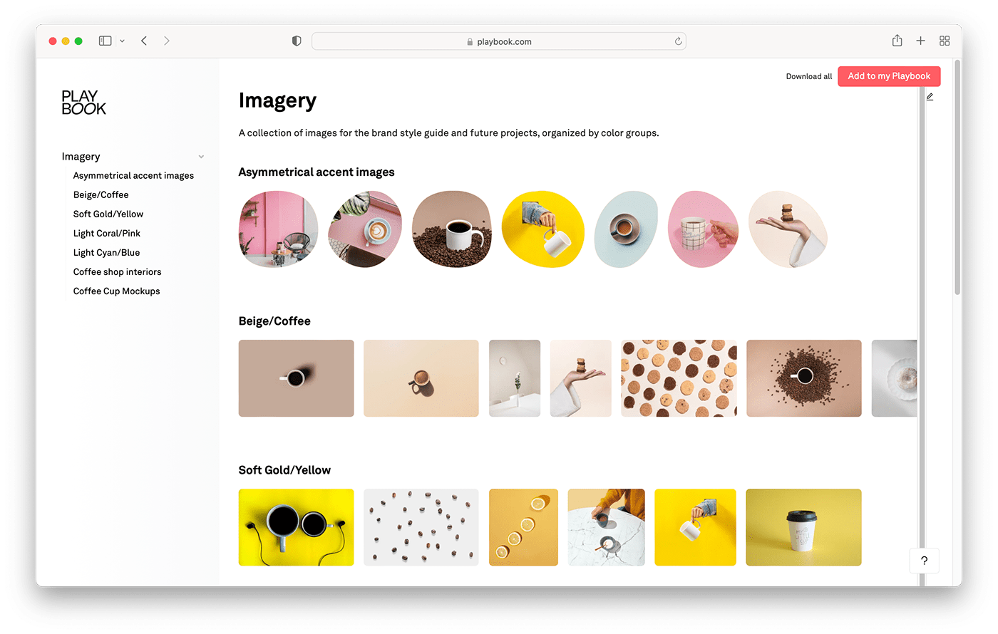
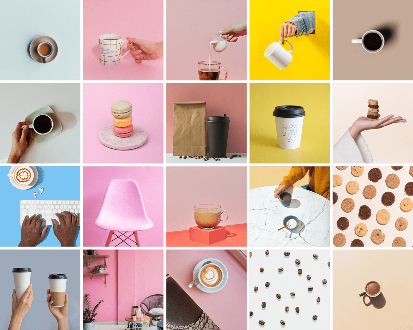
Imagery
Using a variety of sources of commercially-licensed photography, I selected a collection of images for the brand that reflects the values and personality, focusing on imagery that is simple, graceful, high-quality, warm, modern, and diverse. I initially researched and collected imagery for the exploratory brand mood board, and then expanded and added to the collection as the project developed further. I organized the collection of images in the brand Playbook for future inspiration and ease of access/usage.
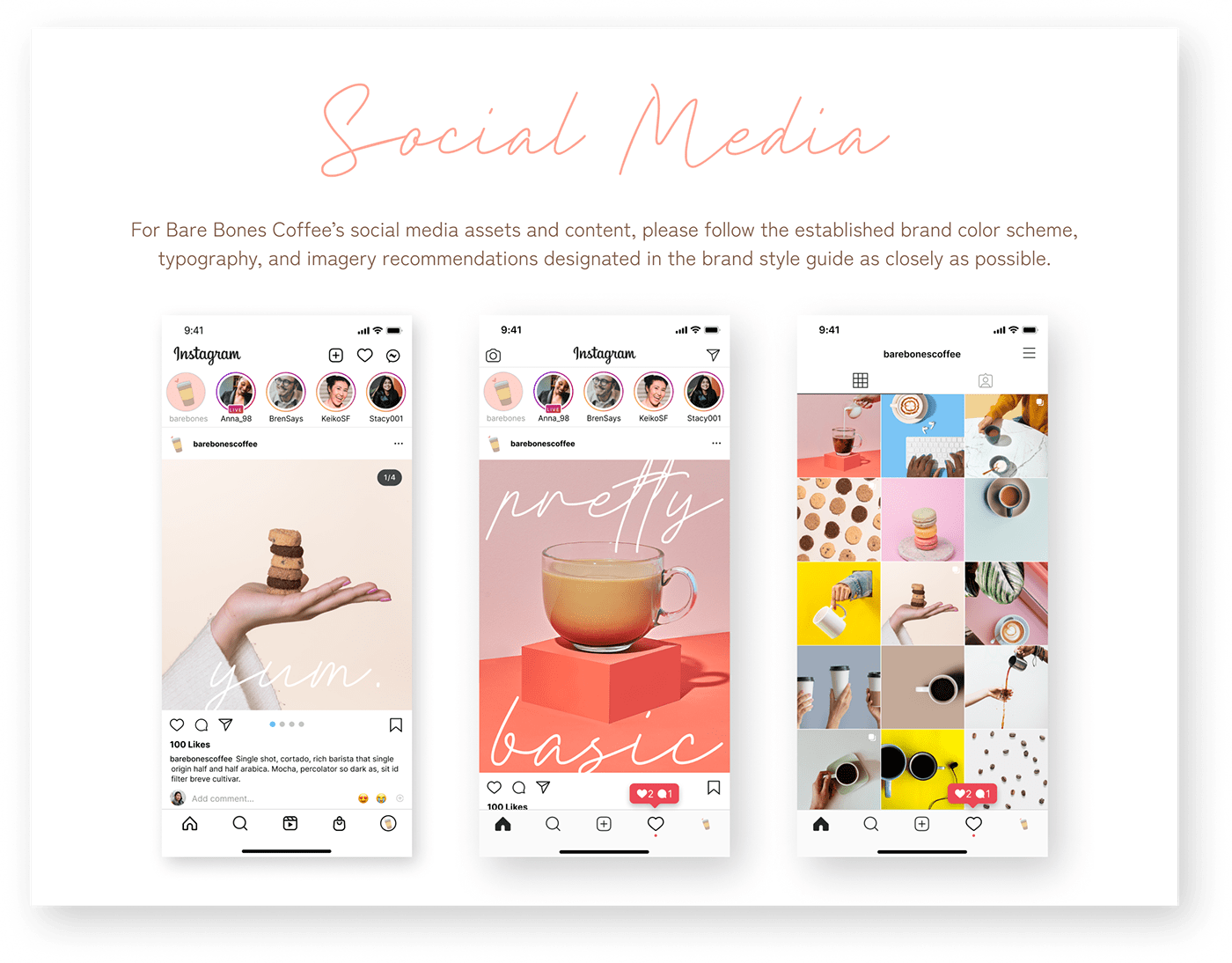
Social Media Visual Guidelines
As social media platforms evolve, the optimum dimensions/formats for visual assets are constantly shifting-so I chose to create guidelines for cover images and social media assets for the brand in place of static pre-formatted items. This gives future designers the ability to quickly create assets that maintain a consistent brand aesthetic when producing promotional media on a wide variety of digital platforms.
Along with the visual social media guidelines provided in the brand style guide, I organized all brand assets generated for this project into the brand Playbook for easy future access for future projects.

Final Design
Brand Style Guide
The final component of the brand identity package for Bare Bones Coffee was a full brand style guide that would bring together all the elements of their branding together in one authoritative document with clear guidelines for brand asset usage.
I created the style guide in Figma to make the document both print and digital-friendly, allowing future designers or stakeholders to easily access, duplicate or modify the guide as needed.
I designed the guide to align with the styling of the brand itself and included the company’s mission, personality, color scheme (in Hex, RGB, CMYK, and HSL formats), font names and source links, typescale, logos with proper usage guidelines, thumbnail marks, icons, social media guidelines, and information/links to the brand Playbook.
The full brand identity package will allow Bare Bones Coffee to maintain a cohesive, consistent brand image across a variety of formats and give them, designers, developers, and vendors the ability to collaborate remotely if needed.


View the full style guide design file live in Figma or download the PDF on Playbook.
Takeaways
The owner of Bare Bones Coffee had a three-month timeframe to get this branding plan completed. This allowed an adequate amount of time to incorporate assets into production for both the physical store, product packaging designs, and grand opening promotional online items.
It was important to consistently communicate with the owner to ensure that the branding matched the overall vision for her business and would resonate with her target customer base. We worked together remotely, meeting virtually every two weeks to discuss and approve the latest iterations of elements for the brand identity package. I shared my designs and incorporated any feedback she offered to develop the final look and content of the project.
As a result of this project, I have worked across multiple design programs (Adobe Photoshop, Adobe Illustrator, and Figma) to create assets for a brand that now has a cohesive look and feel. Due to local pandemic safety restrictions, I worked on this project remotely, utilizing online collaborative tools (Notion, Figma, Google workspace) to effectively communicate and incorporate client feedback.
I also created a centralized hub for brand assets on the Playbook platform, to give future users easy instant access and help facilitate the dialogue between the client and designer. I learned that clients truly appreciate this extra touch and that I enjoy making great designs easy to access and engage with throughout the design process!
Conclusion
When the project was complete, Bare Bones Coffee had a full brand identity package to help establish the look, feel, and tone of the company. The package included the articulated brand mission statement & personality, color scheme, typography, logo, thumbnail marks, icons, imagery collections, and social media visual identity guidelines. A print and digital-friendly brand style guide with an accompanying brand Playbook keeps all brand assets together with instructions on how to use each component.
Creating modern, scalable assets before the launch of their business empowers them to establish a reputation and build excitement even before their opening day. Bare Bones Coffee can feel confident in promoting its grand opening events online, and the physical shop can feature its logo, icons, and color palette on signage and products. Having a source of brand guidelines that are easily shared and followed allows them to focus more of their valuable time on brewing delicious coffee!


