

take one - this size fits nowhere

take one - lets explore arrangements

take 2.1 - she was fun, but too dull

take two - still interested in 3D and patterns, but with more definition with the stroke
take three - less bevel and stroke, more drop and pattern discovery


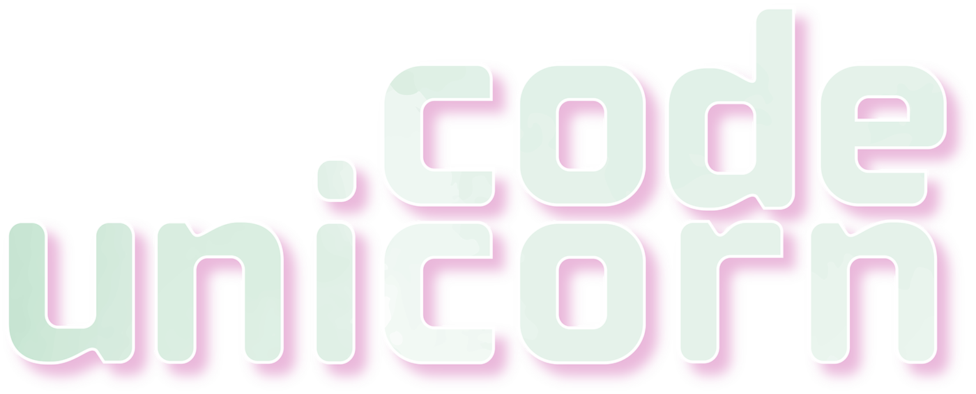
take four would go on to last for nearly a year longer than any of the other logo versions and is still one of my favorites. You can see us move on from the 3D elements as they hadn't quite come together in previous designs, and our identity needed real love and meaning behind it. For this version I truly fell in love with the typeface "cholla" and found real connection and meaning behind its story. I also found the flexibility of the curves, thickness and height along with the way the R's and U's stacked complimentary to the goals I was attempting to accomplish at the time.
However the beauty I found in the combination of type and patterns would be pointed out as another misstep and misrepresentation of the company as it held little connection to the mission.
We would soon begin the design process again, but not completely form scratch this time. The connections and lessons learned would play an important role in the final design and journey towards and identity for Code Unicorn.


