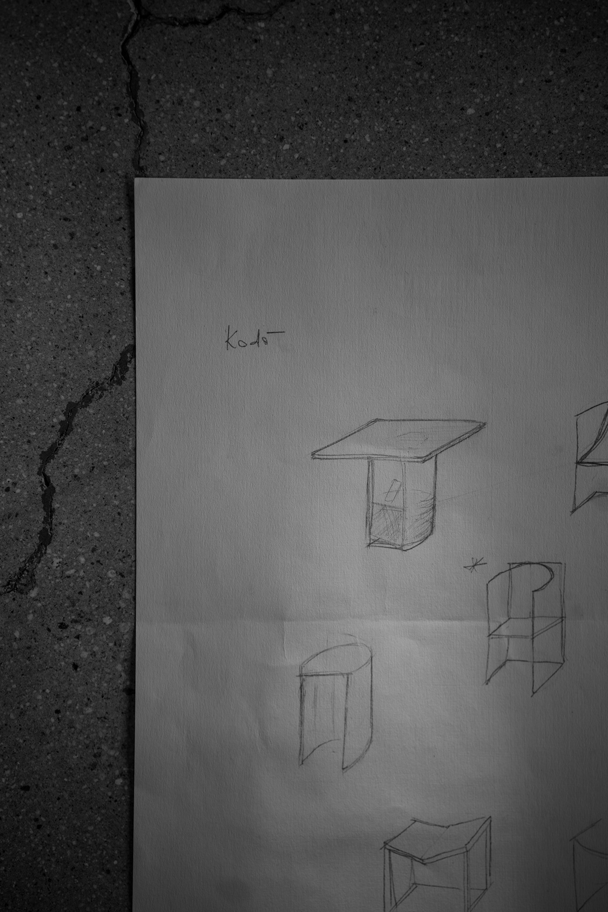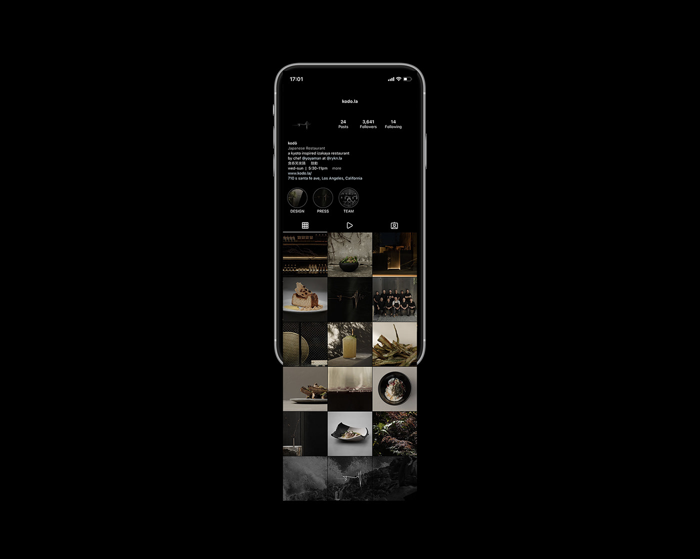
kodō —
a kyoto-inspired japanese restaurant at kenshō rykn.
the menu celebrates the local and fresh; a new take on native kyoto cuisine, tempered with modern california influences.
chef yoya takahashi envisioned creating a heartbeat through the rhythm of each dish, similar to that of the beloved taiko drum.
client: kenshō group
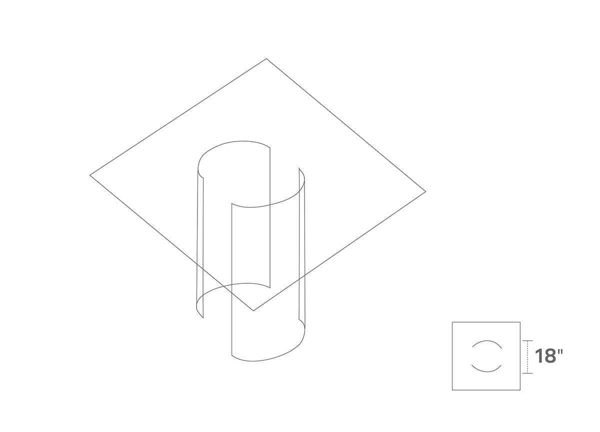
scope: visual concept, brand identity, spacial/interior design, furniture design, photography
scope: visual concept, brand identity, spacial/interior design, furniture design, photography


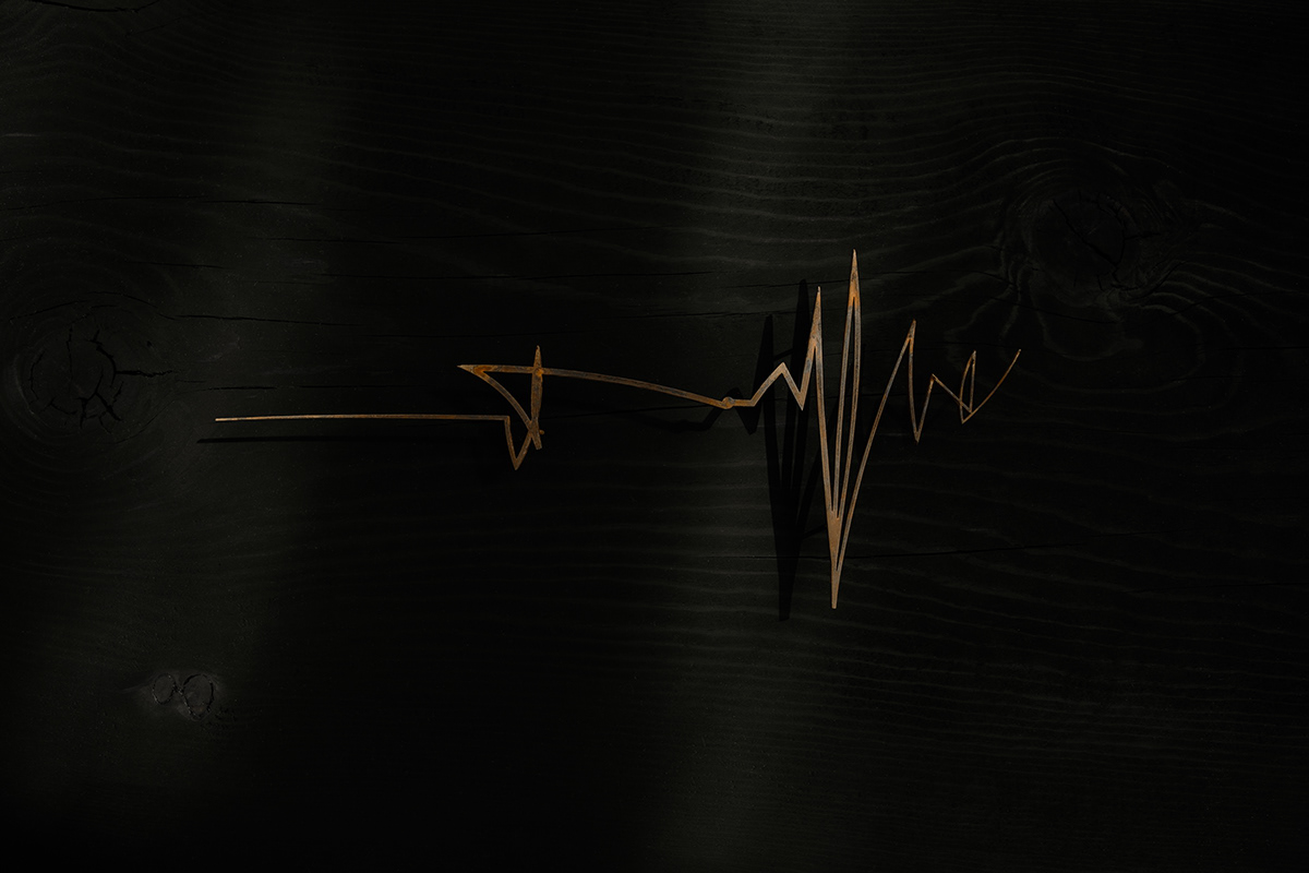
logo —
originally named after "古道" meaning the "old way", after speaking with chef yoya regarding the brand direction + his vision, he wanted a space to simply eat good food, drink, laugh, and dance with good beats, which changed the kanji to 鼓動, meaning "heart beat."
originally named after "古道" meaning the "old way", after speaking with chef yoya regarding the brand direction + his vision, he wanted a space to simply eat good food, drink, laugh, and dance with good beats, which changed the kanji to 鼓動, meaning "heart beat."
we wanted to give the logo as much character and fluctuation as the meaning behind it, while maintaining a rhythmic sense of authenticity - which lead us to a signature cardiogram from yoya's heartbeat as the main logo, along with the kodō mission written in kanji; 食 (eat) 呑 (drink) 笑 (laugh) 楽 (fun) 踊 (dance).


color palette —
kodō's menu celebrates both robata and sushi; grilled and raw.
we carefully curated colors that fluctuate between fire (black mud range) and water (icy grey range)


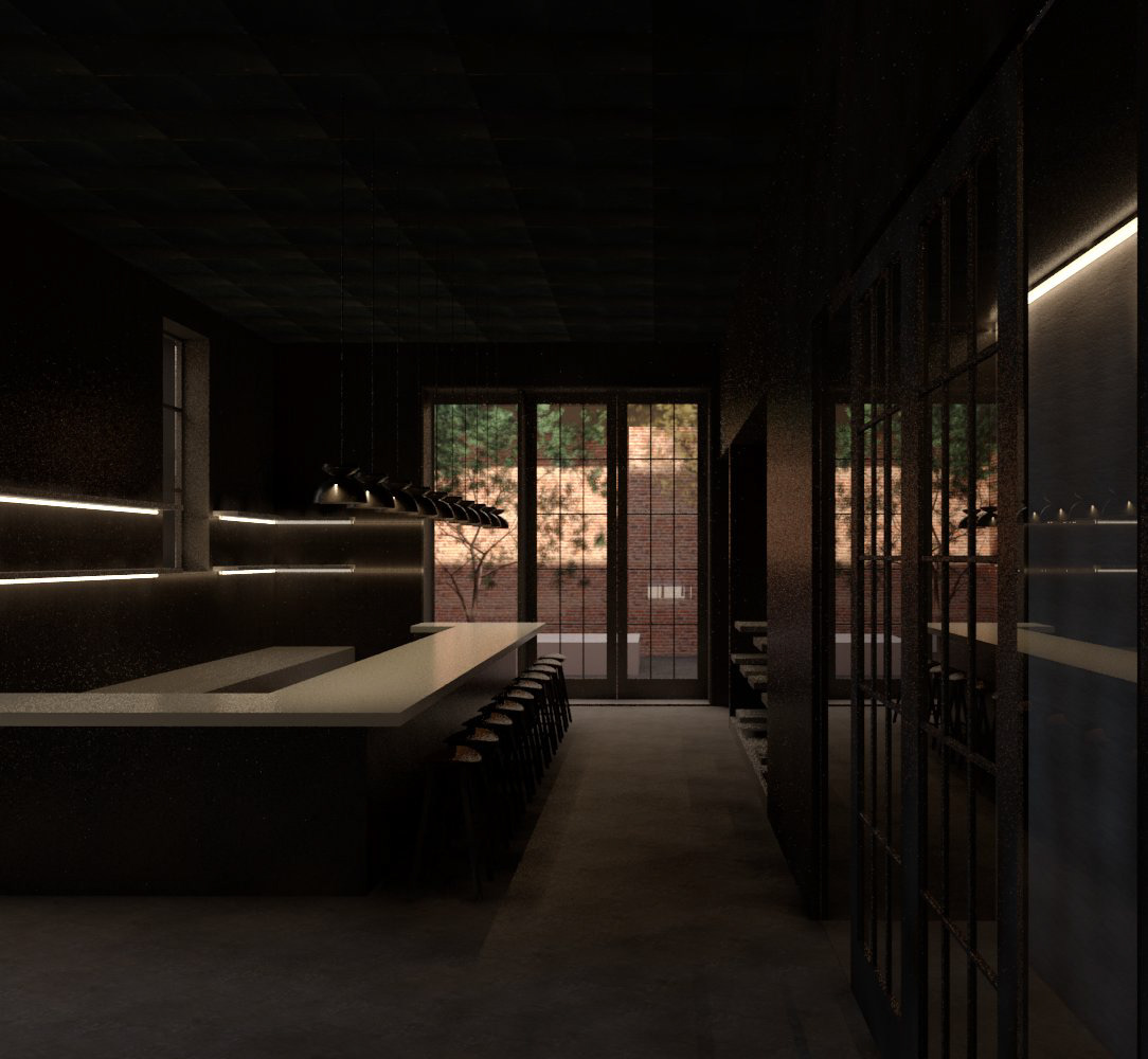
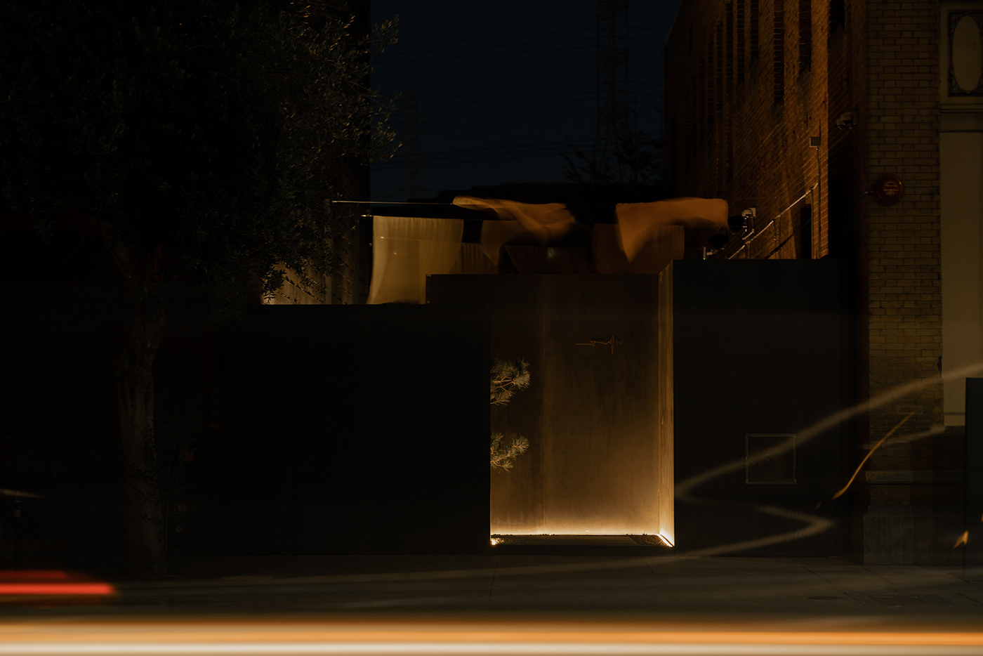
space —
we worked closely with mroyce architecture + his team on the renderings and digital build-outs of the space.
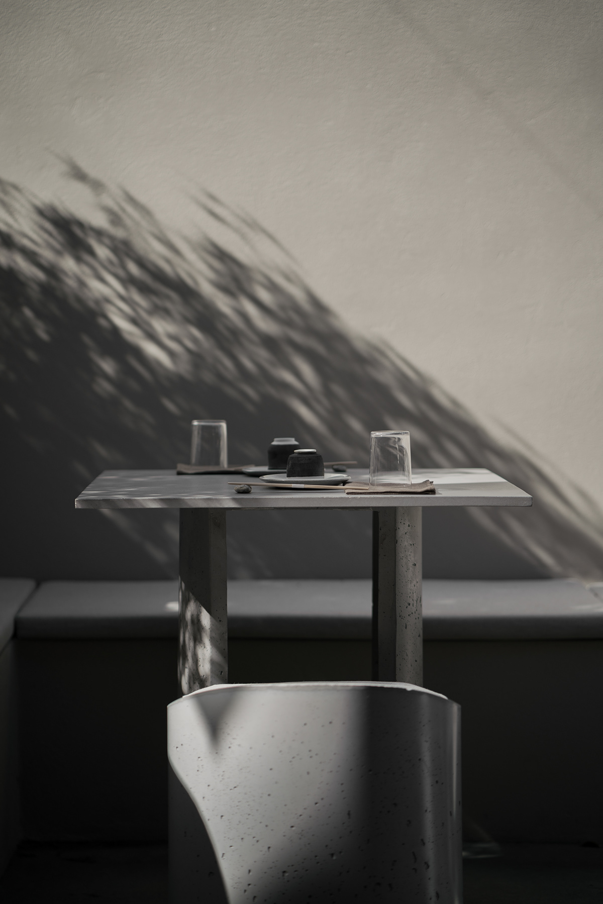
spatially focused on deep connections to nature - elements from earth such as massive, historical boulders, ash wood furniture, rare japanese plants and naturally dyed textiles from amami ōshima (world heritage site) juxtaposed with raw elements like concrete and steel.