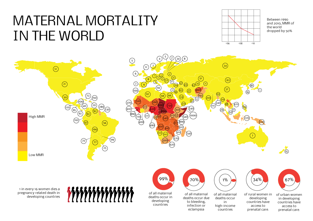
An infographic made to represent maternal mortality in the world, created as an exploration in data visualisation and infographic design.
Source of data: WHO, 2013
This infographic was published on visual.ly and is a staff pick.
link: http://visual.ly/maternal-mortality-world
link: http://visual.ly/maternal-mortality-world
