Roamler App
🗓️ 2022 ✏️ UX Design
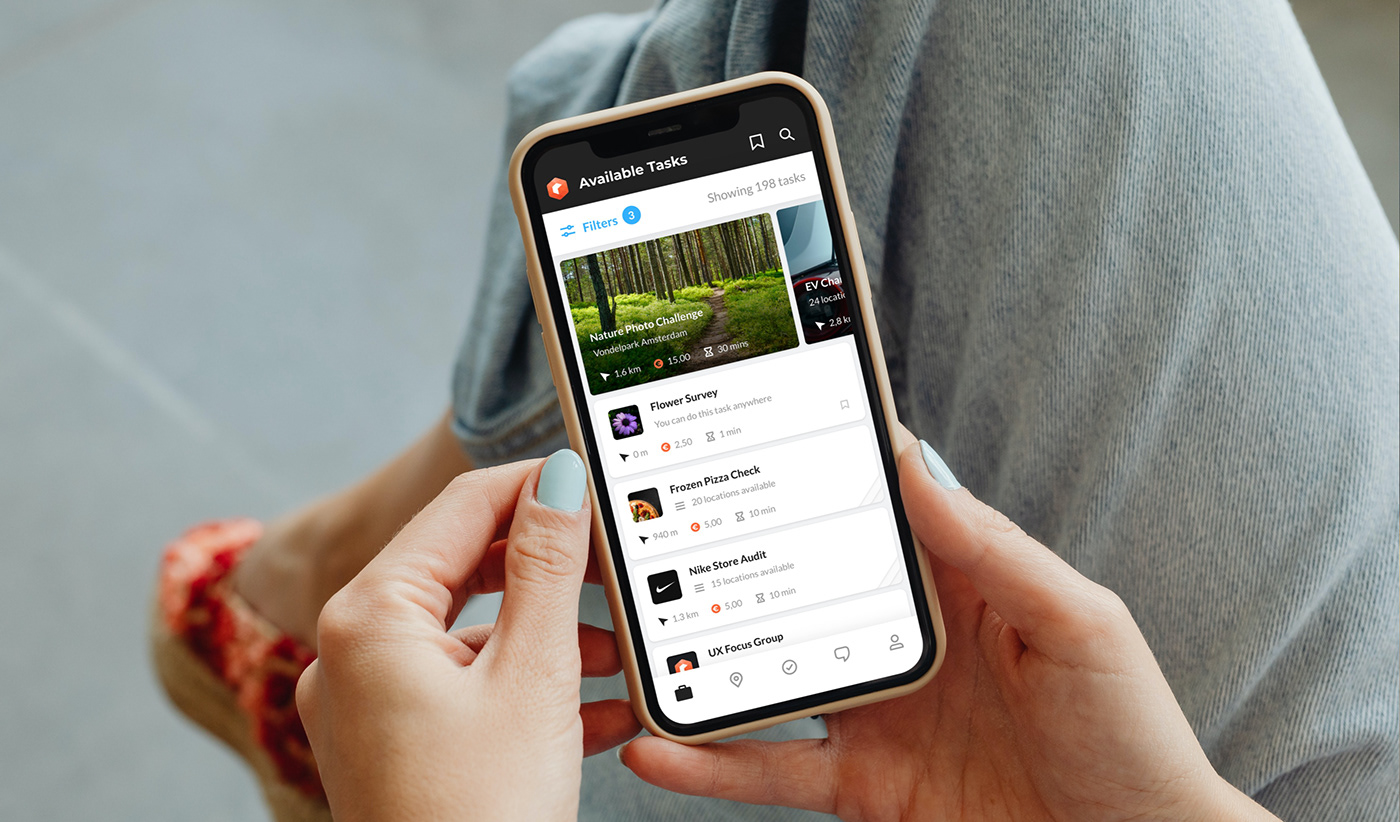
The Roamler app is a platform where users (the crowd) can accept simple, location-based tasks to earn some money. For example: visit to the supermarket and take several photos of a product and answer a couple of questions. The collected information provides valuable in-store insights to the company's retail customers.
Roamler Tech
One of the biggest challenges the team faced in designing the app was the addition of the Tech crowd - a completely new set of users with unique requirements and goals. Independent professionals can now sign up for a Tech account and be able to pick up advanced (appointment-based) tasks for home and commercial installations, maintenance, and repairs to name a few.
The Tech crowd has features designed specifically for their unique needs such as showing the most optimal routes on the map and a task assistant to organize their agenda.

Task Assistant
One of the major pain points we discovered through our user research was how time-consuming it can be for tech users to find tasks that will fit their busy schedule. The task assistant was designed to address this problem and makes it possible fill their agenda with tasks that match their preferences in just a few steps.

Onboarding
Onboarding is an important part of the user journey. That's especially true for a complex app like Roamler with dozens of features and functionalities. We designed contextual tips that appear when needed, to explain certain features or highlight new ones to help nudge new users in the right direction.
Design Process
Roamler has been around for years with very little updates to it’s design and architecture since launch. With the addition of a drastically different set of users (tech professionals) with completely different needs, the app needed an overhaul.
Discovery
We invited a handful of people from different demographics and user groups to the Roamler office for focus groups where we discuss and try to really understand how they use the app, their goals and pain points.
For critical processes like sign-up and payout, one-on-one interviews and usability testing were done alongside the regular focus groups.
We follow up with surveys that we send to more people to have more quantitative data to back up what we discovered.
Competitive Analysis
We reviewed competitors, popular apps, and relevant case studies for inspiration and to see if there are novel solutions that we can use or learn from.
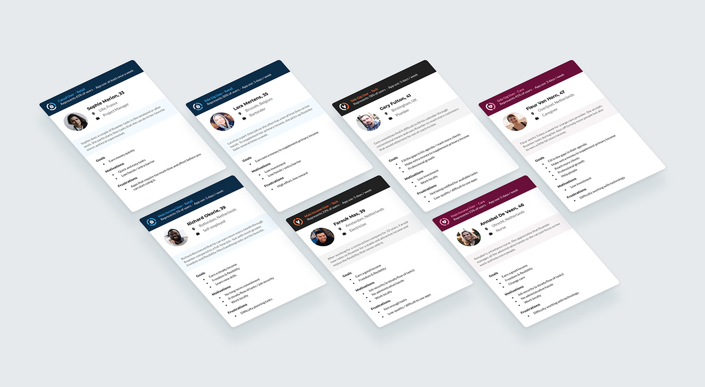
Personas
We came up with 7 unique personas using real user data that challenged our preconceived notions about the crowd and provided invaluable insight that helped when making design decisions.
Journey Maps
Roamler became more complex with the addition of the Tech crowd and more recently the Care crowd (healthcare workers). We made use of journey maps to make sure everyone in the team has a deep understanding of what our users go through to accomplish their goals. Journey maps also let us discover opportunities where certain features or the overall user experience can be improved.
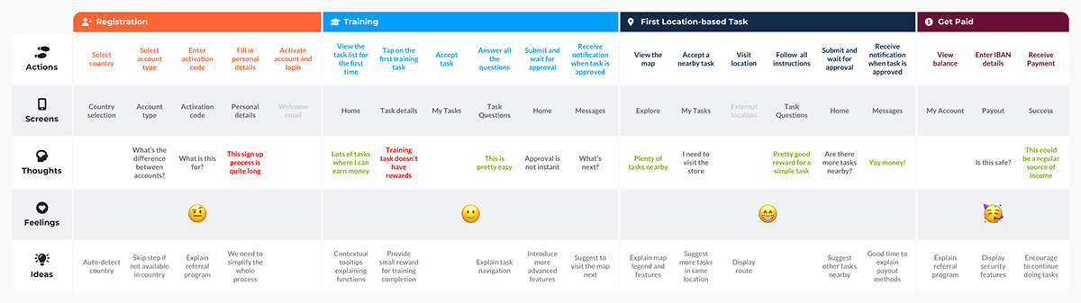
Journey map for the retail crowd from sign up to first payout
Prototype and Testing
The team spent countless hours brainstorming for ideas. To validate them, we would create interactive prototypes which the crowd are always very enthusiastic to test. In the beginning, the prototypes were done using rough wireframes. With the introduction of the Roamler design system it became much easier to produce high-fidelity mockups and prototypes at record speed.
Design System
To ensure consistency throughout the app and other Roamler products, I created a simple but comprehensive design system. It includes hand-crafted icons and illustrations, buttons, input elements and other reusable components. There are instructions and rules of what to use and when to use it, and a handy sizing guide.


