"A Legítima" é uma rede de lojas físicas que está presente há mais de 20 anos no mercado. No decorrer da história da empresa houve algumas mudanças na política de venda, porém, desde o início o foco foi de uma loja popular e com preço baixo, vertente que é mantida até hoje.
Expandido sua atuação, a empresa decidiu entrar no mercado digital e, para isso, criaram uma nova marca: "A Legítima Virtual". Essa marca possui o mesmo foco da principal, mas é desvinculada da mesma, portanto, sua identidade não traz nenhum elemento que a remeta.
"A Legítima" is a chain of physical stores that has been present in the market for over 20 years. Throughout the history of the company there were some changes in the sales policy, however, since the beginning the focus was on a popular store with low prices, which is maintained until today.
Expanding its operations, the company decided to enter the digital market and, for this, they created a new brand: "A Legítima Virtual". This brand has the same focus as the main one, but is unrelated to it, therefore, its identity does not bring any element that refers to it.
Expanding its operations, the company decided to enter the digital market and, for this, they created a new brand: "A Legítima Virtual". This brand has the same focus as the main one, but is unrelated to it, therefore, its identity does not bring any element that refers to it.


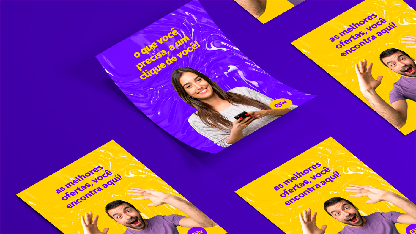
Além de representar bem o DNA apresentado acima, todo o projeto foi desenvolvido com objetivo de comunicar-se bem com o mercado digital, afinal, a nova marca foi criada com este propósito.
A paleta de cores é moderna, marcante e super enérgica. A tipografia é minimalista, limpa e atual, seu arredondamento e a caixa baixa deixam a marca mais próxima e amigável.
O símbolo criado é uma redução do logotipo e foi desenvolvido para garantir maior elasticidade da marca. Como os pontos de contato digitais em grande parte são em círculo, isso foi levado em consideração.
Besides representing well the DNA presented above, the whole project was developed with the goal of communicating well with the digital market, after all, the new brand was created with this purpose.
The color palette is modern, striking, and super energetic. The typography is minimalist, clean and current, its rounded shape and lowercase make the brand closer and friendlier.
The symbol created is a reduction of the logo and was developed to ensure greater brand elasticity. As the digital touch points are largely in a circle, this was taken into consideration.
Translated with www.DeepL.com/Translator (free version)